
Seaside bedroom decor in 2026 ranges from $80 IKEA linen to $600 boutique headboards, and the difference that matters most is not price but texture. The rooms that feel lived-in rather than staged all start with the same foundation: warm white walls that catch morning light like dunes bleached by salt, not the cool clinical shade that reads like a clinic at 6 a.m. Get that base wrong and every rattan pendant and striped throw layered on top becomes costume.
1. Soft, Neutral Base Colors
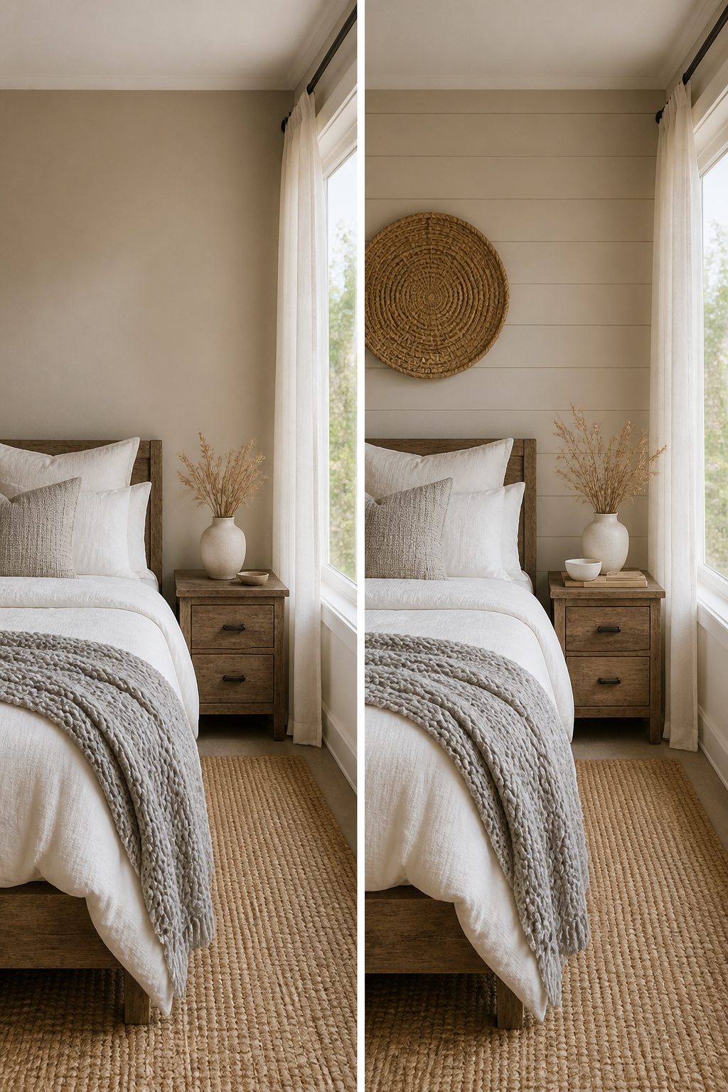
Sandy beiges, warm whites, and soft grays form the foundation of seaside bedrooms because they mirror what you actually see at the coast: driftwood faded by salt, dunes bleached by sun, the hazy sky before noon. These colors catch morning light in a way that matters in a room you wake up in. A cool white can feel like a clinic at 6 a.m.; a warm one reads as daylight.
White Dove by Benjamin Moore and Chantilly Lace by Sherwin Williams both stay on the warm side of white without tipping into cream. They read clean, not cold. In my own search through dozens of coastal rooms, the ones that felt lived-in rather than staged almost always started here. Pale beige or soft gray on the walls keeps the space open and lets you layer in texture later: a nubby throw, a woven shade, a strip of blue from actual sea glass. Skip the accent wall. The neutral base does the work if you let it.
2. Ocean-Inspired Colors
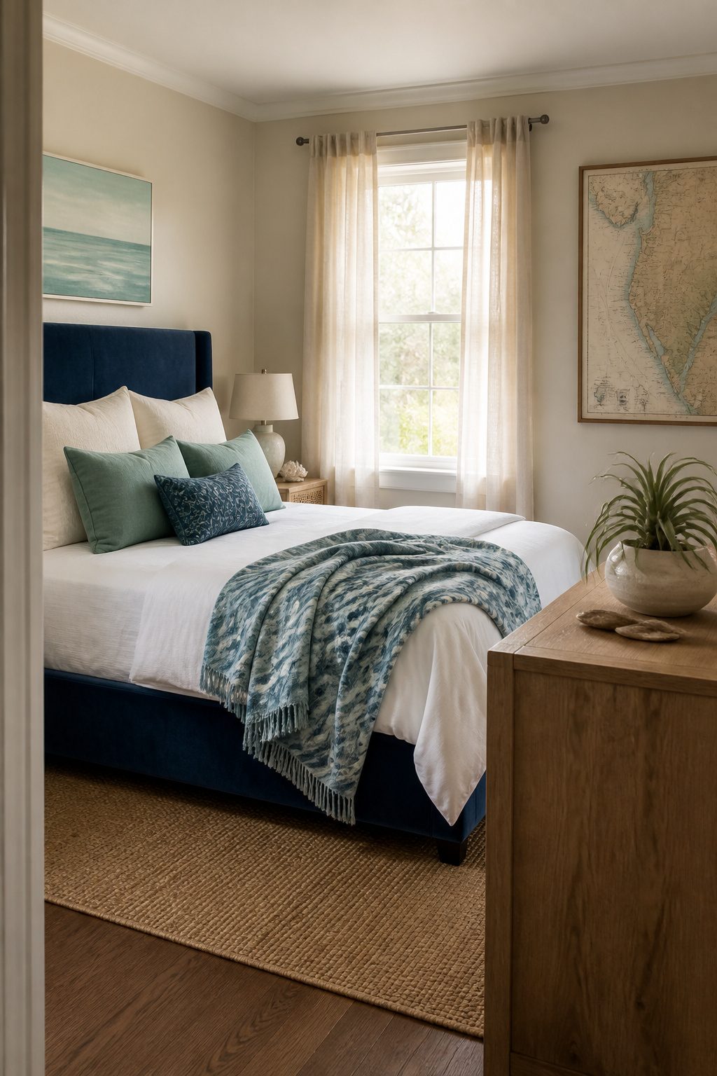
Seafoam and navy need a system, or the room ends up looking like a gift shop. The rule I keep seeing work is roughly 60 percent soft neutrals, 30 percent ocean tones, and 10 percent for something brighter like coral or sunny yellow. That backbone of white, cream, or sandy beige keeps the blues from taking over.
I learned this the hard way. A few years back I painted an entire accent wall in deep navy, thinking it would feel like a night ocean. Instead it felt like a cave, and I repainted within a month. Now I keep the bold blues to pillows, throws, or a single upholstered headboard, and let the walls stay light enough to bounce around whatever natural light the room gets. The 60/30/10 split is not a formula to worship, but it is a useful guardrail when you’re standing in the paint aisle holding two swatches and convincing yourself both can work.
3. Natural Materials and Textures
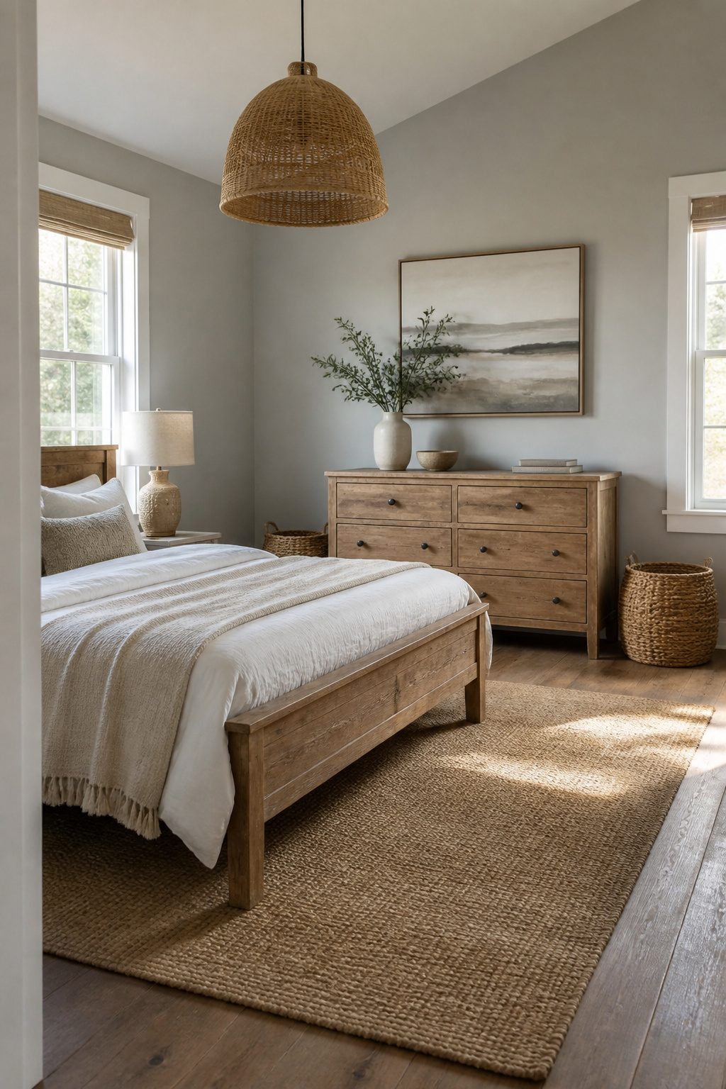
Rattan and wicker read staged when they show up as a single accent chair no one sits in. The coastal rooms that feel lived in layer three or four natural materials so the eye moves around. A jute rug under the bed, a woven rattan pendant over it, and a pair of sisal baskets flanking a simple wood dresser will do more than any one statement piece.
The price gap is real. A woven seagrass headboard runs about $180 at Target or HomeGoods, while boutique versions start near $600 and climb fast. For a renter who moves every two or three years, the difference matters because these materials dent and fray. Jute rugs especially show wear at the corners where vacuum cleaners hit them. Spending boutique money on something that will not survive a third lease is a mistake I have made.
Wicker storage baskets are the exception where cheap holds up fine. They sit on shelves, they do not take weight or traffic, and the $12 HomeGoods version lasts as long as the $40 import. Light fixtures are the opposite. A paper-wrapped wire pendant from a big box store looks it up close; the weave gaps unevenly and the finish goes orange in six months. Spend the money on the fixture that hangs at eye level, save it on the baskets tucked above.
Sisal works best as a flat weave rug with a cotton border, not the scratchy broadloom that feels like a doormat. The cotton edge takes the beating instead of the fiber, and when it frays you replace a $40 rug, not a $200 one.
4. Light and Breezy Bedding
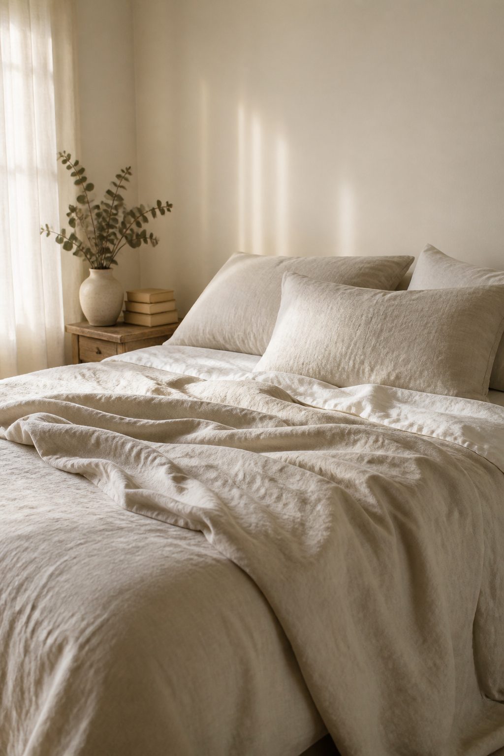
Linen and cotton are the only fabrics that make sense for seaside bedroom decor once you stop treating the bed like a display piece and start treating it like somewhere you actually sleep. Cotton gives you the crisp, cool hand-feel that reads coastal in a photograph, but linen is what holds up to humid mornings and the kind of casual living the style promises. The wrinkles are the point, not a flaw to steam out. That slubbed, slept-in texture is what keeps the room from looking like a hotel staging, and it only gets softer with each wash without turning limp.
A decent linen duvet cover set runs about $120 to $180 for a queen, though I have seen them dip under $100 during end-of-season sales at places like Target or HomeGoods if you catch the right week. I bought mine from a mid-range online bedding shop two summers ago for $145, and the color had already shifted from a true white to something warmer and more interesting by the third wash. If I were buying today, I would check IKEA first. Their linen bedding is thinner than the premium stuff, but the price lands closer to $80 and the weave is honest enough that you are not fooling anyone, including yourself.
5. Coastal Artwork
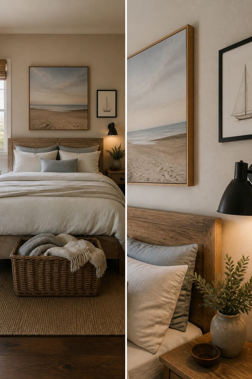
Wall art is where most coastal bedrooms lose their way. The generic canvas prints, the ones that ship from overseas in tubes and smell like chemical primer, read as hotel art the moment they hang. I have made that mistake twice. Now the only things that go up are photography of empty beaches, vintage nautical charts, or simple line drawings of boats. Those three share a restraint that keeps the room from feeling like a theme park.
The empty beach photographs work because the horizon line sits low and the sand takes up most of the frame. No people, no footprints, no sunset colors that fight with your bedding. I print my own from a trip to the Outer Banks for under $20 at a local drugstore with a photo department. The paper stock matters more than the camera; matte finishes look intentional, glossy looks like you forgot to pick the finish.
Vintage nautical charts come from estate sales or from Etsy sellers who list them by region. The paper is already foxed and soft, so the age reads as real. A framed chart of the coastline near your actual town costs about the same as the mass-produced canvas but carries weight. Simple line drawings of boats, the kind with three strokes for a hull and one for a mast, work best in thin black frames above a nightstand. They read as coastal without needing to announce it.
6. Coastal Patterns
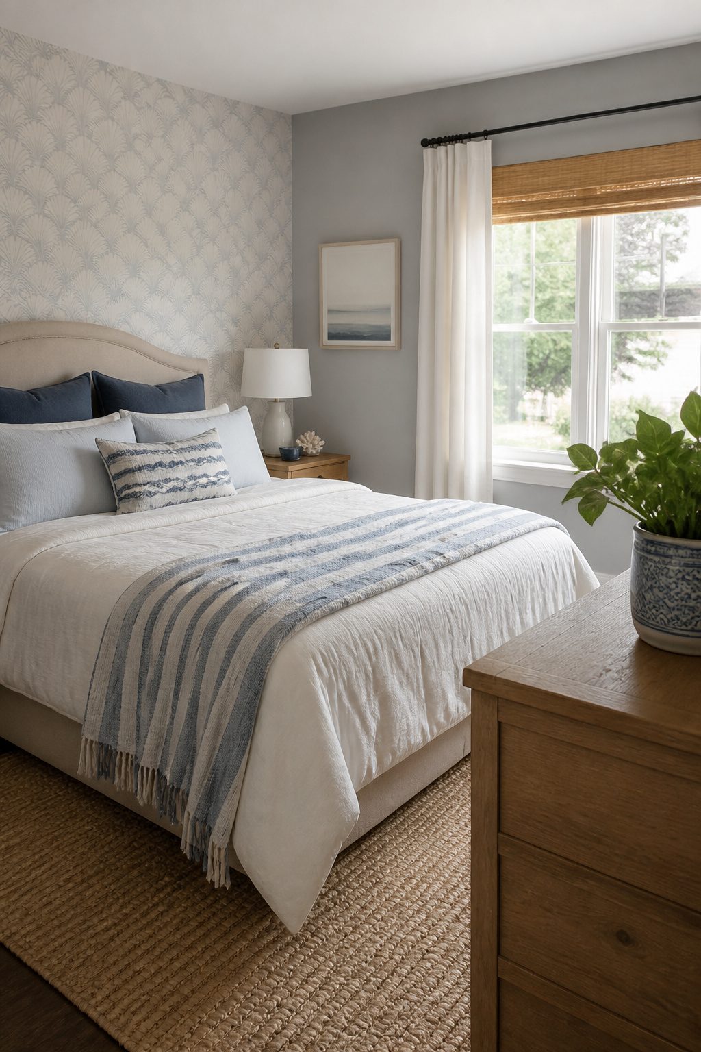
Stripes in blue and white are the safest coastal pattern because they read nautical without trying too hard. Subtle coral, shell, or wave motifs work too, but only in small doses: a pillow, a single throw, maybe curtain panels if the rest of the room stays quiet. One pattern per room is usually enough. Anything more starts to feel like a theme park.
In a rental, pattern has to travel light. Removable wallpaper on one small wall can anchor the look, and peel it off when the lease ends. Pillows and throws do the same job with less commitment. I once tried a busy wave-print duvet cover that seemed perfect for about three weeks, then aged fast and looked dated by month two. Swapped it for plain linen and never missed the drama.
7. Maximizing Natural Light
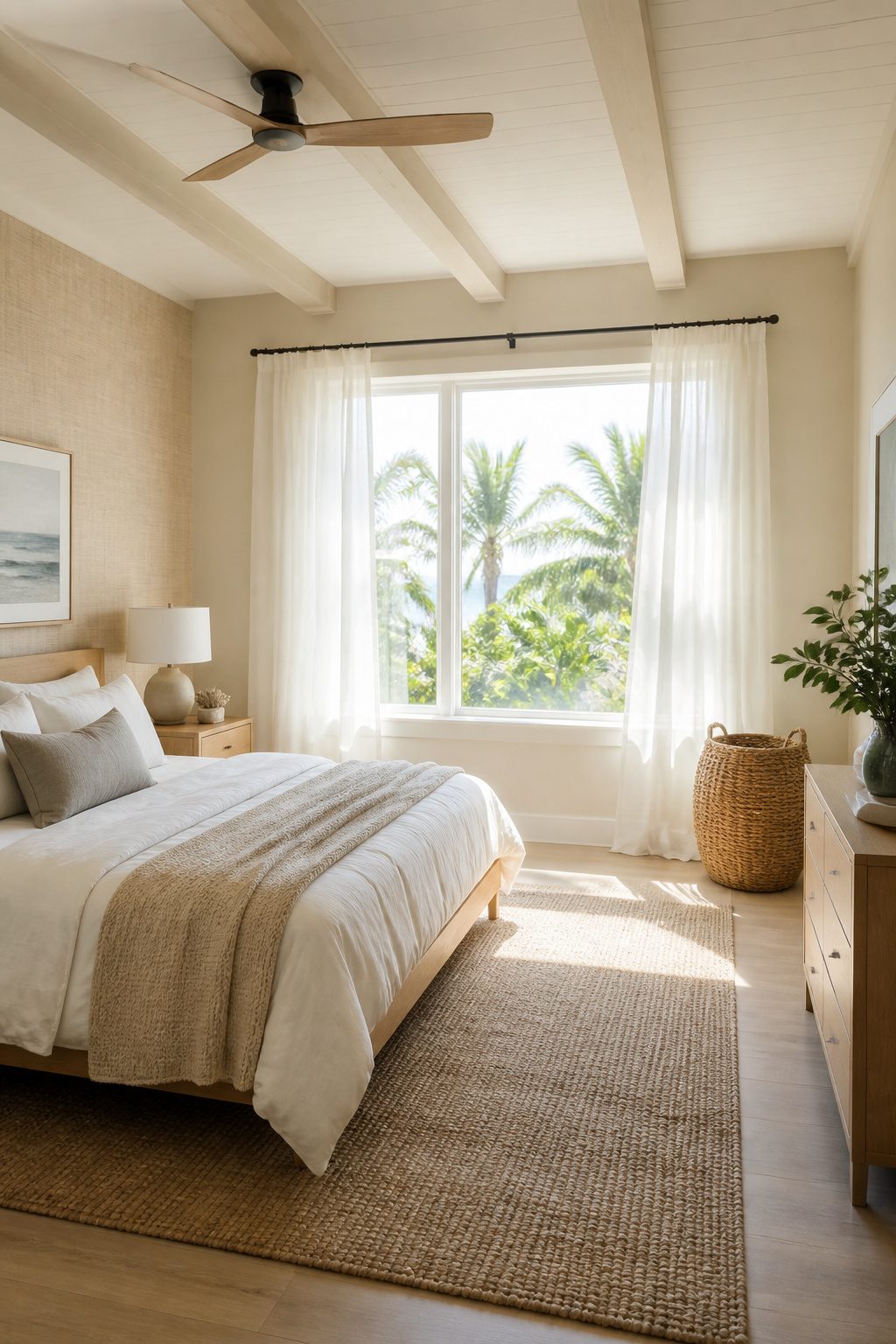
Sheer curtains or light-filtering shades do the heavy lifting in seaside bedroom decor because they spread daylight through the room instead of trapping it at the window. Heavy blackout curtains kill the coastal mood stone dead, even when you need them for sleep. I learned that the hard way in a rental where the afternoon sun hit the bed like a spotlight and the only curtain rod was a cheap tension pole that sagged under anything with lining.
The fix that kept both the light and my sleep schedule intact was layering: sheer panels on a standard rod for daytime, with a separate blackout roller mounted inside the window frame where the brackets hide completely. The hardware that makes this possible for renters is a spring-tension roller shade or, better, a no-drill cellular shade with a peel-and-track frame bracket. The frame-mounted roller disappears behind the sheer layer during the day, so the room still reads airy and coastal, but it drops down at night to block the streetlight or the 5 AM summer sun. Two systems, two jobs, zero holes in the landlord’s trim.
8. Coastal Accents and Accessories
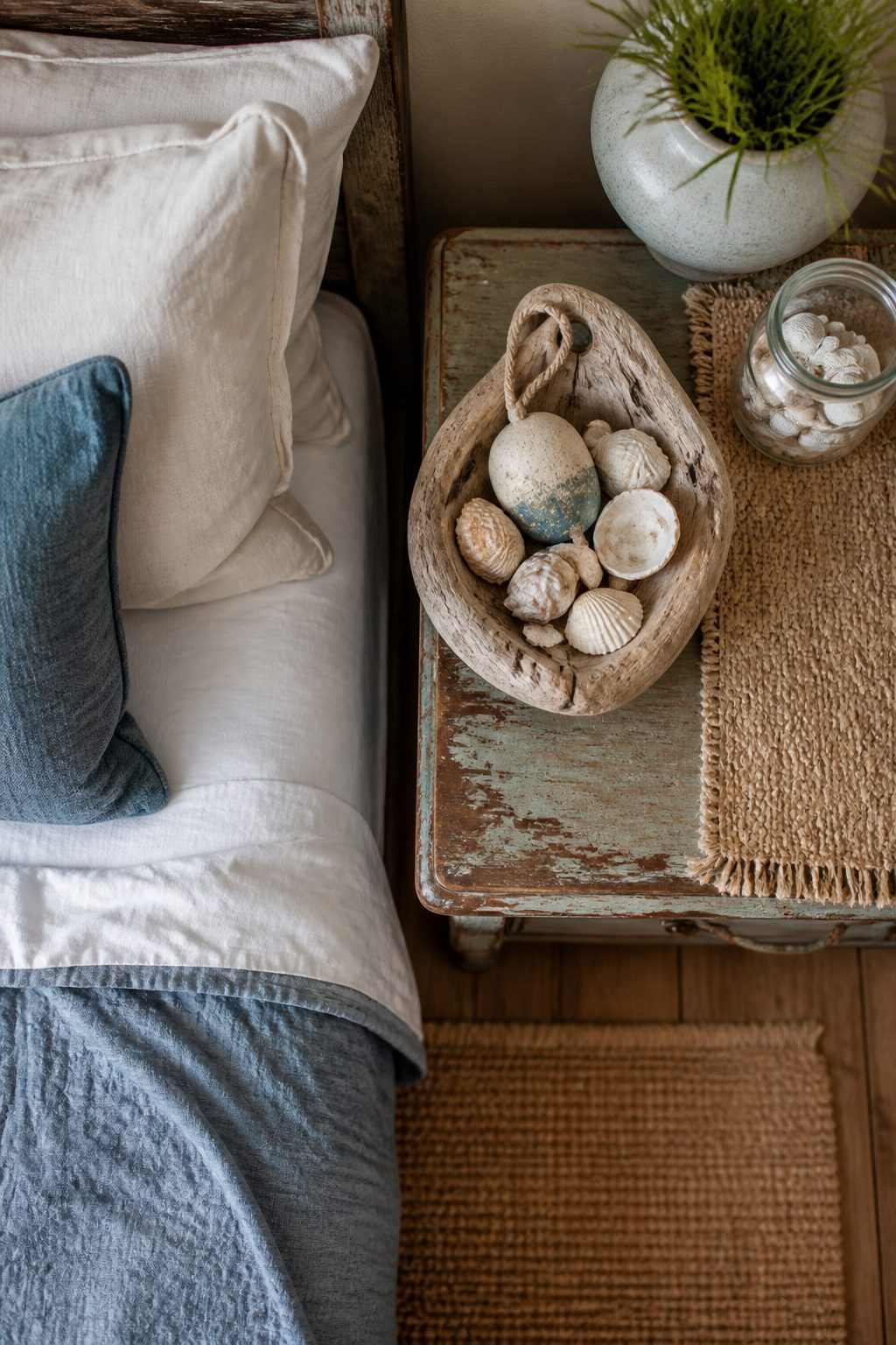
The driftwood bowl on my dresser came from a garage sale two towns over, and the ceramic buoy beside it was a five-dollar find with the paint already chipped in a way that looked earned. Those two pieces do more for the room than the matching glass-float set I almost bought online, where every object carried the same rope knot and the same shade of navy. Three to five coastal objects is the ceiling for a small bedroom, and they need to look like they washed up on different tides. A mass-produced kit in one Amazon box reads like a hotel chain trying too hard; the eye catches the repetition before it registers any single piece. I keep a glass jar of actual shells I collected, and their irregular sizes next to the smooth driftwood keep the whole corner from feeling staged. If everything matches, nothing tells a story.
9. Weathered or Whitewashed Furniture
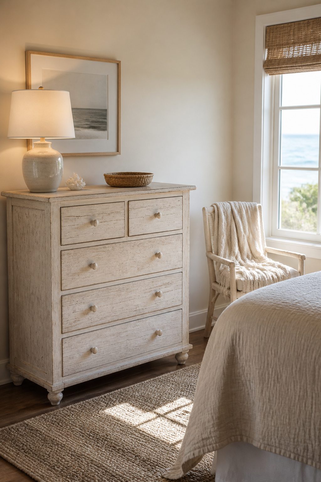
Pine and oak both take a light finish well, but they age differently. Pine goes soft and blotchy if you stain it straight; oak holds grain you can actually see through whitewash. Real sun-bleached wood, the kind that sat on a porch for fifteen years, turns silver-gray from UV and rain cycling through it. Paint or stain that imitates it usually reads too warm or too uniform. The trick is introducing randomness.
I found a solid pine dresser at a Habitat ReStore for $35 that had good bones and bad varnish. To fake that weathered look, I sanded with 80-grit paper just to break the surface, not to smooth it. Then I brushed on two thin coats of Behr Premium Plus in "Weathered White," letting the first coat dry about four hours. The second coat went on unevenly, heavier in spots, so some of the raw wood showed through like actual wear. I left the top bare except for a single coat, then sealed everything with matte polycrylic so it would hold up to real use. The whole thing took one Saturday and Sunday morning. The result reads closer to driftwood than to furniture-store coastal, and for a rental bedroom that needs personality without permanence, that distinction matters.
10. Incorporating Greenery
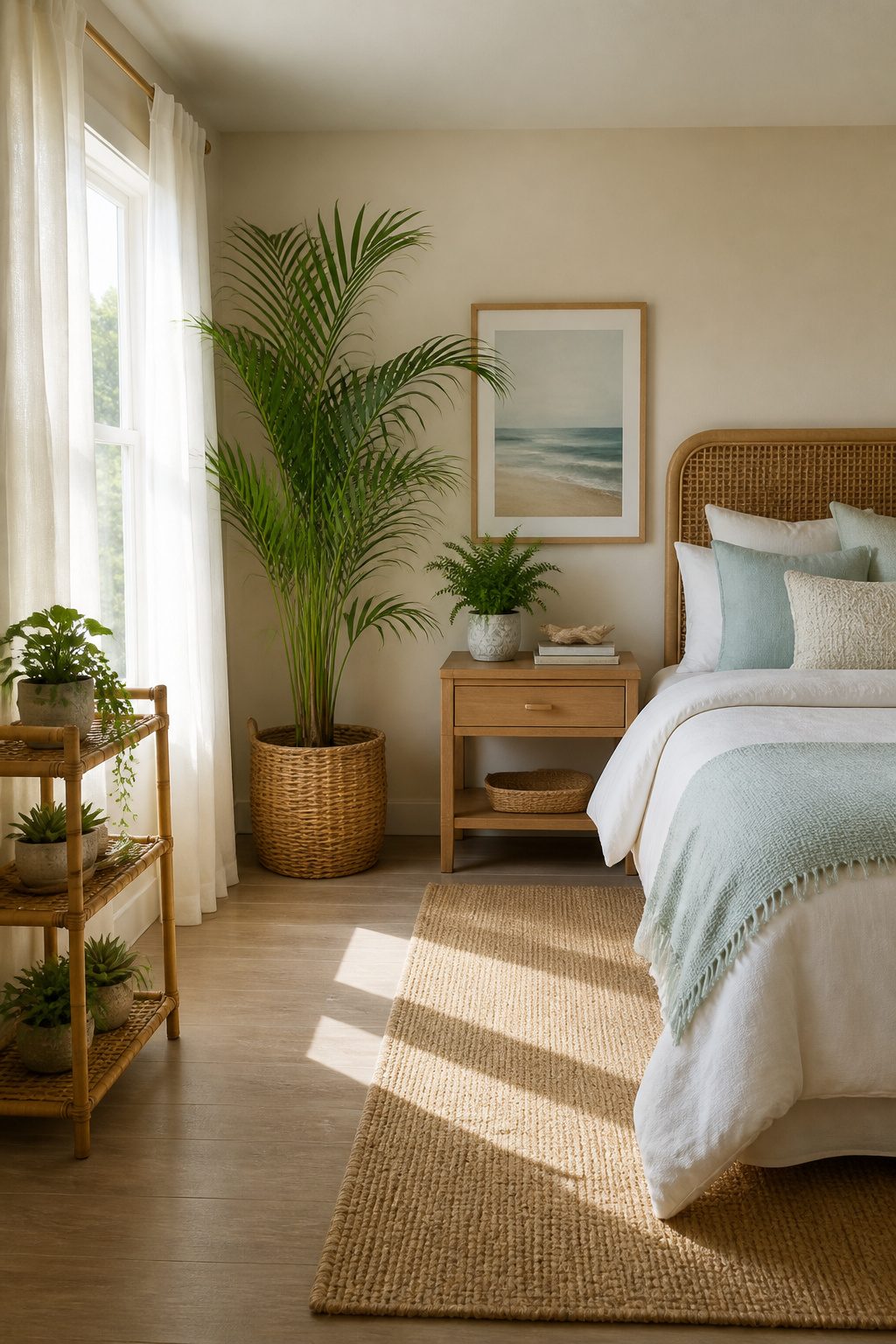
Ferns and palms carry the coastal look better than succulents, which read desert no matter what pot you drop them in. A Boston fern on a nightstand or a parlor palm in a corner brings in the humidity and overgrowth of an actual shoreline, though I have killed both by overwatering and underwatering in the same calendar year. The trick in a rental bedroom is matching the plant to the light you have, not the light you wish for. North-facing windows suit the parlor palm fine; a fern wants brighter, indirect light and will brown at the tips the second the radiator kicks on.
If your building has variable light or you travel for work, a faux palm or clipped saw palm stems do the job without the casualty count. The coastal style is forgiving here because the fronds themselves are the statement, not the soil.
For renters avoiding drill holes, a three-tiered bamboo plant stand or a single over-the-door hanging planter with a tension rod keeps the greenery off the floor and the security deposit intact. I have leaned a stand against the wall rather than mounted it and never lost sleep over the gap.
What Modern Coastal Means Now
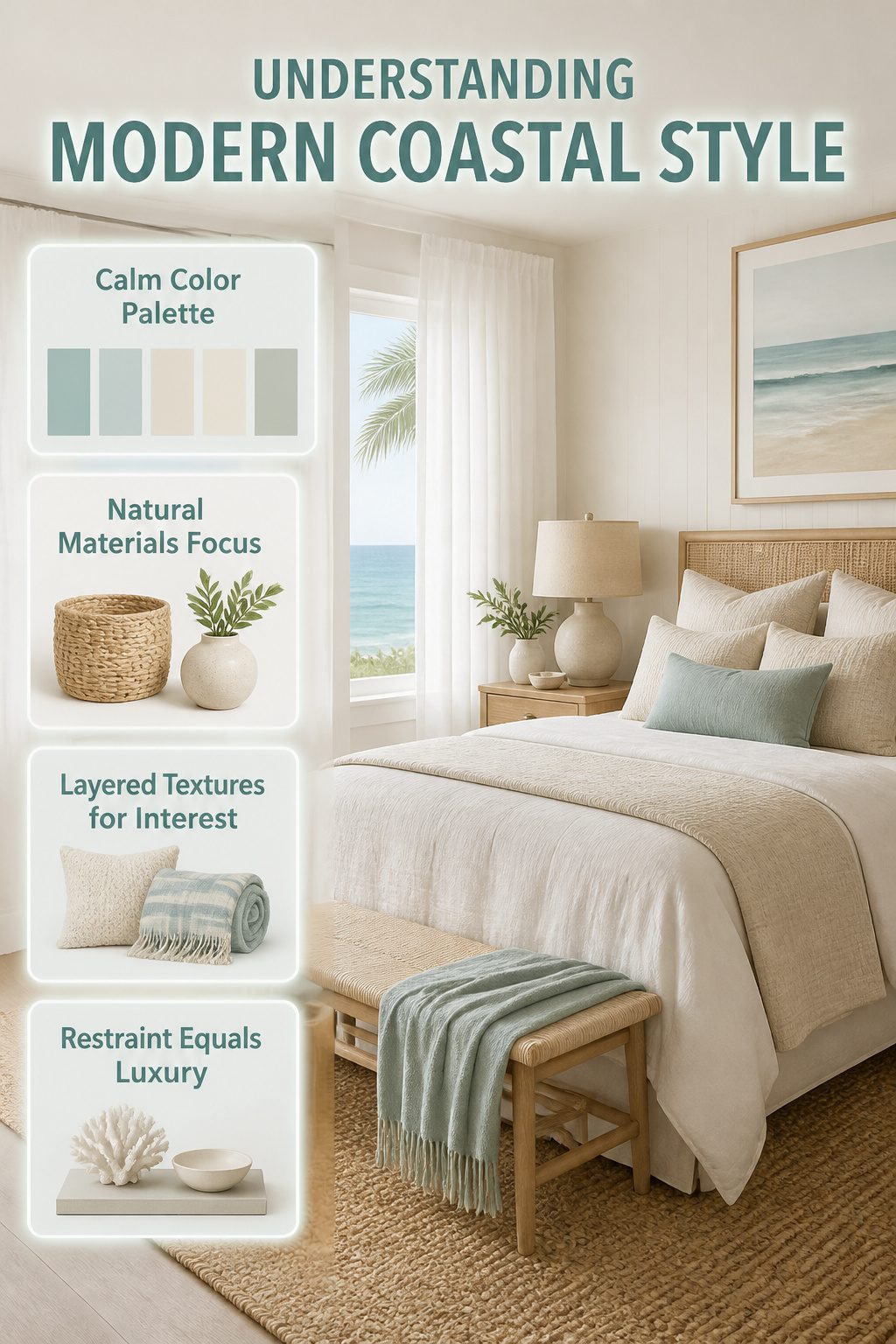
The seaside bedroom decor I see in stores right now still pushes a lot of rope, anchors, and surfboard cutouts, but the current look has moved somewhere quieter. What convinced me, reading through a dozen of these roundups, is the difference between a beach cottage and a tranquil resort: the first shouts with bright colors and seashell accents, while the second gets there with white curtains, soft hues, natural fiber rugs, and plush neutral bed linens. The restraint is what makes it feel expensive, not the theme itself.
This matters if you are shopping this weekend because the old kitsch is still stacked on endcaps and tagged "coastal," and it is easy to bring home something that reads childish by Tuesday. Modern coastal bedrooms use decorative pillows and natural materials, but they do it in muted ways that let you feel calm instead of reminded. Layered textures, not louder objects, create the visual interest. Skip the ceramic fish and maritime flags unless you want whimsy, not serenity. The look that wins for a renter or a first-home owner is the one that survives a real budget without needing a complete overhaul when trends shift again.
A Realistic Project Order
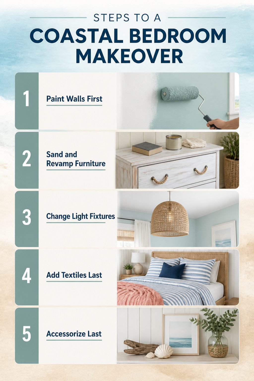
Paint goes down first, because every other decision depends on the wall color. That first weekend is two full days: Saturday for cutting in and rolling the main color, Sunday for a second coat and taping off any stripe or shiplap detail while the base is fresh. The trim and ceiling can wait if you are renting; focus the hours on what you will actually see from bed.
The second weekend splits into four afternoons. Sand and repaint or wax any furniture you already own on Saturday morning. New pieces, especially a whitewashed nightstand or a rope-handle dresser, are better left on your watch list until the right one surfaces on Facebook Marketplace or at a local estate sale. Rushing that purchase is how you end up with a particleboard cube that warps in humid coastal air.
Sunday afternoon one: swap the overhead fixture for a rattan or woven pendant if your lease allows, or add a plug-in sconce if it does not. Sunday afternoon two: layer in the textiles, a striped duvet cover and a single throw pillow in a darker navy or coral to anchor the bed. The accessories, shells, driftwood, a small framed print, come last and should take twenty minutes, not two hours. If a piece does not feel right immediately, leave the spot empty. A blank wall reads calmer than a forced arrangement.
Renters’ Limits and Workarounds

Most leases in the US strip you down to white walls and bare nails the moment you sign, which makes a coastal bedroom feel impossible until you realize the room is already full of vertical surfaces that are not walls.
- Peel-and-stick wallpaper on the closet door gives you one accent wall’s worth of stripe or sand-dollar pattern without touching paint. The door swings shut when you move out, and the landlord never sees it.
- Command strips hold lightweight seagrass mats and framed shell prints up to about five pounds apiece. I hung a grid of six small frames above my headboard that way for two years; the adhesive pulled clean off with a slow tug and dental floss.
- Furniture placement fools the eye better than anything permanent. A low white dresser floated six inches from the wall reads as architecture, not storage, and a floor mirror leaned against the short wall doubles the window light so effectively that I stopped wishing I could mount sconces.
- Rattan or cane headboards stand in for wall texture. They sit on the floor, need no hardware, and the shadow they throw at afternoon light does half the coastal work for you.
Where the Money Actually Goes
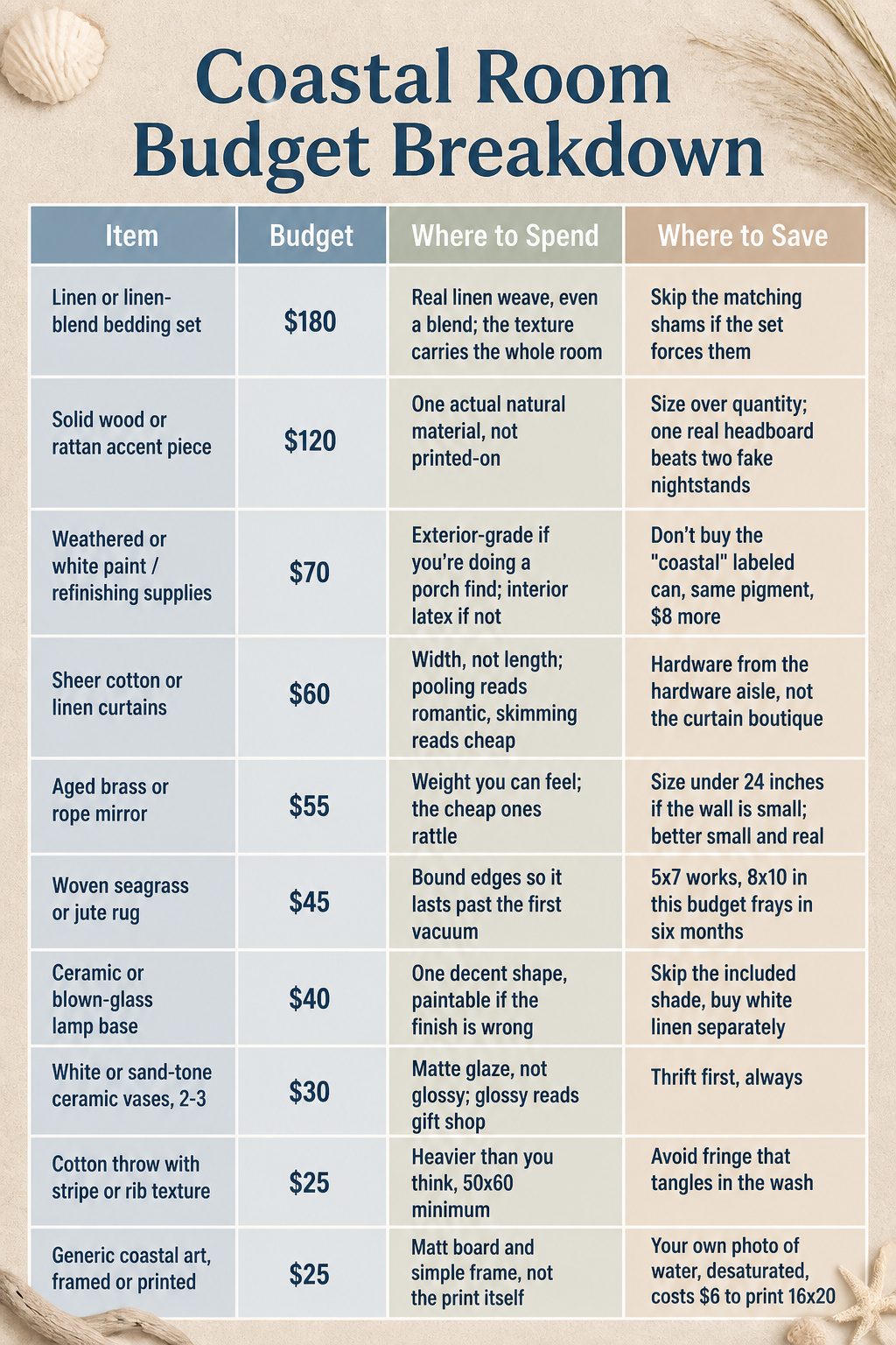
Most coastal roundups skip the part where you actually pay for things. I built a sample $600 spend across ten items, and the split surprised me even after I mapped it out.
| Item | Budget | Where to Spend | Where to Save |
|---|---|---|---|
| Linen or linen-blend bedding set | $180 | Real linen weave, even a blend; the texture carries the whole room | Skip the matching shams if the set forces them |
| Solid wood or rattan accent piece | $120 | One actual natural material, not printed-on | Size over quantity; one real headboard beats two fake nightstands |
| Weathered or white paint / refinishing supplies | $70 | Exterior-grade if you’re doing a porch find; interior latex if not | Don’t buy the "coastal" labeled can, same pigment, $8 more |
| Sheer cotton or linen curtains | $60 | Width, not length; pooling reads romantic, skimming reads cheap | Hardware from the hardware aisle, not the curtain boutique |
| Aged brass or rope mirror | $55 | Weight you can feel; the cheap ones rattle | Size under 24 inches if the wall is small; better small and real |
| Woven seagrass or jute rug | $45 | Bound edges so it lasts past the first vacuum | 5×7 works, 8×10 in this budget frays in six months |
| Ceramic or blown-glass lamp base | $40 | One decent shape, paintable if the finish is wrong | Skip the included shade, buy white linen separately |
| White or sand-tone ceramic vases, 2-3 | $30 | Matte glaze, not glossy; glossy reads gift shop | Thrift first, always |
| Cotton throw with stripe or rib texture | $25 | Heavier than you think, 50×60 minimum | Avoid fringe that tangles in the wash |
| Generic coastal art, framed or printed | $25 | Mat board and simple frame, not the print itself | Your own photo of water, desaturated, costs $6 to print 16×20 |
Linen bedding eats nearly a third of the budget because everything else reads as costume without it. Generic art gets $25 because a white mat and clean frame does more work than the image inside. I have bought the $12 "seashell triptych" and regretted it by Tuesday.
Mistakes That Read as Costly
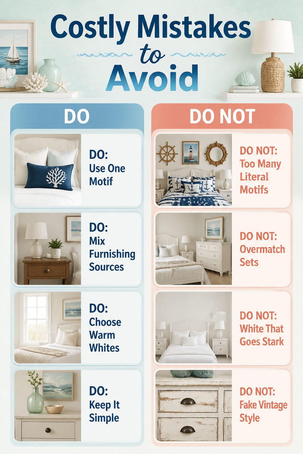
The fastest way to blow a seaside bedroom budget is on fixes for mistakes that read expensive from the doorway.
- Too many literal motifs — one anchor print is a nod, three anchors plus a ship wheel plus rope mirror frames turns the room into a gift shop. I learned this the hard way with a lighthouse lamp that sat in the closet for two years.
- Matching sets from one store — the bed frame, nightstands, and dresser all from the same coastal collection look staged, not lived in. Mixing a secondhand wooden nightstand with a simple painted bed frame costs less and looks like you built the room over time.
- White that goes stark instead of warm — pure white walls against bright white bedding and white furniture read clinical. A shade with a drop of gray or cream, like a warm alabaster, keeps the light without the hospital corridor effect.
- New furniture that tries too hard to look old — factory distressing with sanded edges in identical spots on every drawer fools no one. Actual wear on a real vintage piece, or clean lines on something new, both cost less and look better than fake history.
Frequently Asked Questions
What colors work best for a coastal bedroom?
Sandy beiges, warm whites, and soft grays form the base, with ocean tones like seafoam or navy kept to about 30 percent of the room. A warm white such as White Dove by Benjamin Moore or Chantilly Lace by Sherwin Williams reads as daylight rather than clinic lighting at 6 a.m. The remaining 10 percent can go to brighter accents like coral or sunny yellow.
How do you decorate a coastal bedroom?
Layer three or four natural materials so the eye moves around rather than landing on a single staged accent. Jute rugs, woven pendants, sisal baskets, and linen bedding each do part of the work. Limit coastal objects to three or five per small bedroom, and let them look collected from different sources rather than purchased as a matching set.
What rug works best in a beach house bedroom?
Jute, cotton, or wool rugs keep the space light and relaxed, with sisal working best as a flat weave with a cotton border. The cotton edge takes the beating instead of the fiber itself, so you replace a $40 rug rather than a $200 one when it frays. Skip the scratchy broadloom that feels like a doormat.
What is modern coastal style?
Modern coastal style draws from a tranquil resort rather than a beach cottage: white curtains, soft hues, natural fiber rugs, and plush neutral bed linens that let you feel calm instead of reminded. The restraint is what reads expensive. Layered textures create visual interest, not louder objects or literal motifs like ceramic fish and maritime flags.