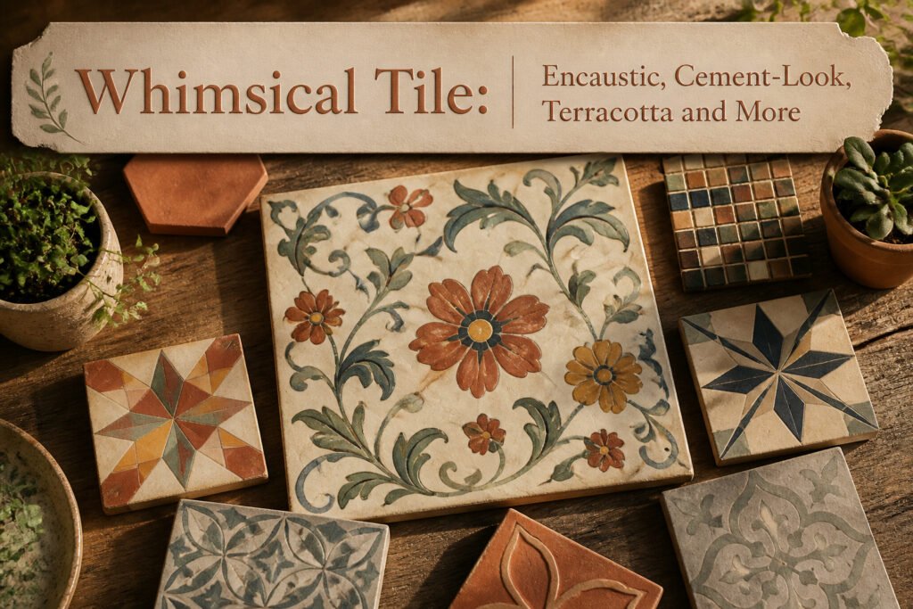
Whimsical tile is personality made solid: a hand-painted floral winding across a backsplash, a geometric pattern in colors that clash on purpose, a mosaic floor that tells a story instead of repeating the same square forever. The difference from standard tile is intent, not just pattern, and that distinction matters most when you have a weekend and a few hundred dollars to spend on a first home. True encaustic runs about double per square foot over ceramic and demands sealing twice in year one, which is why many owners now choose cement-look porcelain instead.
What Whimsical Tile Means
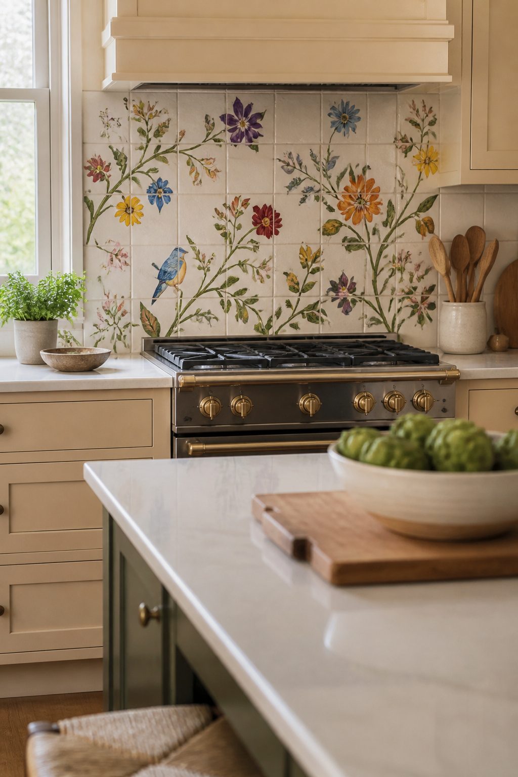
A tile reads as whimsical when it breaks the expected grid: a hand-painted floral winding across a kitchen backsplash, a geometric pattern in colors that clash on purpose, a mosaic floor that tells a story instead of repeating the same square forever. Whimsical tile is personality made solid, and that is exactly what separates it from the beige subway stack most renters inherit.
Standard tile does its job quietly. Whimsical tile does its job while winking at you. The difference is not just pattern but intent: a terracotta starburst or a cement-look arabesque was chosen to start conversation, not to disappear. I have seen kitchens where a single row of patterned encaustic behind the stove turned a rental galley into the room people photograph.
The category is broader than one trend. Florals, stripes, intricate geometries, even narrative scenes like trees or landscapes all count. What ties them together is that playful, personal quality: a design choice that reflects something about who lives there rather than what was on clearance. For a first-home owner with a weekend and a few hundred dollars, that distinction matters. You are not installing a museum piece. You are installing a counterargument to every generic surface in the house.
Encaustic Tile
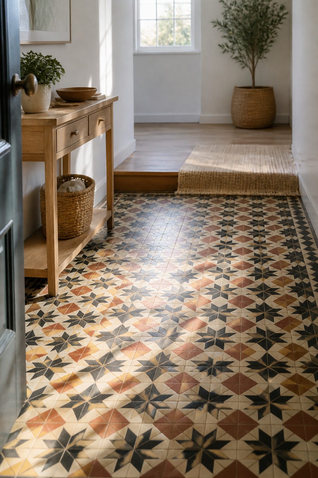
Encaustic tile carries pigment all the way through the body, not just on the surface, which means the pattern stays even as the surface wears. That density makes it one of the few decorative options that actually improves in a high-traffic entry or a kitchen floor that sees grit and water daily. The patterns run geometric, floral, or somewhere between, and the handmade variation means no two tiles match exactly. In a new build with flat drywall and standard trim, that irregularity is the fastest way to lose the showroom feel.
I looked at a lot of these for a bathroom floor last spring and the price jump from ceramic to true encaustic was sharp, about double per square foot. The cement-based body also needs sealing, probably twice in the first year and then every couple years after. Skip that and the surface stains. For a rental or a first home you plan to sell inside five years, the maintenance is real enough that I’d weigh cement-look porcelain instead. But if you are staying and you want tile that looks like someone chose it deliberately, encaustic is the category that keeps coming up.
Cement-Look Tile
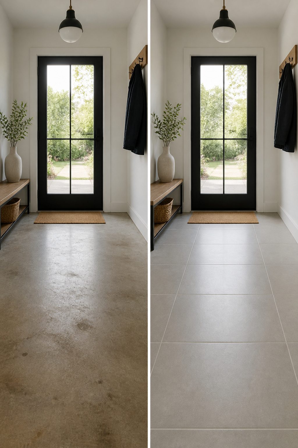
Cement-look tile gives you the matte, slightly imperfect surface of poured cement without the weight or the sealing ritual. Real cement tile runs porous and demands resealing every year or two; the porcelain and ceramic versions skip that entirely. I spent an afternoon once trying to price out authentic 8-by-8 cement field tile for a laundry room floor, and the per-square-foot number plus freight from a specialty supplier killed the project before I even picked a pattern. The mass-produced alternatives ship from big-box stock, install with standard thinset, and cut on a wet saw like any porcelain.
The 17.63-inch Royalty Galactic ceramic field tile and the smaller 8-by-8 porcelain white-black option both read as cement from a few feet away, especially in a busy pattern where the eye catches the geometry first and the material second. The glaze on ceramic versions does flash a little under direct light, so they suit walls and low-traffic floors better than a mudroom that takes grit every day. For renters, peel-and-back versions exist in this look, though I have not tested their longevity under a refrigerator or a rolling desk chair. First-home owners get the most value here: the savings over real cement usually covers the labor if you are hiring, or buys you a better grout and a weekend off if you are not.
Terracotta Tile
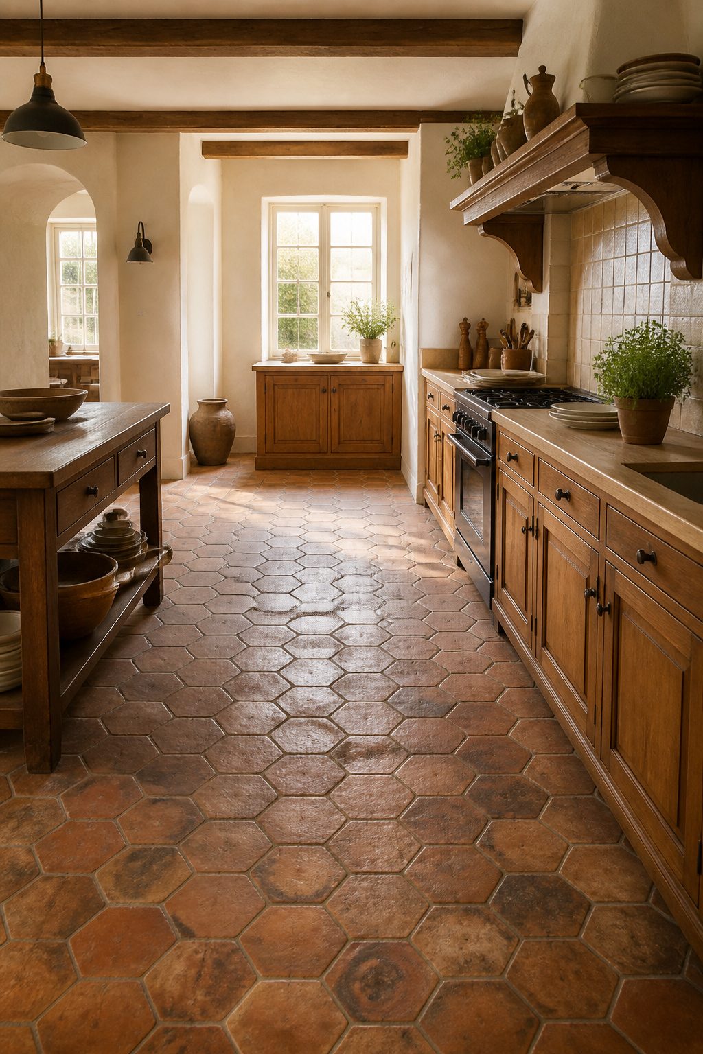
Old terracotta carries a depth that factory-new tile rarely matches. The hex tiles in a French kitchen by Autemps Des Cerises are more than 150 years old, salvaged and brought into a home where they never originated. That aged surface, worn by actual use, adds a layer of authenticity no distressing technique can quite replicate.
Vivi et Margot works with the same material to similar effect. The color variation, the slight unevenness, the patina that builds over decades of foot traffic: these are the qualities that make terracotta read as genuine Old World rather than Old World-inspired.
For a weekend project with a few hundred dollars, salvaged terracotta is usually out of reach. Reproduction terracotta-look porcelain is the practical fallback, and some of it is convincing enough at a glance. What it misses is the specific depth of real age, the way light hits a surface that has been walked on for generations. If the budget stretches and the source appears, actual aged terracotta is worth the hunt. Otherwise, choose the porcelain with the most color variation you can find, and let the grout do some of the work of suggesting history.
Stenciled Tile
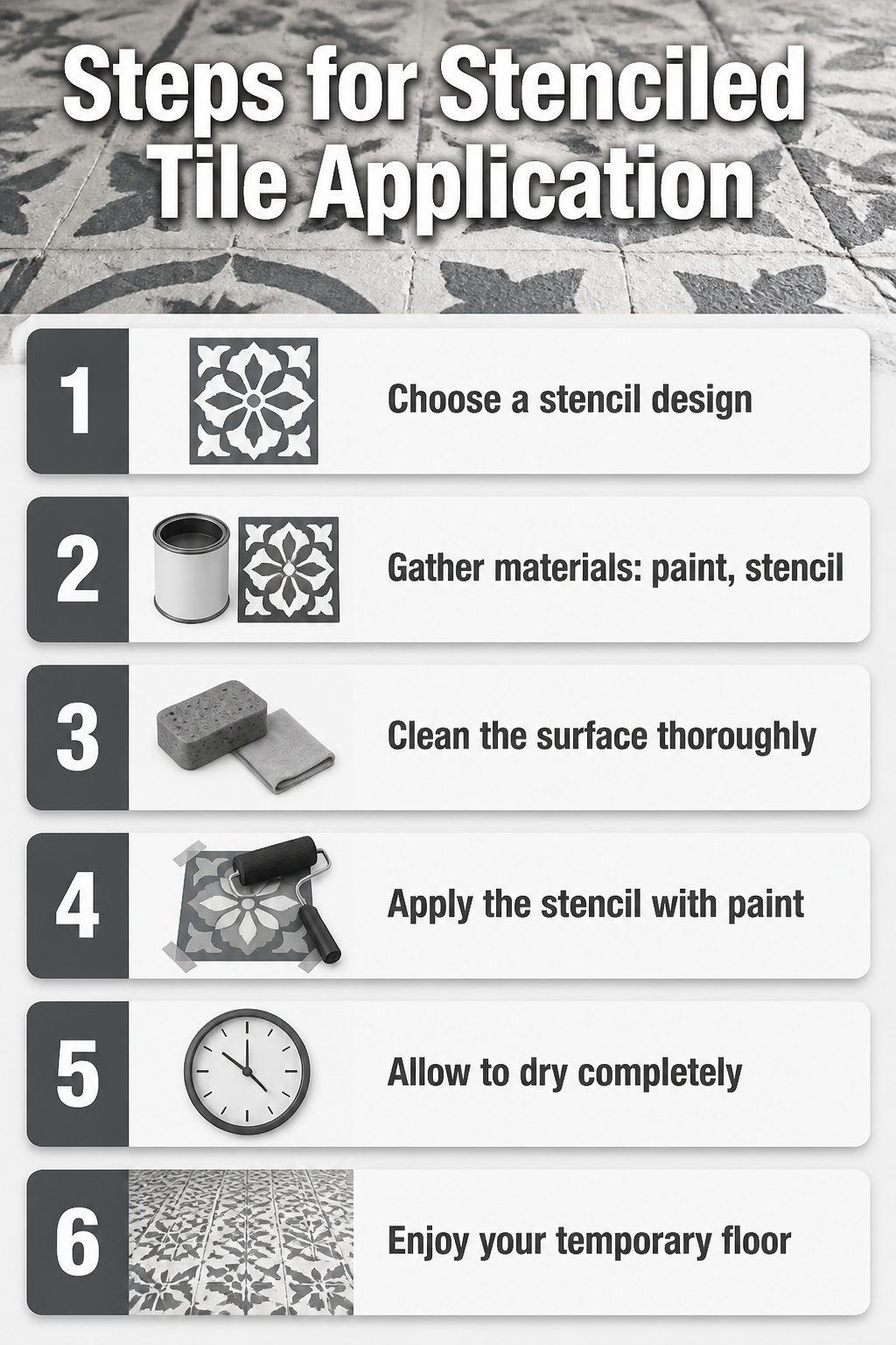
Stenciled tile lets you test a cement-tile look without the mortar or the permanence. A quality stencil, some charcoal grey paint, and a few hours on a Saturday are enough to lay a pattern over existing vinyl, old tile, or even a patio slab. The finish is temporary by design, which matters more than it sounds. Encaustic styles have cycled in and out since the 1850s; when this one fades for you, another coat of paint erases it entirely. Renters use this as version 1.0 flooring, something to live with until the lease ends or the budget opens up for real demo. Homeowners treat it the same way, a low-stakes trial before committing to the weight and cost of actual cement tile. The Jewel Tile Stencil from Cutting Edge Stencils mimics the real thing closely enough to photograph well, and the work fits a single weekend with dry time. The catch is traffic. A painted floor in a kitchen or entryway will show wear faster than a stenciled backsplash or a wall you barely touch. Plan the placement honestly, and this becomes one of the cheaper ways to answer whether you even like living with the pattern.
Mosaic Tile
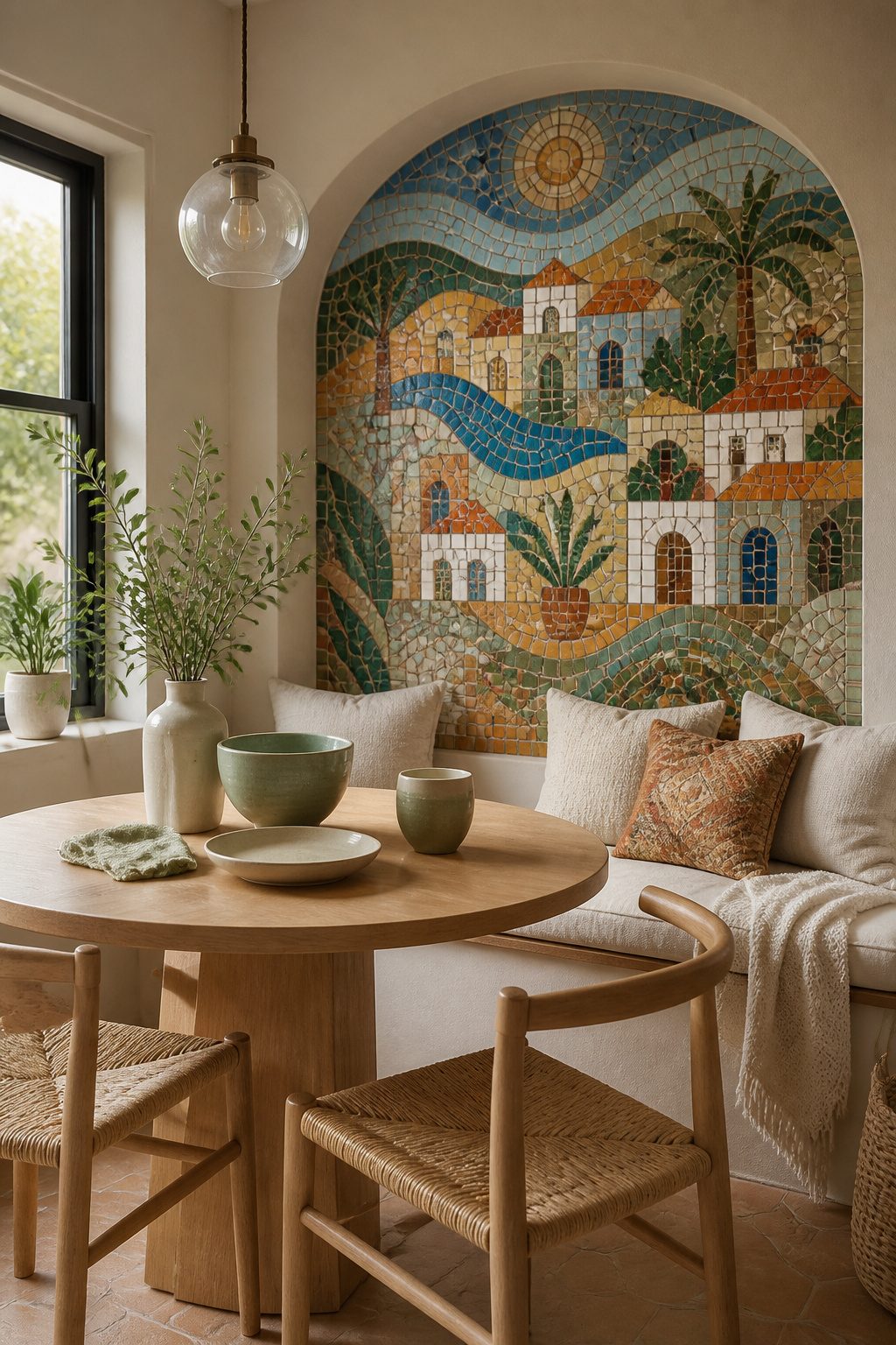
Mosaic tile carries the oldest storytelling impulse in the whimsical category. The Greeks and Romans laid small pieces of stone and glass to record myths, daily life, and cultural values, and that same instinct still drives the work today. A modern floor mosaic might swap the ancient fishbones for a pizza slice, a cat paw print, or a tennis ball, turning a historical format into something that belongs to one household.
The personalization is where the format earns its keep. Geometric mosaics gain personality through color, finish, and how you lay them, while pictorial ones let you build a scene from your own symbols. The motif you choose matters more than the tile grade because the grout lines do the drawing.
Cost and labor run higher here than with large-format whimsical tile. Every piece needs placement, every curve needs cutting, and the field has to stay level or the story reads as a stumble. For a weekend project with a few hundred dollars, a small inset over a stove or inside a shower niche limits the scale without losing the point.
Metallic Accent Tile
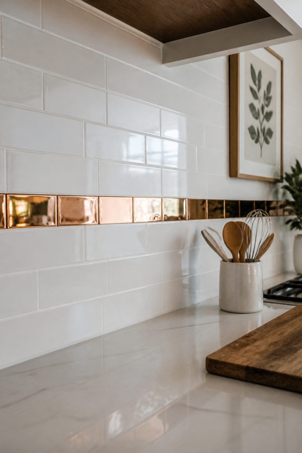
A metallic accent tile works as a whimsical element because the surprise comes from the material itself, not from pattern. I first noticed this in a friend’s kitchen where a band of polished copper strip ran between plain white field tile. The light moved across it all day, turning a simple backsplash into something that caught your eye without shouting for attention.
The copper strips come in 1-by-24 or 1-by-30 sizes, polished or brushed, and they read best in small doses: one backsplash, a shower niche, or a thin horizontal band. Most metallic accent tile is rated for walls only, so keep it off floors and out of shower pans where moisture and wear will punish the finish. The reflection does the whimsical work for you, which means you do not need a busy pattern to get the effect. A glossy ceramic paired with copper, like the Fadma White/Blue/Copper 9-by-10 format, lets the metal be the detail that shifts as you walk past.
Pressed metallic shapes need a wider grout joint than rectified squares, and grout color changes the look more than the tile itself. Choose a neutral grout and let the shine carry the moment.
Where Whimsical Tile Works Best
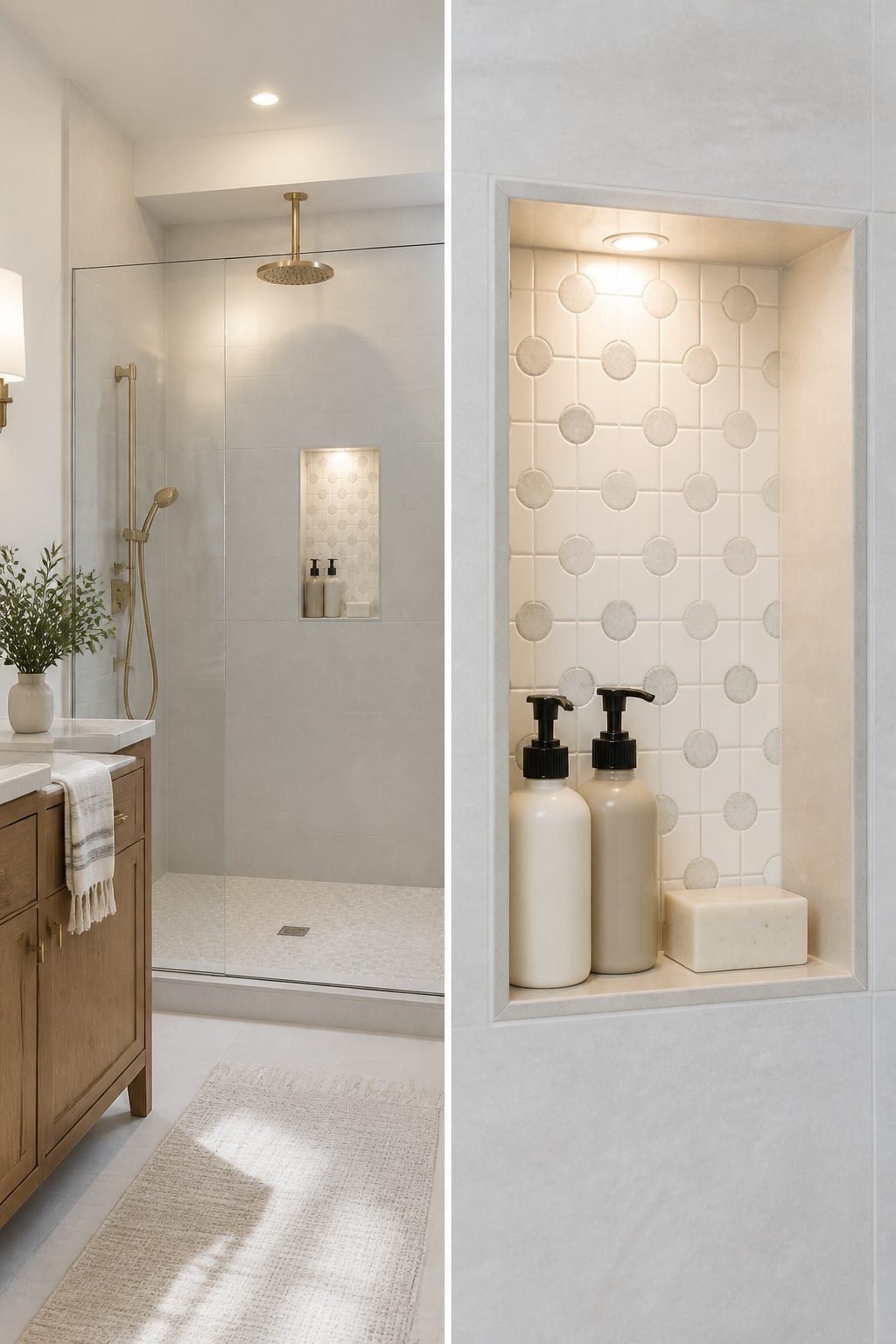
Whimsical tile reads best in small doses. One backsplash, a shower niche, or a thin band running between plain field tile gives the eye somewhere to land without turning the room into a pattern fight. Most of these are wall pieces, so keeping them off floors and out of shower pans is the safer call.
Pressed shapes such as hexagons need a wider grout joint than rectified squares, and grout color shifts the look more than the tile itself does. That is the detail that can make or break the install.
For a controlled dose, Reflection White Dots and Reflection Navy Dots work well. Both are 6-by-6 ceramic with a dot pattern that mixes shiny and matte on one face, and the same design runs at 12-by-24 if you want a larger format with the same personality. The smaller size suits a niche or a single accent strip; the larger one can carry a small backsplash without feeling busy.
Finding an Installer Who Gets It
Mosaic tile lives or dies by the hands that set it, and the gap between a pattern that reads as art and one that reads as mistake is usually about an eighth of an inch in the wrong direction. I learned this the hard way watching a bathroom floor go in where the installer treated the sheeted hex like standard subway, rushing the layout until the floral motif pooled into visual mud near the threshold. The fix cost nearly the tile itself.
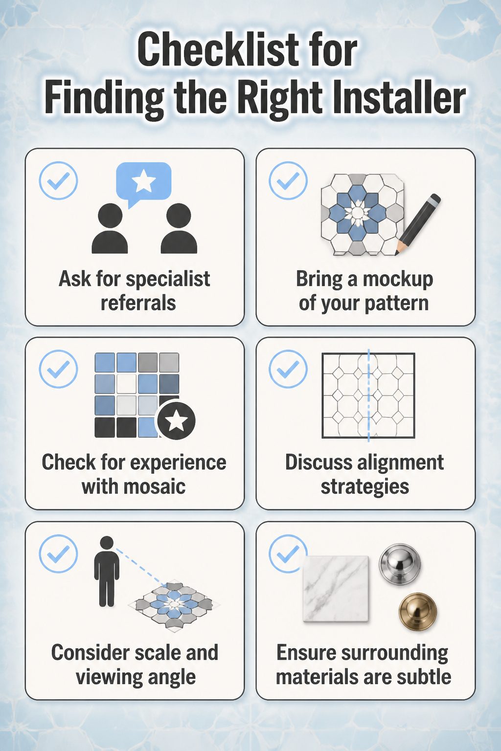
Start by asking your retailer or designer for names, not of installers who "do tile" but of ones who specialize in mosaic or encaustic work. They have seen the callbacks and know who measures twice before the thinset opens. When you interview, bring a mockup of your pattern and ask how they handle sheet alignment at room edges. Their answer tells you everything.
Scale and viewing angle matter more than most budgets allow for. A mosaic meant to be read from a doorway, three feet off the floor, needs tighter grout lines and smaller tesserae than the same pattern viewed from a staircase landing above. I have seen a powder room floor that sang at standing height go flat when the owner added a pedestal sink and started seeing it from seated eye level. The designer had warned them; the warning got filed under "later."
Keep the surrounding materials quiet. Carrara, polished nickel, unlacquered brass, high-gloss millwork: these are the supports, not the competition. Your whimsical tile is already doing the talking.
Balancing What Surrounds It
A bold patterned floor tile needs quiet walls to do its job. In the bathroom I redid last spring, I kept the shower surround to a simple white subway and let the encaustic-look floor carry all the personality. The difference was immediate: the room felt collected, not chaotic. Whimsical tile is the statement piece; everything else should read as backup vocals.
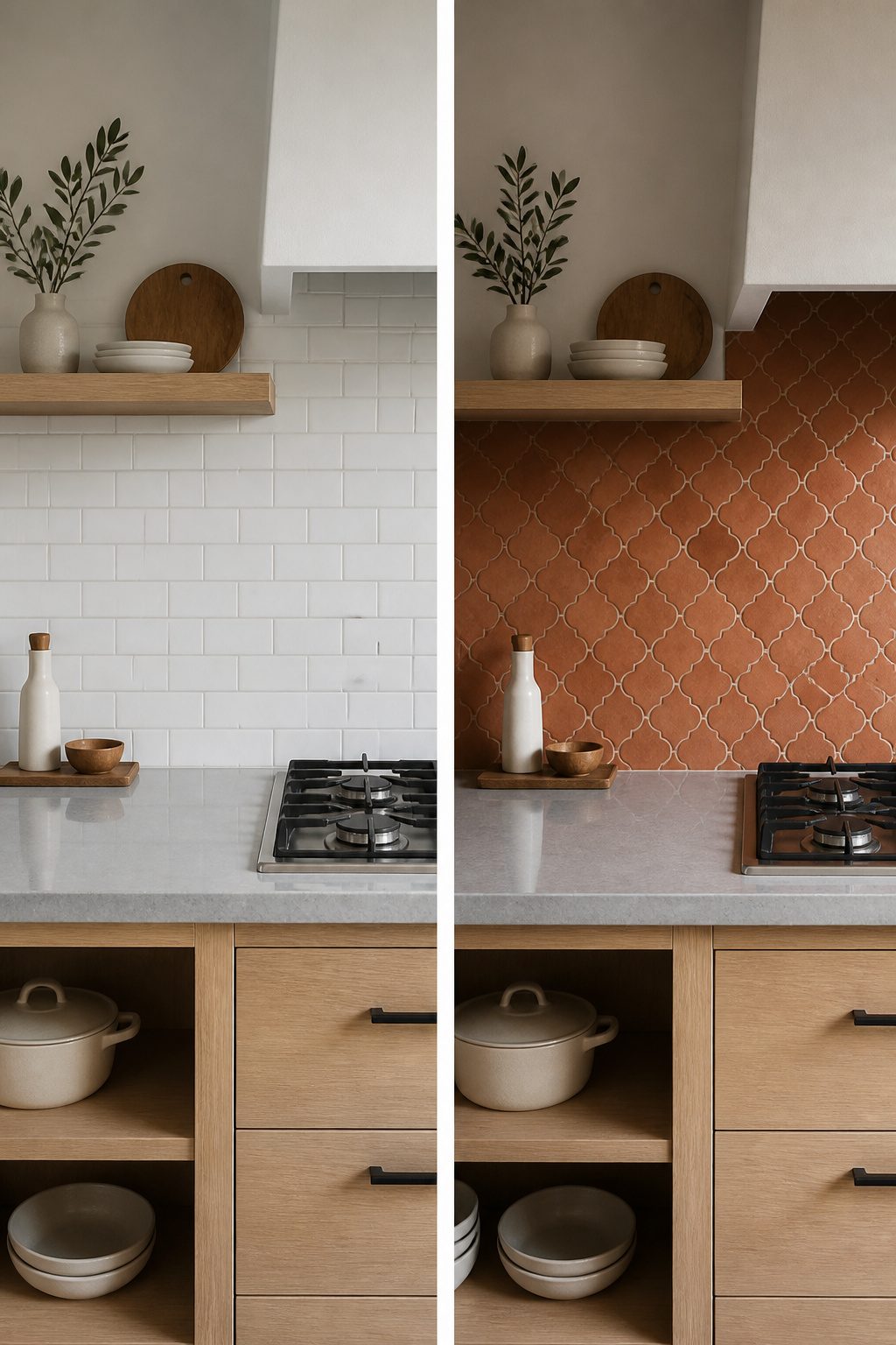
The same rule holds for kitchens. A terracotta-look backsplash behind the range can anchor the whole wall, but pair it with plain painted drywall on the remaining runs and a straightforward quartz counter. I learned this the hard way when I tried stacking patterned tile with a busy granite remnant I had scored cheap. The two fought for attention and the eye had nowhere to rest. I ended up swapping the counter for a solid warm gray, and the tile finally got to sing.
Wood tones matter more than people expect. A cement-look tile with soft gray veining reads completely different against pale oak than against a dark walnut stain. If your cabinets or flooring already have strong grain or color, that is your pattern budget spent. Choose a whimsical tile with a quieter ground color, or keep it to a small area like a hearth surround or a single shower niche.
Metal finishes are the same. Brushed nickel or matte black hardware recede; polished brass or oil-rubbed bronze announce themselves. Mix two competing metals with a loud tile and the room turns into a catalog spread, not a home. I stick to one metal family when the tile is doing the talking, and save the mixed-metal moment for simpler rooms.
Frequently Asked Questions
What are whimsical tiles?
Whimsical tiles are playful, personality-driven designs that break away from standard grids: hand-painted florals, clashing geometric colors, or narrative mosaics that tell a story rather than repeating identical squares. They are chosen to start conversation and reflect who lives there, not to disappear into the background like typical beige subway tile.
How can I use whimsical tiles in my home?
Use them in small doses where they can anchor a space without overwhelming it: a single backsplash behind the stove, a shower niche, or a thin accent band between plain field tile. Bathrooms, laundry rooms, mud rooms, and kitchens are the prime spots for this kind of daring choice.
What should I consider when installing whimsical tiles?
Find an installer who specializes in mosaic or encaustic work, not just someone who "does tile." Ask how they handle sheet alignment at room edges and bring a mockup of your pattern to the interview. Scale and viewing angle matter too; a mosaic read from standing height needs tighter grout lines than one viewed from above.