
The difference between a room that looks cozy and one you actually want to spend time in usually comes down to layering order, not budget. Get the sequence wrong and even an expensive velvet throw reads as clutter; get it right and a $25 Target pillow pair does half the work. Start with walls fully cured, then floors, then the textiles that warm them: a 2700K bulb in a linen-shaded lamp, gel pillows that keep their loft, and a duvet built from two inexpensive inserts instead of one flat core.
1. Warm Wood Tones

Walnut and red oak carry warmth in a way painted furniture rarely matches. A solid wood bed frame or a single nightstand in either species can shift a whole room from flat to settled. Birch works the same trick at a lighter value, which helps if your walls are already warm or the space runs small.
The catch with buying on a budget is that sellers name the species but not the grade. A walnut nightstand from a big-box store and one from a consignment shop may share the label and look nothing alike. Lower grades carry more color variation and mineral streaks, which I actually prefer for a lived-in look, but the finish matters more than the grade for durability. Check whether the surface is raw, oiled, or sealed, since that determines how much maintenance you are signing up for.
Facebook Marketplace and antique shops are where I would look first for a wood piece with some age already in it. A deep cleaning and a light oiling usually brings the tone back without erasing the wear that makes it feel like yours.
2. Layered Bedding
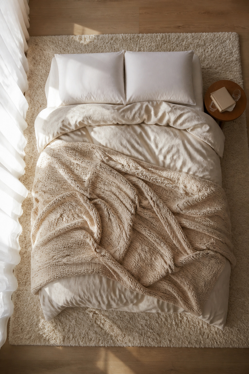
The bed you actually want to climb into starts with a fluffy duvet at the core, not draped on top like a display piece. Two inexpensive duvet inserts inside one waffle-textured cover give the same squashed-cloud volume as the high-end versions, and gel sleeping pillows that do not flatten complete the stack. Beneath that, soft sheets with some slip to them let you turn over without fighting the fabric, which matters more than thread-count bragging.
Chunky knit throws belong folded at the foot or across the middle, not layered flat where their weight compresses everything below. I tried running a thick cable-knit blanket as the top layer for a week last winter, and the duvet underneath went flat and clammy where the knit pressed down. The throw works because it reads as texture from across the room while the duvet does the actual warming.
"Soft textiles like a quilted coverlet, a chunky knit throw, or linen drapes instantly add depth and warmth to the bedroom," says Amy Peltier, owner and principal designer of Peltier Interiors.
What that means in practice: build warmth from the inside out, and let the decorative layer sit loose enough to do its visual job without crushing the functional ones.
3. Soft Lighting
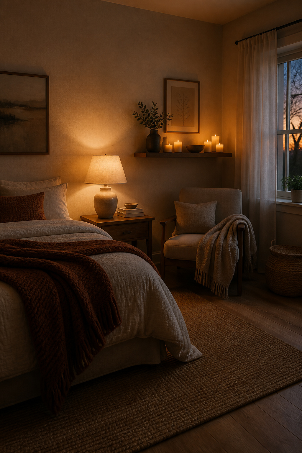
The overhead fixture in my last bedroom was a single dome light with a cool-toned LED bulb that made the whole room feel like a clinic waiting area. I swapped it out for a soft white bulb, the kind labeled around 2700K, and the difference was immediate: the walls looked warmer, the shadows softened, and my eyes actually relaxed after sundown.
Table lamps with linen shades or frosted glass do most of the work now. I keep one on the nightstand and another on a small stool in the corner so the light hits from two heights instead of one flat blast from above. For renters who cannot hardwire anything, plug-in wall sconces with fabric shades clamp to shelves or sit on ledges without an electrician.
Flameless candles with a timer and remote fill the gap where real candles would go. I set mine to dim mode for an hour after dark; the glow reads as candlelight in photos and does not risk the security deposit.
4. Textured Textiles
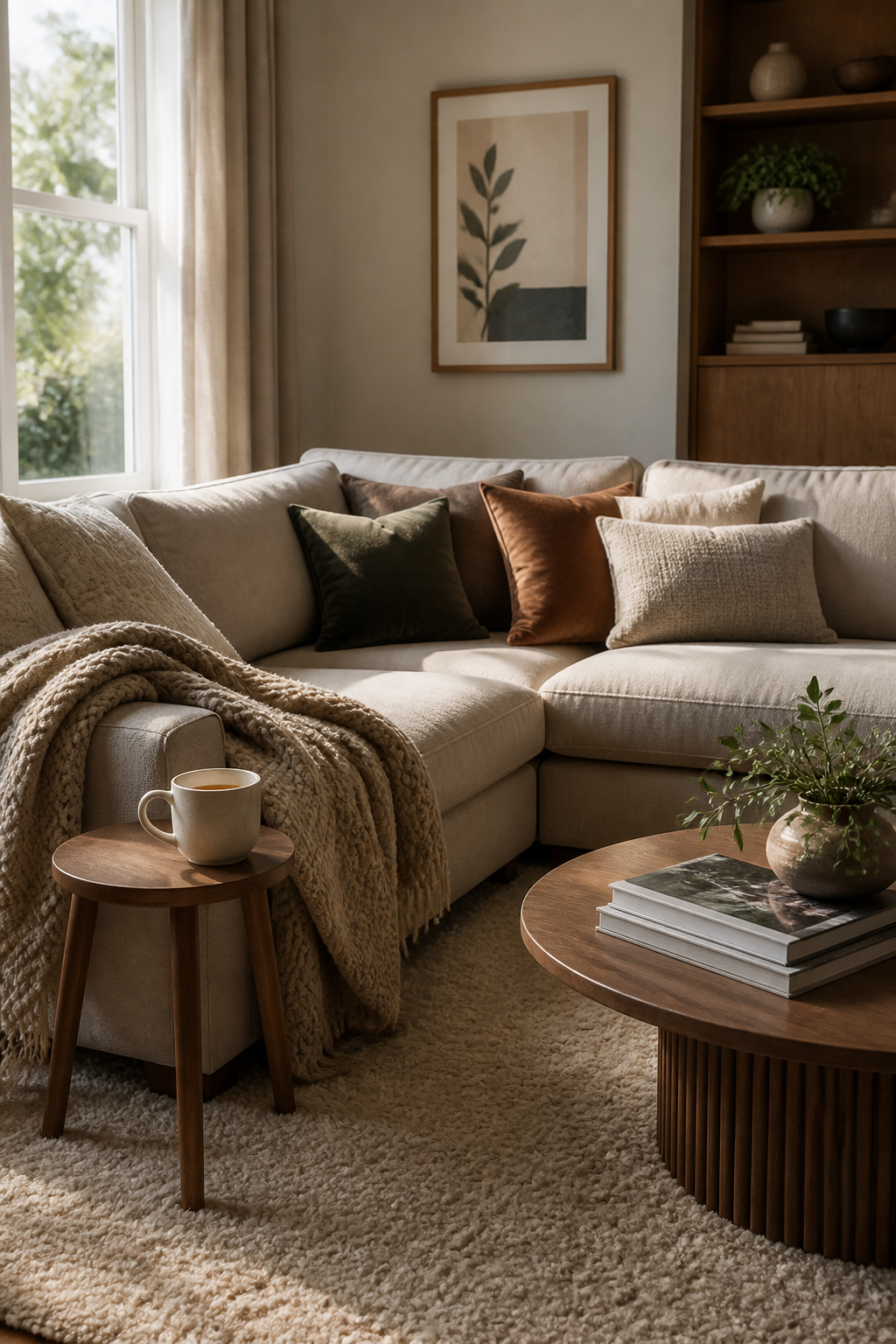
Velvet, chenille, and brushed cotton each do something different under your hand, and that difference is what keeps a room from reading flat. The sources point to these three specifically, not as a random pile of soft things but as a deliberate mix: velvet catches light and throws it back, chenille has that dense, caterpillar-like give, and brushed cotton stays matte and lived-in. Layer them wrong and you get visual noise; layer them right and the textures talk to each other instead of competing.
I started with velvet throw pillows because they were the cheapest entry point, about $25 for a pair at Target, and I figured if I hated the look I was not out much. The chenille blanket came next, draped over the sofa arm, and it helped, but the piece that actually changed how the room felt was the brushed cotton rug I put down last. Something about that matte, napped surface underfoot grounded everything else. The velvet still reads as the "dressy" layer, the chenille as the cozy middle, but the brushed cotton is what makes you want to take your shoes off and stay.
The rule that kept it from becoming clutter was keeping the color story tight. Overlapping textures add depth only when the palette stays coherent; three textures in three unrelated colors just looks like you bought what was on sale. I stayed in a warm, dusty range, cream through rust, and that let the materials do the work without the eye bouncing around.
5. Nature Elements

Live plants do more for a room than almost anything else you can set on the floor, but the two that keep showing up in every cozy room photo, the Monstera and the fiddle leaf fig, need completely different treatment. I learned this the hard way after bringing both home the same weekend and watering them on the same Tuesday schedule. The Monstera, with its hole-punched leaves, is built for dappled light and likes its soil to dry out almost completely. The fiddle leaf fig, tall and dramatic with those violin-shaped leaves, wants consistent moisture and bright, direct light for at least a few hours a day.
My Monstera thrived on neglect in a north-facing corner. My fiddle leaf fig dropped three leaves the second week because I let it go dry, then lost two more after I overcorrected and left it soggy. Now the Monstera gets water when the top two inches of soil feel like dust, usually every ten days or so. The fiddle leaf fig sits near the brightest window, and I check it every five or six days, watering only when the surface just starts to pull away from the pot edge. Fake versions of both have gotten convincing enough that I keep one in the bathroom where no real plant would survive, but the living ones in the main room are what make the space feel finished rather than staged.
6. Calming Color Palettes
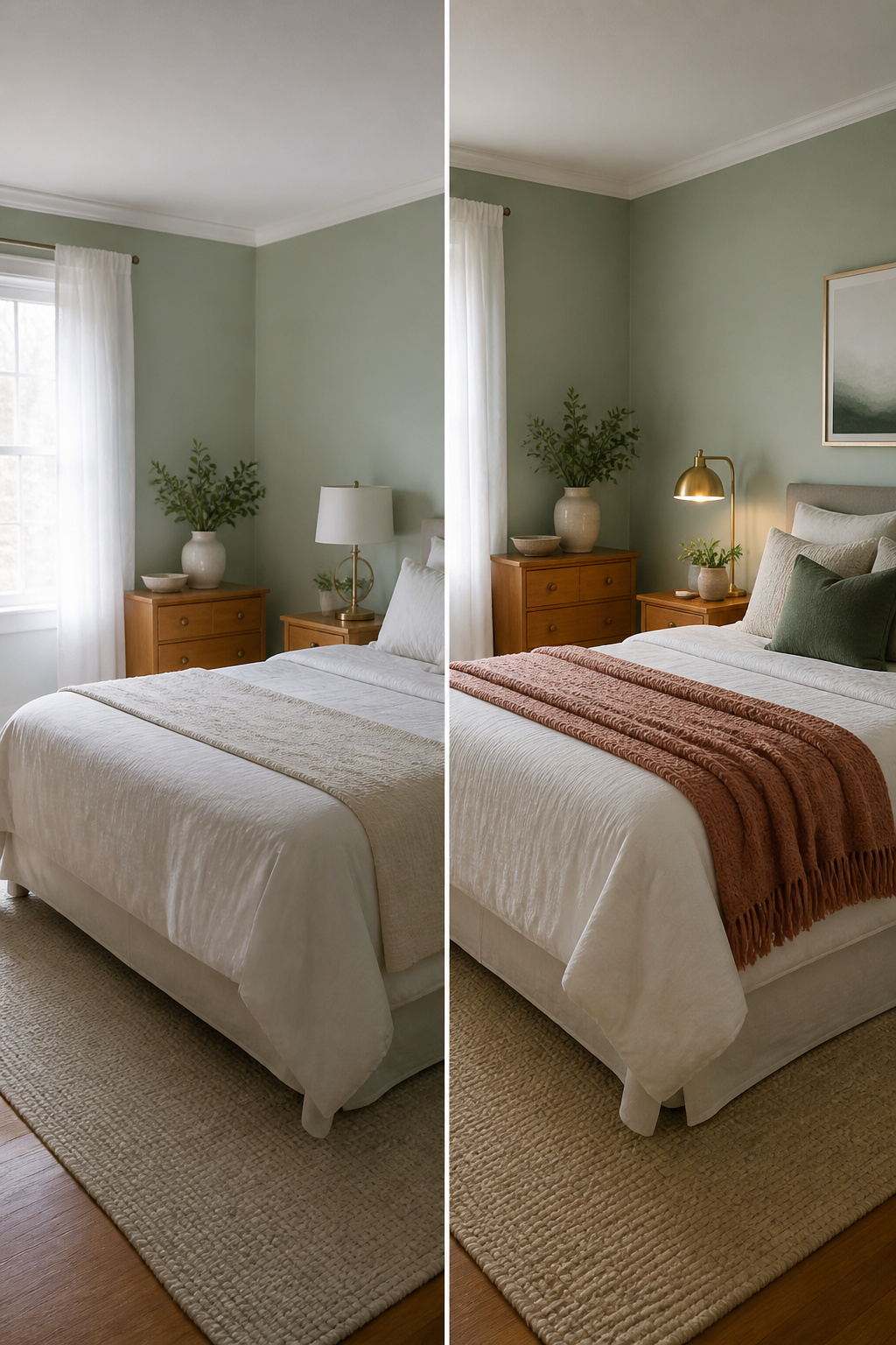
Sage green, soft blues, and warm whites are the three directions showing up most often for rooms that read as restful rather than decorated. Use any of them as a base, not a rule, and build outward with what you already own.
I learned that last part the hard way. After I painted a small bedroom in soft sage, the room went flat. Too quiet, like a waiting area. The sources that mention sage usually pair it with something warmer, so I added a honey-colored throw and swapped in a brushed brass sconce I had from another project. The green settled down immediately. The metal gave it a little weight, and the amber tone kept the whole thing from feeling like a spa.
Warm white works the same way. On its own it can turn sterile fast. The fix is almost always a deeper accent, something in the muted terracotta or deep blush range, or even just texture. A woven rug or linen bedding does more to warm up a white wall than another coat of paint ever will. Soft blues need the same counterweight, though there the natural move is toward coastal accents, which can read cold if you are not careful. I would take the honey throw over driftwood every time.
7. Area Rugs
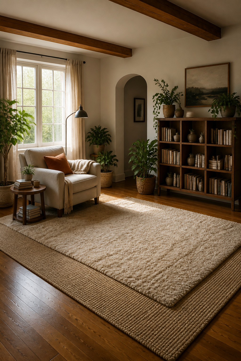
An 8′ x 10′ rug is the size that actually fills a standard living area without looking like a postage stamp. The first time I sized one for my own space, I measured wall-to-wall and ordered a 6′ x 8′ because it felt safer on the budget. Two feet of bare floor on every side made the whole room feel smaller, not cozier, and it went back in the box the same weekend.
Warmth underfoot is the main reason to bother with a rug at all. A flatweave gives you a thin, even layer that works in high traffic; a tufted or shag pile adds the softness you notice when you kick off shoes. Layering the two gets you both: start with the larger flatweave centered in the room, then angle a smaller 5′ x 8′ tufted rug on top so the edges do not line up. The slight overlap of textures reads as depth, not clutter. A small sheepskin or cowhide angled by the bed does the same job on a smaller scale, catching your feet first thing in the morning.
8. Personal Touches
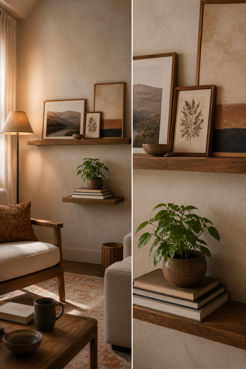
The line between personal and cluttered is thinner than most Pinterest boards suggest. A wall of mismatched frames reads like a storage problem, not a life being lived. What works is grouping: three or four pieces with a common thread, hung with the same spacing, so the eye reads them as one intentional shape rather than a scatter.
I started with a 17th-century Flemish verdure tapestry, a piece my grandmother had kept folded in cedar for years. Above the bed it had weight and history, but it also swallowed the room whole. After two weeks I took it down. The scale was wrong for a 10-foot ceiling, and the dark greens turned the wall into a cave every evening after four. What stayed was a smaller framed photograph, a candid shot of my parents at a kitchen table, placed on a narrow floating shelf beside a ceramic bowl. The bowl holds nothing. The photograph faces slightly toward the door, so it greets you on entry rather than demanding attention from across the room.
Keep one surface almost empty if you want the personal items to land. A shelf with a single frame and a small stack of books reads as curated. The same shelf with seven objects reads as unfinished. I learned this by overloading a bedside table, then removing pieces until the space breathed again. The final count was three: the photograph, a slim brass reading lamp, and a paperback with a cracked spine.
9. Cozy Seating Areas

A reading nook only works if the corner earns it. The first spot I tried was the alcove by my bedroom door, drawn in by the blank wall and the quiet. By afternoon the chair sat in shadow, and by evening I was squinting at pages under a ceiling fixture that threw light behind me instead of onto it. The wall sconce I had skipped, figuring a reading lamp would do, turned out to be the piece that would have saved the setup. I moved the chair to the window wall, added a swing-arm sconce, and suddenly the same thirty-dollar chair felt like a different piece of furniture.
The rug should be small enough to read as a deliberate zone, not a leftover. Mine is about the size of a bath mat, just larger than the chair’s footprint, which keeps the corner from feeling like a staging area. A chunky throw over the arm adds the layer that makes you stay, and a side table within real reach, not aspirational reach, holds the coffee while you finish the chapter. Sheer curtains soften the window light without asking you to choose between brightness and glare.
The sources that rank for this keep mentioning lounge chairs and accent chairs interchangeably, but the difference matters in a tight corner: an accent chair sits upright and polite, while a lounge chair lets you actually settle. For a weekend project and a few hundred dollars, the second one is where the money goes.
10. Wallpaper or Wall Treatments

Wallpaper can warm up a room faster than almost anything else, but the wrong print turns a cozy idea into visual noise. The two directions that actually work for lived-in spaces are botanical prints and textured designs. Botanicals, especially leafy prints in soft gray or olive green, add depth without shouting. Textured designs like grass-cloth do the same job while catching light differently throughout the day, which reads as warmth even in a neutral palette.
Neither needs full coverage to matter. One wall behind a headboard, or even a single panel framed like art, gives the eye somewhere to land. Darker colors like charcoal or navy work the same way, though they read as intimate rather than airy.
I sampled both routes last spring. Ordered a palm print with metallic accents and a grass-cloth sample in a warm white. Hung them in the bedroom for three days. The palm felt like a vacation rental. The grass-cloth was beautiful but caught every scuff from the dog and the vacuum. Both came down. I ended up with paint in a faded green instead, applied with a dragged brush to fake the texture I had wanted. Cost about $40 and an afternoon. The wallpaper would have run closer to $200 with paste and the liner the textured stuff needs.
Reading Nooks That Actually Get Used

A reading nook fails when it faces the wrong wall. The chair might be soft, the lamp warm, but if your eyes land on laundry piles or the door someone keeps walking through, the spot dies in a week. Angle the seat so you see the calmest corner of the room, not the busiest path through it.
Distance from the bed matters more than I expected. Too close, and the nook becomes a landing strip for half-read books and yesterday’s clothes. Three or four feet of clear floor keeps it feeling like a destination, not an extension of where you already spend eight hours.
Arm’s reach is where I draw a hard line. One small surface holds the current book, a water glass, and the lamp switch. A basket on the floor catches the next two books in queue. Everything else, a throw blanket included, lives across the room where it belongs. The second you add a charging pad, a snack bowl, a place to set your laptop, the nook becomes a station, and stations feel like work.
Accent Walls Without the Commitment

Peel-and-stick wallpaper has come far enough that a single wall now takes about three hours and passes most move-out inspections, which was not true five years ago. I learned this the hard way in a 2020 rental where I painted an accent wall deep green, then spent a February weekend restoring it to landlord-beige before I could get my deposit back.
The temporary route starts with one wall, never the whole room. A single saturated wall behind a bed or sofa reads as intentional; wrapping the color around reads as unfinished. For renters, removable panels beat full rolls in small spaces. A 6-foot panel covers the average headboard wall with one seam, and if the pattern arrives crooked, you peel it back in minutes rather than living with the tilt for a lease term.
My last landlord noticed the peel-and-stick wainscoting I ran in the dining area, but only because he asked where I bought it. The adhesive left no residue on the eggshell paint beneath, which is the test: smooth or eggshell finishes release clean; flat paint can lift with the paper. I now test a 2-inch corner piece and wait 48 hours before committing the full strip.
Paint still wins for speed and cost if your lease allows it. A quart of quality paint covers one wall with a roller and two coats; the same wall in peel-and-stick runs three to four times that, and the pattern you love online often scales larger than expected. My rule is to order one panel first, tape it up, and live with it through a evening of lamplight before the rest ships.
What Order to Tackle These In

Walls have to come first because everything else leans against them. I learned this the hard way when I hung a gallery wall after laying a new rug and moving in a reading chair. The chair left scuff marks I had to paint over, and the rug caught drips from touch-ups that never quite washed out. Paint, wallpaper, or any wall treatment should be fully cured before furniture or textiles come back into the room, which means two weekends minimum if you are doing two coats.
Floors come next, whether that means a rug swap or refinishing. Textiles and lighting fill in after that, since both need the walls and floors settled to read correctly. A cream throw against wet paint looks entirely different than it will in three days, and lamp light bounces off fresh white in a way that changes once the walls have dulled to their true color.
Plants and personal items go last. They are the easiest to shift, the hardest to damage, and the layer that turns a decorated room into one that actually feels lived in. I once placed a fiddle-leaf fig before the rug arrived, then spent an hour dragging it across the floor to get the rug flat underneath. One corner of the leaves never recovered from that scrape.
Small Space Moves That Still Work

Most of the cozy room decor ideas you’ll find assume you have room to spare. My own bedroom is 10′ x 12′, so I’ve had to sort what actually scales down from what just photographs well in a larger space.
Layering without crowding means choosing one textured wall treatment and stopping there. I wrapped my own walls in grasscloth to add dimension, then skipped the gallery wall I had planned. Built-in storage flanking the window replaced the dresser I couldn’t fit, which meant the floor stayed clear for movement and one small rug rather than a crowded layout.
Floating shelves work where a bookcase won’t, but I keep them at eye level or above so the lower wall stays open. Storage ottomans and under-bed boxes handle what I don’t display; color-coordinated bins keep the visible clutter from breaking the calm.
What I compromised: the oversized floor mirror every cozy list includes. At full length it blocked the door swing. I use a smaller mounted mirror now, and the room reads larger for it.
What I Bought and What I Spent
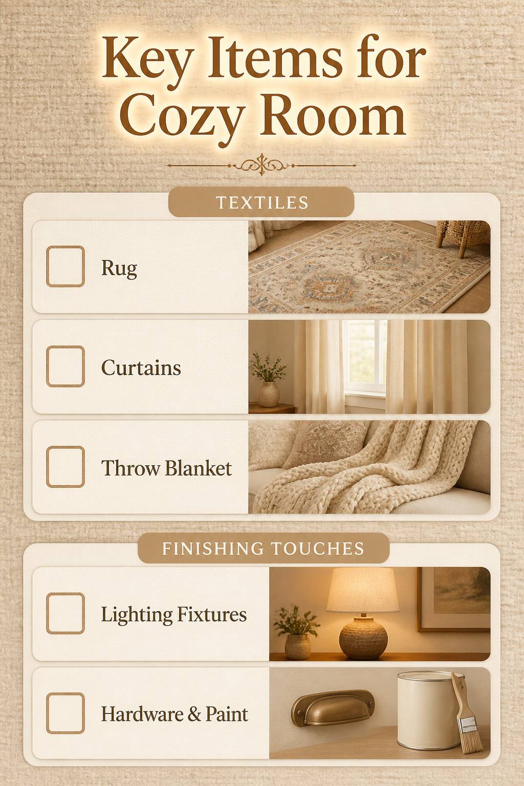
The money for a cozy room tends to disappear in predictable places. In my own projects, the biggest cluster always lands on textiles: the rug, the curtains, the throw you actually use. Size drives rug cost more than pattern or fiber, and a 5×8 hand-tufted piece starts around $600 while hand-knotted work starts closer to $1,200 for the same dimensions. Step up to 8×10 or 9×12 and the gap widens fast.
I save by skipping the matching set mentality. One good layer, bought at the right size, beats three small ones fighting for space. Most rooms do not need fewer rugs; they need the right single rug. Before I start any project now, I set a range with the textile line item capped first, because that is where I will feel the spend. Everything else, lighting, hardware, a can of paint, follows behind it.
Mistakes That Read as Cozy in Photos But Fail in Use

A few "cozy" setups I tried and later undid taught me where the look outruns the living.
- Throw pillows sized wrong for the cover. I once bought inserts that matched the cover dimensions exactly, and the pillows sat flat and limp. The rule I picked up later: use an insert two inches larger than the cover so it fills out the corners. My current setup uses that sizing, and the difference in shape is immediate. Storage got simpler too, since fuller pillows stack without collapsing.
- Candles placed where I could not actually light them. A narrow ledge behind my sofa looked moody in photos with tapers, but reaching back there meant moving furniture. I switched to flameless candles with a timer and remote. The glow reads the same from across the room, and I use them most evenings instead of never.
- Plants that needed daily misting in a room I only entered after dark. Two ferns turned crispy from neglect. I relocated them to the kitchen near the sink, where I actually see them, and replaced the bedroom spot with a dried arrangement that asks nothing.
Rent-Friendly Versions of Permanent Looks

Removable wallpaper peels off in one sheet if the wall was primed, but the cheap liner paper I tried in a 2018 apartment left flecks that took a Magic Eraser and my whole Saturday. The peel-and-stick vinyl from the big-box brands came down clean at two rentals since, though I learned to test a corner after 48 hours before I commit to a whole wall.
Plug-in sconces with fabric cords read the same as hardwired if you tuck the cord behind the headboard or run it along a painted baseboard in a matching color. I spent $34 on a pair with a warm 2700K bulb already included, versus the $200 quote I got for an electrician to add a box.
Tension rods inside the window frame hold blackout curtains without a drill, but the spring kind slips on anything wider than 36 inches. I switched to the kind with a rubber grip pad and a twist-lock mechanism; they have held through two winters of heavy linen.
Adhesive hooks rated for 16 pounds have carried everything from framed prints to a small woven wall basket, but the "damage-free" promise has a time limit. The strips I left up for eighteen months pulled paint at my last move-out, while the ones I removed at twelve months came off with a slow pull parallel to the wall and left nothing. The difference was the same brand, same wall, same summer humidity. I now set a phone reminder to cycle them yearly, which costs nothing and takes ten minutes.
Seasonal Swaps That Do Not Require Storage

A duvet cover change does more than a full bedding swap ever could. I keep one warm-toned cover for October through March and a lighter, cooler one for the rest of the year. Same insert, same storage footprint, completely different room.
Pillow covers work the same way. I own three sets in linen and cotton that rotate onto the same down-alternative inserts. The inserts stay on the bed year-round; the covers fold flat in a drawer that already holds socks.
The brass table lamp beside my sofa spent summer on the nightstand. Moving it took ten minutes and changed which corner felt lit at night. I do not own a second lamp for that spot; I own a different arrangement of what I already have.
What stays put: the rug, the frame layout, the heavy furniture. What moves: textiles, portable light, any plant that tolerates a new window. What I store is minimal, just the off-season covers and one spare set of pillowcases. Everything else earns its keep full-time or leaves.
When to Stop Adding
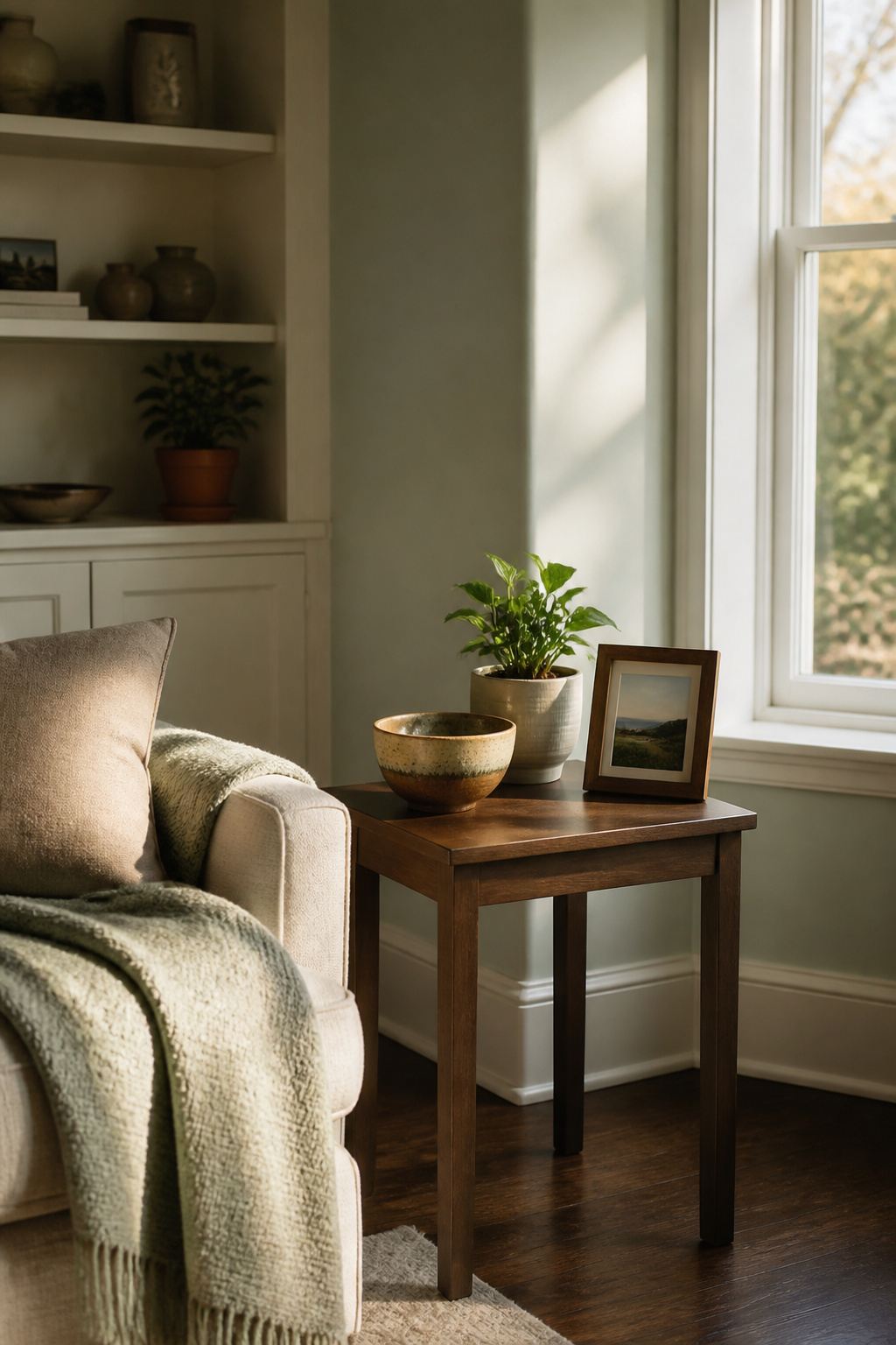
The line between cozy and cluttered is thinner than most Pinterest boards suggest. I learned this in my own living room last winter, after adding a second throw blanket, a third candle, and a ceramic bowl that looked warm in the store but just collected dust on the coffee table. The room felt smaller, not warmer. The test I use now is whether the new item does a job the room actually needs, not whether it photographs well.
I remove about one thing for every two I bring in, and the removals usually happen after living with the addition for a month. The woven wall hanging I hung above the sofa looked textured and inviting for about two weeks, then started feeling like visual noise every time I sat down to read. Taking it down opened up the wall and let the lamp I’d already chosen actually matter.
Before buying anything now, I ask one question: what will this replace? If the answer is nothing, I wait. The pause costs nothing and has saved me from at least a dozen purchases that would have joined the dusty bowl.
Lighting Temperatures That Work Together

Soft light only reads as cozy when every bulb in the room is speaking the same language. The sources call for warm bulbs, amber tones, soft white, but they rarely warn you what happens when one fixture disagrees with the rest. I learned this the hard way after swapping a burnt-out bedside bulb for whatever I had in the junk drawer, probably something around 5000K. The room suddenly looked like a returns desk at an electronics store, all because one lamp was shouting cool blue while everything else whispered yellow.
2700K to 3000K is the range that actually reads warm, and keeping every bulb inside that band matters more than the exact number. Frosted glass or a linen shade, as the sources suggest, buys you margin for error; it diffuses the edge off a slightly cooler bulb. Dimmers help too, though not every LED dims gracefully. Some flicker or drop into a gray zone that feels clinical, not cozy, so the fixture and the bulb need to be compatible. Candles, flameless or beeswax, sit outside this system entirely, which is partly why they work; they add a layer that does not have to match anything.
The fix is simple: pick your temperature, buy a spare, and label the box. Mixing by accident is how a room loses its warmth in an afternoon.
Frequently Asked Questions
How to make your bedroom feel more cozy and warm?
Start with a fluffy duvet at the core of your bed, not draped on top, and pair it with soft sheets that have some slip so you can turn over easily. Add two inexpensive duvet inserts inside one cover for volume, and keep a chunky knit throw folded at the foot so it reads as texture without compressing the layers beneath. Warm wood tones in a single nightstand or bed frame, plus soft white bulbs around 2700K, do more to shift the mood than a full room redo.
What colors are relaxing for the bedroom?
Sage green, soft blues, and warm whites all work as restful bases, but each needs a warmer counterweight to avoid going flat. A honey-colored throw or brushed brass fixture keeps sage from feeling like a spa; muted terracotta or deep blush does the same for warm white. Soft blue reads cold fast unless you steer toward amber and honey tones rather than driftwood.
How to create a cozy reading nook?
Angle the chair so you see the calmest corner of the room, not the busiest path through it, and keep it three or four feet from the bed so it stays a destination. A rug just larger than the chair’s footprint defines the zone without looking like a leftover, and a side table within real reach holds what you need. Add a swing-arm sconce or reading lamp for actual use, not a ceiling fixture behind you.