
White house exteriors are paint colors that read as white on siding, trim, and fascia, but the same swatch can shift from warm cream to cool gray depending on which wall faces the sun. North-facing surfaces pull out blue notes that turn crisp whites institutional by late afternoon, which is why Alabaster’s subtle beige undertone keeps it hospitable even in shadow. A single sample board will not tell you enough; the color that looked clean at 10 a.m. may settle into something muddy by dusk.
Sherwin Williams Alabaster

Sherwin Williams Alabaster SW 7008 sits in that narrow space between stark white and something too yellow to trust on siding. The warmth comes from subtle beige undertones that read creamy in exterior light rather than chalky, and that distinction matters more outside than in. North-facing facades or heavy tree cover can push cooler whites toward institutional gray; Alabaster’s slight lean toward beige keeps it hospitable even in shadow.
I noticed it first on a farmhouse-style build where the owner had tested three whites against her brick chimney. The two cooler options looked almost blue by late afternoon. Alabaster held its ground, pairing cleanly with her dark charcoal trim without the high-contrast severity that reads modern when you wanted traditional.
For farmhouse and traditional exteriors, that creaminess does specific work. It softens the crisp lines of clapboard and keeps wide porch columns from looking like PVC pipe. On a modern box it might feel muddy; on a 1920s bungalow or a new build with a covered entry and board-and-batten gable, it reads intentional and settled.
The risk is pairing it with trim that’s too close in value. Alabaster needs breathing room. A deep green-black or a warm bronze for shutters and doors lets it do its job without competition.
Benjamin Moore White Dove
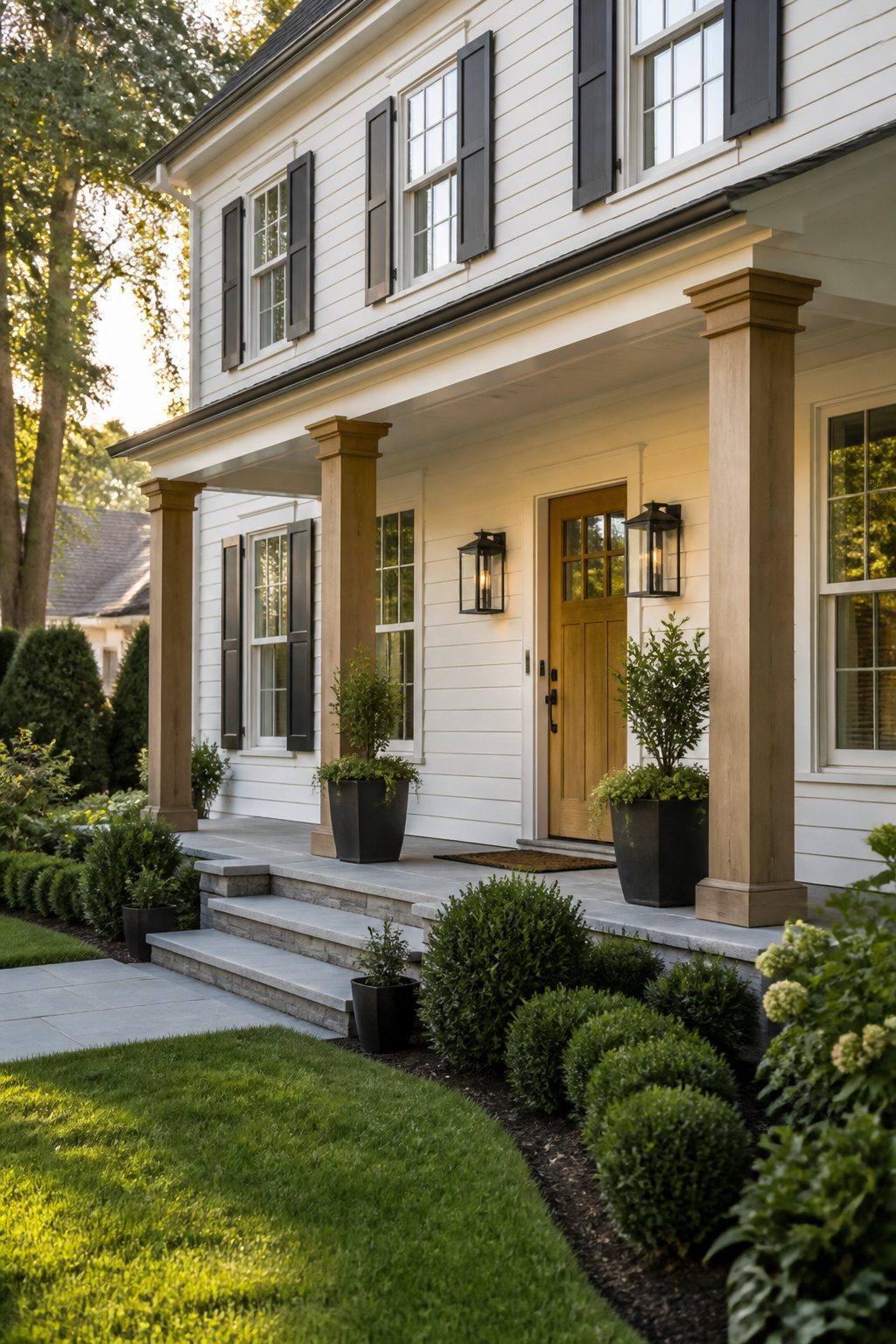
Benjamin Moore White Dove, OC-17, sits in that narrow space between creamy and crisp. Its warmth comes through in soft yellow undertones, but a trace of gray keeps it from reading buttery or dated on siding that sees sun all afternoon.
Colonial and Cape Cod exteriors carry this color well. The slight gray cast flatters traditional lines without the harshness of a true bright white, and the warmth keeps the house from looking like a rental flip on a street of older homes. On a modern farmhouse the effect is different but still workable; the creamier note softens the boxier rooflines.
Natural wood is where White Dove earns its keep. Garage doors, porch posts, or a stained front door in oak or cedar pick up the warm undertone and make the white feel intentional rather than default. Black accents, planters, or lantern mounts sharpen the contrast without fighting the color the way they might against a starker white.
The risk is overcast light. On a gray afternoon the gray in the paint can push toward dingy, especially if the trim is also White Dove with no break in sheen. A satin or semi-gloss on trim against eggshell siding gives the eye something to read, and the color stays alive.
Sherwin Williams Pure White

Sherwin Williams Pure White, SW 7005, sits almost dead center between warm and cool, which makes it the safest bet when you want the architecture to read louder than the paint. I have seen it read slightly cool in north light and barely warm at golden hour, but the shift is subtle enough that it never looks like you chose the wrong white by afternoon.
The lack of undertone is what sells it for modern and transitional exteriors. On a flat-front house with clean trim lines, Pure White stays crisp without looking like primer, and on a traditional facade with shutters and a colored door, it becomes the quiet background that lets dusty blue or charcoal accents do the intentional work. The sources pair it with soft blue on shutters, awnings, and even hydrangea beds for a pulled-together look that does not try too hard.
I would use it on walls and trim both, since it does not need a second white to correct it. The risk is only in very shaded lots, where any white can go flat; there, a slightly warmer choice might give more life. For most exteriors catching mixed light, SW 7005 is the neutral that behaves.
Benjamin Moore Simply White

Benjamin Moore Simply White, OC-117, carries a faint yellow warmth that keeps it from reading sterile without drifting into cream territory. On my own shortlist for a porch ceiling repaint last spring, the trim-versus-body question is what sold or sank it depending on the light. Sources place it as bright enough for full sun, where that subtle warmth keeps the glare from feeling like a hospital corridor, yet soft enough that shaded north-facing trim does not go chalky or flat.
The real use I see is pairing: one designer ran it against Sherwin-Williams Alabaster on siding, and the Simply White trim popped just enough to read as the brighter note without clashing. Natural stone or raw wood accents settle it down, which matters when the whole house in one flat white starts looking like a primer job. I would not use it as the sole white on a facade with mixed materials unless I wanted the body and trim to whisper rather than speak; the undertone is too polite to create shadow lines on its own. For a single weekend with a few gallons and a rental that needs curb appeal before lease end, it is forgiving paint. Roll it in direct afternoon light and the warmth shows. Roll it under deep eaves and it behaves like a neutral, almost disappearing. That adaptability is the selling point, though it also means the color never fully commits. If your house needs a statement, look elsewhere. If it needs a quiet yes to whatever brick or siding already exists, Simply White earns its bestseller status.
Sherwin Williams Greek Villa

Sherwin-Williams Greek Villa SW 7551 carries a warm, creamy depth that reads as white without the starkness that can turn chalky in direct sun. On Mediterranean and Spanish-influenced homes, that slight warmth matters: the stucco surfaces and clay roof tiles already lean earthy, and a cooler white fights against them. Greek Villa settles in beside terracotta and natural stone instead.
The color handles strong sunlight better than brighter, cleaner whites because the built-in cream softens the glare rather than reflecting it back flat. Paired with black or dark gray trim, the contrast stays crisp without looking harsh; paired with wood accents or a brown tile roof, the warmth ties together rather than clashing. For homes with arched openings or iron railings, the white stays quiet enough that the architecture keeps the attention, which is the whole point of that style.
Benjamin Moore Chantilly Lace

Benjamin Moore Chantilly Lace, code OC-65, sits at the bright end of what white paint can do. The blue undertone reads as crisp rather than warm, and on a house with clean lines it sharpens every edge the way a photograph gains contrast. Ranch styles especially benefit; the brightness pulls the eye outward and keeps a single-story layout from feeling compressed.
The risk is real, though. Without something to soften it, Chantilly Lace can feel sterile, almost clinical. What convinced me, reading through a dozen of these exterior write-ups, was the pairing pattern. The successful jobs all had warmth somewhere nearby: natural wood around the entry, a dark trim in navy or black to create depth, something to keep the white from floating untethered. One Kentucky project used it on an older home and made it work, but the common thread was always that second material doing the emotional heavy lifting.
If your house already has brick texture, existing wood grain, or you are adding a slat wall or timber accent, Chantilly Lace is a strong move. On something flat and new-built with no natural texture in sight, I would look a shade warmer or plan to add that element deliberately.
Farrow & Ball Wimborne White

Farrow & Ball Wimborne White sits at that strange point where a color is almost not a color at all. The warmth in this shade comes from barely-there pigment, just enough to keep it from reading as stark or clinical. On my own sample board, it looked chalky in a way that flatters old clapboard but can turn muddy against vinyl siding.
The real test is overcast light, where Wimborne White goes soft and slightly gray in a manner I find genuinely beautiful. Sunny days give it back that warm edge; gray skies flatten it into something more like a very pale stone. For a north-facing facade or a lot with heavy tree cover, that behavior matters more than the chip suggests.
Farrow & Ball runs roughly twice the cost per gallon of comparable whites from big-box lines, and exterior durability is where I start questioning the spend. Their estate emulsion is formulated for interior walls; the exterior masonry or full-gloss options carry the same premium without the same reputation for longevity that Sherwin-Williams or Benjamin Moore have earned through decades of contractor use. If the budget is tight and the project is a full house rather than a front door or shutters, I would test Wimborne White as a custom match in a more exterior-proven base before committing to the original tin.
Sherwin Williams Snowbound
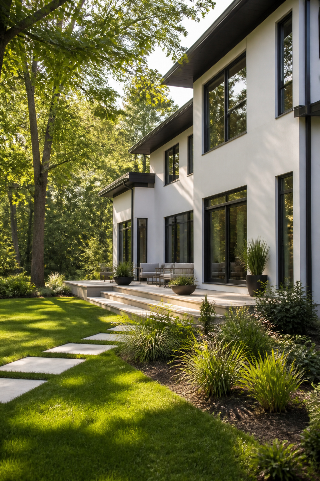
Sherwin-Williams Snowbound SW 7004 reads as a clean, cool white with a soft gray undertone that keeps it from going sterile. On contemporary homes, especially those with a lot of glass or metal, that hint of warmth underneath the coolness stops the facade from looking like a primer coat. The color plays well with both cool and warm accents, which matters when you are trying to coordinate existing hardscaping or a roof you cannot change.
Black or charcoal trim is where Snowbound earns its keep. The contrast reads as intentional rather than harsh because the gray in the white and the gray in the trim share a common thread. A bright red door, if you want one, becomes the single focal point without the palette feeling busy.
At dusk, Snowbound shifts noticeably cooler, pulling more gray as the light drops. That behavior can look sophisticated on a modern facade or slightly flat on a traditional one with warmer stone or brick nearby. I would test it on the north and west sides of the house and check it around 7 p.m. before committing.
Benjamin Moore Oxford White
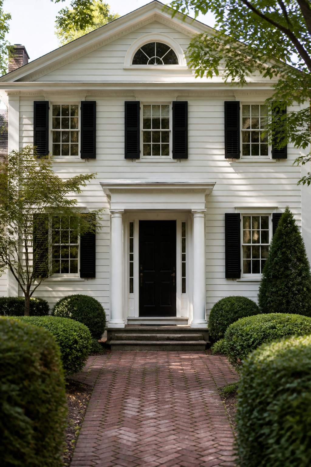
Benjamin Moore Oxford White, coded CC-30, sits in the quieter corner of the white-paint conversation, and that relative obscurity is part of what makes it useful. The color carries a slight coolness that keeps it from reading sterile under bright sun, but it stops short of the obvious blue cast that can turn a whole facade cold by late afternoon. I noticed it first on a colonial revival where the owner had paired it with a near-black door and matte brass hardware; the trim was the same white at a higher sheen, and the slight temperature shift between flat siding and semi-gloss trim gave the house more depth than a single swatch would suggest.
That same cool-neutral balance translates cleanly to modern farmhouse exteriors, especially where the design mixes vertical board-and-batten with wider horizontal siding or where a dark standing-seam roof needs a wall color that can hold its own without starting a fight. The sources note it works with darker, bolder trim colors and modern architectural details, and I have seen it hold up equally well on vintage-style homes when the trim stays warm, in wood tones or deep charcoal rather than pure black.
White Dove gets the bulk of the attention in this family, and fairly so; it is forgiving, adaptable, widely tested. Oxford White asks slightly more of its setting. It wants contrast, either in trim tone or in material texture, and it rewards that effort with a crisper, more intentional look. For a weekend project with a few hundred dollars in paint and a single exterior to address, the risk with Oxford White is choosing it for a house with no contrast to give; on a plain box with matching trim and no natural wood or dark metal in the scheme, it can flatten out and read as merely bright rather than designed. Pair it deliberately, and it outperforms its reputation.
Behr Swiss Coffee

Behr Swiss Coffee sits right where warm meets practical. That almond undertone keeps it from reading sterile under afternoon sun, but it never drifts so yellow that your trim starts fighting with it.
The big-box availability changes everything about sampling. I can grab a quart on Saturday morning, brush it onto the actual siding while the coffee’s still hot, and know by Sunday whether the morning light turns it creamier than I want. No waiting on a mail-order chip that might not match the can anyway. For a project capped at a few hundred dollars and two days off, that speed matters more than boutique cachet.
On my own place, that accessibility saved me a full weekend. The first sample looked too stark against our red brick foundation; the second quart, mixed a shade softer, hit it in one trip. The $15 sample gamble beat a $45 specialty order that would have arrived Wednesday, after the long weekend had already passed.
Sherwin Williams Eider White

Sherwin Williams Eider White sits in the same warm-white family as Alabaster, but it pulls in a different direction entirely. Where Alabaster reads creamy and sunlit, Eider White carries a cool gray-green undertone that can turn almost sage in certain light. That shift makes it less of a default choice for traditional white exteriors, and in my experience watching projects come together, it is the reason fewer homeowners land on it at first glance.
The gray-green works beautifully on houses with existing stone, weathered wood, or any natural material that already leans cool. It pairs with black or charcoal trim more crisply than a warm white would. The surprise comes in overcast weather or heavy shade, where the green can advance and the house reads noticeably muted, even a bit institutional. I have seen it look sophisticated on a modern farmhouse and slightly tired on a colonial with red brick, all because the surrounding hardscape pulled that undertone forward.
Eider White demands more testing than its popular sibling. A single sample board on one wall will not tell you enough. Paint a corner that catches morning light and another that sits in afternoon shadow, then live with both for two days. The color rewards patience, but patience is exactly what the weekend timeline crowd often skips.
Benjamin Moore China White

Benjamin Moore China White carries a warmth that feels borrowed from old plaster rather than mixed in a modern lab. Where White Dove opens up and almost floats in morning sun, China White sinks back and lets the light find it, which gives a house more gravity than gloss.
I noticed how little current press it gets while I was sorting through swatch books last month. The color has not been abandoned, just quietly passed over for louder neutrals, which makes it useful if you want a white exterior that does not read as a 2024 renovation the instant someone pulls into the driveway.
The historical weight is real but not costume-drama heavy. It belongs on clapboard, on stucco that has aged past its first crisp edge, on trim that needs to look carved rather than sprayed. In morning light the cream undertone shows as depth, not as yellow; by afternoon it turns almost stone.
For a weekend painter working with a few gallons and borrowed scaffolding, that consistency matters. A color that shifts with the hour forgives uneven coats and the odd brush mark. China White asks for less perfection than White Dove and gives back more shadow, more corner, more sense that the house was always this color.
Color Undertones

White paint on a house exterior is never just white. The undertone, whether it leans warm with yellow or beige, or cool with blue or gray, determines how the color reads against your roof, your trim, and your landscaping. Warm whites tend to pair better with natural materials like stone or brick, while cooler whites work well with modern materials like metal or glass.
The same white can look like two different colors depending on the time of day and which wall you are standing in front of. North-facing walls stay in shadow longer and pull out the cool notes, so a gray-white can turn almost blue there. South-facing walls get direct sun, which exaggerates warmth and can make a creamy white look more yellow than it is. That is why a sample that looked perfect on the front of your house at noon can look wrong on the side wall by four in the afternoon.
Testing samples in the morning, afternoon, and evening light, on different parts of the house, is the only way to see what you are actually getting. The color that reads clean and bright at 10 a.m. may settle into something muddy by dusk, or shift from warm to cool as the sun crosses the sky.
Testing Samples in Light

- Paint two square feet minimum, or order a 9 x 14.75 inch peel-and-stick sample if the brand offers it. Anything smaller and the color reads as an accent, not a wall.
- Morning light brings out cool undertones. A white that looks crisp at 8 a.m. can shift blue-gray by noon, so that first look is not the one to trust.
- Midday sun flattens everything. This is when warm whites can turn chalky and bright whites can glare. I step back to the curb and squint, which sounds odd but kills the detail and shows me the mass.
- Evening light warms everything up. A white with a yellow or beige undertone that looked clean at noon can read straight-up cream by six. This is the hour that wrecked my first pick on the last house I helped paint.
- Wait two full days before deciding. One cycle of light is not enough; clouds roll in, the neighbor’s oak leafs out, and the color you loved Tuesday reads different by Thursday. The sources all say "different lighting conditions" but skip the timeline. Two days is the shortest stretch where I have not been fooled.
Architectural Styles

White siding can read colonial, farmhouse, or contemporary depending on what you pair it with. On a colonial, the symmetry does the work: let the trim and roofline carry the detail, not the color. I like a warmer white here, something with a soft undertone that catches shadow in the paneled corners without looking stark.
The modern farmhouse look needs weight to ground it. A charcoal or dark gray roof acts like a lid that caps the whole design, and chunky porch columns beat thin posts every time. One detail that pays off: stain the porch ceiling in a warm wood tone. It throws a glow back into the house and turns the porch into an actual room.
Contemporary forms let you go cooler and brighter. Oxford White, with its crisp undertone, reads fresh against metal or glass. Here you can stack textures in the same white family, smooth stucco against panel cladding, and let the light do the contrast for you. The shadows on the textured surface create depth without a second color.
White works because it steps back. The material, the trim, the roofline, those become the feature, and the house reads as intentional rather than blank.
Natural Materials and Contrast

White siding reads flat from the street until something breaks up the plane. Wood, stone, and brick do that work, and they do it without fighting the white for attention.
On a house I studied for this piece, the designer ran wood across the garage door, the portico overhead, the deck rail, and every window surround. The grain catches light differently than paint does, so the eye reads depth even when the color stays quiet. Stone skirting at the base does the same job with weight; deep neutral tones in the stone ground the house and keep the white from floating.
Trim color is where you decide how much drama the house carries. Black or deep green trim paints shadow lines onto the architecture itself, carving out the shape of windows and the roofline without adding any actual structure. One approach I kept returning to pairs a white body with deep forest green on shutters and the front door, then brass hardware against that dark field. The brass reads warm, the green reads heritage, and the white stays clean rather than clinical.
The risk is doing too many materials at once. Wood plus stone plus brick plus a bold trim color starts to look like a collection instead of a house. Two companions to the white is usually the stopping point, and the second one should be quieter than the first.
Maintenance Reality

White paint on siding shows everything, which is exactly why I notice the houses that still look clean five years in. The ones that don’t usually made one predictable choice early on. Fiber cement and engineered wood hold paint longer than traditional clapboard because they don’t expand and contract with every season swing, so the surface underneath stays stable. That stability matters more than the paint brand for keeping chalking and cracking at bay.
Vinyl siding in white has a different problem: the color is baked in, which sounds like less work, but UV exposure eventually oxidizes the surface to a dull, slightly sticky film that doesn’t wash off. You either live with it or replace it. For a house you plan to stay in, paintable fiber cement costs more upfront but needs repainting half as often, and that second round is where the savings show. My own rule, after watching a neighbor’s white vinyl turn gray-pink in six years, is to put the money into the substrate first and worry about the shade second.
Frequently Asked Questions
What are the best white paint colors for exteriors?
Sherwin Williams Alabaster, Benjamin Moore White Dove, and Sherwin Williams Pure White lead the list. Alabaster works for farmhouse and traditional homes with its subtle beige undertones. White Dove suits Colonial and Cape Cod styles with its soft yellow warmth balanced by gray. Pure White sits almost dead center between warm and cool, making it the safest neutral for modern and transitional exteriors where you want the architecture to read louder than the paint.
How do I choose the right white for my home?
Match the paint to your home’s style, study the undertones, and test samples across two full days of light. North-facing walls pull out cool notes and can turn gray-white almost blue, while south-facing sun exaggerates warmth and pushes creamy whites toward yellow. Paint at least two square feet on different walls and check morning, afternoon, and evening light before deciding. A color that looks crisp at 8 a.m. can shift entirely by 6 p.m.
What styles look good with white exteriors?
Colonial, farmhouse, and contemporary styles all carry white well, but each needs different treatment. Colonial homes favor warmer whites that catch shadow in paneled corners without looking stark, letting trim and roofline carry the detail. Modern farmhouses need weight to ground them, like a charcoal roof and chunky porch columns. Contemporary forms can go cooler and brighter, stacking textures in the same white family so light creates the contrast.
How can I add contrast to a white exterior?
Use darker trim colors or natural materials to break up the plane. Black or deep green trim paints shadow lines onto the architecture itself, carving out windows and rooflines. Wood grain across garage doors, portico overhangs, and window surrounds catches light differently than paint and reads as depth. Stone skirting at the base grounds the house with weight. Stop at two companions to the white; wood plus stone plus brick plus bold trim starts looking like a collection instead of a house.