
A white living room can run from Scandinavian restraint to boho texture to full monochrome luxury, and the deciding factor is not the shade you pick but how you handle what surrounds it. The catch is that white shows every flaw in your bulbs, your fabrics, and your maintenance habits more ruthlessly than any other background. Warm undertones against cream and wood read as home; the same white under cool LED turns sterile by six o’clock.
1. Modern Minimalism

A white room lives or dies by what you leave out. In my own place, the shift happened when I stopped trying to fill the walls and started paying attention to the gaps between things instead. Clean lines need breathing room to work; a low-profile sectional in white or cream fabric anchors the space without climbing up the walls and demanding attention. The seat stays comfortable because the proportions stay human, not because you piled on throw pillows to compensate for a sofa that towers over you.
Architectural features do the emotional lifting here. Floating shelves, thin moldings, or recessed lighting read as texture without clutter, and furniture with sharp angles or geometric silhouettes keeps the eye moving through the space rather than landing on any single object. The restraint is what keeps the room from feeling cold, not a warmer shade of paint or a busier rug. Spacing matters more than ornament; every piece needs enough clear floor around it to prove you chose it on purpose. A modular sofa or a two-seater with a chaise can adapt to smaller footprints without breaking that visual rhythm, and ottomans with hidden storage let you keep surfaces bare when the clutter of actual living shows up.
2. Cozy White Living Room

White walls can read cold fast if the only texture in the room is flat paint. Boucle fabric on a chair or ottoman gives you that nubby, almost hand-woven surface that catches light without adding color. I ran into this last winter when I swapped a smooth cotton slipcover for a linen sofa and the whole room felt warmer by sundown. Layering different fabrics and materials is the latest living room trend that makes white livable, and it costs nothing extra if you build it from what you already own. A woolen throw across the boucle, a low-pile rug under the linen, maybe one velvet pillow if the budget stretches that far. The point is contrast: rough against soft, matte against slight sheen. Skip the matching sets. Two textures that fight a little keep the eye moving so the white stays a backdrop, not a hospital corridor.
3. Scandinavian Inspiration

Light wood floors set the tone faster than anything else in a white living room. I learned that the hard way after painting my walls a clean warm white and leaving the existing espresso laminate in place; the room felt like a dental clinic until I swapped in an oak-look vinyl plank two weekends later. Whitewashed or pale oak furniture does the same work if you rent and cannot touch the flooring. A storage ottoman in ash veneer, for instance, checks the Scandi box for functional form while hiding the throw blankets that otherwise clutter a small space.
Plants are where the warmth actually happens. A tall fiddle leaf fig, potted snake plant, or trailing ivy introduces organic shapes and vibrant greens without fighting the palette. The fig in particular earns its floor space; the height breaks up vertical blankness and the broad leaves cast shadows that make white walls feel inhabited rather than empty. Wood accents in picture frames, open shelving, or a live-edge side table ground the room the same way, connecting the indoors to something living.
The mistake I made early was treating minimal as empty. Scandinavian rooms need the clutter edited out, but the remaining pieces must earn their place by doing a job. A convertible sofa that stores bedding, a bookshelf that actually holds books rather than staging objects. Keep the decor intentional, and the hygge follows without the mess.
4. White Boho Living Room Ideas
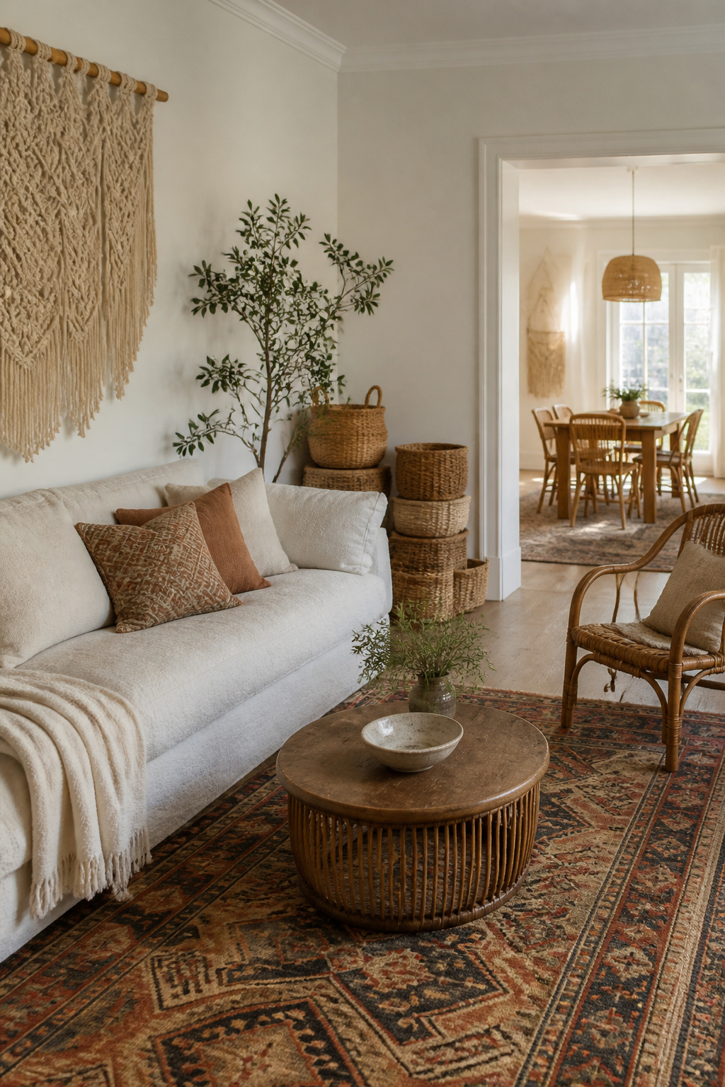
A white boho living room lives or dies on texture layered thick enough that you stop noticing the walls are white at all. I learned this the hard way after painting my last rental’s living room in a clean white and watching it flatten into something clinical by week two. The fix was not more color but more surface: a nubby linen sofa cover, a macramé wall hanging I found secondhand, and a vintage kilim rug with the red barely faded out.
Woven baskets stacked in a corner and a rattan chair with the finish worn to gray do the same work. They give the eye something to travel across so the room reads as collected over years rather than assembled in a single Saturday. The sources I trust on this split on how tight to keep the palette. One camp throws in colorful throws and cushions as the finishing move; the other warns that too many competing patterns will undo the calm you bought the white for in the first place. My own take is to keep the textiles in the sand and cream family and let the vintage rug carry whatever color story the room gets. That rug is doing enough.
Boucle fabric, brushed metals, and natural woods all add warmth without leaving the neutral scheme, and a plush white area rug with real pile underfoot changes how the space feels at 7 a.m. when the light is still thin. The negative space matters too. Every wall does not need a hanging; every surface does not need a basket. The breathing room between pieces is what keeps the look relaxed instead of cluttered.
5. All-White Living Room

An all-white living room commits to the shade without hedging, and the payoff is a space that reads larger and more open than its actual walls allow. The trick is layering enough texture so the room does not flatten into a showroom. A marble coffee table gives you cool weight and subtle veining against a linen sofa or a wool rug. Sheer white curtains keep the light moving, and mixing matte paint with a glossy ceramic lamp or a reflective surface on a side table adds dimension you notice without naming.
The secret to keeping a monochromatic space from veering into boring territory is paying close attention to the details, both architectural and decorative.
That means the ceiling finish matters as much as the throw pillows. In a small living room, this scheme is especially useful: white recedes, so boundaries blur and the eye travels farther. The fear, of course, is maintenance. Sources disagree on whether to worry. One approach says live with the risk and enjoy the calm; another quietly adds metallics or pale wood to break the monochrome without breaking the promise. Both work. The choice depends on whether you want the discipline of pure white or a barely-there relief that still reads as all-white from the doorway.
6. White and Wood

Natural wood grain against white walls does what color alone cannot: it adds depth without starting a competition. Oak, walnut, and pine each read as neutral, but their differences in tone and grain keep a room from going flat. I learned this the hard way after installing matching white shelves and a white sofa against white paint. The space felt like a showroom, not a living room. Adding a reclaimed wood bookshelf and swapping a metal coffee table for a rustic oak one fixed it. The wood introduced shadow and movement where the white had none.
Whitewashed brick works as a textural bridge between the two. It carries the warmth of wood and the cleanliness of white without reading as either. In one layout I studied, a whitewashed brick wall behind a linen sofa connected to oak shelving and pine picture frames across the room. The brick’s uneven surface caught light differently throughout the day, so the wall changed while the palette stayed fixed.
Mixing oak, walnut, and pine together creates a layered look that reads intentional, not accidental. The trick is keeping the wood in the same value range: all medium tones, or all light. A single dark walnut piece against pale oak and pine becomes a visual anchor you did not plan. Small wood accents in light fixtures or hardware tie the layout together without demanding attention.
7. White Cream Living Room Design
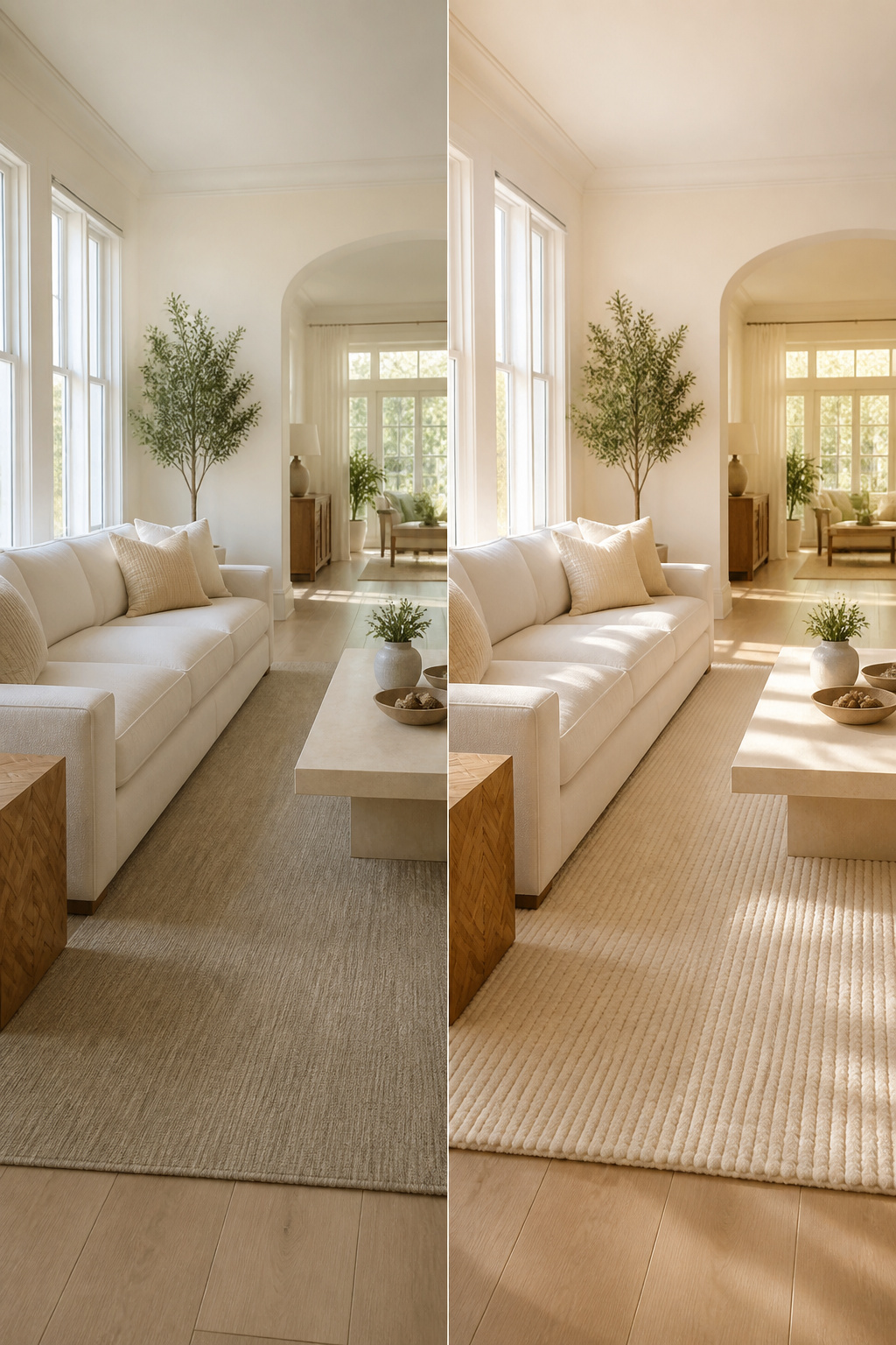
Pure white walls can feel like a hospital corridor if nothing breaks them, which is why I started slipping cream into my own white living room a few years back. The trick is keeping the undertones in the same family. Warm whites, the ones with a hint of yellow or red, blend with ivory and bone without fighting. Cool whites, which lean gray, will make cream look dirty by comparison. Hold any fabric or paint chip against a pure white swatch and the undertone reveals itself fast.
I built the whole room around a warm white sofa and a cream rug that reads almost oatmeal in afternoon light. The variation gives the eye somewhere to land, so the space feels layered rather than blank. For anyone worried about the room going flat, the balance is roughly two-thirds white to one-third cream; more cream than that starts to read as beige, and the brightness disappears. Gold or brass hardware on lamps or side tables sharpens the warmth into something intentional, not accidental.
8. Luxury White Living Room

Marble reads expensive in a white room because it carries its own veining, so the eye travels without needing another color. A marble-topped coffee table or a thin slab on a side console does the work; you do not need a full installation to get the effect. Polished metals, not brushed, keep the tone lifted. Chrome or polished nickel on lamp bases or picture frames catches light differently than matte finishes, and in an all-white space that flash of reflection becomes part of the architecture.
The gallery wall is where most white rooms go flat or go off-palette. A tight grid of black-and-white photographs, all in matching oversized frames, keeps the monochrome commitment while giving the eye somewhere to land. The frames themselves should be slim; ornate molding would fight the restraint that makes the room feel expensive. I have seen this done with abstract line drawings too, but photographs hold their detail at distance better than thin ink strokes.
Velvet and silk on pillows or a single throw add the textile layer boucle cannot quite reach for this particular mood. The catch is upkeep: silk scuffs, velvet collects. I would use them on pieces that see ceremonial use, not the daily sofa.
9. White Living Room with Pops of Color

A white living room works best as a gallery wall for objects when you treat restraint as the strategy itself. I learned this after watching a friend’s space fall apart: she added a teal pillow, then a mustard throw, then rust candles, and suddenly the white looked muddy rather than intentional. Limit yourself to two colors, maybe three, and let the white do the framing work.
The sources disagree on where those colors should live. One approach keeps accents soft and seasonal, pastel in spring, richer tones in fall, swapping throw pillows and small rugs as the year turns. The other goes bolder and fixed: a single oversized abstract in saturated color, or one vibrant rug that anchors the whole room. Both work, but the second demands more commitment. A gallery wall of black-and-white photographs against white walls reads as texture, not color; add one large piece with real saturation and the same wall becomes the room’s entire personality.
Placement matters more than quantity. Color placed low, on a rug or the seat of a chair, grounds the room. Color hung high, in art or a pendant, draws the eye upward and makes the ceiling feel taller. Putting it at both levels without enough white space between them creates competing focal points, and the eye tires fast. I would rather own one good emerald velvet pillow and a single print that picks it up than a basket of mismatched brights. The white between them is what makes each one sing.
10. White Furniture Living Room Ideas

White upholstery looks like a trap until you realize the cleaning math has changed. Performance fabrics and leather now handle the red-wine-and-dog-hair reality most of us actually live in, and the difference between a white sofa that survives and one that dies in six months is almost always the material choice, not the color.
I spent too long assuming slipcovers were the only honest path. They work, and sources still recommend them as the budget-friendly shield against stains, but the better synthetic fibers and treated leathers have narrowed the gap. Leather in particular sits at the center of pet-friendly advice: hair wipes off instead of weaving in, and a scratch that would shred linen barely marks it. The catch is the upfront cost, which runs higher than standard fabric. For renters or anyone planning to move the piece within a few years, that math deserves a hard look.
White case goods, cabinets, and tables are easier. Distressed finishes hide the small dings that accumulate, and a coastal or farmhouse style leans into that wear instead of fighting it. The real mistake I see is choosing a white with the wrong undertone for the room’s light. A creamy white that reads warm in a north-facing space can turn yellow in afternoon sun, and fixing it means repainting, not redecorating. Pick your paint color last, after the furniture is in place and the light has settled.
Choosing the Right Shade of White

The first white I ever painted a room was the brightest thing the hardware store had on the shelf, and by evening it looked like a hospital corridor. Light had shifted, and that pure white turned cold and flat against my oak floors. I learned then that warm versus cool undertones decide whether a white living room feels like a home or a waiting area.
Warm whites carry yellow or pink beneath the surface. They soften at sunset and play well with cream, beige, and wood tones. Cool whites lean gray or blue, stay crisp under bright light, and pair cleanly with slate or chrome. The trouble is, the same paint can read warm at noon and cool by lamplight, so testing a swatch across a full day matters more than trusting the chip.
Farrow & Ball lists over twenty shades of white, each with its own undertone. That range exists because north-facing rooms swallow warmth and south-facing rooms amplify it; a white that works in a Maine apartment can look sickly in a Florida rental. The undertone you choose becomes the filter for everything else in the room: your sofa, your rug, even the wood grain in a coffee table. Pick warm and stay warm throughout, or the room fractures into pieces that never quite agree.
Texture in White Spaces

A white living room without texture reads like a blank page rather than a design choice. The eye needs somewhere to land, and in a space where color has been stripped away, that landing spot has to come from how a surface feels under your hand or shifts under light.
Boucle fabric on a chair gives you that nubby, almost sheep-like density that catches shadows differently than flat weave. Linen on a sofa does the opposite: it slubs and wrinkles, creating soft irregularity that stops the white from looking printed rather than lived-in. I learned this the hard way with a set of white velvet cushions I ordered for a client project years ago. Alone they looked cold, almost clinical. Layered against a nubbier throw and a whitewashed brick wall behind them, the same cushions suddenly made sense. The brick’s rough lime-washed surface and the woolen throw’s fuzz created enough variation that the velvet could just be one note in a chord rather than the whole song.
Marble works the same way, though it asks more of your budget. A small marble side table or even a thrifted marble tray introduces cool smoothness and faint veining that breaks up flat white without adding color. The pairing that keeps coming up in the projects I study: soft pile rug underfoot, something brushed or nubby at seating height, and one harder, smoother element at eye level or above. Get that triangle in place and the room stops fighting you.
Layered Lighting

White walls throw light back at you from every angle, which sounds generous until you realize it also throws back every flaw in your bulbs. A cool LED that reads crisp at noon turns a white room sterile by six, and a warm-toned lamp that felt cozy in the store can push the same walls toward butter yellow after dark. The fix is not buying better bulbs; it is building layers you can dial down.
Ceiling fixtures set the base. Globe pendants or sculptural chandeliers give ambient light a shape worth looking at, not just a disk of glare. I keep that layer low enough to live with, then add table lamps or sconces for the actual work of the room: reading, leaning over a coffee table, finding the remote. The accent layer is the one most people skip. A narrow beam on a single object, a plant or a framed print, breaks the flatness that makes white rooms feel like waiting areas.
Dimmer switches are what let a white room shift from day to evening without repainting it. In darker spaces, a dimmer just makes things darker. In a white room, it changes the temperature of the whole space because the walls are still reflecting, just less of it. That transition is what keeps the room from feeling like a showroom after sunset.
The honest part, the part that stings, is that white shows light quality more ruthlessly than any other background. A bulb with a bad CRI, color rendering index, looks fine in a navy bedroom and wrong in here. You notice the green spike in cheap LEDs, the pink drop in aging halogens. The walls do not forgive it; they broadcast it. I learned that the hard way with a set of sconces I loved the shape of, hated the light from, and could not return.
Keeping White Clean

Washable paints and stain-resistant fabrics are the baseline, not the finish line. The sources all mention them, but none of them say what happens after the first scuff appears. In my reading, the gap between "easy to clean" and "actually cleaned" is where most white living rooms turn gray.
Spot-clean within the first ten minutes if you want the mark to lift. The performance fabrics the sources recommend, leather and synthetic fibers, buy you that window; untreated cotton or linen starts setting almost immediately. For walls, a satin or eggshell sheen catches light more evenly than flat, which means a patched spot blends instead of flashing. I would skip high-gloss unless you want every brushstroke visible from the doorway.
Slipcovers, mentioned in one passage as a pro tip, work best if you own two sets and rotate them. One washes while the other wrinkles into place; waiting for a single cover to dry leaves the sofa bare for a day. Distressed white cabinets in that coastal style hide fingerprints better than smooth lacquer, which is worth weighing if the household includes small kids or pets. The sources call all-white "not practical" for that exact situation, and the honest read is: it is practical only if you commit to the maintenance cycle before you buy the first chair.
Frequently Asked Questions
Is a white living room right for you?
A white living room suits anyone who wants a classic, clean backdrop that adapts as trends shift. White reflects light to open up small spaces and stays calm enough to live in, while neutral walls let you swap accessories without repainting. The tradeoff is maintenance; it works only if you commit to the cleaning cycle before buying the first chair.
How do I keep my white living room clean?
Spot-clean within the first ten minutes for the best chance of lifting a mark. Choose performance fabrics like leather or synthetic fibers, use satin or eggshell wall paint so patched spots blend rather than flash, and rotate two sets of slipcovers so one washes while the other stays in place. Distressed finishes on cabinets hide fingerprints better than smooth lacquer if kids or pets are in the household.
What are the best shades of white for a living room?
Warm whites with yellow or pink undertones soften at sunset and play well with cream, beige, and wood; cool whites leaning gray or blue stay crisp under bright light and pair cleanly with slate or chrome. Test any swatch across a full day, since the same paint can read warm at noon and cool by lamplight. North-facing rooms swallow warmth, so they often need warmer whites, while south-facing rooms amplify it.
Can white living room ideas work in a pet-friendly home?
Yes, if you choose durable, easy-to-clean materials. Leather sits at the center of pet-friendly advice because hair wipes off instead of weaving in, and scratches that would shred linen barely mark it. Performance synthetic fibers have narrowed the gap with traditional fabrics, though leather’s upfront cost runs higher and deserves a hard look if you plan to move the piece within a few years.