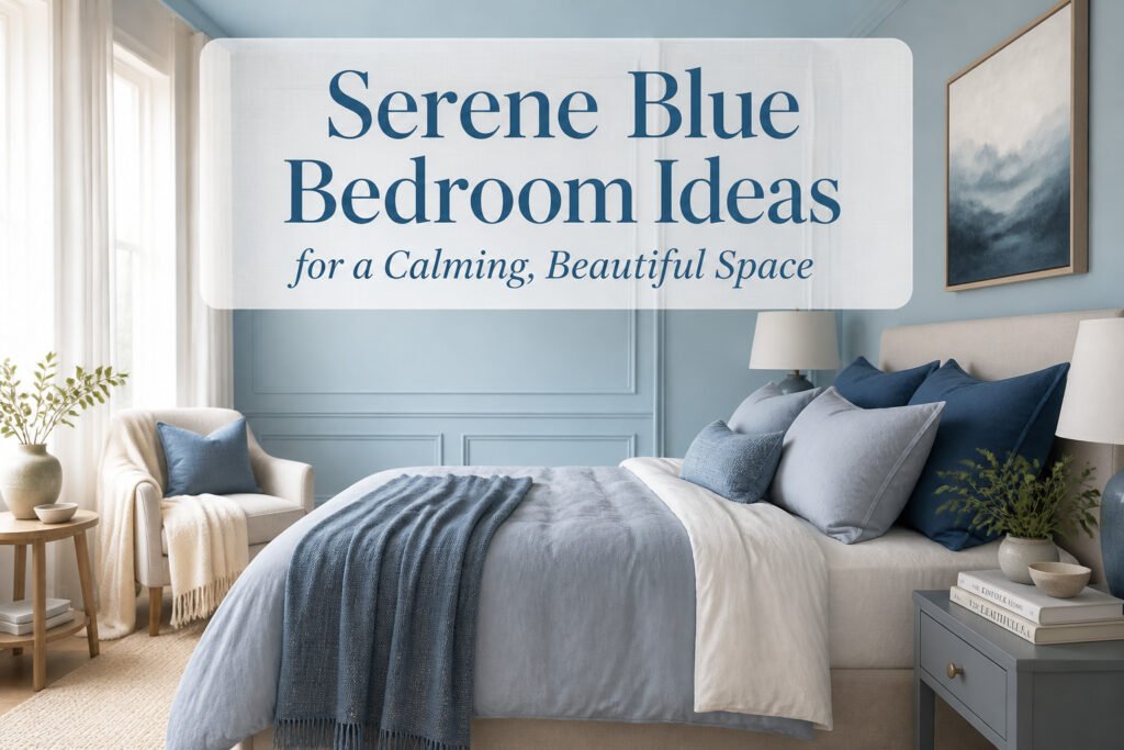
A serene blue bedroom can feel like a retreat or a cold box, and the difference is usually how much blue you actually use. The rooms that calm instead of overwhelm keep blue to about thirty percent of the visual field, letting neutrals do the quiet work of holding the edges. Get that ratio wrong, paint the walls, bedding, and a nightstand the same shade, and the effect is underwater rather than restful. That 60/30/10 split is the first filter: if your ceiling is low and your light scarce, pale blue expands; if the architecture gives you volume, deep blue rewards you with a cocoon.
1. Immersive Wall Treatments
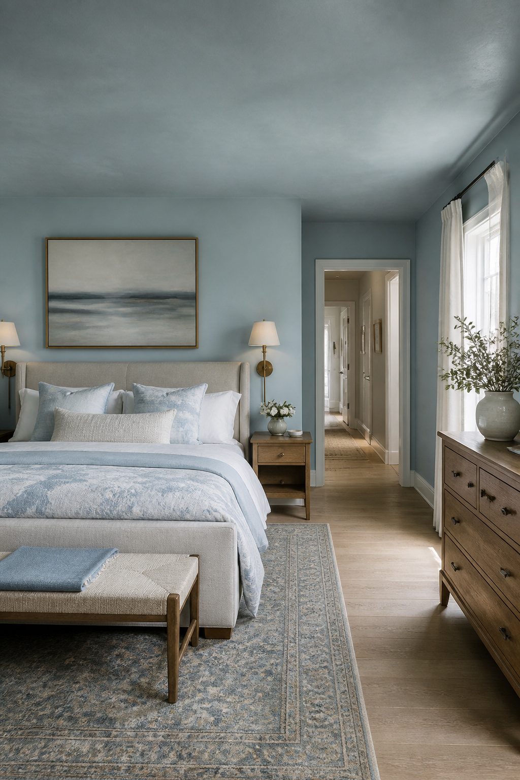
The most enveloping serene blue bedrooms start with the walls and do not stop there. Wrapping both walls and ceiling in the same tone removes the visual break that keeps a room feeling boxed in, and the effect is closer to sky or water than to paint. Sherwin-Williams Sleepy Blue SW 6225 carries enough gray to stay restful even across a large surface; Benjamin Moore Palladian Blue HC-144 reads slightly greener and works best where morning light is weak, since its warmth keeps the room from feeling dim.
Paint is not the only route. Blue and white striped wallpaper gives the same wrapped feeling with more movement, though the stripe width matters. Narrow stripes read as texture from across the room; wide stripes make a stronger statement and need simpler bedding to avoid competition. Floral blue wallpaper does the opposite work, softening the architecture with pattern, but the scale should match the ceiling height. Large blooms in a room with standard eight-foot ceilings tend to feel pressed down on you.
Ceilings are usually left white by habit, not by rule. A blue ceiling returns light differently than a white one, especially after dark, so the lamps matter more. Brass adjustable wall sconces with linen shades, or an arched brass floor lamp with a drum shade, give warm points of contrast that keep the blue from turning cold. The mistake is treating the ceiling as an afterthought and then wondering why the room still feels flat.
2. Balanced Blue with Neutrals
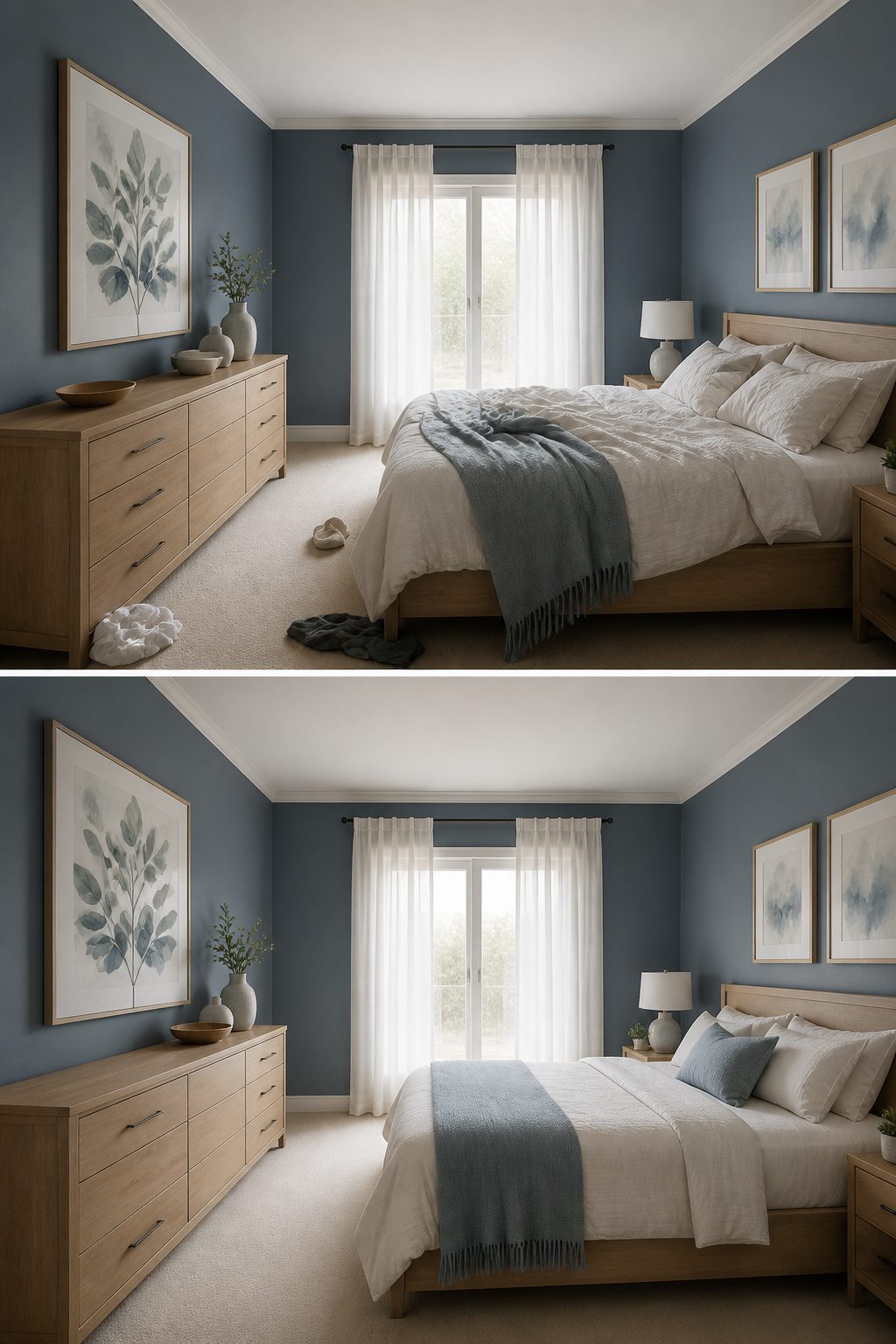
A serene blue bedroom risks turning cold fast if the blue owns too much of the room. The fix is a 60/30/10 split: roughly sixty percent neutral ground, thirty percent your chosen blue, ten percent a deeper accent or a second blue. Neutrals belong where the eye rests first, on flooring, the bed frame, the larger dresser, and the trim. That placement lets blue read as atmosphere instead of decoration.
White keeps the palette crisp and contemporary, the clean backdrop that lets a pale blue wall breathe. Beige warms the whole room, especially in a space with morning sun that might otherwise feel sterile. Gray, used in curtains or a upholstered piece, bridges the gap when you want cool without chill. I have seen rooms where blue swallowed the walls, the bedding, and a painted nightstand, and the effect was not calm, it was underwater. The neutral majority prevents that by giving the eye somewhere to land.
Steel blue walls work because the gray of the curtains and the white of the frames and pillows do the quiet work. The blue becomes the pool of tranquility only when the neutrals hold the edges. For a weekend project on a real budget, this ratio means you can paint one wall, keep the beige carpet you already have, and swap in white pillowcases. The calm arrives in the balance, not in buying more blue.
3. Layering Different Shades of Blue
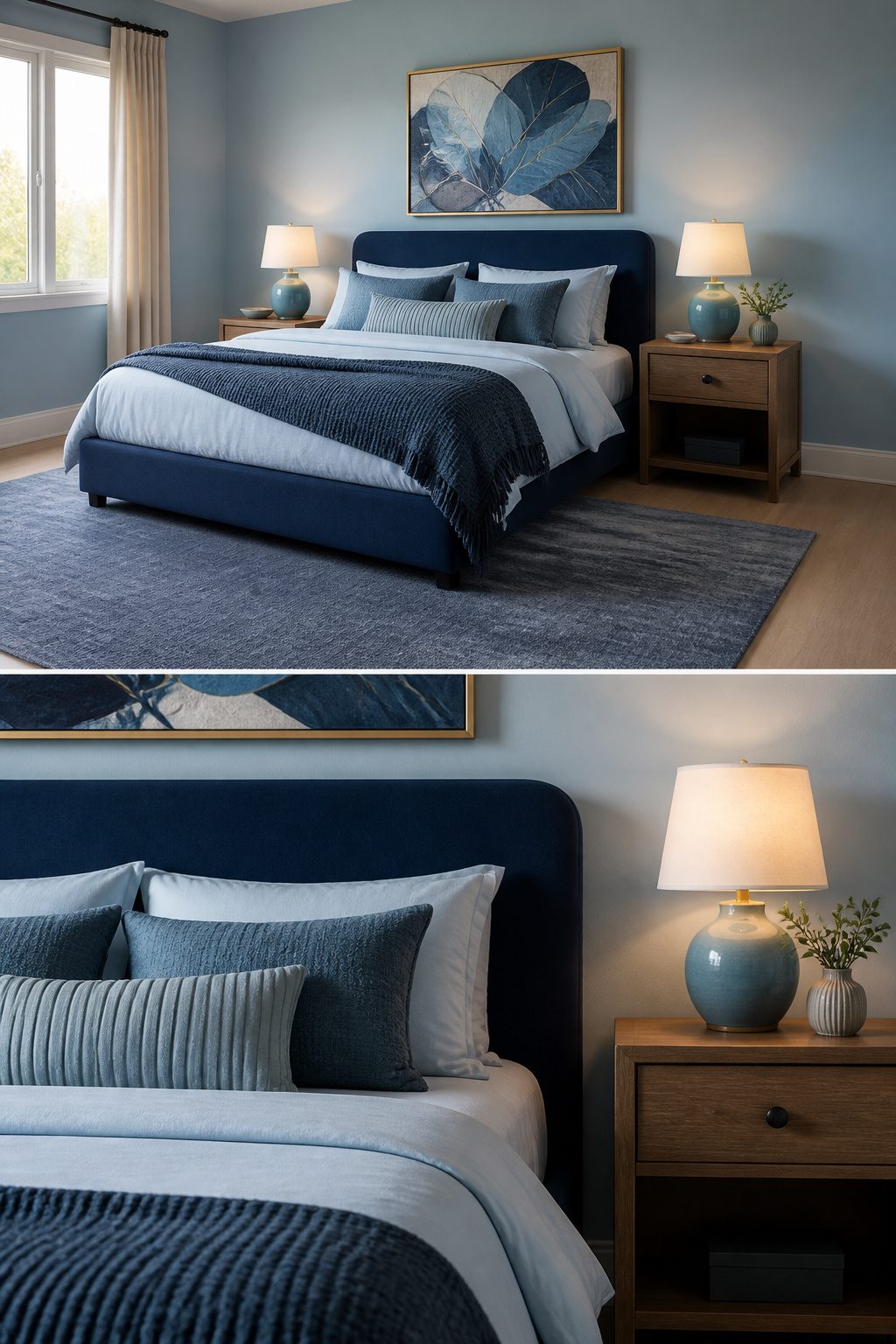
A single shade of blue on every surface flattens a bedroom into something closer to a waiting room than a retreat. The fix is layering, and the sources agree on the method: three distinct blue tones, kept within the same undertone family, either all cool or all warm.
In my own reading, the combination that keeps coming up is sky blue on walls, deep navy in upholstery, and a dusty mid-tone in textiles. A navy velvet bed frame against Sherwin-Williams Sleepy Blue walls gives the room its anchor; pale blue sheets and denim throw pillows soften the contrast without introducing a new color family. A slate blue rug underneath ties the levels together and keeps the eye from floating.
The mistake to avoid is letting the undertones drift. Cool blue walls against orange-toned wood reads jarring, not restful, and four walls of saturated blue turns the room cave-like rather than calm. Consistency in temperature matters more than the exact shades you choose.
4. Blue and White Combinations
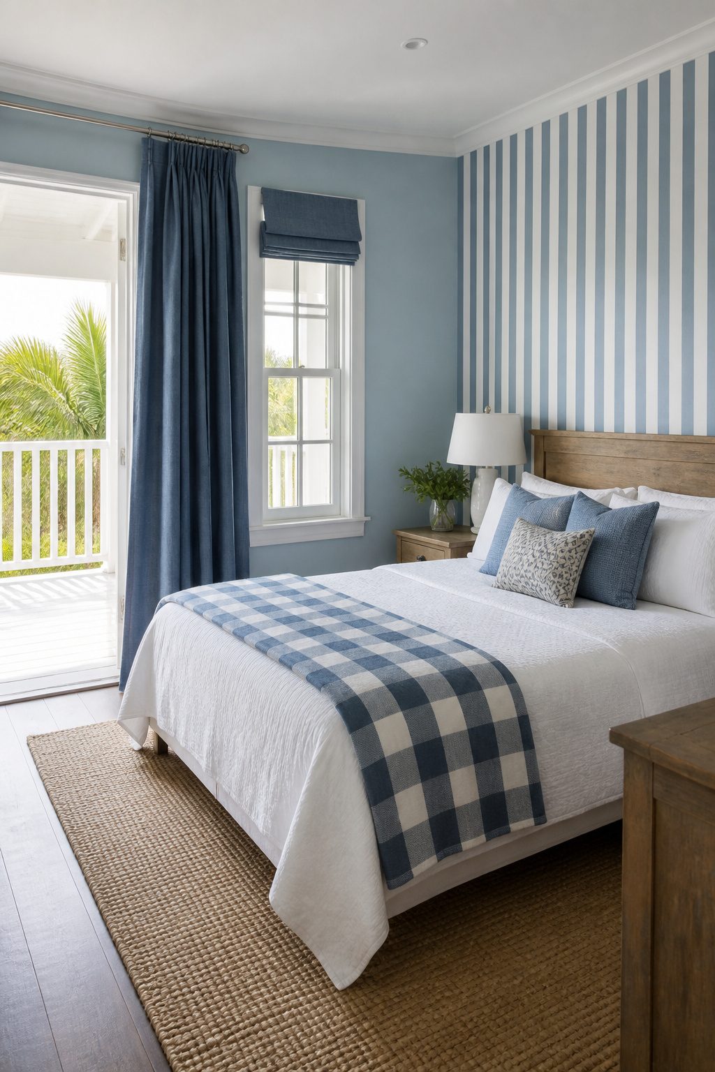
Blue and white together carries its own personality, separate from pairing blue with beige or gray. The ratio matters more than the colors themselves. A room that reads as serene keeps blue below about sixty percent of the visual field; push past that and the same two colors start to feel like a decorated set rather than a place to sleep.
Crisp maritime blue against bright white wakes a room up, almost to the point of a guest room rather than a primary one. I have seen this work in a Nantucket bedroom where the designer used bold blue drapery with tailored white bed linens and a checkered quilt, then added windows until the space felt garden-bright. The blue stayed in motion through fabric, not wall, and that kept it from going nautical in the wrong way.
Striped wallpaper in blue and white is the specific execution everyone pictures, and it is the one most likely to tip over into theme territory. It echoes the sea, which is calming until it becomes literal. I would put it on one wall behind the bed, never wrapping the room, and keep the stripe scale medium, not bold.
Softer aged combinations, what some sources call Mediterranean, let the white go cream and the blue go sky or faded navy. The bedding in one example used sky blue with white and sky blue border pillows against a sky blue wall, the wood bed and nightstands doing the work of grounding it. That version feels lived-in rather than staged.
The risk with this pairing is always decoration for its own sake. When the blue and white start competing to be noticed, serenity leaves first.
5. Textured Walls in Blue
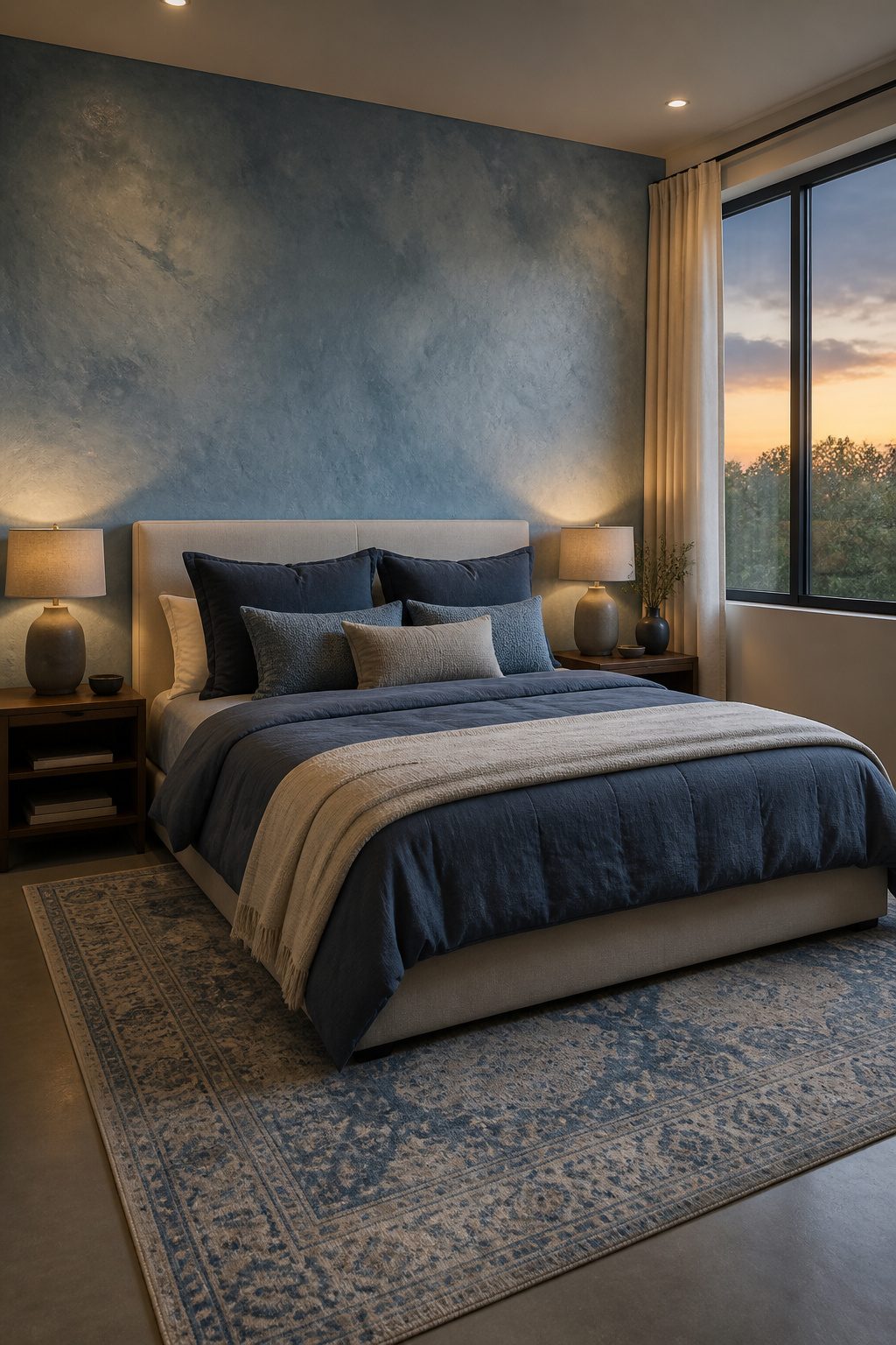
A flat blue wall can read like a clinic corridor no matter how soft the shade. Texture breaks that spell. Grasscloth, limewash, or a textured concrete wall in pastel blue catches light unevenly across the day, so the color shifts instead of sitting dead still.
Two ways to play this. Cover one wall behind the bed and keep the rest clean; the texture becomes a backdrop without closing the room in. Or run it full-room if the finish is subtle, like a brushed limewash, though that demands more budget and a steadier hand. Textured concrete panels, the kind meant for a bed backdrop, lean industrial and need a contractor for the pour; limewash and grasscloth are weekend jobs a renter can reverse.
Cost splits wide here. Grasscloth runs material-only and peels off later. Limewash needs two coats and rags you will throw away. Concrete is the outlier: permanent, pricier, and the one that feels designed rather than decorated. For a serene blue bedroom that actually calms, texture is not extra. It is the thing that keeps blue from feeling like a color choice and makes it feel like a place.
6. Blue Accent Furniture
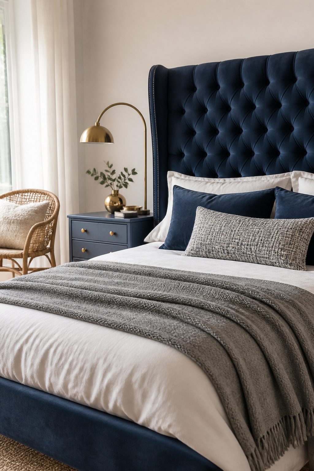
A single blue dresser against white walls reads as intentional; a blue nightstand crammed between two mismatched wood pieces looks like a leftover. The difference is usually scale and spacing. I learned this the hard way with a painted chair I wedged into a corner where it fought the bed frame for attention. One piece needs room to breathe.
Start with your largest textural piece, like a tufted velvet headboard in navy or a linen upholstered bench at the foot of the bed, then build the room around it. A painted nightstand works, but it should repeat a finish or tone already present, otherwise it floats. Brass arc lamps with linen shades, natural rattan, antiqued brass, these warm materials keep blue from turning cold.
The rule that saved me: no more than three competing textures in one sightline. Matte velvet, slubby Belgian linen, and one woven accent like a chunky merino wool throw or a rattan stool. Add a fourth and the eye stops resting; the room feels cluttered rather than curated. Two blue pieces anchor a neutral space. One reads as an accent, three starts a collection you may not have meant to start.
7. Incorporating Floral Patterns
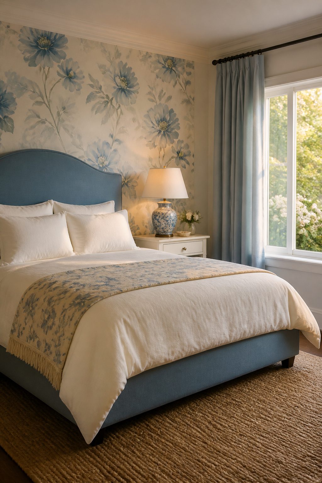
Floral blue wallpaper and fabrics add charm to a serene blue bedroom, but the scale of the pattern decides whether the room feels airy or crowded. A large repeat with open space between blooms reads calmer than a dense, small-scale print that competes with itself across every wall. I learned this the hard way in a guest room where a tiny floral on all four walls turned claustrophobic by week two.
Soft watercolor florals in blue work best on a single accent wall, especially behind the bed where the pattern frames sleep rather than surrounds it. Saturated prints have their place, yet they demand restraint: one source pairs bold Sister Parish wallcovering with simple white slipcovers to let the pattern breathe. The same rule holds for fabrics. A Quadrille or Schumacher floral on pillows or a single curtain panel adds romance without the commitment of full wallpaper.
If the room lacks architectural interest, wallpaper becomes the character, but flooring and lighting should stay quiet. A seagrass rug or matte ceramic lamp lets the floral be the gesture. Mixing prints works only when the scales differ sharply: one large floral with one small stripe, never two florals of similar size. The goal is a room that feels collected over time, not decorated in a single afternoon.
8. Coastal Themes with Blue
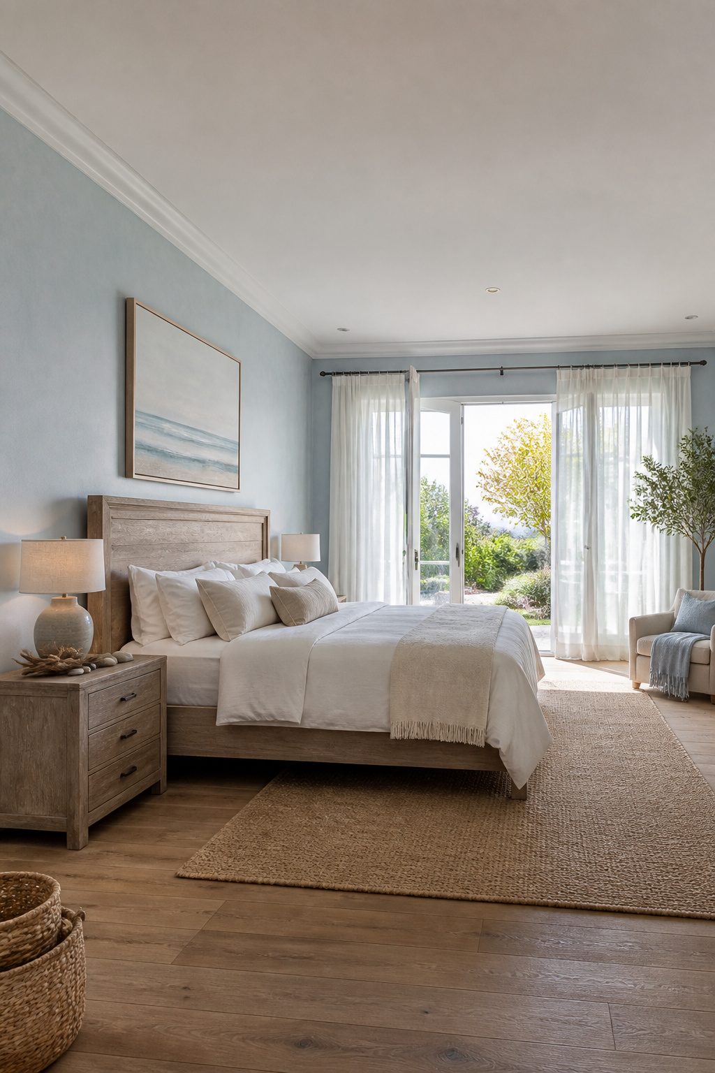
Coastal blue can go two ways, and only one of them belongs in a bedroom you actually sleep in. The literal route piles on rope drawer pulls, shell collections, driftwood signs pointing to the beach. I have seen rooms that look like a seafood restaurant got shrunk into 120 square feet. The atmosphere stays busy, and busy is the opposite of serene.
The atmospheric route keeps the feeling without the props. Weathered wood tones read as sun-bleached dock or old fishing boat, not craft-store nautical. Blues that look faded by salt air work better than saturated navy for calm. White in small doses, kept to the texture of sea foam rather than stripes or anchors, lets the eye rest.
What convinced me, reading through a dozen of these rooms, is that the calming ones never explain themselves. There is no story to read, no theme to decode. The blue simply looks like it got there by weather and time. Skip anything that needs a label to make sense, and the bedroom stays a bedroom instead of becoming a set.
9. Blue Statement Pieces
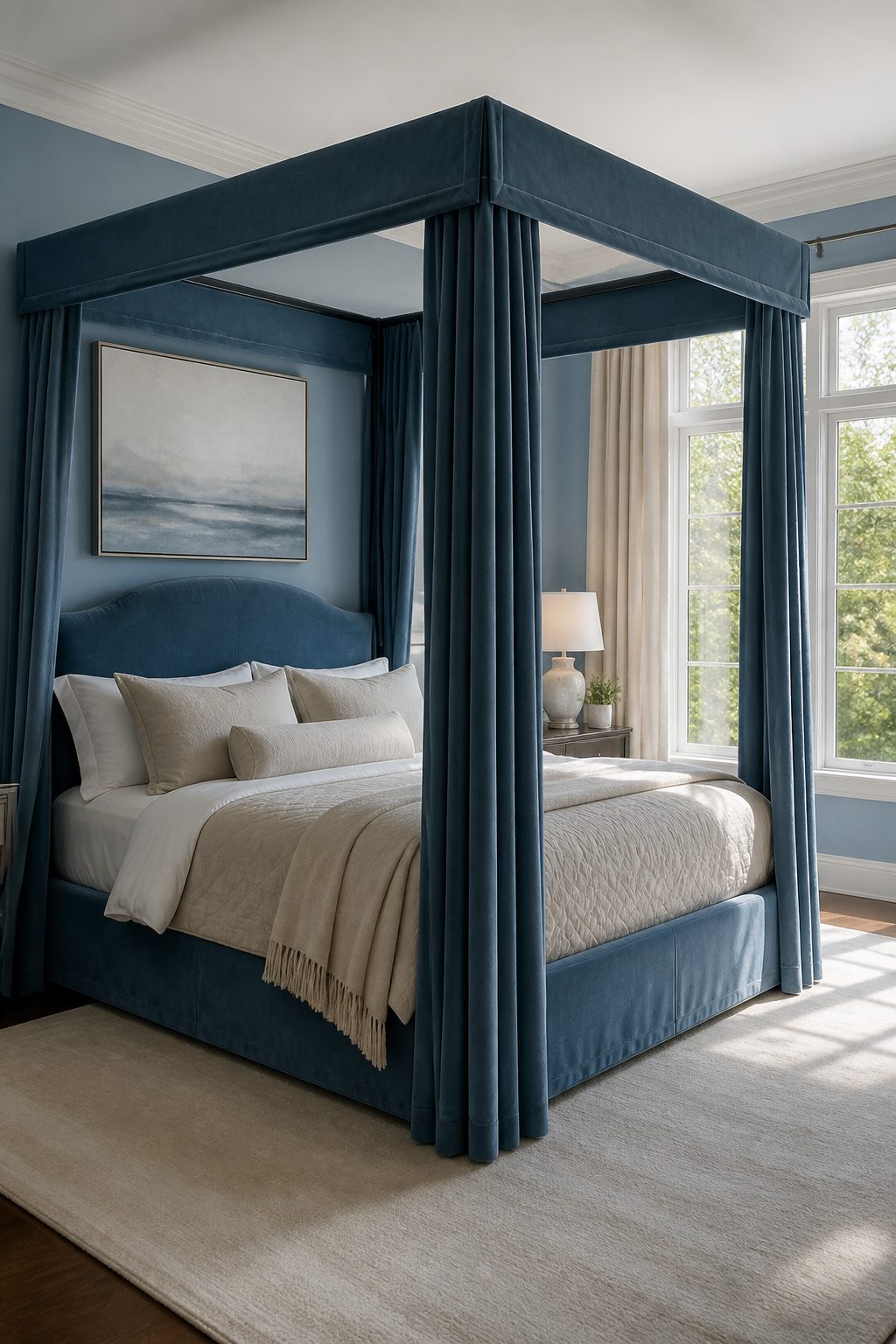
A single oversized piece carries the blue load so the rest of the room can stay quiet. I learned this the hard way after crowding a bedroom with three medium blue things, a lamp, a bench, and a rug, and watching them fight for attention until none of them read as intentional.
Scale matters more than color intensity. A canopy bed or a ceramic lamp big enough to hold a dinner plate demands enough floor or wall space to breathe; place it where the eye lands naturally when you enter, usually the wall opposite the door or the bed’s headboard wall, and keep a 24-inch clear zone around it so it reads as deliberate, not crammed in.
The payoff is restraint everywhere else. With one large blue artwork above the bed, the bedding stays oatmeal or warm white, the side tables stay wood, the curtains stay undyed linen. The room still feels serene because the blue has a single voice instead of a committee.
10. Mixing Blue with Contrasting Colors
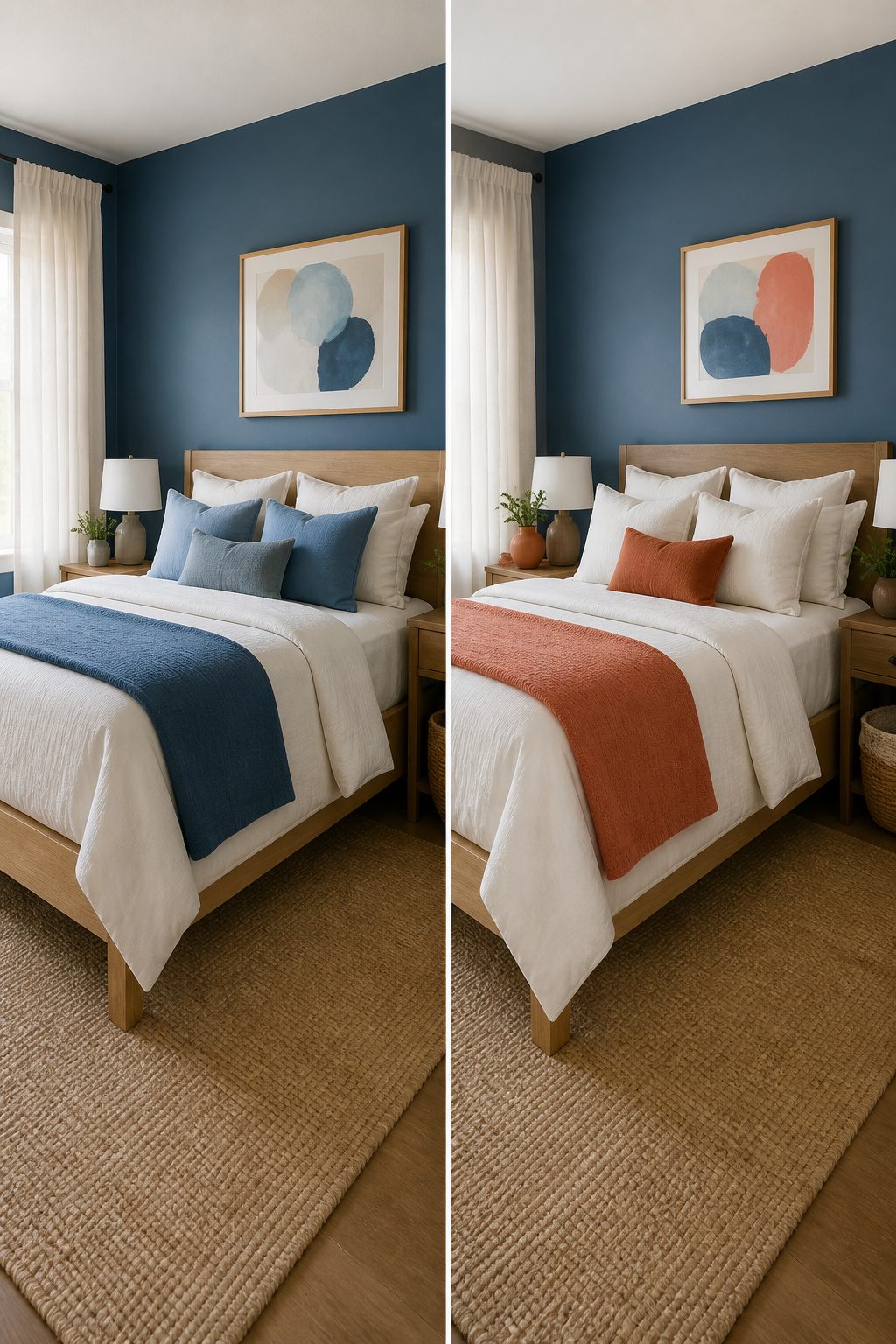
A blue bedroom can drift toward the feeling of a clinic if every tone stays cool. The fix is a small, warm accent placed where the eye lands last, not first. Coral, mustard, and terracotta all sit opposite blue on the wheel, and in tiny doses they keep the calm from turning cold.
Shani Core used this trick in a Boca Raton guest room: coral throw pillows and a cozy throw against bold blue-and-white palm wallpaper, with natural wood on the bed frame and nightstand to keep the saturation livable. The coral did the work of warming the space; the wood kept it from feeling like a color experiment.
the color can take on different characteristics depending on how you use it—from moody and sophisticated to bold and energetic
For a serene bedroom rather than an energetic one, keep the warm accent to about 10–15% of the visible room. A mustard pillow with blue piping reads as a whisper; a full coral wall reads as a shout. Place the contrast low and small: a folded throw at the foot of the bed, a single small print behind the lamp, piping on a standard sham. Blue plus coral stays vibrant; blue plus gold turns luxe. The first wakes a room gently, the second dresses it up. For the calm you came for, stay closer to the coral or terracotta family and let the blue dominate everything above the mattress line.
Light Blue versus Dark Blue
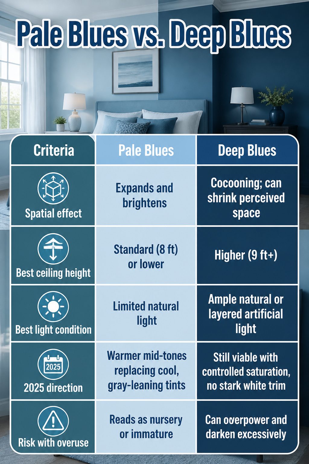
Pale blues push walls outward and bounce daylight around, which makes them the safer default for a serene blue bedroom with standard eight-foot ceilings or a single window. Deep blues do the opposite: they pull the surfaces in and drop the visual ceiling, so the room reads as a cocoon. That can be exactly what you want in a large, bright space where the goal is sleep rather than square footage.
Ceiling height and natural light are the real deciders. A south-facing bedroom with ten-foot ceilings can handle a saturated navy without turning cave-like. A north-facing box with one window and low ceilings will feel smaller still in the same color. The room’s function matters too: a bedroom used only for sleeping tolerates more darkness than one where you fold laundry or work at a desk.
For 2025, the shift is toward warmer mid-tone blues and blue-greens rather than the cool, gray-leaning pale blues that dominated the last few years. Color drenching, where walls, trim, and even furniture sit in the same hue family, is part of that same movement. A dark blue bedroom still works if the saturation is controlled and the trim is kept from stark white contrast, which reads as harsh rather than restful.
| Pale Blues | Deep Blues | |
|---|---|---|
| Spatial effect | Expands and brightens | Cocooning; can shrink perceived space |
| Best ceiling height | Standard (8 ft) or lower | Higher (9 ft+) |
| Best light condition | Limited natural light | Ample natural or layered artificial light |
| 2025 direction | Warmer mid-tones replacing cool, gray-leaning tints | Still viable with controlled saturation, no stark white trim |
| Risk with overuse | Reads as nursery or immature | Can overpower and darken excessively |
If your ceiling is low and your light is scarce, the paler end wins. If the architecture gives you volume and light to burn, the deep end rewards you with the enveloping calm that makes a bedroom feel like a retreat rather than a display.
Blue and White against Blue with Other Colors
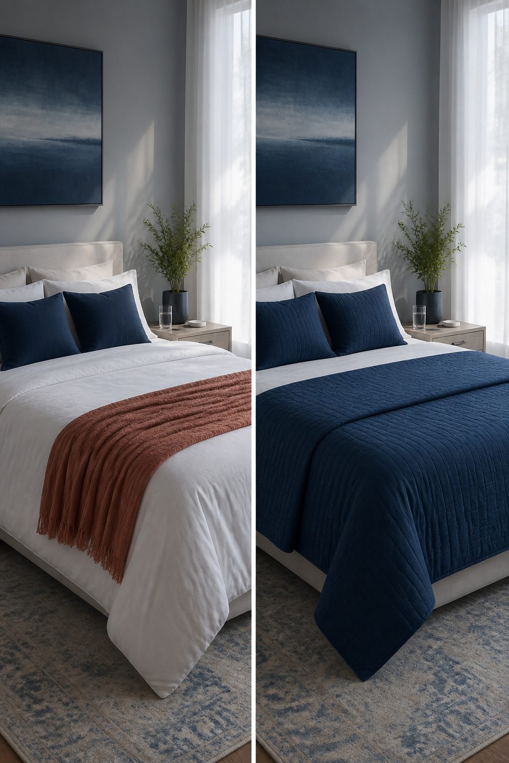
The classic blue and white pairing works because it asks so little of you. Two colors, clean contrast, and the room reads as intentional even when the bedding is rumpled or the nightstand holds a water glass and a phone charger. For renters or anyone selling within a few years, that simplicity protects your investment. Buyers see a blank they can live with; you see a space that never fought you.
Adding a second or third color, warm neutrals or a deliberate contrast like mustard or terracotta, gives the room your fingerprint. The risk is real: that terracotta throw pillow you loved in October can look exhausted by February, and replacing one accent often means replacing three so nothing sits orphaned. I have watched a friend chase cohesion through three rounds of new pillow covers after her rust-colored curtains faded unevenly in south-facing light.
Blue and white forgives sun fade, mismatched whites, and the fact that you will not repaint before you move. A more complex palette demands that you stay attentive to what shifts, and that attention is itself a cost. Choose the busier mix when you own the walls and the time to tend them; choose blue and white when the bedroom needs to stay calm without your help.
Textured Walls against Flat Paint
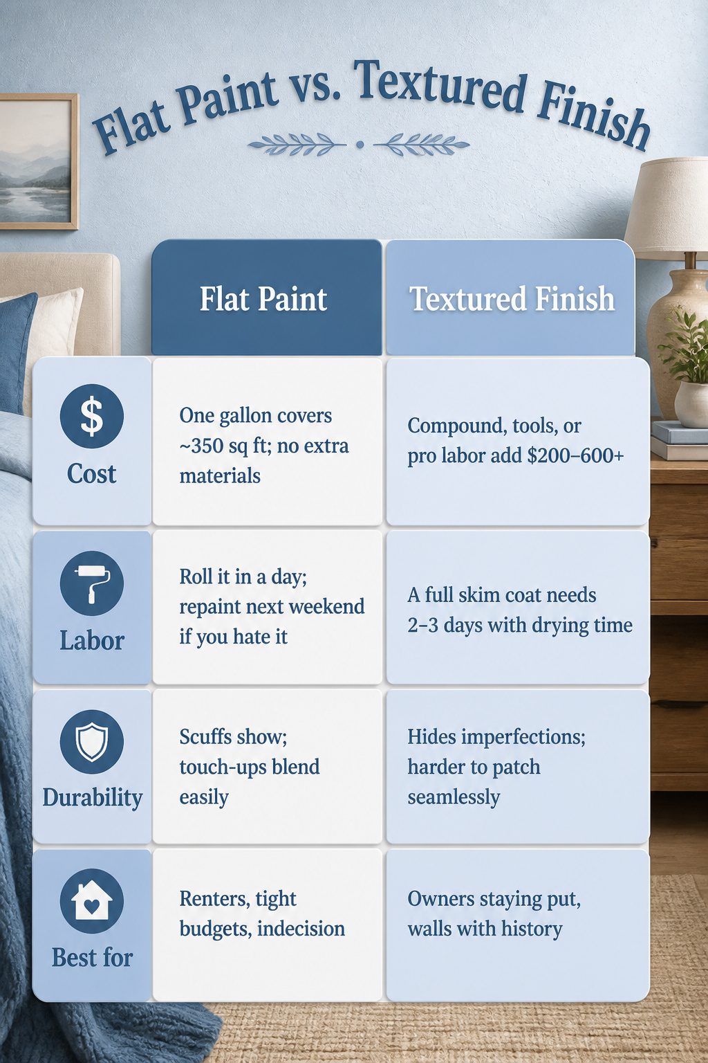
Flat paint in a serene blue bedroom reads clean and intentional, but it can also read unfinished if the walls underneath are less than perfect. Texture adds the depth that makes a color feel designed rather than just applied, though it asks for more time and more commitment.
| Flat Paint | Textured Finish | |
|---|---|---|
| Cost | One gallon covers ~350 sq ft; no extra materials | Compound, tools, or pro labor add $200–600+ |
| Labor | Roll it in a day; repaint next weekend if you hate it | A full skim coat needs 2–3 days with drying time |
| Durability | Scuffs show; touch-ups blend easily | Hides imperfections; harder to patch seamlessly |
| Best for | Renters, tight budgets, indecision | Owners staying put, walls with history |
If you are renting, flat paint wins. You can repaint before move-out and get your deposit back. Texture is for the house you plan to sleep in for years. I have rolled flat blue over bad drywall and regretted the every-afternoon light that showed every hump; I have also skim-coated a ceiling, sworn through the sanding, and admitted after that the room looked finished in a way paint alone never would. For a weekend project, texture is the scope creep that kills the timeline. For a forever bedroom, it is the detail you stop noticing and then stop wanting to live without.
What Makes Blue Calming
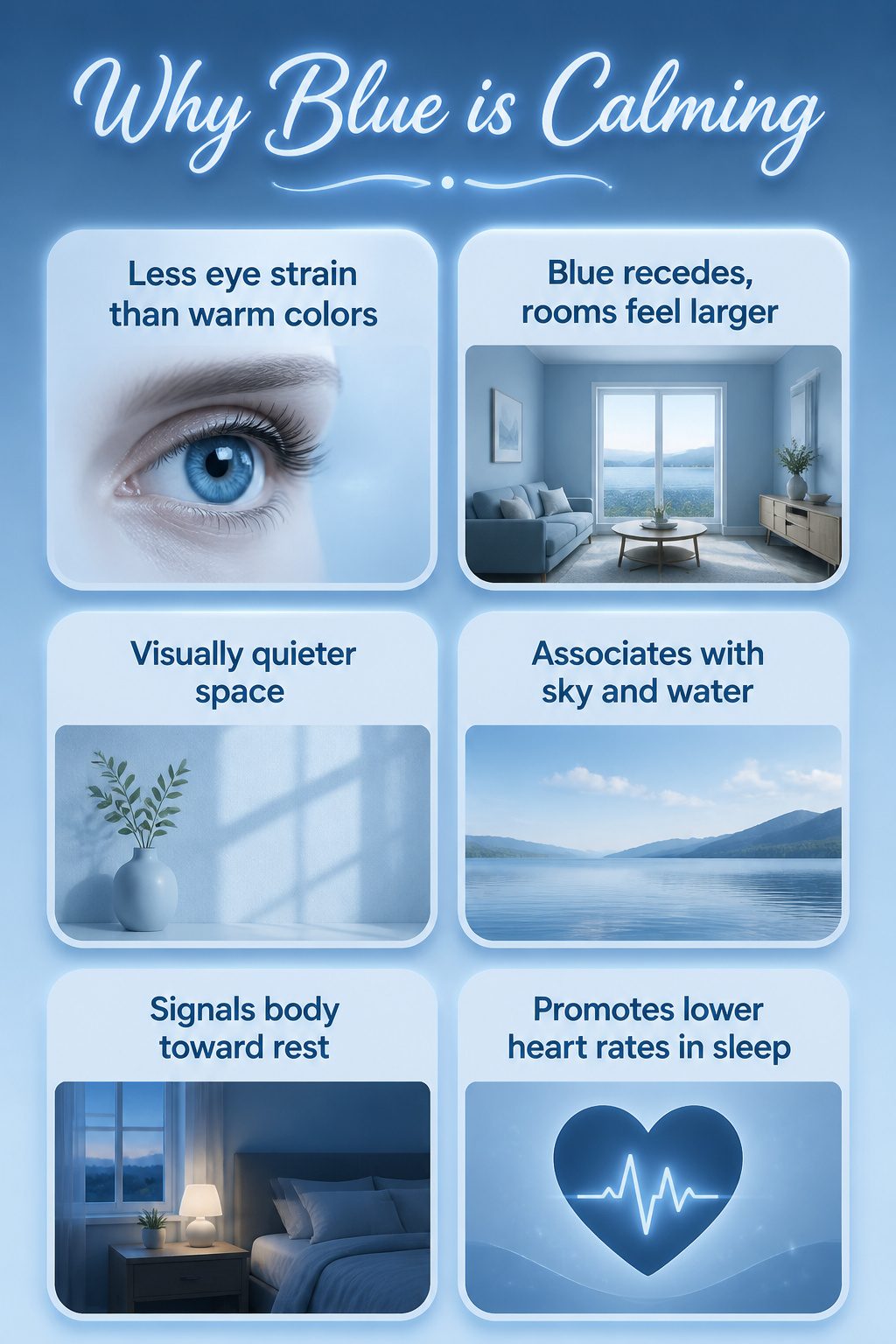
Blue registers as calm because the eye processes it with less strain than warmer colors. Red and orange advance; blue recedes, which makes walls feel farther back and rooms feel larger. That same receding quality quiets the space visually, so the mind stops working to place edges and distances.
The association with sky and open water runs deep enough that most people feel it without naming it. Cooler light in the evening, the color of a window at dusk, signals the body toward rest in a way that warm lamplight does not. Studies tracking sleep quality have found that blue-dominant bedrooms tend to produce lower heart rates and longer rest periods than rooms saturated in warm tones, though the effect is modest and varies with the exact shade and the person.
For a bedroom specifically, the advantage is practical. Blue offers enough color to feel intentional without the stimulation that keeps you sorting visual information when you want to shut down. A mid-tone slate or dusty navy does this better than a bright or saturated hue, which can flip toward energetic. The quieter blues let the color do its work while you sleep.
Two Paints That Get It Right
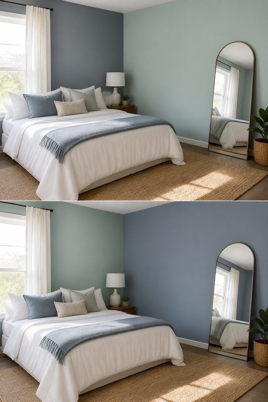
Sherwin-Williams Sleepy Blue SW 6225 carries a gray undertone that keeps it from reading babyish in a south-facing room. Benjamin Moore Palladian Blue HC-144 leans greener, almost mint in certain light, and it brightens a space with less natural light than you’d expect from its mid-range reflectance. I spent an afternoon taping both to the same wall in a friend’s rental before she chose, and by evening the Palladian had turned almost seafoam while the Sleepy Blue held steady. That shift is why I now tell people to live with swatches through a full day before buying a gallon. The name on the chip means less than the window you own.
Frequently Asked Questions
What shades of blue are best for a calming effect?
Light blue and mid-tone blue work best for calm, especially if they carry gray or green undertones that keep them from reading as nursery colors. Sherwin-Williams Sleepy Blue SW 6225 stays restful even across large surfaces because of its gray base; Benjamin Moore Palladian Blue HC-144 leans greener and brightens rooms with weaker morning light. For 2025, warmer mid-tone blues and blue-greens are replacing the cool, gray-leaning pale blues that dominated previous years.
How can I incorporate blue into my bedroom decor?
Use blue across walls, textiles, furniture, and accessories, but keep it to about thirty percent of the room so it reads as atmosphere rather than decoration. Paint is the obvious starting point, though wallpaper, upholstered headboards, painted nightstands, and blue bedding all layer in without overwhelming. The 60/30/10 split puts sixty percent neutral ground, thirty percent blue, and ten percent accent so the room stays balanced.
What colors pair well with blue in a bedroom?
White keeps the palette crisp and contemporary; beige warms the whole room, especially with morning sun; gray bridges cool without chill. For small contrast that keeps the room from feeling cold, coral, mustard, or terracotta at about ten to fifteen percent of the visible space add warmth where the eye lands last. Brass, natural rattan, and antiqued brass also keep blue from turning clinical.
Are blue bedrooms trending in 2025?
Yes, blue bedrooms remain popular, though the direction has shifted toward warmer mid-tone blues and blue-greens rather than cool, gray-leaning pale blues. Color drenching, where walls, trim, and even furniture sit in the same hue family, is part of that same movement. Dark blue stays timeless if the saturation is controlled and it is not paired with stark white trim, which reads harsh rather than restful.