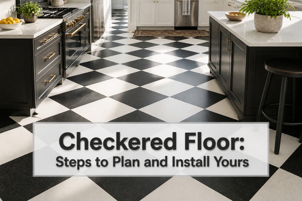
A checkered floor is a grid of square tiles in two alternating colors, creating the familiar chessboard effect that has survived from Egyptian temples to 1950s American diners. The pattern only works if you match tile size to room scale; 24-inch porcelain squares that look commanding in a dining room become a cutting nightmare in a 5-by-7-foot powder room, where 12-inch or even 8-inch tile is the actual ceiling. That same scale rule governs every decision that follows, from material choice to whether the layout runs straight or turns 45 degrees.
What a Checkered Floor Actually Is
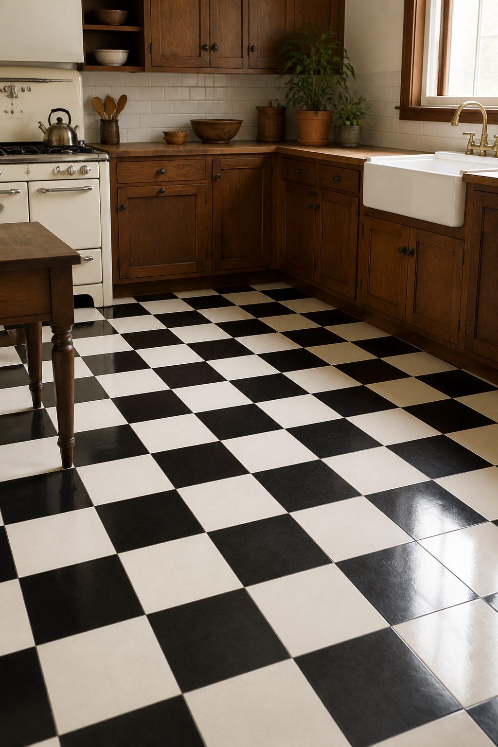
A checkered floor is simply a grid of square tiles in two alternating colors, nothing more. The pattern reads as "checkered" rather than generic patterned tile because the eye locks onto the predictable rhythm of same-size squares meeting at sharp corners, creating that familiar chessboard effect. The basic geometry comes in three forms: a straight grid with tiles aligned to the walls, a diagonal layout where squares turn 45 degrees so their corners point toward the room’s edges, and the harlequin variation, which is the same diagonal arrangement but often with a specific color pairing like black and white or gray and white.
The pattern has been doing this work for a long time. Egyptian temples used it around 3000 BC, European palaces and medieval churches carried it forward, and 1950s American diners made it feel like home. That history matters less than the practical effect: the regular grid creates visual stability, and in a small room the repetition can make the space feel larger than it is. What draws people back to it now is the same thing that kept it alive for five millennia: two colors, one grid, and a result that feels intentional without trying too hard.
1. Tile Size and Room Scale
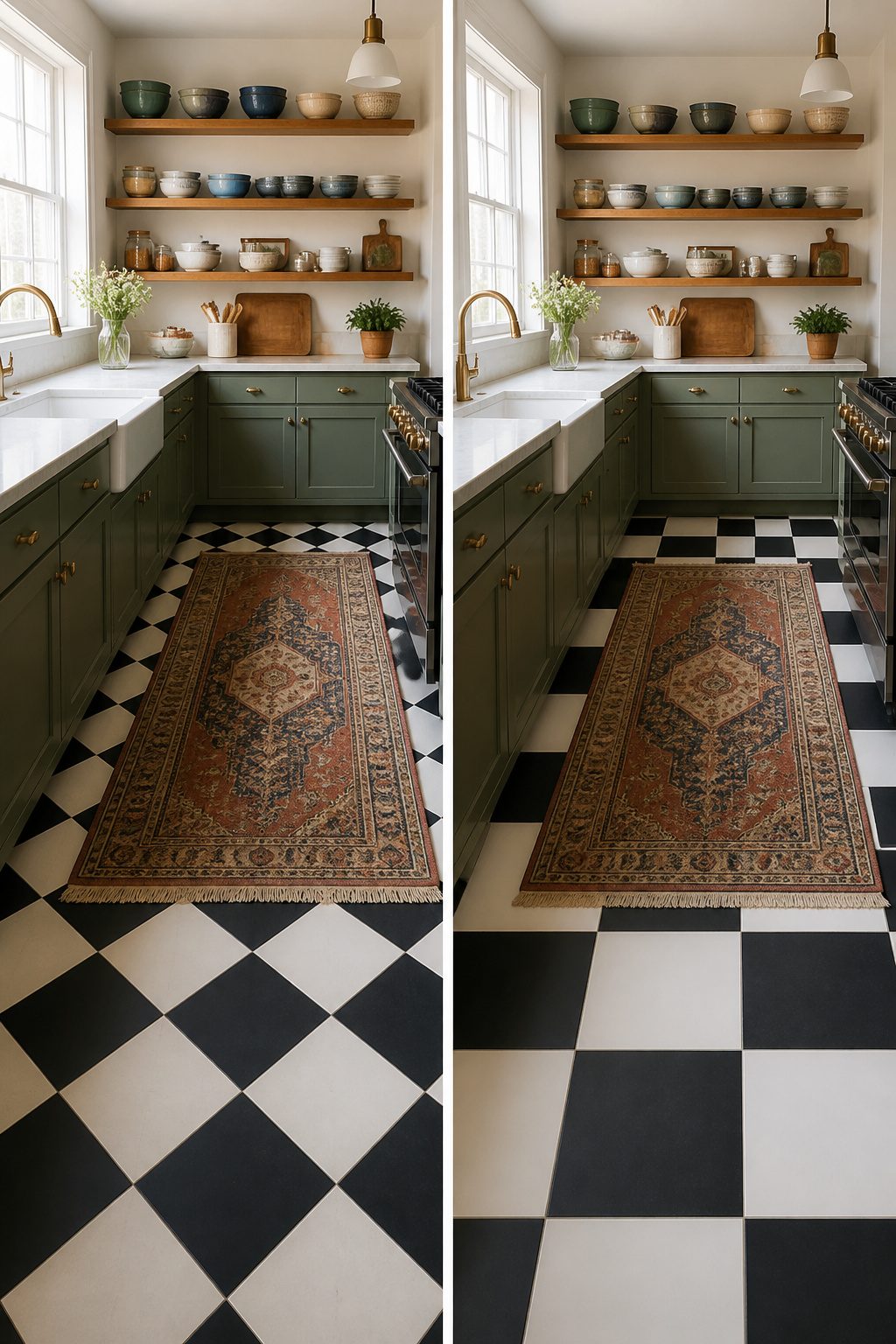
Square footage is the quiet decider of whether a checkered floor looks intentional or like a craft project gone wrong. 12" x 12" tile is the standard that works in most rooms; the pattern reads clearly without demanding too many cuts at the edges. In larger spaces, 18" x 18" or 24" x 24" keeps the grid from turning into visual noise. Chris Loves Julia used 24" squares in a big dining room, and the scale holds up because the room can carry it.
Smaller tiles have their place. 6" x 6" or 8" x 8" suits bathrooms, entryways, or anywhere you want a vintage, slightly busier effect. The increased square count breaks up the space more deliberately.
I learned the hard way that bigger is not always better. In a 5′ x 7′ powder room, I laid 24" tiles. Three cuts per row, awkward slivers along every wall, and a pattern that fought the room instead of filling it. Never again. For a space that tight, 12" would have been the right ceiling, or even 8" if I wanted that retro density.
2. Material Choice
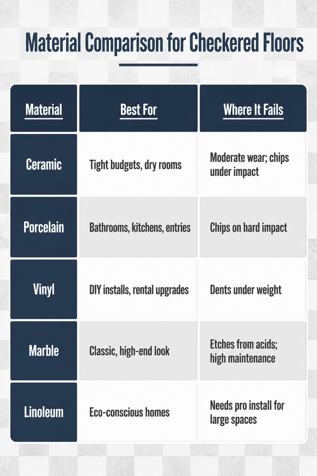
Five materials keep showing up for checkered floors, and each fails in a different way. Porcelain is the densest and holds up best in wet areas, though a dropped cast-iron pan can chip the corner clean off. Ceramic gives a similar look for less, with moderate durability that works fine in low-traffic rooms. Vinyl is the budget pick and the easiest to lay yourself, but heavy furniture leaves dents that do not bounce back. Marble carries the classic look everyone pictures, yet acidic spills etch the polish and the maintenance never really ends. Linoleum, made from natural materials, is the eco-friendly option, though sources disagree on whether it belongs in the same conversation; only two of the projects I tracked used it, and both hired pros for the adhesive work.
| Material | Best For | Where It Fails |
|---|---|---|
| Ceramic | Tight budgets, dry rooms | Moderate wear; chips under impact |
| Porcelain | Bathrooms, kitchens, entries | Chips on hard impact |
| Vinyl | DIY installs, rental upgrades | Dents under weight |
| Marble | Classic, high-end look | Etches from acids; high maintenance |
| Linoleum | Eco-conscious homes | Needs pro install for large spaces |
For most weekend projects, the choice narrows fast. Porcelain or ceramic wins if you own the place and can rent a wet saw. Vinyl peel-and-stick, like the Floorpops line Chris Loves Julia put out, gets you the pattern in an afternoon with a utility knife and a straightedge. The marble look is what draws people in, but real marble belongs on the mood board, not under the coffee table, unless you are ready to reseal twice a year.
3. Color Combinations
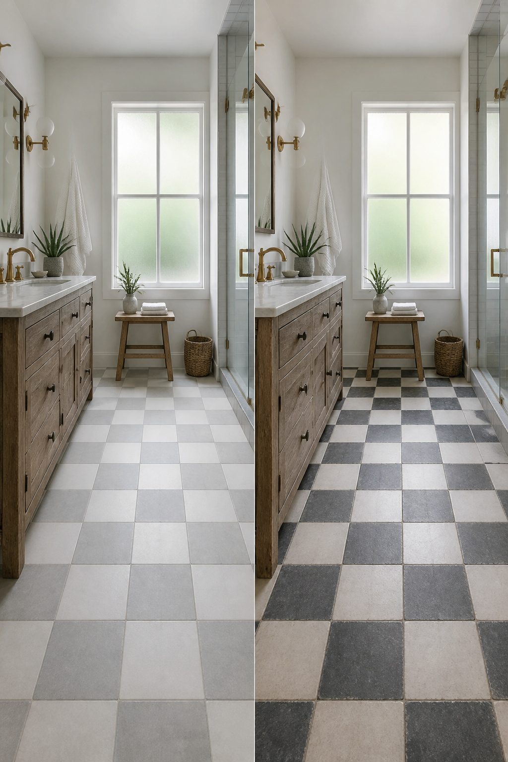
Black and white checkered floors are the reference standard for a reason. The high contrast draws the eye straight to architectural details like moldings or doorways, and the neutrality means the floor adapts rather than competes with whatever furniture or paint colors come later. Grout color changes the whole read, though. Matching the grout to either tile softens the grid into something quieter; a contrasting grout line sharpens it into a graphic statement that can feel busy in a small room.
Gray and white has pulled ahead as the softer alternative. The contrast drops enough to keep the pattern without the same visual punch, which works well in kitchens or bathrooms where you want the floor to ground the space rather than own it. Sources note that women between 28 and 44 save this combination more often than classic black-and-white on Pinterest, which tracks with how the look reads: designed but not performative.
Beige and white pushes further toward warmth, trading the crispness for something that sits easier against wood cabinets or vintage fixtures. The same Pinterest skew holds here, with this pairing out-saving black-and-white among that demographic.
Bold colors like red or blue belong to specific rooms and periods. A 12×12 red-and-white check in a kitchen reads diner-adjacent and high-energy; navy or hunter green against white can land traditional or preppy depending on the trim. The checkerboard pattern itself carries enough history that the color choice becomes the whole mood.
4. Layout Direction
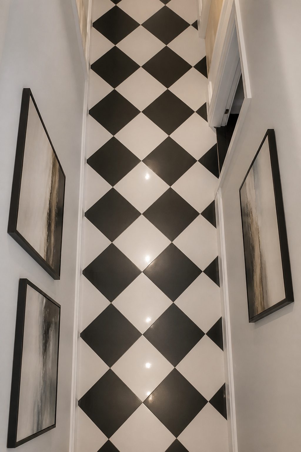
A straight grid is the layout you will see in most kitchens and bathrooms, and for good reason: tiles meet the walls at 90 degrees, so cuts stay simple and waste stays low. Plan for 10 percent overage and you will almost certainly have enough to cover a miscut or two. The diagonal layout turns those same square tiles 45 degrees so the points aim toward the corners of the room. The visual effect is real; the floor reads wider than it is, which helps in a narrow galley kitchen or a small powder room. That expansion comes at a cost. Every tile touching a wall needs two cuts, not one, and the triangles you trim off mostly end up in the trash. Budget 15 percent overage for a diagonal job, and do not try to talk yourself down to 10. I have tried, and I ended up making a third trip to the store for one more box.
Harlequin sounds like another word for diagonal, but it is not. True harlequin uses a specific diamond-shaped tile, longer than it is wide, set so the points run wall to wall. The pattern reads more formal, more Parisian apartment than suburban mudroom. If you are working with standard square tiles and turning them 45 degrees, you are doing diagonal, not harlequin. The distinction matters when you are ordering material or describing the job to someone who actually knows the difference.
5. Subfloor Prep
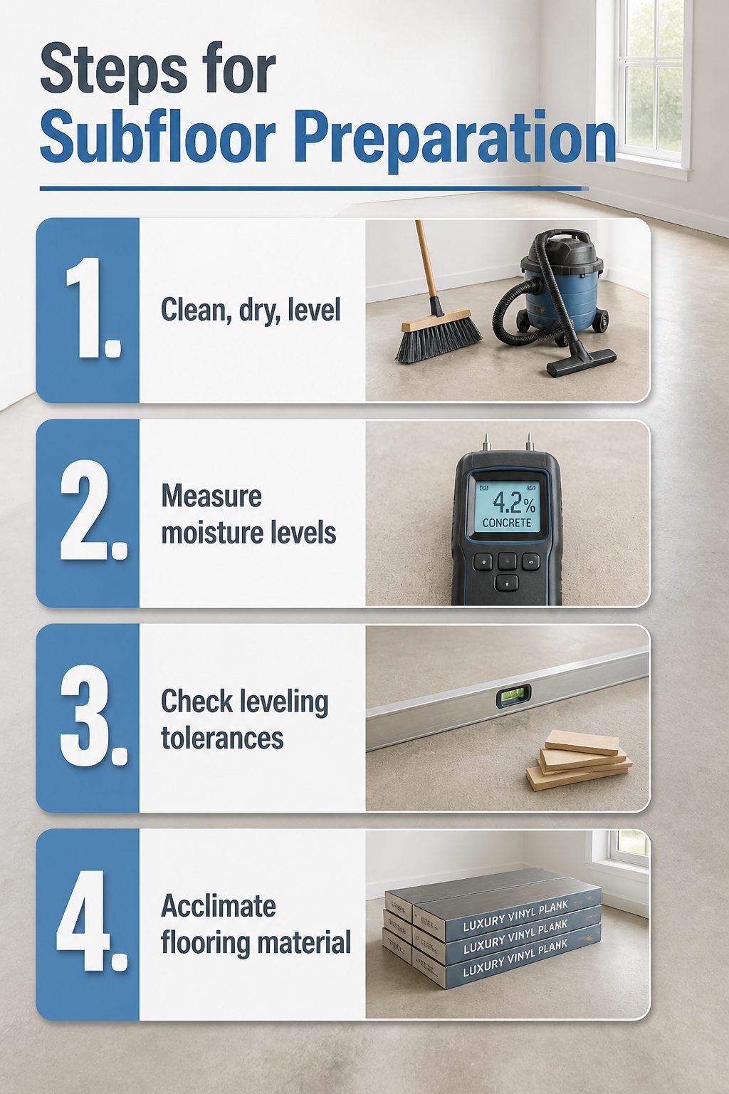
- Clean, dry, level — those three checks decide whether the job lasts past the first season. I start with a broom and a shop vac, then run my hand across every square foot. Dust and grit left behind telegraph through thin vinyl or wreck the bond on adhesive-backed tile.
- Dry means more than surface-dry. In my basement laundry room, I skipped the moisture meter because the concrete looked fine and I was impatient to get the pattern down. Six months later the adhesive turned to paste and the tiles released like postage stamps. Now I tape a 2×2 foot sheet of plastic down for a full day anywhere below grade, and I read the meter before I open a bag of thinset.
- Level tolerances vary by material. Porcelain wants the floor within 3/16" over ten feet; vinyl is more forgiving, though deep dips still show as shadows in the pattern. I use a ten-foot straightedge and shims, mark the highs with chalk, then grind or float as needed.
- Acclimate the boxes in the install space for 24 to 48 hours before you cut anything open. Temperature swings from a garage or a hot truck bed stress the material and the joints never sit quite right afterward.
6. Installation and Grout
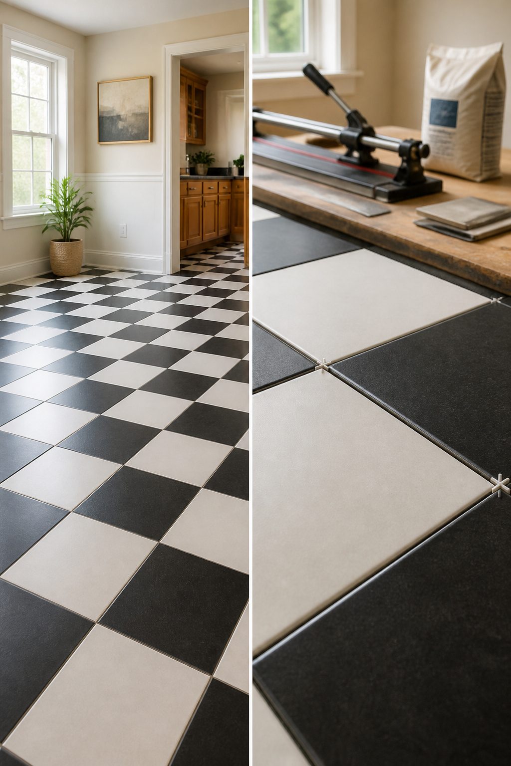
Dry layout first, find center, work outward in quadrants. Spacing by material — ceramic and porcelain typically 1/8" or 3/16", vinyl often butt-joined or 1/16". Grout selection: sanded for joints 1/8" and wider, unsanded for narrower. Seal porous materials (marble, some ceramics) per manufacturer; porcelain and vinyl need no seal. Include the error of grouting too soon, footprints in wet joints.
- Snap chalk lines to find the dead center of the room and work outward in quadrants so the pattern stays square even when walls aren’t. Dry-lay a full row in both directions before you mix any thinset; the time you spend shifting tiles now is time you won’t spend chipping them up later.
- Spacing depends on what you’re laying. Ceramic and porcelain usually want a 1/8" or 3/16" gap to handle subfloor movement. Vinyl tiles are often butt-joined or held to a hairline 1/16" joint; the material itself has enough give.
- Grout follows the joint width, not the tile color. Sanded grout fills 1/8" and wider without cracking; unsanded grout is made for anything narrower where sand particles would jam the line.
- Seal porous materials like marble or unglazed ceramics before you grout, or the grout color will drink into the tile face and never come out. Porcelain and vinyl need no seal at all; skip that step and that expense.
- The mistake that still haunts me: grouting too soon and walking back across the floor for a "quick" photo. Footprints in wet joints don’t wipe clean; they gouge. Wait the full cure time the bag gives you, even if the surface looks dry.
Maintenance by Material
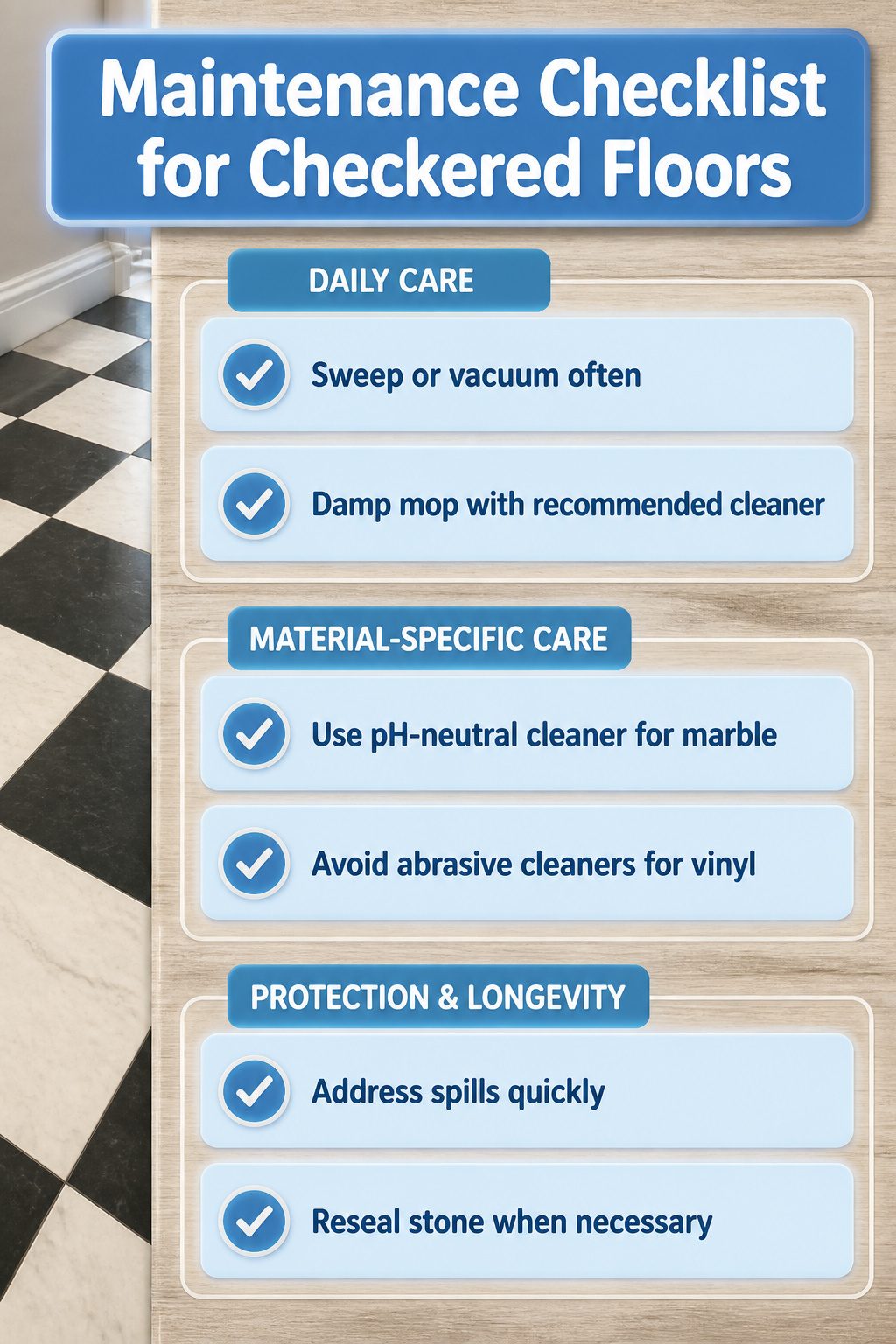
The checkered floor you chose back in step three determines how much work the next ten years will be.
- Sweep or vacuum often. Grit is what scratches every surface, and a checkerboard pattern makes those scratches stand out more than a solid color would.
- Damp mop with whatever the manufacturer recommends. No shortcuts here; the wrong cleaner etches stone or strips vinyl finish.
- Marble needs pH-neutral cleaner. Vinegar, lemon, anything acidic will dull the polish permanently.
- Vinyl tolerates most cleaners but still abrades. That grit rule matters double here because the pattern does not hide wear.
- Spills need attention fast. A red wine stain on white squares, or oil on black, becomes a design feature you did not plan.
- Sealed stone needs resealing when water stops beading. Unglazed porcelain barely needs anything beyond the basics.
Your weekend install is only the start. The material choice either keeps maintenance occasional or turns it into a quarterly project.
Design Trends and Staying Power
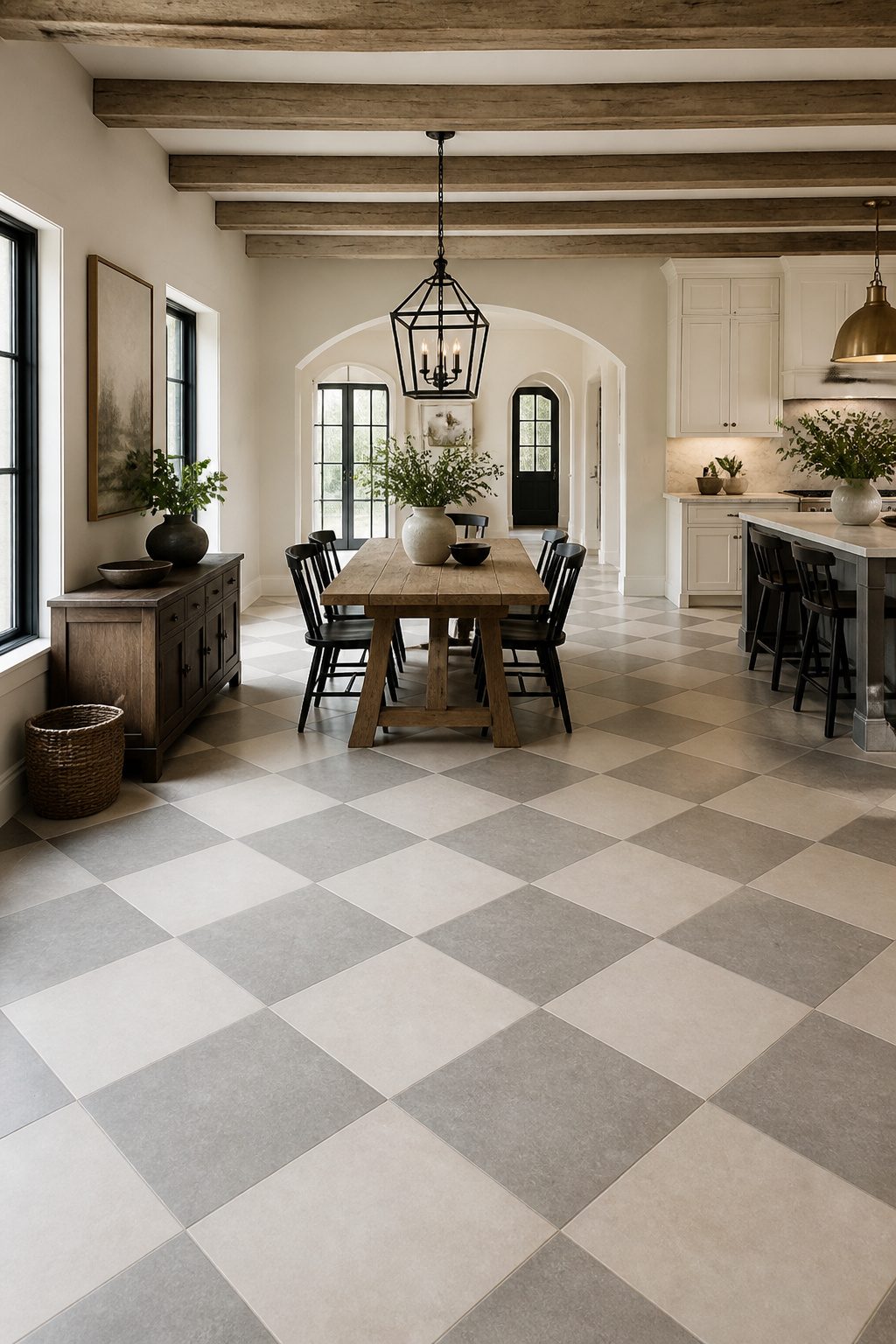
Checkerboard floors keep surfacing in feeds for a reason. The pattern reads as 1920s kitchen or 1950s diner when you want it to, but gray-and-beige versions slip into modern farmhouse or moody traditional spaces without the costume effect. Pinterest saves back this up: they cluster around those two labels, not pure retro.
I noticed the same flexibility reading through project accounts. In one house the same 24-by-24 porcelain tile looked period against warm wood cabinets; in another, the identical material read contemporary with matte black fixtures. The difference was the surrounding choices, not the floor itself.
Color pairings have widened the appeal. Beyond black and white, sources note sage, terracotta, dusty blue, charcoal, and warm neutrals keeping the grid fresh. A honed marble in Bardiglio gray and Carrara white hits vintage notes; large-format porcelain in soft bronze and cream leans current. The pattern stays, the era shifts.
What convinced me was seeing how little it takes to tip the mood. Hardware, cabinet color, and one light fixture decide whether guests ask about your grandmother’s kitchen or your design sense. That adaptability is why the checkerboard floor outlasts the trend cycle it keeps riding back into.
When to Call a Pro
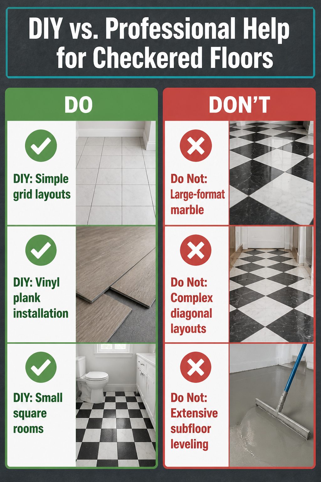
Large-format marble tiles in a checkered pattern are where I draw the line on doing it myself. The weight alone makes them a two-person lift, and the cuts for a checkered layout eat through wet saw blades fast enough that rental fees start to look cheap compared to the pile of chipped corners you will stack up learning. Subfloor leveling beyond a bag or two of self-leveling compound is another handoff moment; if the low spot runs wall to wall, the pour and the grinding that follows belong to someone with the right pump and the right knee pads.
For vinyl plank or tile, ceramic in a straight grid, or any material in a small square room, DIY is genuinely viable. The cuts stay simple, the layout forgiving, and a weekend timeline holds. Diagonal layouts in irregular rooms multiply the cuts enough that the math changes; every wall meets the floor at a different angle, and the waste pile grows while your patience shrinks. That is the point where I would rather pay for the speed of someone who has done it a hundred times than spend my third Sunday on a single bathroom.
Frequently Asked Questions
What materials are best for a checkered floor?
Porcelain and ceramic work for most homes, vinyl suits DIYers and rentals, marble delivers the classic look but needs constant upkeep, and linoleum fits eco-conscious buyers who can hire out the adhesive work. Porcelain handles wet areas best. Vinyl dents under heavy furniture. Marble etches from anything acidic and needs resealing twice a year.
How do I install a checkered floor?
Start with a clean, dry, level subfloor and acclimate your tiles in the room for 24 to 48 hours. Snap chalk lines to find center, dry-lay full rows in both directions, then work outward in quadrants. Ceramic and porcelain need 1/8" or 3/16" gaps; vinyl often butt-joins. Sanded grout fills wider joints, unsanded for narrower ones. Wait the full cure time before walking on fresh grout.
What color combinations work well for checkered floors?
Black and white remains the standard for its crisp contrast and adaptability. Gray and white softens the effect for kitchens and bathrooms. Beige and white warms the look against wood cabinets. Bold pairings like red and white or navy and white steer toward diner energy or preppy tradition, so pick based on the mood you want the room to hold.