
A neutral living room paint color only works if the light in your actual room agrees with it. The same warm straw that glows like afternoon plaster in a south-facing space turns flat and dirty in a north-facing bedroom, as one expensive test proved when a single gallon of Matchstick had to be repainted entirely. What separates the thirty-nine colors below is not how they look on a chip, but which walls they survive on once the sun moves.
Why Neutrals Need Texture More Than Color
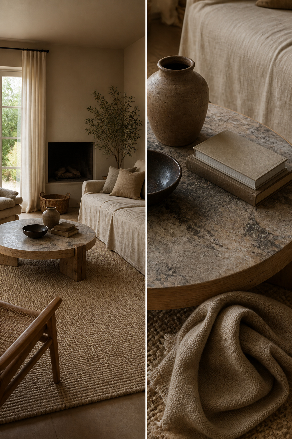
A few years back, I painted my living room walls, trim, and even the ceiling in the same warm beige, thinking it would feel cohesive. Instead, it looked like a rental catalog, the kind of space where you forget what room you’re in the moment you step out. The color wasn’t the problem; the surfaces were. Without anything breaking up that single tone, the eye had nowhere to land.
What saved the room wasn’t another paint color. It was a nubby wool rug I dragged in from the bedroom, a raw wood coffee table I found secondhand, and linen slipcovers that softened the sofa’s edges. Three textures, minimum, is the threshold where a neutral space starts to feel intentional rather than vacant. Woven, plush, and rough together do more than any accent wall could.
The round coffee table helped too. Most living room furniture runs rectangular, so that curved shape kept the layout from feeling like a showroom grid. Stone surface, walnut-finish legs, and suddenly the same beige walls looked like a backdrop instead of a mistake.
1. Fake Tan

Warm sandy neutrals with real yellow in them read as lived-in rather than staged, but the light has to cooperate. I learned that with Fake Tan No. 9912 in a north-facing living room where the walls turned straight orange by mid-afternoon. The color needs southern or western exposure to keep that yellow from tipping into pumpkin territory; in my case, the room faced north and the overcast light pulled every bit of red forward.
Brass lamps fixed it. The metal added enough warm reflection to balance what the window stripped away, and the shade shifted from orange back to something like sand. Without them I would have repainted entirely. If your living room faces north or east, keep Fake Tan for a space with better sun, or budget for fixtures that throw warm light back at it.
2. Vichyssoise
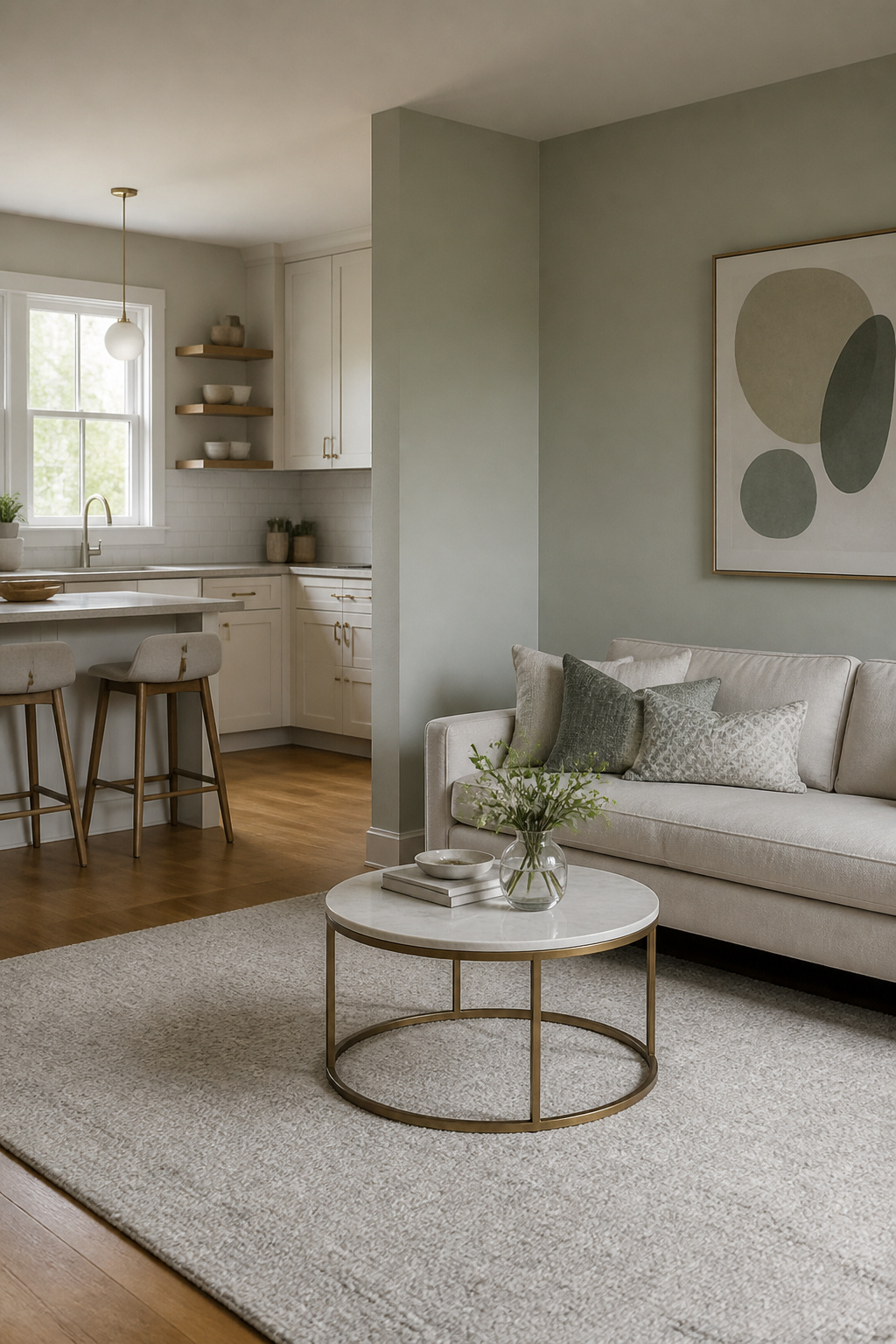
Vichyssoise reads cooler than it sounds, a pale silvery green that slips into a neutral palette without announcing itself as color at all. I found it after two sample boards failed against the oak floor in my kitchen-living room divider, a space where the wood runs continuously and any wall color has to talk to that honey tone rather than fight it. The first sample I tried, a safer gray-green, flattened to concrete under the afternoon light. The second leaned too sage and started looking like a deliberate accent, which was not the point of a room that needed to feel like one continuous space. Vichyssoise sat right in the gap between them, picking up the gray of the kitchen cabinets and the warmth of the floor without matching either. I painted the divider wall only, leaving the living room side in the existing white, and the threshold between the two spaces softened in a way that a bolder color would have broken.
3. Double Cream

Double cream carries enough ochre to feel like something, not just a wall waiting for art. I learned that the hard way with a couch I bought in what the tag called "natural linen," a warm oatmeal that looked mid-tone in the store lights. Against this paint, it disappeared. The wall color was richer, and the fabric just… flattened. Sat there like a mistake.
The fix cost about forty dollars and an afternoon. I swapped in throw pillows two shades lighter, a raw cotton that still had warmth but enough contrast to separate the shapes. The wall needs something to push against, or it swallows the room whole. Suddenly you could see where the couch ended and the architecture began. The original pillows went to the bedroom, where the walls are white and they actually show up.
4. Shadow Gray

Shadow Gray is a cool mid-gray that carries just enough blue to shift noticeably in afternoon light. I learned that the hard way after brushing it onto a north-facing bedroom where the color flattened into something cold and institutional. Without warm sun to balance it, the wall felt like the inside of a filing cabinet, and I repainted within the month.
The living room with western exposure was where it finally settled in. By two or three in the afternoon, the low sun pulls out a soft slate quality that keeps the gray from reading as flat. Mornings stay neutral enough that the room never feels themed, but that late-day shift gives it dimension without a second color on the wall.
For a rental or first project, test it on the wall that gets the most afternoon light first, not the one you are hoping to fix. Shadow Gray rewards the sun it gets, and it punishes the room that has none to give.
5. Bombazine

Bombazine sits right on the edge where brown-gray turns to near-black, and that threshold is exactly why I hesitated. The swatch looked rich in afternoon light, but I worried the same wall after sunset would swallow the room whole. I painted the alcove anyway, a single accent wall behind the sofa, and for the first evening the space did feel smaller, almost like the color had pushed the ceiling down.
The fix cost less than the paint itself. I hung three mirrors: one flat rectangle centered above the couch, two smaller rounds flanking it at different heights. The trick was placement, not size. Each mirror caught the lamp from the adjacent corner and threw that light back across the dark surface. Where the wall had read as a solid mass before, the reflections broke it into shifting planes. The room felt deeper, not tighter, and the brown-gray showed its warmer undertone instead of flattening to pure shadow. Hang mirrors to catch existing light before you buy brighter bulbs; the paint needs that help, but it rewards it.
6. Single Cream

Single Cream sits lighter and cleaner than its deeper cousin, with just enough yellow to read warm without tipping into ivory. On living room walls, that barely-there warmth can go flat in north-facing light; the color ends up looking like primer that forgot to become something. I learned that the hard way in a rental with one window and a giant oak outside it. The fix was moving it to trim, where the slight creaminess separates white walls from white ceilings without adding a new color to the room. It reads as intentional edging, not a mistake in the paint mix.
The ceiling is where Single Cream finally made sense for me. Flat white ceilings in small rooms can feel like a low sky pressing down; this shade lifts just enough to catch lamplight without the yellow bounce you get from true cream. I used it in a bedroom first, then carried it into the living room ceiling after the wall failure. The cost was the same gallon I’d already bought. For renters who can’t change the walls, a ceiling shift buys you warmth without losing your deposit.
7. Farrow’s White

Farrow’s White carries a warmth that keeps it from reading as sterile, which matters more than you’d think in a north-facing rental with dark wood paneling. I used it in a 1970s unit where the living room walls were vertical boards stained nearly black, and the landlord had approved "any light neutral" in writing. Two coats covered the grain without primer, though the first coat looked patchy enough that I almost stopped for a third. The second coat leveled out once it dried overnight, and the slight cream undertone caught the afternoon light in a way flat white never would.
At move-out, the landlord walked through with a checklist and paused in that room longer than anywhere else. He asked if I’d be willing to leave the paint can behind, and I handed over the half-empty gallon with the formula circled on the lid. Two coats over dark paneling, no primer, and it still read as intentional rather than a cover-up job. That is the test for a rental white: does it look like you tried, or like you gave up?
8. Ancona Blue

Gray had been the safe choice, the one every rental advice list pushed as a blank canvas. Mine looked like a parking garage. The walls sucked the light out of a south-facing room that should have felt open by noon. I needed something that read as neutral without the emotional temperature of concrete.
Ancona Blue carries just enough pigment to feel intentional while still functioning as a backdrop. It is dusty, desaturated, closer to weathered shingle than to anything nautical or cute. Two coats over that dead gray changed how the rattan chair I found secondhand sat in the space. The warm honey tone against the cool wall did the coastal thing without a single rope accent or shell-shaped dish in sight. The chair had looked stranded before, too rustic for the sleek cool I had forced on the room. Against Ancona Blue, it looked deliberate.
The shift cost a weekend and two gallons. The mistake was waiting so long to trust a blue to do neutral’s job.
9. Matchstick

Matchstick is a yellow-based straw tone that reads as warm sunlight on plaster when the light is right. I learned what "right" meant the expensive way. The south-facing living room in my old rental held it beautifully: morning light pulled the yellow forward into something lively, and by afternoon the color had settled into a soft glow that still felt neutral. That same can, rolled two months later onto a north-facing bedroom wall, turned the color flat and slightly dirty, like old hay left in a barn. The underlying pigment hadn’t changed; the light had simply failed to ignite it. Directional light decides whether a warm straw reads as glow or grime, and paint chips under store fluorescents tell you almost nothing about which side your room falls on. I now test yellow-leaning neutrals on every wall that receives light differently, and I wait a full day before deciding. The second gallon of Matchstick I bought for that bedroom became the primer coat for a cooler replacement, so the lesson cost me twice in paint and once in labor.
10. House White

Straight white with no undertone reads as nothing at all, which is exactly what I needed for a gallery wall project last spring. The frames were oak, black metal, and a single brass piece I found at a flea market; any color on the walls would have picked sides. House white stayed out of the argument.
The finish was where I miscalculated. I started with a matte I had left over from a bedroom ceiling, and within a week the wall looked like a forensic site. Every handprint, every brush from a sleeve moving a frame, every time the dog shook off near the door, it all registered. Eggshell is the only sensible finish for a white wall that people actually touch. The slight sheen bounces enough light to keep the room from feeling like a rental turnover, and the film is tight enough that most marks wipe off with a damp rag instead of needing a touch-up kit.
The switch took a Saturday morning, one coat over the matte since the color matched exactly. The frames read better too; the subtle gloss catches the eye before the wall does, which is the whole point of a gallery wall.
11. Blackened

Blackened reads as a near-white with just enough black pigment to turn the temperature cool, not cold. In a Scandinavian-inspired space with pale pine floors, that subtle shift matters more than you expect. The raw wood threw everything too yellow against the wall, and the room felt like two materials arguing instead of one quiet space.
I tried a gray wash on the floorboards first, diluted to almost nothing and worked in with a rag. Two coats of water-based stain cut the pine’s warmth without killing its grain, and the walls finally settled. A gray wash at 10–15% opacity is usually enough to bridge the gap between cool paint and warm wood without the expense of replacing the floor.
The result stays minimal without feeling sterile. The blackened wall recedes just enough to let simple furniture read as intentional, not leftover.
12. James White

The back wall of my living room is floor-to-ceiling built-ins, and paint colors read completely differently on twelve feet of shelving than they do on a two-inch chip. I taped up full sheets of Farrow’s White and James White side by side, No. 9812 against No. 2010, and then I did nothing for two weeks. Every morning I’d walk in with coffee and stare at them. Farrow’s White is the safer choice, the one that looks correct in morning light, but by four in the afternoon it turned flat and slightly pink against the wood grain. James White carries a faint green-gray drift that sounds like a flaw until you see it in shadow. At 4 p.m., when that wall loses direct sun, the color still holds dimension instead of collapsing into blankness. That drift keeps it alive.
Find colors that feel like home.
What they mean by "home" is not the color that looks best in a photograph but the one that behaves well in your actual afternoon light. James White won because it failed less dramatically when conditions were worst.
13. Clunch

Clunch carries a warm, stony base with a pink undertone that sounds risky until you see it against brick. I spent two years hating the red brick fireplace in my rental; every neutral I tried made it look like a feature the landlord had installed, not a choice I had made. The pink in Clunch does something different. It picks up the clay in the brick instead of fighting it, so the wall and the fireplace start reading as the same decision.
The color reads as beige at midday and warms toward putty in the evening, which means the brick finally feels intentional rather than inherited. I would not use it in a room with cool gray stone or a lot of chrome; the pink needs something earthy to talk to. Two coats covered a previous off-white without primer, and the finish stayed even where the old paint had gone thin around the mantel. For a weekend project on a few hundred dollars, that kind of forgiveness matters more than a color that looks perfect only in the can.
14. Dimity

Dimity reads soft gray-pink on the chip and stays that way on the wall, which is harder to pull off than it sounds. Most pinks this muted turn muddy or simply disappear into beige; this one keeps its quiet warmth without announcing itself as a color choice. I first saw it in a shared living room where two people with opposing tastes had to agree on something, and the compromise was that neither of them won outright. The person who wanted warmth got the pink undertone. The person who wanted restraint got the gray that swallowed it. Neither walked away thrilled, which is sometimes the mark of a successful negotiation.
The relationship ended two years later. The paint stayed, and looked better at year five than it had at month six. That slight blush in the gray caught late-afternoon light in a way full gray never would have, and it softened the edges of secondhand furniture that neither roommate could afford to replace. It works best in a room that gets real daylight, because artificial light at night will push it toward lavender in ways that read as dated rather than subtle. If your living room faces north or relies on lamps after four o’clock, test it at dusk before you commit to the gallon.
15. Great White
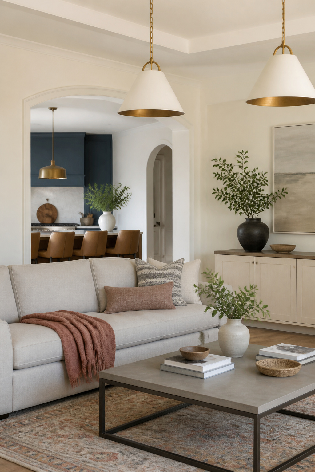
Warm white with real body is harder to find than you’d think. Great White carries enough pigment to read as intentional, not like you forgot to pick a color. I learned this in an open-plan rental where the kitchen and living room shared one long wall and no natural break between them. House White had disappeared against the cabinets, so I needed something that could hold its own across both zones without fighting the single accent wall I’d already committed to in Hague Blue.
That blue wall sat opposite the entry, deep enough to swallow light on cloudy afternoons. Great White balanced it because it is not a shy white; it has the warmth of old plaster rather than the chill of primer. In south-facing morning light it turned soft and buttery, and by evening under lamps it flattened to something calmer, almost oat-colored. The shift worked in my favor since the kitchen ran cool with stainless and the living room ran warm with a thrifted leather chair.
The mistake I nearly made was testing it only on the living room side. On the kitchen wall, with Hague Blue throwing reflected color, a cooler white would have gone gray and sad. Great White absorbed that cast and stayed friendly. Two coats, no primer on previously painted drywall, and it unified the space without making it feel like a single beige box.
16. All White
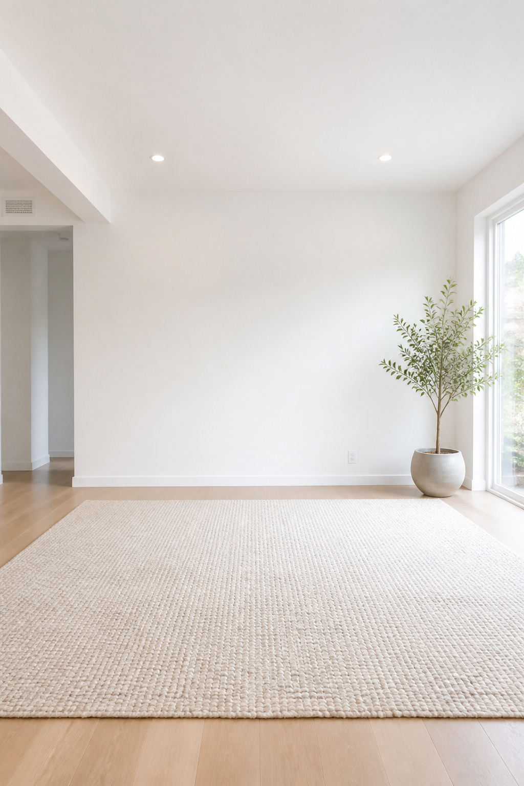
The truest white is the one color in this range that will not hide a single thing. Every brush mark, every patch in the drywall, every time the previous tenant bumped the corner with a vacuum shows through. I learned this the hard way converting a small back room into a photography studio for product shots. The lighting setup demanded a bounce surface with no color cast at all, so I mixed a pure titanium white base and rolled two coats across every surface, floor to ceiling. The retouching time dropped by half. Skin tones and fabric came back accurate straight out of camera, which paid for the extra paint in about three sessions.
That same quality makes it brutal to live inside. A true neutral white reflects every mood of the daylight and throws it back at you. Morning feels like a hospital corridor; evening under lamps feels like waiting. I kept that studio for six months before moving the gear to a rented space and painting the room back to a warm off-white that swallowed some of the light instead of returning it all. If you need a white for a living room people actually sit in, plan on adding warmth somewhere else, because the paint itself will give you none.
17. Slipper Satin

Warm gray with historical weight usually means either a museum piece or a compromise, but Slipper Satin threads the needle by staying quiet. In my friend’s Victorian rental, the original crown molding and fireplace surround needed a color that acknowledged the 1890s without turning the living room into a period drama. She chose Slipper Satin for the walls and let the architecture do the talking.
The bridge to now came through her sofa, a low-profile charcoal piece with clean arms and zero ornament. Against the warm gray, it read as intentional contrast rather than clash. The Victorian details stayed dignified; the sofa stayed modern. Neither one apologized.
What surprised her was how the color shifted. Morning light pulled out a stony coolness; lamplight in the evening brought the warmth forward and made the room feel smaller, cozier, almost like a different paint entirely. She stopped fighting it and started planning lighting by zone instead of relying on the overhead fixture the landlord installed in 1987.
For renters, the payoff is that Slipper Satin plays well with trim you can’t change and floors you didn’t choose. It photographs slightly creamier than it reads in person, so boards and samples are worth the trip before you commit to the weekend.
18. Revere Pewter

Gray-beige sounds like a compromise until you live with it. Revere Pewter became my default suggestion for anyone stuck between warm and cool because it simply refuses to shift dramatically as the day moves. Morning light keeps it reading as a soft warm gray; by evening lamps it settles into something closer to taupe without turning muddy. I have steered friends toward it for a north-facing rental where every previous sample turned blue by 4 p.m., a basement family room with one window, and a living room with honey oak trim that fights anything truly gray. In all three, the color stayed quietly consistent and let the furniture carry the personality.
The one place it failed me was my own bedroom, where I wanted something that would recede and let a vintage quilt be the focus. Revere Pewter was too present, too politely interesting, and after six months I found myself avoiding the room without knowing why. For a space that needs to disappear behind what is in it, go lighter or go darker; the middle ground demands attention in a way that reads as restlessness. I repainted within the year, and the quilt finally got the wall it deserved.
19. Elmira White

Elmira White carries a warm cream base that shifts under light, sometimes reading closer to oatmeal, sometimes picking up the faintest green-gray note in shadow. That undertone is what saved a living room I helped a friend sort out last year. She had inherited wall-to-wall carpet in a color somewhere between sage and institutional green, and the lease gave no option to pull it up. Most creams we sampled against it looked like a mistake we were trying to hide. Elmira White was the one sample that sat down next to the carpet and somehow made the green look intentional, almost like a deliberate contrast rather than a leftover. The green-gray in the paint spoke back to the carpet instead of fighting it. We painted the walls over a Saturday, kept the trim in a slightly cleaner white to avoid muddiness, and the room finally felt finished rather than endured. If you are working with dated green flooring or even a heavy velvet sofa in that olive range, this is the direction I would test first.
20. French Press

The navy I tried first swallowed the room whole after 4 p.m., so I painted over it with French Press, a deep brown that carries just enough red to stay warm without shouting burgundy. The shift was immediate. Where the navy flattened everything, this color picked up the copper from a pendant light I’d hung too high and finally made it look intentional, like the fixture had been chosen for the wall instead of despite it. Winter evenings are when it earns its keep. By six the room goes amber, and the brown reads almost chestnut against lamplight rather than sinking to black. The red undertone does the work; you don’t need extra warmth from bulbs or throws. My mistake was testing it on a patch near the window midday and worrying it looked too purple. Move the sample to the interior wall before you commit. North light quiets the red, and that’s the version you actually live with.
21. Natural Linen

Unbleached flax carries a warmth that reads as honest rather than cozy, and that honesty can tip into looking like a laundry pile if the room already leans farmhouse. I learned this in a cottage-style living room with a stone fireplace and wide plank floors, where the walls in this shade felt less like a choice and more like a default, the color of something waiting to be dyed. The space needed contrast or texture to wake it up, and without it, the tone flattened into the upholstery and the rug until the whole room felt like one continuous beige sigh.
The same paint shifted completely in a loft with concrete floors, exposed ductwork, and windows that faced north. There, the warmth stood up against the cool gray of the industrial shell instead of sinking into more warmth. The color looked intentional, almost like a work shirt hung against a concrete wall, useful and grounded. The distance between those two rooms was not the paint; it was the temperature of what surrounded it. In a warm, soft space, this shade disappears. Against hard, cool materials, it holds its own.
22. Sparrow

A medium brown-gray like Sparrow settles a room without making it feel heavy. I painted the backs of my living room bookshelves with it after years of watching objects disappear against white. The color is quiet enough that the eye reads it as shadow, not as a statement, so the books and pottery in front finally stood out with real separation.
The trick was keeping it to the recessed planes only. Sparrow on the flat wall would have turned the whole unit into a dark block, but on the backs it creates depth the objects can sit inside, not against. The gray in the mix keeps it from reading as pure mud, and the brown stops it from feeling cold under warm lamplight.
Objects that had always looked muddy against cream suddenly read as intentional. A terracotta pot I nearly threw out became the thing people asked about. The change cost a quart of paint and an afternoon’s work, and it solved a problem I had blamed on the objects themselves.
23. Carter Gray

Carter Gray, CW-80, reads as a true blue-gray in the morning light, not the muddy neutral that some mid-tone grays collapse into. I watched it on the walls of an east-facing living room where the sun arrives hard and honest, and the color held its cool temperament without drifting toward purple or green. By mid-afternoon, the shift was harder to ignore. The same walls turned flat and heavy once the direct light moved on, exposing a slump that warmer neutrals usually hide better. If your living room faces east and you need the walls to carry the same energy after lunch that they had at breakfast, Carter Gray asks more of your lamps and your furniture than a warmer hue would. The afternoon test matters as much as the morning one, and this color fails it quietly rather than dramatically, which makes the mistake easy to miss until the paint is already on.
24. Light Pewter

Light Pewter carries the same grayed warmth as its better-known relative but steps back about fifteen percent in depth, and that distance matters enormously in a tight room. The studio I painted two summers ago was 380 square feet with a single north window; the previous tenant had left the walls a saturated sage that turned the space into a walk-in jewelry box. Rolling Light Pewter over it took one Saturday and two coats, and the walls simply stopped pressing inward. The color reads as air rather than architecture, which is exactly what you want when the living room is also the dining room and the home office.
The trick that kept it from floating away entirely was one interior door left in the existing dark stain, almost walnut against the pale gray. That single vertical shadow gave the eye somewhere to land and kept the whole scheme from feeling like a rental wipe-down. For anyone working with a small neutral living room, the lesson holds: pale walls expand, but one dark anchor saves them from disappearing.
25. Manchester Tan

Manchester Tan carries a yellow base that reads warm and historical in daylight, which is exactly why it soured on me once I swapped the living room over to LEDs. The bulbs I first installed ran around 2700K but skewed pink, and against that light the walls turned the color of old nicotine, like the room itself had been smoked in for decades. I lived with it for six weeks thinking the paint had simply aged badly before I realized the bulbs were the culprit. Swapping to a 3000K LED with a fuller spectrum ran me about $34 for six bulbs, and the tan settled back into the soft, grounded neutral I had picked it for. The paint was fine; the light had lied. Now I test bulbs against the wall for a full evening before I commit to either the color or the fixture.
26. Pashmina

Pashmina AF-100 sits right where warm gray and taupe overlap, soft enough that it never reads cold but gray enough that it never drifts into beige territory. The versatility comes from that balance: north light keeps it cool, south light pulls the warmth forward, and in a living room that opens into a hallway or kitchen, it does the seamless transition work that makes open plans feel intentional rather than unfinished.
Three years ago I paid for a professional color consultation after second-guessing myself through six sample boards. The designer walked through with a fan deck, held swatches against the trim and the brick fireplace, and landed on Pashmina within twenty minutes. I spent $350 for that visit, plus the cost of the painter I hired to avoid cutting in around the built-ins myself.
The color was exactly right. The process, I am less sure about. I could have held my own fan deck against the same surfaces and narrowed to three candidates; what I actually bought was permission to stop worrying. For a renter or a first-time owner with a few hundred dollars and a Saturday, the money is better spent on paint and a good angled brush than on someone else to validate what your eye already sees. I have not paid for a consultation since.
27. Antique Pewter

Antique Pewter sits a few shades deeper than the standard Pewter family, and that extra depth is where the green undertone starts to drift in. In my dining-living combo, the wall between the two functions had been fighting me for months; the old color read as two different rooms depending on which window the light came through. Antique Pewter flattened that out. The same paint on both sides made the open plan feel intentional rather than leftover.
The real test came when I swapped the chairs. I moved the dining set into the living area and pulled the living chairs over to the table, expecting the room to fall apart. The color held. Furniture I would never have paired on purpose suddenly looked like it belonged to the same space. The green undertone was doing the bridging work, not the wood tones or the upholstery. That is the detail worth checking on your own walls: hold a fabric swatch or a chair cushion against the wet sample and watch whether the paint pulls the object in or pushes it out. If it pushes, you are looking at a cooler gray. Antique Pewter pulled.
28. White Winged Dove

White Winged Dove carries just enough gray to keep a warm white from going creamy or yellow, which matters when you are trying to make a bedroom feel like a living room without moving a single wall. I used it in a railroad-style apartment where the front room had to switch from sleeping to seating; the old color read as morning light, and this one reads as afternoon. That shift in temperature did more to signal "sit down and stay" than the sofa placement did. The gray influence keeps it flat under artificial light, so lamps do not turn it peach after dark. Two coats over a previous pale blue covered without primer, and the trim in the same finish made the built-ins disappear just enough. The trick is keeping the ceiling the exact same shade; a brighter white overhead would have turned the walls dingy by comparison. Renters should note that this color shows handprints faster than a true gray, but it also wipes clean without leaving a ghost.
29. Smokey Taupe

Smokey taupe sits in that narrow space where gray and brown refuse to pick a side, and that indecision is exactly what gives it atmospheric depth. On a ceiling, the color pulls the surface downward visually without making the walls feel shorter, a trick that only works if you break the plane somewhere. I learned this the hard way in a rental where the landlord had painted ceiling and crown the same flat white; the room felt like a box no matter what I put in it. White crown molding is the hinge that makes the ceiling color work. It catches light and creates a sharp horizon line, so your eye reads the taupe above as sky rather than lid. The molding needs to be genuinely white, not cream, or the contrast goes muddy and the ceiling drops again. I used a satin finish on the trim, eggshell overhead, and the difference in sheen did more of the lifting than I expected.
30. Hush

Hush sits so quietly on the wall you might call it gray in morning light and beige by lamp light, and neither camp in the room would be fully wrong. That barely-there lavender undertone is what lets it play both sides, though in my experience it satisfies purists of neither. The gray faction notices the warmth creeping in at the edges; the beige camp catches that cool veil and suspects they’ve been outmaneuvered.
In the living room where I watched this compromise unfold, the sofa read as warm greige while the same paint on the adjacent wall cooled toward slate, all because the window faced north and the recess stayed dim. The solution was not to fight the shift but to let it happen: walnut side tables and cream textiles kept the overall feeling from tipping too cold, while the paint itself did the work of bridging two palettes no one wanted to surrender. The risk is combining that subtle purple undertone with cool flooring and cool lighting all at once; then the room goes flat and dim, the color retreating into something closer to shadow than intention. Warm bulbs and at least one substantial wood piece keep Hush from disappearing into the architecture it was meant to soften.
31. Glacial Till

Glacial Till carries that faint blue-gray pull of actual stone, the color of gravel beds left behind after a glacier retreats. I first saw it used in a cabin living room in northern Minnesota where the walls needed to pick up the lake light without competing with pine beams and a slate hearth. There, against raw wood and wool blankets, it read as sophisticated rather than cold because the room had enough texture to ground it.
The same shade in my friend’s Chicago apartment, three floors up with southern exposure and oak floors, felt flat and institutional. The stone reference needs something organic nearby to make sense; without it, Glacial Till drifts toward office park.
This is the geographic specificity neutrals rarely advertise. A color drawn from a particular landscape asks for materials that belong to that landscape. In the cabin, the paint choice felt inevitable. In the city, it looked like a mistake about what "neutral" means. If your living room has no stone, wood, or rough textile in sight, this gray will fight the room rather than settle into it.
32. Wood Ash

Wood Ash sits in that narrow space between gray and beige where most "neutral" paints lose their nerve and drift toward blue or yellow. The warmth comes from a trace of green so subdued you barely register it until the light changes. I noticed it first on a sample board propped against a brick fireplace surround that had been painted white the year before. The white had seemed safe, but three months of actual fires left a ring of soot that scrubbing only spread into a gray smudge. The fireplace looked dirty even when it was clean.
Wood Ash was dark enough to absorb the soot rather than advertise it. The same smoke that had ruined the white now barely registered, and the occasional scuff from logs or tools blended into the tone instead of screaming across it. A damp microfiber cloth with a drop of dish soap handles the ash dust after every third or fourth fire, no elbow grease required. The paint has held for two winters now, and the surround looks intentional rather than neglected, which is the difference a half-shade of warmth makes when you live with a real fireplace instead of staging one for a photograph.
33. Coastal Path

Gray-green paint with a weathered, sun-bleached quality reads as neutral because it borrows from driftwood and dried beach grass rather than making a color statement. The trick is letting it stay muted enough that it disappears into the background, which means checking it against both morning and afternoon light before committing.
I spent a weekend in a Carolina beach rental where the owner had already painted the living room this shade, and I arrived ready to hate someone else’s choice. The walls were the color of old lobster-trap rope left out for two seasons, slightly greener than sage, slightly grayer than sea glass. By Saturday evening I stopped noticing the paint at all and started noticing how the room held its breath during high tide, everything going quiet and gray in the best way.
The owner told me she’d picked it to hide the sand that blows through the screens from April to October. That practical decision, made for maintenance, had accidentally created the calmest space I’d sat in for months. I left with the name of the color written on a grocery receipt, though I still haven’t used it in my own place. Something about it belonging to that particular weekend makes me hesitate to transplant it.
34. Rattan

Rattan furniture had me chasing a color that does not exist as paint. I brought home three swatches labeled warm honey or natural cane, held them against the frame of a secondhand peacock chair, and each one looked like a mistake on the wall. The chair itself is the color: oxidized straw, hand-bent, slightly glossy where palms have worn the arms. Paint cannot catch that because the material is doing the work, not a pigment.
I tried anyway, on the short wall behind the chair. The closest match went flat and sad, like a rental kitchen from 2003. Two coats in, I painted over it with a soft white and let the chair carry the whole moment. The gap between them, that six inches of trim, is what makes the rattan read as intentional rather than orphaned.
Objects want to be objects. The peacock chair cost me $80 at a church sale and two afternoons of tightening cane with a damp cloth. It is warmer than any neutral I could roll on, and it moves with the light in a way latex never will. My living room stayed quieter once I stopped asking the wall to do the furniture’s job.
35. Chatsworth Cream

Chatsworth Cream carries enough yellow to read as aged plaster rather than fresh drywall, which is exactly why I tried it on a set of IKEA Billy shelves I’d hacked with trim and crown molding. The paint gave them the weight of something built in 1920, a trick that worked almost too well. My desk lamp, a matte black LED thing from Target, looked like it had been dropped in from another building entirely. The coffee table, clean oak with rounded corners, felt equally lost. For two weeks I lived with the clash, telling myself the contrast was intentional. Then I moved the modern pieces to the bedroom and brought in a brass floor lamp with a worn patina and a walnut side table I’d found at a flea market for $40. The room finally felt like one conversation instead of two. The edit cost less than the original lamp, and the shelves now look like they were always meant to hold old books and dented objects rather than catalog furniture.
36. Frosted Toffee

Warm mid-tones with a candy name usually read too sweet for a living room wall, but Frosted Toffee earns the reference through desaturation, not sugar. The pink and amber notes sit far enough back that the color registers as approachable rather than decorative, which is exactly why it works in a kitchen-adjacent living room.
I noticed this most in a space where the only window faced north and the cooking area sat ten feet away. Morning light came in flat and gray; by evening the under-cabinet LEDs threw warm pools toward the sofa. Frosted Toffee took both without shifting noticeably. Where cream walls would have gone sickly in the artificial light and a true beige would have flattened to mud by morning, this color kept its balance. Grease and steam from daily cooking never seemed to stain the walls visually the way they did on a former landlord’s stark white.
For renters, that indifference to conditions matters more than the shade itself. A color that forgives your lighting and your ventilation is a color you can live with past the first month.
37. Stone Brown

Stone Brown sounded like exactly what I wanted on the swatch: warm, grounded, the kind of color that makes a rental feel settled. The living room I tried it in was north-facing and already dark, and this paint turned the walls into something that felt less like a color choice and more like a warning about drainage. For two days the room looked like a root cellar with a sofa. The brown had swallowed every scrap of light that managed to get in.
What pulled it back was not a lamp or a mirror. I moved in every plant I owned, four of them, nothing fancy, just a pothos and a snake plant and two things from the grocery store that had been dying in the kitchen anyway. The green against that literal dirt tone gave the eye somewhere to rest that wasn’t the walls. Suddenly the brown read as soil instead of shadow, and the room felt intentional, almost like a conservatory that happened to have a television.
Literal color names need a second room to live in, or at least a space where the sun does half the work. I kept the paint in the end, but I learned to test them where the light is worst, not where it is best. A name that tells the truth can be too honest for its own good.
38. Mocha Cream

Mocha Cream carries enough brown saturation to read as intentional rather than apologetic. I noticed this most clearly in a south-facing living room where terracotta planters, a walnut coffee table, and a stack of ochre-spined paperbacks all needed a backdrop that would let them relate to each other without shouting. The wall color did exactly that. It held the warmth of the collection together and kept the room from feeling like a furniture showroom.
The saturation is the detail that matters. A paler neutral would have let each piece compete for attention. Mocha Cream recedes just enough to make the objects feel collected rather than staged, which is the difference between a room you live in and one you photograph. It pairs especially well with brass hardware and unbleached linen, less successfully with cool chrome or stark black-and-white prints. The undertone leans red, not yellow, so it turns muddy in north light. Test it at the hour you actually use the room.
39. Old Soul

The first time I saw a brand-new wall finished to look like it had been there since 1926, something in my chest tightened. The plaster was tinted in layers, then sanded back at the edges so the "wear" sat exactly where a century of hands would have left it. The color itself was beautiful, a warm putty somewhere between taupe and oatmeal, but the fakery of the distressing made me want to turn around and leave the room.
That reaction stuck with me through two weekends of testing samples on my own living room wall. I tried the same layered approach, then stripped it back, then tried again with half the steps. What I finally accepted is that the discomfort was mine, not the room’s. A new house pretending to be old reads as a stage set only when the wear is too specific, too storyboarded. The color itself, that muted, time-softened neutral, does not lie. It simply is what plaster becomes when the sun has worked on it for years.
Now my living room wears a single wash of aged-complex gray-beige, no sanding, no artful chips. The history it suggests is vague enough to let a visitor believe what they want, and the room feels settled in a way pure white never managed. The trick is stopping before the finish becomes a costume.
Frequently Asked Questions
What is a good neutral paint color for a living room?
Warm sandy neutrals like Fake Tan and straw tones like Matchstick work well in south- or west-facing rooms where sunlight keeps the yellow from reading orange or flat. For cooler light, Vichyssoise, a pale silvery green, or Shadow Gray, a cool mid-gray with blue undertones, hold up better in north- or east-facing spaces. The right choice depends on your room’s directional light and what it needs to play against, whether oak floors, brick fireplaces, or existing trim.
How do I find the best neutral living room paint colors for my project?
Start with the elements you cannot change: flooring, natural light, fireplace materials, and existing furniture. Test samples on the wall that gets the most afternoon light first, not the one you hope to fix, and wait a full day before deciding. Three textures minimum, woven, plush, and rough together, keep a neutral space from feeling vacant no matter which color you land on.
Can neutral paint colors work in different design styles?
Yes, neutrals unify rather than define a space, which lets the architecture and furniture carry the style. Slipper Satin reads historical enough for Victorian crown molding while pairing cleanly with a low-profile modern sofa. Ancona Blue does coastal without rope accents when set against rattan and honey wood. The paint stays quiet so the pieces around it can shift the room’s era or mood.
How do you choose the right neutral palette for your room?
Work with what is already fixed in the space instead of forcing a new look onto it. A gray wash at 10–15% opacity can bridge cool paint like Blackened with warm pine floors. Clunch’s pink undertone picks up clay in brick rather than fighting it. James White’s faint green-gray drift keeps dimension in afternoon shadow where safer whites go flat. The palette succeeds when the walls and the permanent features start reading as one decision.