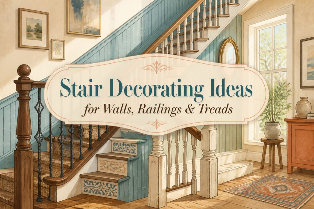
Decorating stairs runs from a $340 baluster swap to a full salvage beadboard wall, and the deciding factor is usually how much of the climb you actually see. A back stair you use twice a day can handle a bold navy that swallows afternoon light; the main hallway needs the mirror that catches what daylight the landing gets and throws it back toward the treads. Jennifer Kopf’s turquoise beadboard in a Missouri farmhouse works because the color has already softened, the edges have settled, and the whole wall reads as inherited rather than installed. That distinction, between bought-in-a-batch and collected-over-time, is what separates the ideas that hold up from the ones that look finished only in the photo.
1. Salvaged Beadboard
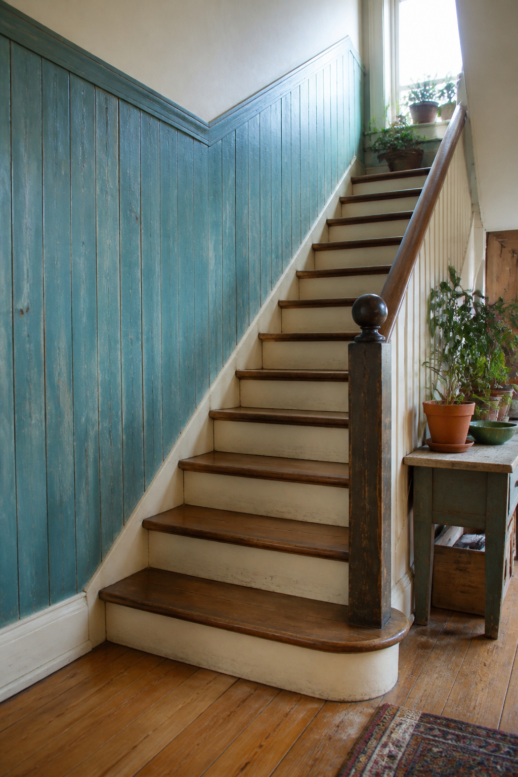
Salvaged turquoise beadboard along a stair wall carries a kind of history that new material never quite matches. The color has already softened, the edges have settled, and the whole wall reads as something inherited rather than installed. Executive Editor Jennifer Kopf used exactly this in a Missouri farmhouse back entry, running the boards as wainscoting to give the space what she calls a "been-around-forever feel." That is the effect most weekend projects are chasing.
Finding it takes patience. Architectural salvage yards carry beadboard pulled from old porches and kitchens, though the supply is unpredictable. Habitat ReStores sometimes stock it by the stack. The boards will not match perfectly, and that is the point. A mix of widths and slight color shifts reads as collected over time rather than bought in a batch.
Installation means letting the imperfections show. Gaps between boards of different eras get a thin strip of matching trim rather than forced alignment. The turquoise that has already faded unevenly stays that way; a single coat of clear sealer protects the surface without flattening the variation. The result looks like it was always there, which is the only test that matters for stair walls you pass a dozen times a day.
2. Hang a Mirror
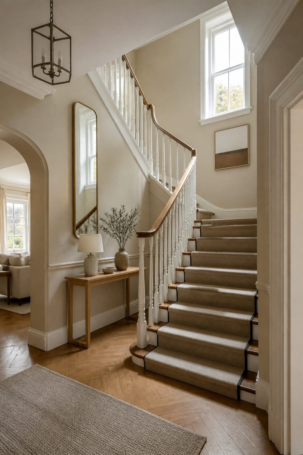
A mirror hung on a stair wall does more than fill space; it catches whatever daylight the landing gets and throws it back up the steps. The wall beside a staircase is usually the darkest spot in the house, and a mirror there turns the light you already have into something that actually reaches the treads. The trick is keeping the bottom edge low enough that someone climbing can still see into it. On a sloped ceiling or a stair wall that angles with the roofline, the temptation is to push the mirror high to clear the slope. That leaves it floating above eye level, reflecting nothing but the ceiling and the top of someone’s head. A taller, narrower piece works better than a wide one here because it gives you glass lower on the wall without fighting the angle above. I have measured twice for a stair mirror and still hung it an inch too high; the fix was a smaller hook and a frame that sat lower on the hardware.
3. Built-Ins on the Landing
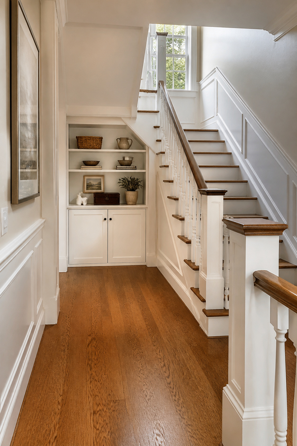
A stair landing is dead space until you treat it as a room. I added a shallow bookcase and cabinet combo to mine after measuring the passage width: anything deeper than 12 inches crowds the walk line, and a landing needs to stay clear enough for two people to pass or for someone carrying a laundry basket to turn around. The Jersey Ice Cream Co. design that convinced me used the same depth for open shelving, and they filled theirs with books, art, and collected pieces. Mine holds the overflow I had no wall for elsewhere: a ceramic pitcher that was too tall for kitchen cabinets, a stack of art books I actually pull out, and the one antique box that used to live on the floor of my closet. The closed cabinet below hides the dog leash, extra light bulbs, and the toolbox I need for every other project in the house. Without the doors, the landing would have become a dumping ground instead of a display.
4. Contrast Wainscoting

Two-tone wainscoting on stairs works best when the darker color sits below the rail and the lighter one above it, because the lower half takes the scuffs and the upper half catches what light the stairwell gets. I used a deep navy on the bottom and warm white on top in a house with a closed stringer staircase, and the contrast made the wall feel taller than the ceiling actually allowed.
The tricky part is the transition line on uneven stair walls. In older homes, the rake of the stairs rarely meets the landing wall at a clean angle. I ran the chair rail parallel to the stair slope instead of level, which sounds wrong until you stand at the bottom looking up; the line reads straight to the eye because it follows the movement of the steps. On the landing, I picked a height where the rail would have landed if the stairs had continued, then carried it level through the short wall. That small jog is invisible in daily use, but a level line slashing across a sloped wall would have looked like a mistake every time you walked past it.
Keep the darker paint below the transition on every plane, including the short vertical walls between winders. I tried carrying the light color down one of those kite-shaped walls to "open things up," and it broke the visual rhythm completely. The eye wants the dark mass to anchor each step of the climb.
5. Painted Treads
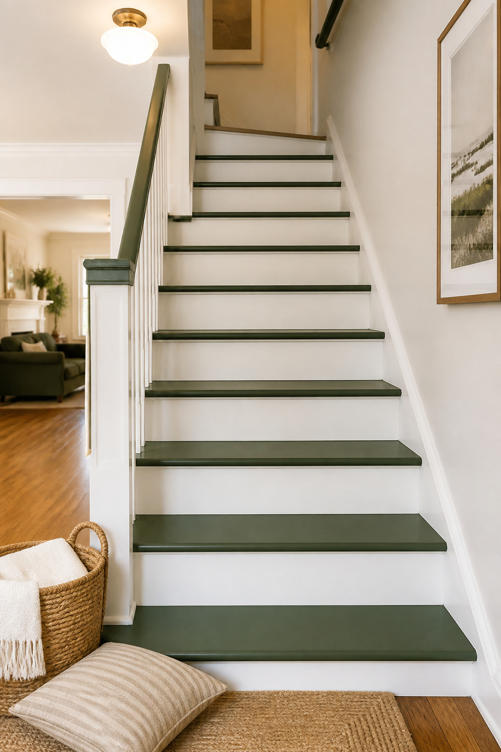
A coat of Raleigh Green by Benjamin Moore on stair treads turns a plain white stairwell into something with actual personality. The color reads as a happy historic green, cheerful without shouting, and it pairs naturally with worn wood or painted risers.
Prep matters more than the brush you use. I once skipped primer on a set of pine basement steps, thinking two coats of quality paint would seal things up fine. Within two months the knots bled through and the finish looked patchy in afternoon light. Now I prime every time, even when the can claims paint-and-primer-in-one. Sand the treads to scuff the old surface, vacuum the grit out of corners, and let the primer cure overnight before the green goes down.
For the best wear, a satin or semi-gloss sheen on treads lets you wipe away scuff marks instead of repainting them. A painted runner in a lighter neutral base, with thin darker borders, is another way to get color underfoot without committing the whole tread. Either approach takes a weekend and holds up to real traffic.
6. Historic Charm
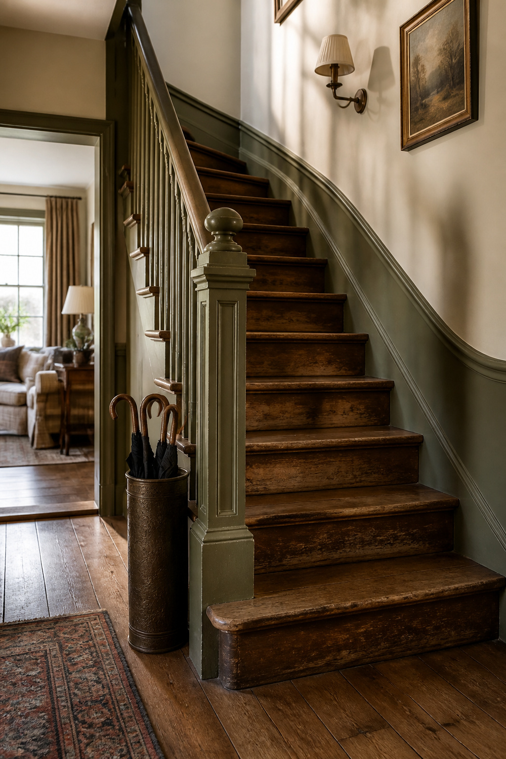
Old houses hand you details that new construction charges extra for, and the stairs are where those details pile up. The trick is knowing what to strip back and what to paint over. Worn wood treads carry more charm than any stain can replicate, so leave the treads bare if the wear is honest and the surface is still safe. Paint the newel post and banister instead, in a crisp black or a deep sage that reads fresh without erasing the age.
Reproduction parts make sense when the original is rotted past saving or missing entirely. A reclaimed riser, raw wood or patinated metal, adds the same character without the hunt for a perfect match. I have seen staircases where every riser came from a different barn, and the mismatch is what makes the staircase feel collected rather than decorated. The cost stays low because the material is already out there; the labor is in the fitting, not the finding.
Where the treads are too far gone to leave exposed, paint them. But paint them a color that owns the choice, not a color pretending to be wood. The worst mistake is a half measure, a stain trying to hide damage that stain only spotlights.
7. Collections on Display
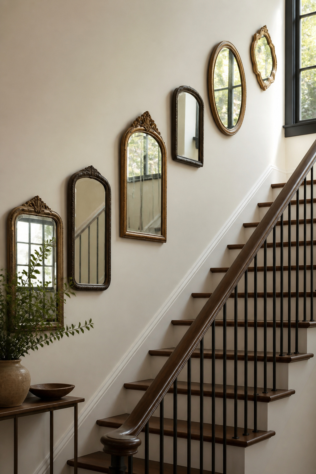
A staircase wall is one of the few places where a collection actually makes sense, because the climb gives you a natural viewing pace. I started with vintage mirrors after seeing the idea somewhere, but the first attempt looked like a junk shop. The fix was editing down to pieces that shared a frame finish or a shape, then hanging them in a staggered step pattern that echoed the stairs themselves.
Keep a safe buffer from the handrail, roughly the width of your hand or a little more, so nobody grazes a frame on the way down. Matte glass or matte frames help too, since overhead fixtures throw glare at an angle on a stairwell. Two rows interlock like steps, which gives you flexibility if your collection has mixed sizes. Baskets, concert posters, even framed shirts work the same way, but the wall needs one clear anchor or the eye gets exhausted before you reach the landing.
8. Wallpaper Matching the Door
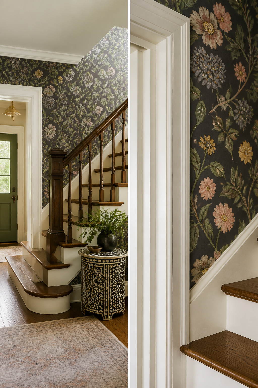
Carrying the same wallpaper from your foyer up the stair wall sounds simple until you hit the door frame. Paper meets trim at an inside corner that wants to tear or bubble, and the pattern has to line up across that break or the whole effect falls apart.
I learned the hard way that the seam belongs on the door casing, not floating on the wall beside it. Cut the strip so the pattern matches the last full strip on the foyer wall, then wrap the excess onto the casing edge. The eye reads the pattern as continuous, and the actual seam hides where the casing shadow already falls. For the return edge along the casing face, I cut a fresh strip rather than wrapping the same piece, since the turn kinks the paper and the pattern drifts after even an inch of bend.
Renters can do this with peelable paper if the casing is smooth; painted MDF casing takes adhesive well, but stained wood with open grain will grip too hard and tear on removal. In that case, stop the paper at the corner and live with the slight pattern shift. It reads as intentional if the color matches, and it saves your security deposit.
9. Statement Furniture
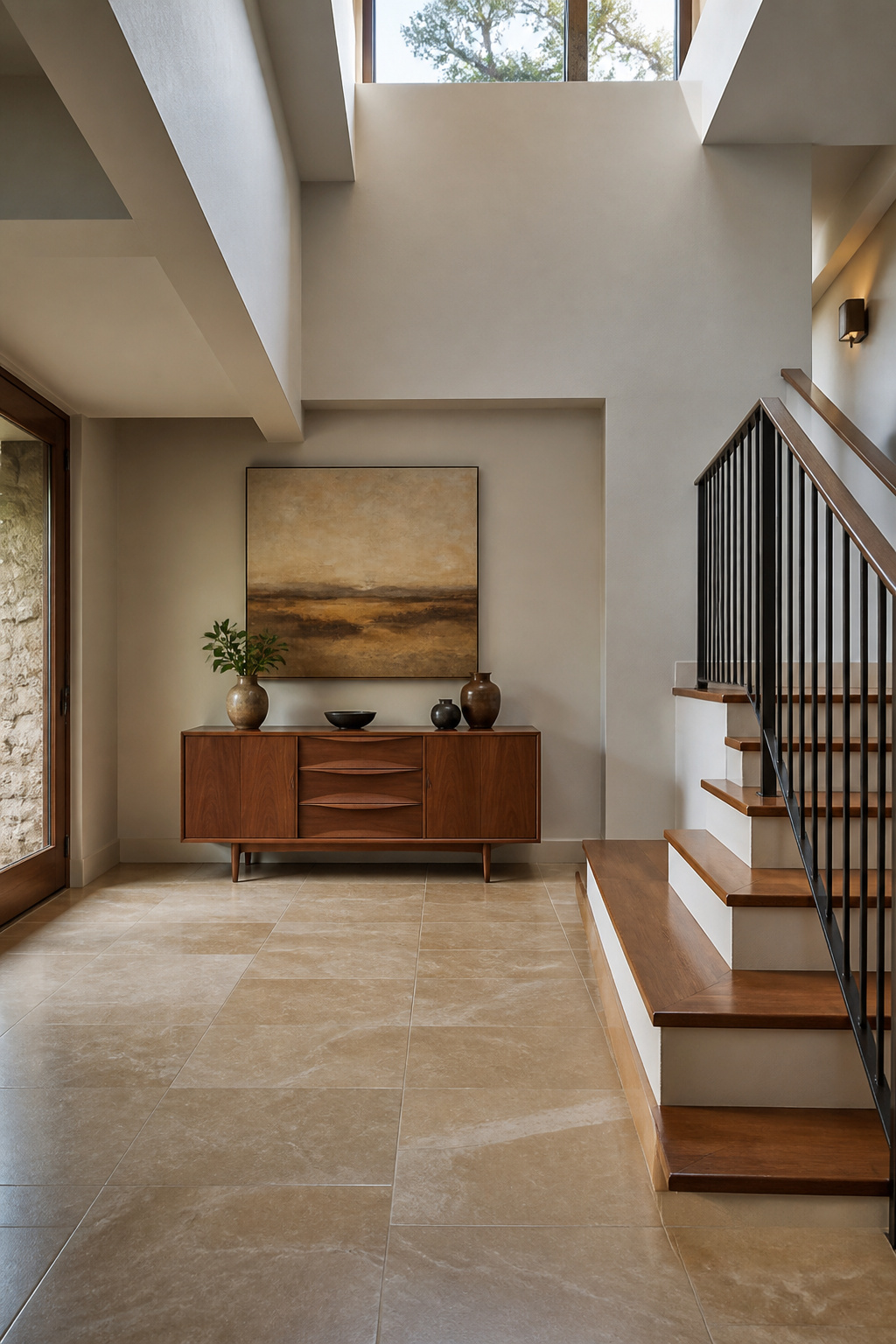
A stair landing is dead space until you give it a job, and one strong piece does more than three small ones fighting for attention. The sources point to a midcentury sideboard piled with antiques or a single oversized pitcher in the corner of an L-shaped run. Scale matters more than style. The piece needs to sit where it does not crowd the walking path, and that means measuring the clearance before you buy. I learned this the hard way with a console I placed at the top of my own landing. It looked right in the room below, but two weeks in I moved it because the overhang caught every elbow on the turn. Now I keep at least 30 inches of clear passage on the approach side, the width of a standard door, and test the path with a laundry basket before I commit. A single large canvas on the wall above can carry the same weight if floor space is tight. The negative space around it does the framing, and the eye reads the whole landing as intentional rather than leftover.
10. Dark Paint
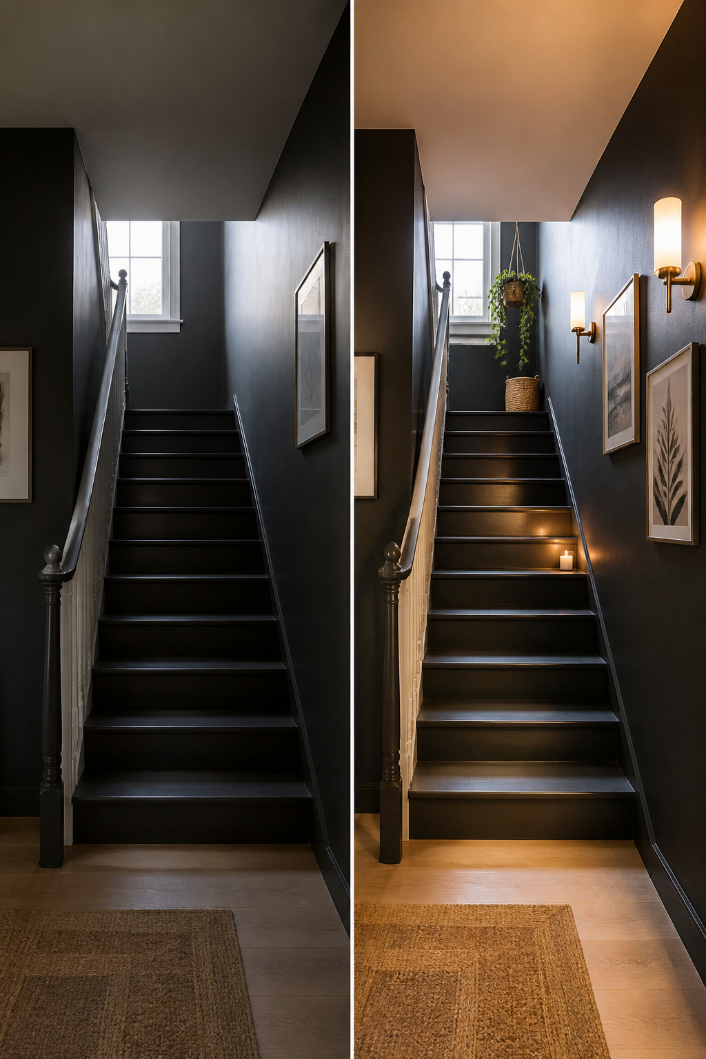
Charcoal or navy on a stair wall reads as sophisticated when you hang light frames against it, but the same color in a windowless stairwell can turn oppressive by mid-afternoon. I learned that difference the hard way after painting a narrow enclosed run deep gray and watching it absorb every scrap of daylight after 3 p.m. The fix was warmer sconces on the landing, which brought back enough shadow and depth to keep the color alive without glare.
Not every room can carry that weight. A stairwell open to a living area with good natural light handles dark paint well; a separate back stair with one small window does not. If your treads or railing are already dark, offset them with lighter walls rather than doubling down. Aged wood frames and a rustic fixture add warmth where the architecture runs cold, but the paint itself has to earn its place hour by hour.
11. Wood and Iron Railing
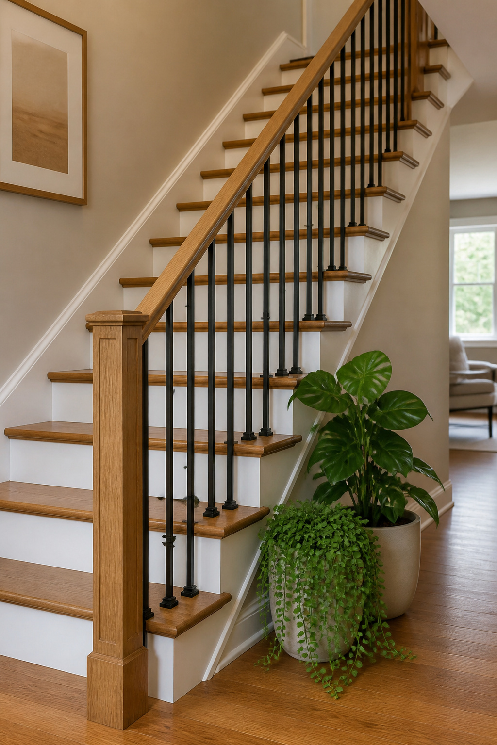
Wood handrails with iron balusters sit right in the middle of traditional and industrial, which is exactly where most American staircases already live. I priced out a full replacement last spring, and swapping every baluster for iron while keeping the oak rail I already had came to about $340 for a thirteen-tread run. A complete wood-to-wood upgrade would have run closer to $900, and all-iron would have needed a custom fabricator I couldn’t find within two counties.
The wood top matters more than I expected. Hands grab that rail daily, and oak wears in rather than wearing out. Iron rails in the same profile feel cold in winter and show every fingerprint. My contractor pushed for a full iron system until I ran my hand down a sample on a 45-degree morning; the decision made itself.
Iron balusters spaced every four inches keep the look open without triggering modern code issues. I used plain square bars for the straight run and a single basket twist at the turn where the stairs switch back. The mix reads intentional, not like I ran out of money halfway through, which was the whole point.
12. Beach Vibes
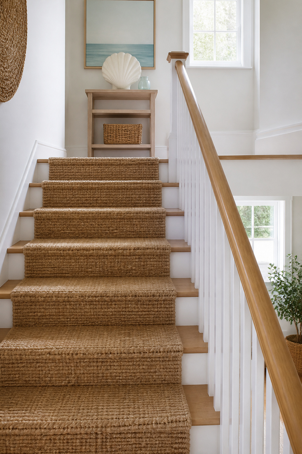
Woven seagrass stair runners read coastal without the kitsch, and they hold up to busy households in a way softer materials do not. That was my first instinct for a beach-adjacent look, but the texture felt too literal once I laid a sample against the wall. I swapped it for a natural-toned wool carpet in a similar weave, something closer to the vintage hallway look I had pinned, and the stairs relaxed immediately.
Raw wood or patinated metal on the risers would have pushed the theme further, and I considered reclaimed boards for about a day. The character is real, but in my narrow stairwell it read shipwrecked, not shorehouse. I kept the risers painted and let the runner do the work.
If you want the coastal feel without the carpet commitment, painting your own runner with tape and two straight lines down the center gives you the same visual break for the cost of a quart of paint. I tried this on a basement trial run first; the lines wandered on the third step and I learned to snap a chalk line before taping.
13. Stair Runners
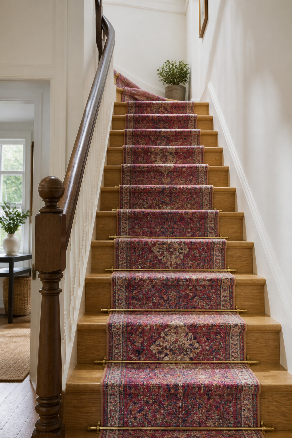
A stair runner changes the whole feel of a hallway without touching the walls. I installed mine with brass stair clips spaced every third step, which sounds fussy but takes about twenty minutes once you mark the pattern. The runner itself was another story. I ordered 27 inches, and 24 inches showed up, a difference that matters when you want the wood border to read as intentional, not an afterthought. Rather than send it back and lose a weekend, I shifted the whole strip an inch toward the wall and called the wider reveal on the outer side a design choice. The real mistake was starting at the top of the stairs. I thought working downward would be easier on my knees, but gravity had other plans; the runner kept sliding under my weight and the alignment wandered by the fourth tread. Starting at the bottom lets each step anchor the next one up, and the clips bite cleaner when you are not fighting the drape.
14. Practical and Pretty Storage
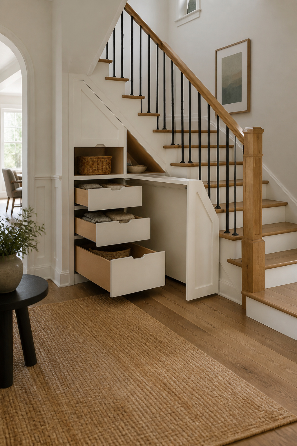
The triangle under a closed stair is usually dead space wrapped in drywall, and opening it up for storage only helps if the stuff you put there is stuff you actually reach for. My first attempt was a single deep cabinet with a door on the hallway side. Shoes went in, but the back corner turned into a black hole for single mittens and a lint roller I used once. The cabinet was technically full, yet nothing I needed was at hand when I was running out the door.
The second version works better because I split the cavity into shallow pull-out drawers on the hallway face and left a deeper bay behind them for the vacuum and a folding step stool. The drawers are only about fourteen inches front to back, which means nothing gets buried; the vacuum bay opens from the side, where the stair stringer leaves just enough clearance. Fitted units like these make sense for shoes, coats, and dog leads because that is the moment you use them, and the storage has to match the motion of leaving. A desk fitted underneath sounds clever in theory, but the ceiling slope over my treads drops to about four feet at the outer edge, and I would crack my head on it within a week. For a landing with full head height, shelving for books and collected pieces is the better play; under a running stair, keep the storage shallow and specific to what you grab on the way out.
15. Newel Post Cap
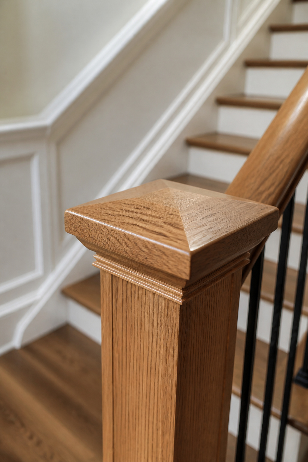
The newel post cap is the one detail on a staircase that reads custom even when it isn’t. I noticed this first in a friend’s 1920s bungalow: her caps were simple oak squares, slightly oversized, with a tiny chamfered edge that caught the light. The posts underneath were standard builder-grade. The caps had been swapped in a weekend.
A cap that sits proud of the post by half an inch or more does the visual work. Anything flush looks like it came shrink-wrapped. I fitted one on my own stairs by unscrewing the existing cap, which was just a thin disk of poplar, and replacing it with a slightly larger square of red oak I found at a local lumberyard. The post itself stayed put. I cut the new cap with a miter saw, sanded the edges, drilled pilot holes from underneath, and attached it with finish screws I countersunk and filled.
Styles that read catalog tend to be turned, over-decorated, or too perfectly symmetrical. The ones that look built-in are simpler: a block, a low pyramid, a shallow dome. Paint or stain to match the handrail, not the post, and the cap ties the whole railing together instead of floating on its own.
16. Salon Wall
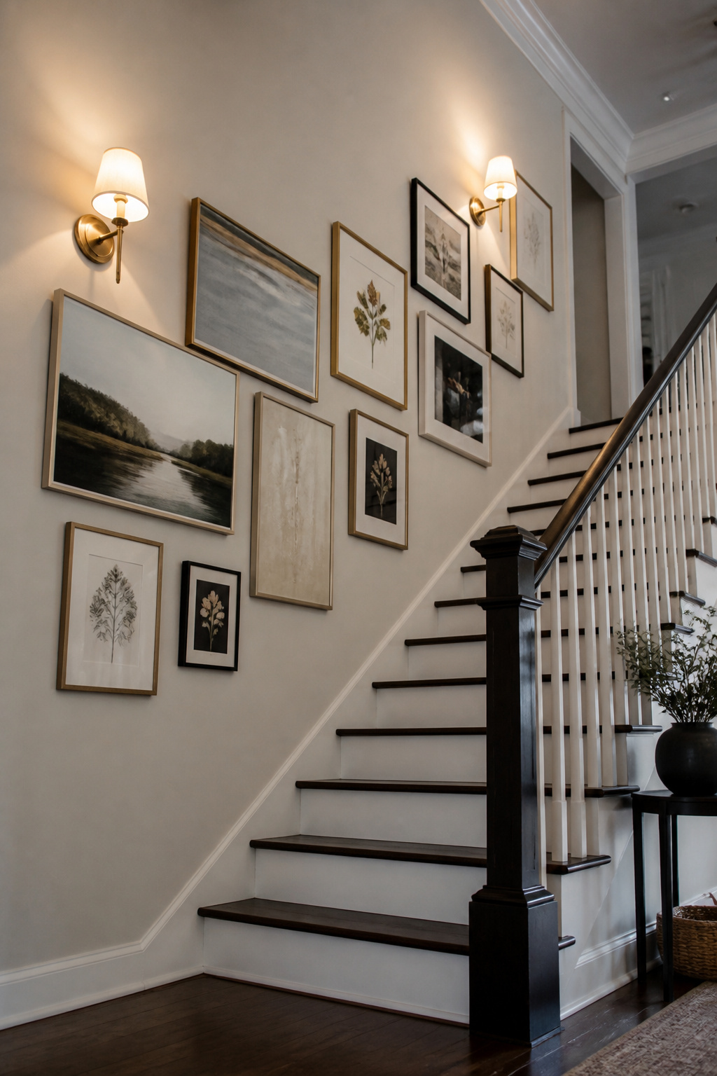
A salon wall climbing a staircase lives or dies on its sightline. The trick is to keep the center of each frame 57 to 60 inches above each step, measured parallel to the handrail so the grid rises with you as you walk. I learned this the hard way after hanging my first row at eye level from the floor, then stepping back to find the top frames crowding the ceiling and the bottom ones lost behind the rail.
Frame size matters more here than on a flat wall. Squares in the 8-by-8 inch range read tidy and uniform, while 8-by-12 rectangles add rhythm that helps the eye travel upward. Either way, leave 1.5 to 2 inches between pieces, and stay at least 2 inches clear of the handrail so descending knuckles don’t bump glass.
For renters, adhesive frames solve the nail problem cleanly, though only if the paint underneath has cured fully. Two weeks of drying time is the minimum before any sticky backing goes up; fresh latex will off-gas and weaken the bond. I would skip the mock-up phase on a stair wall, though. Tape paper templates to the risers, step back from the bottom, and you catch the real viewing angle before committing holes or adhesive.
17. Trompe L’Oeil Paint

Trompe l’oeil paint can trick the eye into reading a flat stair wall as something architectural, like stone blocks or panel molding. The technique is old, but the supplies are basic: a level, painter’s tape, and two or three shades of the same color family. I spent an afternoon once mapping out faux wainscoting up a stairwell, measuring each "panel" to shrink slightly as the stairs rose, the way real perspective would work. The first three steps looked convincing. By the time I reached the landing, the angles had drifted, and the whole thing read as off-kilter stripes. I painted over it the next weekend.
What stayed was simpler. I kept the tape, skipped the perspective games, and painted a single band of darker color where a chair rail would sit, about 32 inches up from each tread rather than from the floor. The line stays level to the eye as you climb, and the slight shift in color does enough of the work. Two quarts of paint, one Saturday, no special brushes.
18. Painted Balusters
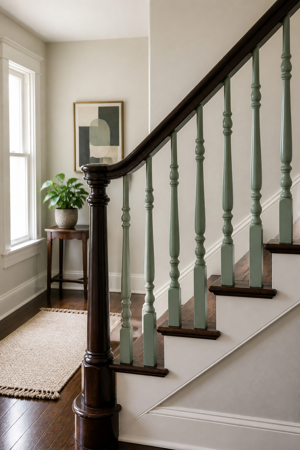
Painting every baluster the same color as the handrail flattens the whole railing into one shape. Splitting them, like the blue-against-blue pairing that gets repeated on the front door, gives the stairway its own rhythm without demanding a second color that fights everything else in the house.
The turnings are where patience breaks. Those narrow waists and bulbous knuckles collect drips if you brush freehand, and tape that rides up over even one curve telegraphs under the paint. Cut the tape into short strips, maybe two inches, and overlap them in small chevrons around each turning so the edge follows the profile instead of fighting it. I stopped after six balusters the first afternoon. The work is simple but the sight line is low, and rushing the second coat shows up at every angle you climb past.
19. Small Changes, Big Impact
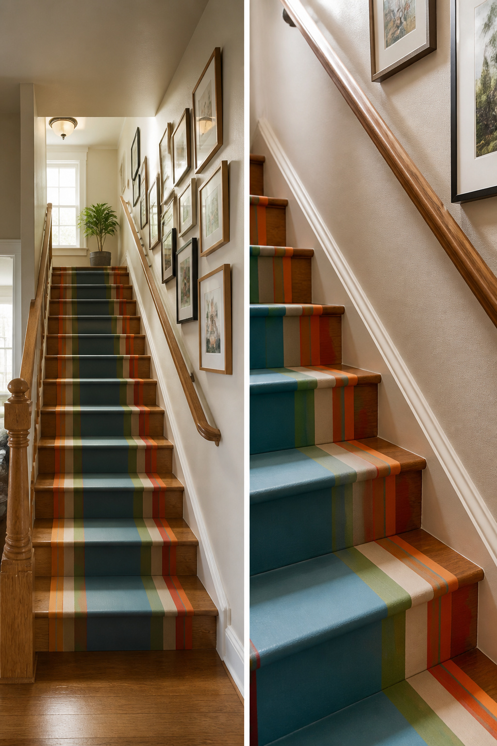
The stair runner I almost bought was a woven seagrass, the kind meant to endure busy households, but the quoted install pushed the job past a weekend and well past what I had. I stepped back and looked at what actually bothered me: the bare wood treads read as unfinished, and the wall above the handrail was just beige nothingness. Two problems, not one project.
For under fifty dollars, I swapped the runner idea for a painted runner using two strips of painter’s tape and leftover satin wall paint. The seagrass would have lasted longer, but the painted version took two hours and reads the same from the foyer. The wall got three large black poster-sized frames with a single family photo each, hung at the sightline you naturally follow climbing the stairs. Keep the center of each frame about six to twelve inches above the rail, not at standing eye level, or the rhythm breaks on the ascent.
What felt permanent about the original stair was the assumption that covering treads meant committing to carpet or living with bare wood. Tape and paint proved that wrong. The frames, hung with a simple row rather than a full gallery layout, took less planning and still carried the wall. Both edits reverse clean if the lease ends or the taste shifts.
20. Bold Paint Choices
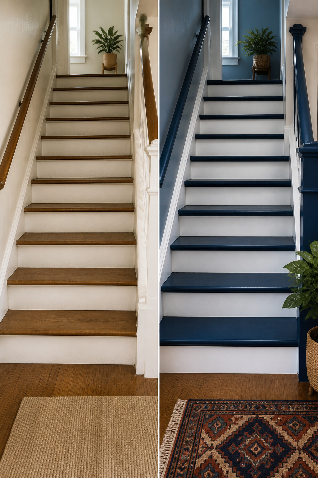
Gray lasted two years on my stairs before I admitted it was just wallpaper paste in paint form. I switched to a saturated blue, the kind that reads almost navy at 7 a.m. when the east light hits it straight on, then warms to something closer to teal by 7 p.m. under the landing fixture. The risers stayed white, which keeps the climb from feeling like a tunnel. Bold color works on stairs only if you break it somewhere, and white risers are the cheapest break there is. A friend painted her entire staircase, sides and all, in bright yellow; the continuous color does elongate the wall, but you need the nerve to live inside a feature that shouts back at everyone who walks in. I did not have that nerve. The blue was compromise enough.
Gallery Walls That Work
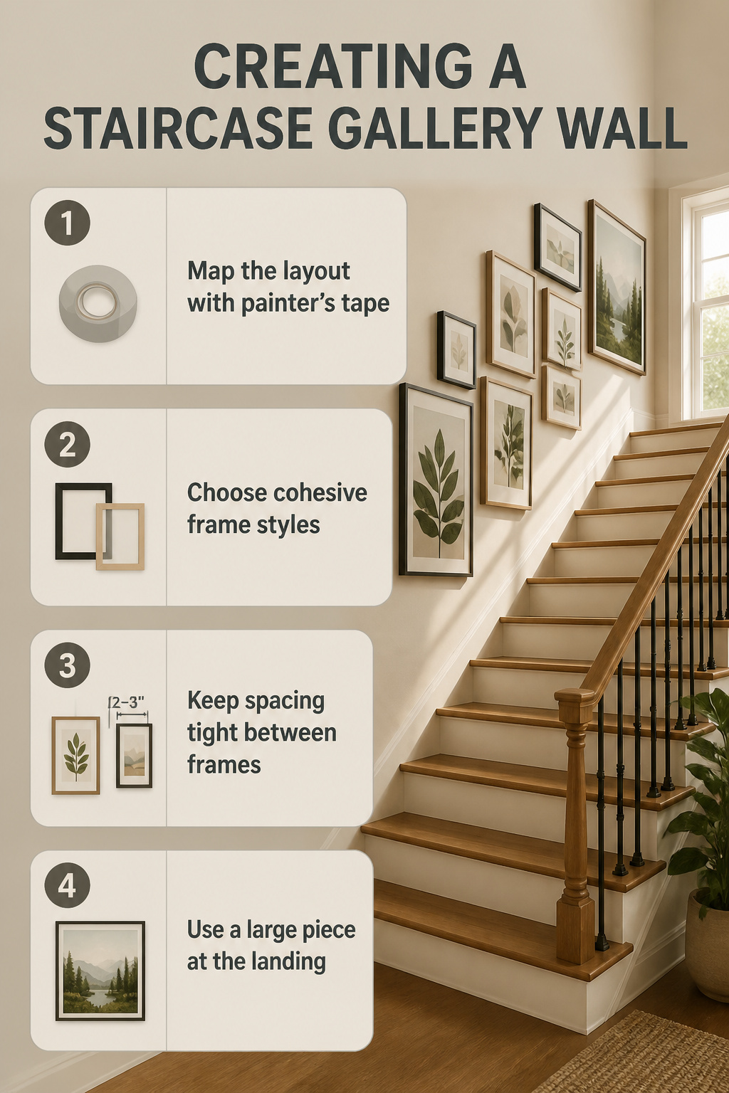
A staircase gallery wall lives or dies on how it handles the incline. The easiest mistake is hanging frames level with the floor; the bottom edge of each frame should climb with the stairs, rising about an inch for every six to eight inches of horizontal wall. I map this out with painter’s tape first, running a long strip along the intended baseline so I can step back and see where the sightline actually goes.
The current relaxed layout mixes sizes without the old grid rigidity. I lean toward one unifying element, matte black frames or light wood, so the cluster still reads as one continuous idea even when the art inside shifts from abstract to botanical. For a shorter run, a single oversized piece at the landing does more work than a dozen small frames fighting for attention up the rise. The landing is where your eye naturally rests between flights, and a large nature-inspired print there gives the climb a destination rather than just a sequence.
If the wall is long, the gallery can afford more variety. Keep the spacing tight, two to three inches between frames, so the group holds together as you move past it. The frames themselves should stay cohesive; the art inside can wander across styles as long as one thread, color palette, frame finish, or subject mood, pulls it back together.
Stair Lighting
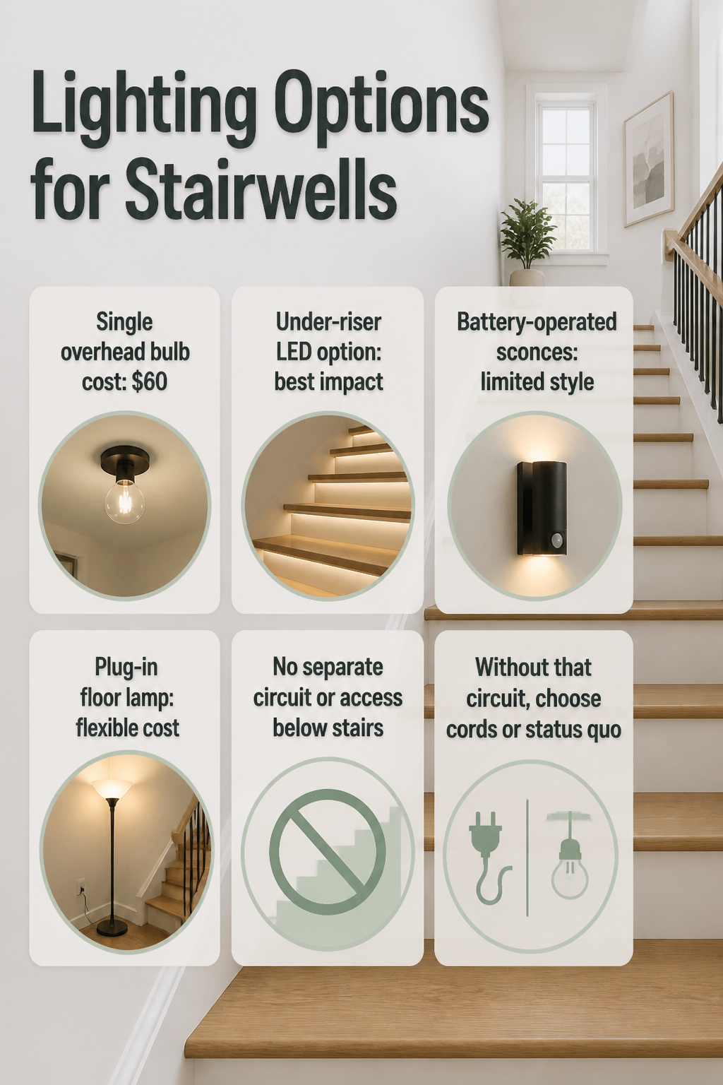
The stairwell in my last rental had a single overhead bulb that left every step looking like a shadow. I looked at LED strips tucked under the open risers for that floating effect, but the staircase was closed-riser and the strips would have shown as a bright line, not a glow. Wall sconces were the backup. I priced a pair of simple fixtures at about $60, but the wall switch controlled the overhead, not a separate circuit, so anything I added would have to tap that same box or run on batteries. I did not want to open the drywall to pull wire for a rental. Battery-operated sconces existed, but the ones I found looked like emergency lights and the warm tone the sources describe never matched between the fixture and the overhead. I ended up keeping the overhead and adding a plug-in floor lamp on the landing, aimed upward. It was not the look I wanted, but it cost $25 and moved with me. If you own the place and have access below the stairs, the under-riser LED route is the better play. Without that circuit, you are choosing between visible cords or living with what the builder left you.
Color Favorites for Stair Walls
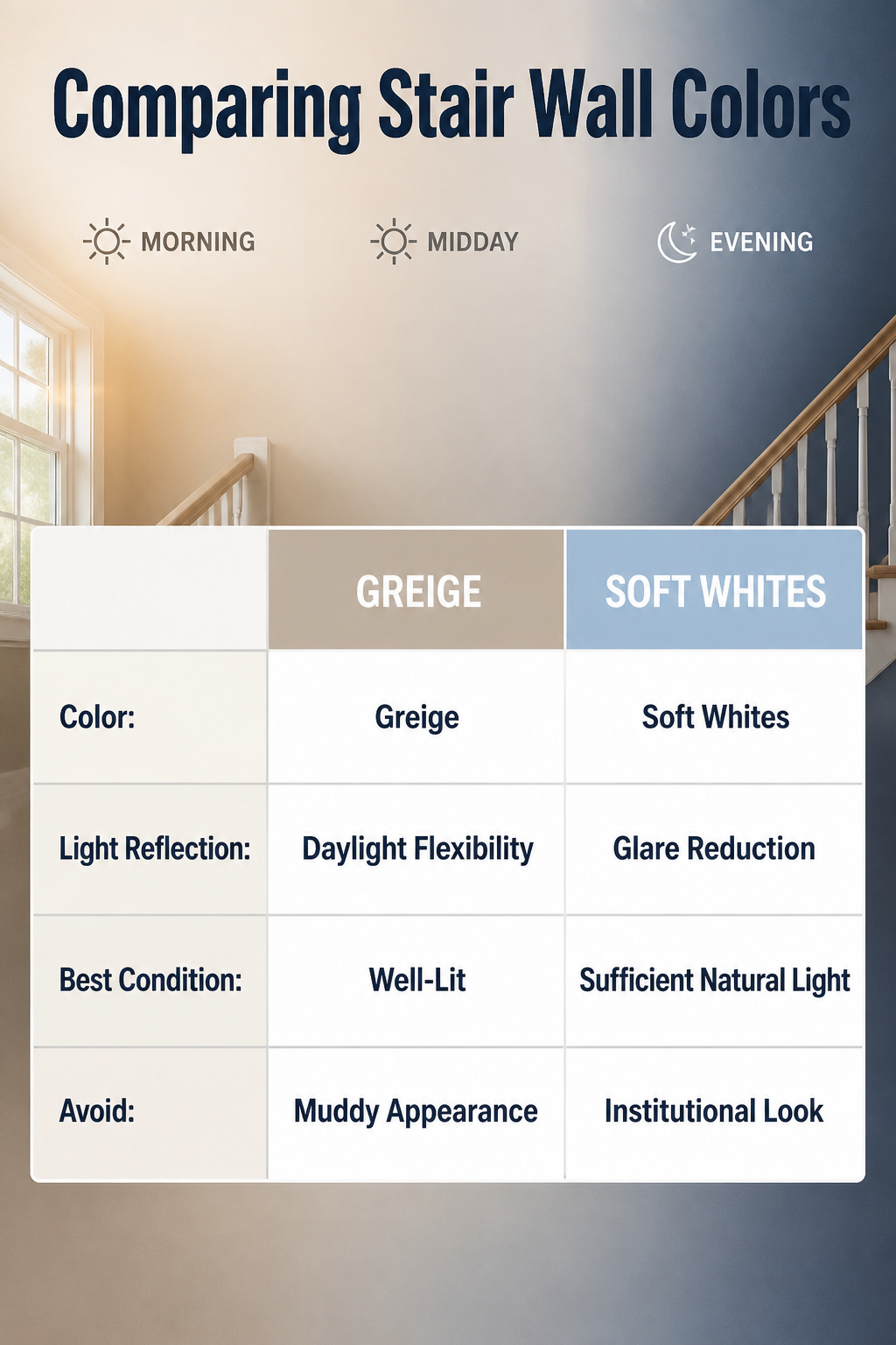
Greige still holds the top spot for stair walls because it shifts warm or cool depending on what the daylight does. In my own stairwell, morning light from an east-facing window turned it almost beige by 10 a.m., while the same wall read gray after lunch. That kind of flexibility matters when you’re painting a space you pass through at different hours.
The colors that currently work best follow a short list:
- Soft whites for walls that catch direct sun and need to stay readable without glare
- Warm taupe where the light is steady but indirect, since it can go muddy if the bulb is too warm
- Sage green in a stairwell with enough natural light to keep it from looking institutional; my north-facing upper landing was too dim for this one
- Dusty blue for walls opposite a window, where reflected sky already lives in the room
Charcoal or navy can work if you want the wall to recede and you have light frames or a pale railing to balance it. In a narrow or dark run, though, lighter tones do the actual work of keeping the climb from feeling like a tunnel.
What Fits Under the Stairs
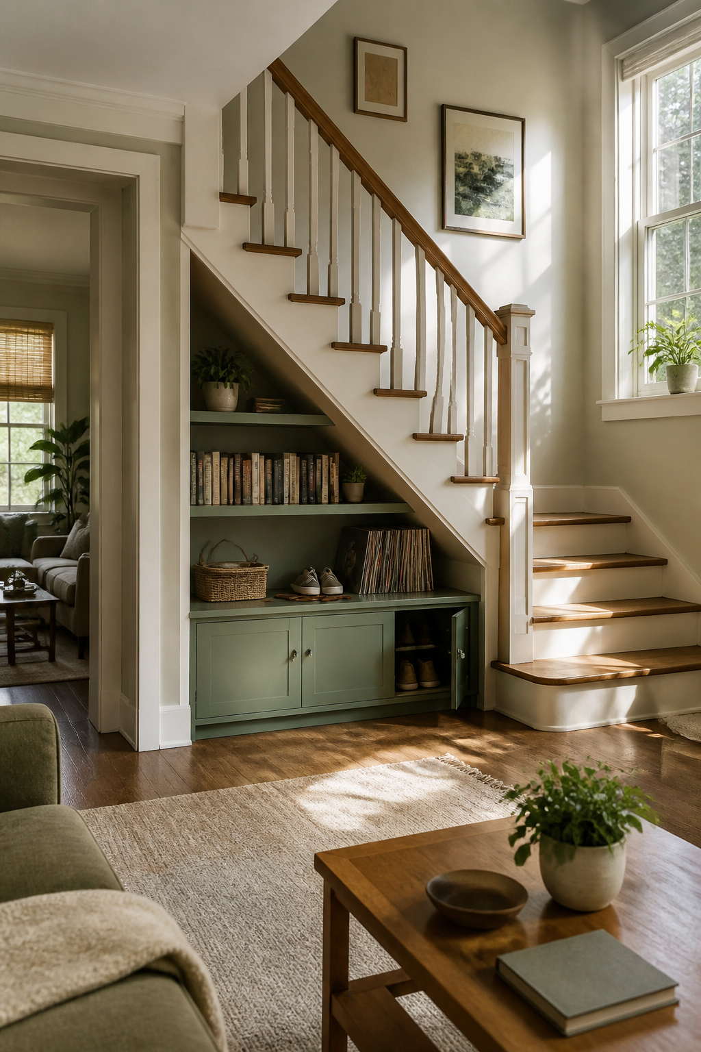
The triangle under a staircase is dead space only until you measure the head height. In my last rental, the stairs climbed straight up from the living room, and the hollow underneath looked like it wanted to become something: a library, a desk nook, the home office every blog suggested. I sketched shelves for books and vinyl, even priced out a slim desk that could double as a drinks station when people came over.
Then I sat under there with a tape measure. At the deepest point, where the stairs met the floor, I had about 34 inches of clearance. Six inches in from that edge, the slope of the treads dropped it to 28. By the time I was far enough back to fit a chair, my head would have been inside the third riser. Head height kills more understairs projects than square footage ever does.
What I built instead was two shallow shelves along the side wall, just deep enough for paperbacks and a row of records, plus a narrow cabinet for shoes and the dog leash. It was storage, not a room. The desk-and-library vision would have needed a different staircase entirely, one with a landing or a switchback that pushes the usable volume toward the middle of the flight. If your stairs run straight, measure sitting height before you dream about sitting there.
Seasonal Decor on Stairs

Holiday garlands on a staircase are one of those projects that look effortless in magazines and eat an entire Saturday in real life. I learned that the first December I spent stringing artificial pine along our banister, wire-wrapping every three feet so the cat couldn’t pull the whole thing down in one leap. The wire showed if you looked close, which I decided not to do.
The rotation itself became manageable once I stopped trying to theme every inch. A narrow stairwell doesn’t have the visual room for full Halloween skeletons plus Thanksgiving gourds plus winter lights; something always clashes. I now keep it to one element per season, switched the weekend after the holiday passes. October gets a paper leaf garland I made from grocery bags in an hour. February gets nothing, because February deserves honesty.
The piece that stayed year-round was a strand of warm white lights I meant to take down in January. They looked thin and sad in March, so I told myself April, then forgot. By June I’d stopped seeing them. Then a friend visited in September and asked why I’d put up Christmas lights so early. I looked at the banister and realized they’d been glowing every evening for eight months. I took them down that weekend, and the stairwell looked strangely empty, like a room after moving out. They went back up by November, this time on purpose, and they’ve stayed since. The trick is choosing a light color warm enough to read as ambient rather than seasonal, something that looks intentional in July and still works in December.
Frequently Asked Questions
How do I decorate a staircase wall, start to finish?
Map your layout to a rising sightline parallel to the handrail, keeping the center of each frame about 57 to 60 inches above each step. This follows the natural angle of the climb so the arrangement reads straight to the eye rather than drifting toward the ceiling or sinking behind the rail.
What wall decor trends work best on staircases right now?
Bold geometric or floral wallpapers, abstract and nature-inspired art, relaxed gallery walls that mix frame sizes, and a single oversized statement piece at a landing all work well. Light woods, matte black frames, and mirrors that bounce light up the steps are popular finishes; keep at least one element cohesive so the climb feels intentional.
Which paint colors look great on staircase walls?
Greige is the most versatile favorite, with soft whites, warm taupe, sage green, and dusty blue close behind. For drama, charcoal or navy paired with light frames reads sophisticated, but only in stairwells that get enough daylight; narrow or windowless runs need lighter tones to keep from turning oppressive by afternoon.