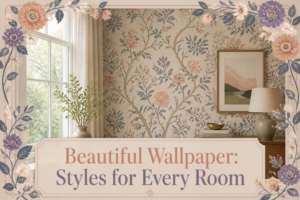
Beautiful wallpaper is printed paper or vinyl, sometimes fabric-backed, that adheres to walls in continuous sheets to give a room pattern, color, and texture all at once. The hassle is real: matching seams, cutting around outlets, and working with paste takes patience that paint does not ask for. But peel-and-stick options and pre-pasted papers have narrowed the gap enough that renters and first-home owners still reach for it. In Caroline Gidiere’s Alabama home, a modern Adelphi Paper Hangings wallpaper applied as a bar backsplash picks up Chippendale fretwork from the cabinetry and layers in what antique glass alone could not.
What Wallpaper Is and Why It Still Works

Wallpaper is printed paper or vinyl, sometimes backed with fabric, that you adhere to a wall in continuous sheets rather than brushing on in coats. The purpose has not really changed since the 1700s: it gives a room pattern, color, and texture all at once, and it does so with a depth that flat paint rarely matches. In Caroline Gidiere’s Alabama home, a modern-leaning Adelphi Paper Hangings wallpaper applied as a bar backsplash picks up the Chippendale fretwork from the cabinetry and layers in what antique glass alone could not. That kind of character is why renters and first-home owners still reach for it.
The hassle reputation is not wrong. Matching seams, cutting around outlets, and working with paste takes patience that a roller of paint does not ask for. But peel-and-stick options and pre-pasted papers have narrowed the gap, and the result survives in a way that a weekend paint job often does not. A wall you actually notice when you walk in tends to feel like a room that was finished with intention, not just covered to hide drywall. For someone spending a few hundred dollars and a Saturday, that difference matters more than the extra hour of setup.
1. Floral

Floral wallpaper has two lives right now, and the gap between them is where most people get stuck. The traditional version still shows up in 1930s Connecticut homes with canopy beds and colonial roots, full of dense pattern that reads as inherited rather than chosen. The modern take, like the bold botanical Sophie Robinson designed for Harlequin’s 2024 Kips Bay show house, treats flowers as color blocks rather than delicate illustration. Same motif, completely different weight.
I learned the hard way that scale matters more than color. A small powder room swallowed the dainty vintage print I tried first; the pattern disappeared into the corners and the room felt blank. In a larger living room, that same print would have read as intentional texture. The Harlequin approach, oversized and saturated, needs breathing room. It works because the designer paired it with solids elsewhere, not because the wallpaper carried the whole room.
For renters watching budget and timeline, the modern floral is the easier bet. The large-scale prints forgive uneven walls and speed up matching at the seams. Traditional patterns, with their repeating stems and tiny leaves, show every eighth-of-an-inch slip. Peel-and-stick versions in either style exist now, though the color saturation still lags behind paste-the-wall options. If you’re committing to a weekend project, bold and simplified wins over detailed and historic every time.
2. Geometric

Geometric wallpaper lives or dies by the scale you choose against the wall you have. A tight honeycomb or small-scale lattice can read as texture from across the room, which is why it works on a long hallway where a busy pattern would turn oppressive. Bold shapes, the kind with six-inch repeats and high contrast, need breathing room. I learned that hanging a large-scale triangle print on a wall that faced a window; the afternoon light threw shadows through the ridges and the shapes seemed to move, which was more drama than I wanted for a bedroom.
The direction of the lines matters as much as the size. Vertical stripes or elongated diamonds draw the eye up and add perceived height to a room with standard eight-foot ceilings. Horizontal geometries do the opposite, which can flatten a space unless that is the intent, like widening a narrow powder room. I have seen rooms where the homeowner ran a bold horizontal pattern on every wall and the space felt like a tunnel viewed from the wrong end.
Color contrast controls the effect even more than the shape itself. A tone-on-tone grid barely registers as pattern and functions like textured paint. The same grid in black and white becomes the single loudest surface in the room. For renters, a subtle geometric in two shades of the same color gives you the structure without the commitment; it photographs well for resale or return of deposit, and it pairs with actual furniture instead of demanding center stage.
3. Tropical

Tropical wallpaper lives or dies by the room you give it. In a Naples kitchen I read about, Summer Thornton installed hand-painted de Gournay palms behind a Lacanche range and shielded the paper with a thin glass pane, a move that costs but keeps the pattern from turning greasy. She paired that burst with pale sherbet raffia walls and white oak latticework, which is the lesson: tropical paper needs quiet neighbors.
Actual plants change the math. A real fern or bird of paradise next to printed foliage either reads as clever echo or visual shouting match, and the line is thinner than most people guess. My own rule, after trying both, is one or the other per sightline. In a bedroom, David Netto took a different path entirely, balancing a 1930s Connecticut home’s colonial bones with a bold, globally inspired pattern alongside a vintage Tuareg mat and a Bernhardt canopy bed. The tropical there works because it is part of a collected story, not a single vacation note.
Where tropical fails is the half-measure: one accent wall in an otherwise neutral room reads like a hotel lobby you did not finish. Commit to the mood or skip it.
4. Botanical

Botanical wallpaper keeps the garden focus on leaves, stems, and branches rather than full blooms, which gives it a quieter presence than floral. I noticed this difference hanging Soane Britain’s Renaissance-inspired botanical motif in a small upstairs bath: the leaf forms read as green texture from the doorway, not as a pattern you study up close. The effect was calming in a way a busier floral probably would not have been.
Two approaches sit on opposite shelves. Naturalistic botanicals, like the Soane Britain piece, try to look observed from life. Stylized versions, such as Sophie Robinson’s bold Harlequin designs, simplify the shapes for stronger color and repeat. The naturalistic route works better in rooms where you want the wall to feel like background foliage; stylized wins when the wallpaper itself is meant to be the event, as in the 2024 Kips Bay show house lounge where the designer paired it with equally loud fabrics.
For a weekend project on a few hundred dollars, stylized botanical prints in vinyl or peel-and-stick are the safer bet. The larger shapes forgive slight misalignment during hanging, and the calmer color blocks hide seams better than fine naturalistic detail.
5. Vintage
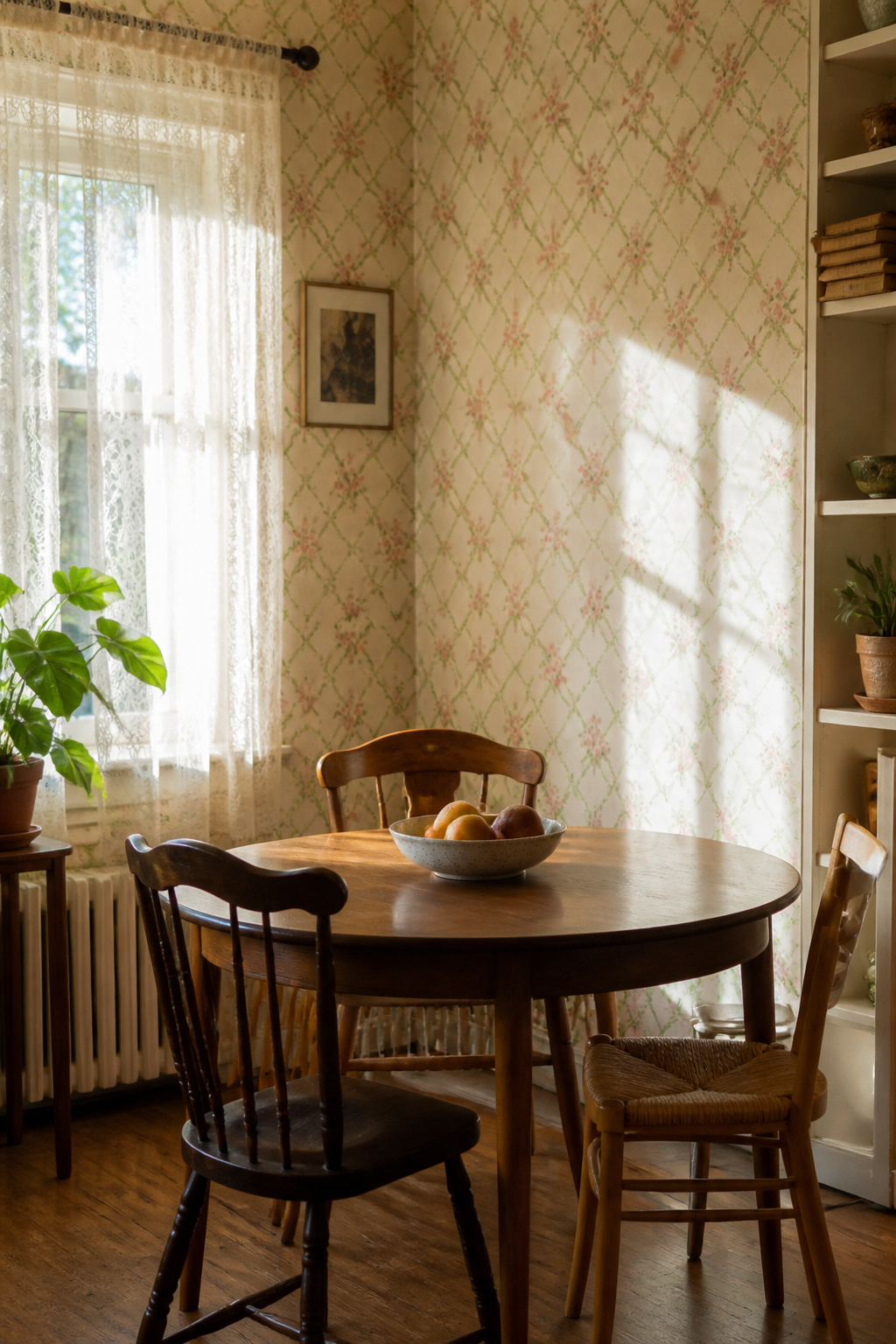
Vintage wallpaper walks a line most other styles do not: the pattern already carries a date, and the room can tip from collected to closed-in fast. The trellis wallpaper Meg Braff used in her Locust Valley breakfast room shows how to keep it alive. She paired it with a mid-20th-century plaster-finish lantern so the room felt like sitting in a garden, not a period set. The lantern’s era matched the wallpaper’s spirit without matching it exactly, and that looseness is what saves the look.
Actual vintage paper, the kind pulled from a 1930s Connecticut colonial like the one David Netto worked on, demands more caution. The fibers have aged, the adhesive backing is unpredictable, and the colors shift under modern light. Reproduction prints from houses that study archive patterns, or even new designs that borrow scale and palette without copying exactly, give the same warmth with paste that behaves. I have hung both, and the reproduction rolls saved me the three-hour hunt for matching batch dye lots that actual vintage often needs when you run short.
If you do find a roll of real vintage paper you love, treat it as an accent. One wall, a closet interior, or the backing of a glass-front cabinet lets the pattern read as found object rather than time machine. The global pieces Netto blended, the Tuareg mat and the bold accent pillow, worked because they broke the wallpaper’s timeline. Mixing eras is not eclectic for its own sake here. It is the only way vintage wallpaper breathes.
6. Artistic
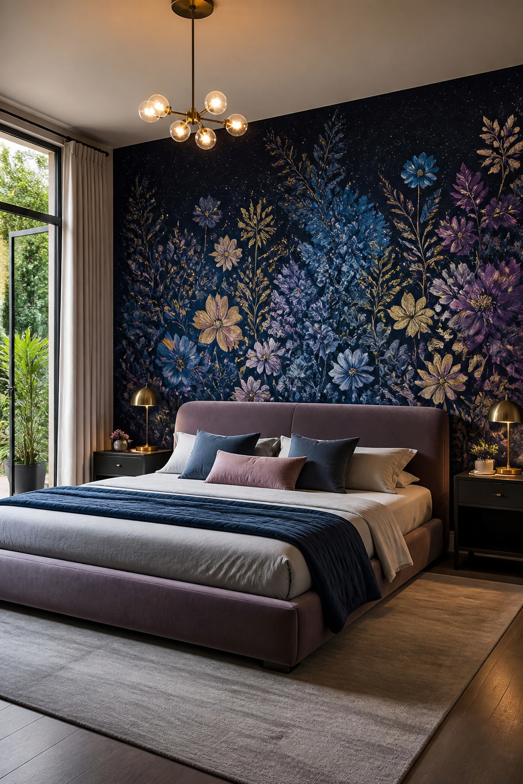
A wall covered in a Gracie Studio midnight garden print, scaled to climb 15-foot ceilings, stops being background the moment you walk in. The bed sits in front of it, but your eye goes straight past the furniture to the paper itself. That is the shift: artistic wallpaper demands to be looked at, not walked past.
I have treated paper as art in two rooms now, and the mistake both times was starting too small. A painterly mural needs one uninterrupted wall, not a corner chopped by a doorframe. The first attempt, a floral scene behind a bookshelf, disappeared behind the objects; the second, a single wall in a narrow hallway, finally worked because there was nothing competing for attention.
Vinyl abaca murals, like the emerald Phillip Jeffries paper used in a 2022 Kips Bay bathroom, handle steam better than traditional paper while still reading as hand-worked. The tradeoff is weight: you will need two people to hang a full-wall panel straight, and the adhesive window is shorter than standard rolls allow. Budget for a pro install or a very patient friend.
The wrought-iron four-poster bed is front and center, but you could argue the ceiling and walls are the true focal point of the space.
— Veranda
What that means for a 24-by-19-foot bedroom is less important than what it means for yours: measure the wall that faces the door when you enter, and put the art there. Every other wall in the room can stay quiet.
7. Textured

Grasscloth was the first textured wallpaper I ever hung, and the wall looked like a million dollars for about six weeks. Then the cat found it. The weave catches light in ways flat paper never manages, and that same weave also catches claws, vacuum bumps, and the edge of a laundry basket you swear you were careful with. Fabric-backed vinyl solves the durability problem but flattens the effect; you get the suggestion of texture under perfect lighting and a hotel-room blandness the rest of the day. Dimensional options, the ones with raised ink or actual plaster ridges, split the difference on toughness but double your hang time because every seam shows. Light skimming across them at breakfast looks incredible. Light hitting head-on at noon reveals every wave in your wall prep. I learned that last part the expensive way in a hallway with original 1950s plaster.
8. Custom Designs

Digital printing has pulled custom wallpaper out of the showroom and dropped it into reach for weekend projects. A few years back, ordering your own design meant minimums that swallowed a whole room’s budget and lead times that stretched past a season. Now you can upload a photo or pattern, get a proof in days, and cover a single accent wall for roughly the cost of mid-grade designer paper.
The math shifts quickly. A repeat pattern you tweak yourself becomes worth the extra cost when the wall is the focal point of an open living area, or when standard catalogs keep turning up nothing that matches your trim or tile. For a powder room or the back of a bookcase, the premium rarely pays off. Those spaces finish faster and cheaper with stock.
I watched a neighbor go through the process last spring. She wanted her grandmother’s botanical sketches scaled to wrap her dining room. The printer sent her a one-foot swatch first, which saved her. The original colors printed muddy at wall scale, and adjusting the saturation took two rounds. Without that swatch step, she would have been stripping a thousand dollars of mistake off the plaster. Order the physical proof every time, even when the digital mockup looks perfect. The texture of the ground paper changes how ink sits, and screens lie about depth in ways you only catch with the material in hand.
Lead times still run three to six weeks for most small-batch shops, so custom work does not rescue a project on a Friday deadline. Plan it as the first decision, not the last.
Vinyl, Paper, and Peel-and-Stick

Wallpaper comes in three backings that matter more than the print on the front. Traditional paper needs paste, a water tray, and patience, and it bonds to the wall like it belongs there, which is great until you need it gone. Vinyl-coated paper wipes clean with a sponge, so it survives kitchens and bathrooms where steam and splatter happen daily. The trade is weight; it fights you in corners and shows every bump underneath.
Peel-and-stick arrived promising to solve all of this, and sometimes it does. The backing peels away like a giant sticker, which sounds fast until you are smoothing the fifth bubble out of a four-foot strip. It works best on eggshell or semi-gloss paint in decent condition. Flat paint or textured walls grab the adhesive wrong, and within a month the edges lift like a curl of dead skin. Renters love the promise of clean removal, but the reality depends on what the last tenant did. Cheap paint comes up with the paper; good paint stays put.
I have learned to test a corner first, wait a week, and watch. Paste-the-wall products split the difference, lighter than vinyl, more forgiving than peel-and-stick on imperfect surfaces. For a room you plan to keep five years, paste wins. For a year or two, peel-and-stick is worth the gamble if the wall is smooth and the climate is stable.
Design Inspiration That Matches Your Actual Life

A small room can handle a bold pattern if you keep it to one wall and let the other three breathe. The mistake I made in my first apartment was papering every surface in a dense floral; the space closed in like a jewelry box. Now I treat wallpaper as the outfit and the furniture as the accessories. A busy print works when your sofa, rug, and shelves are quiet solids. In a large living room, you have the opposite freedom: a subtle texture on all four walls adds warmth without competing with the pieces you already own.
The question that stops most people mid-search is whether their existing decor locks them into one style. It does not, but it does set the price of admission. A room full of mid-century wood and clean lines can take an Art Deco geometric, but the clash has to be intentional, not accidental. The safest move is to pull one color from something you already own and let that shade lead the paper choice. Your eye registers the match even when you cannot name why the room feels pulled together.
Renters should look at the room’s actual use, not its Pinterest potential. A peel-and-stick botanical in the bedroom you see for ten minutes each morning is a different bet than the dining wall you stare at through every meal.
Kitchens, Bathrooms, and Other Tough Spots
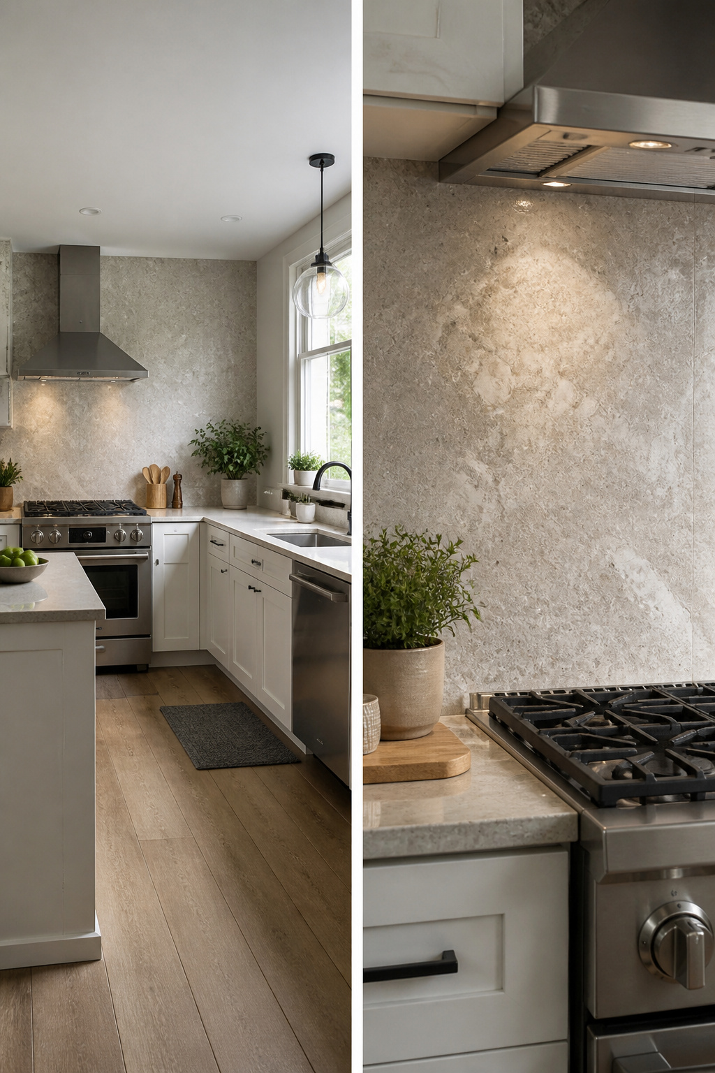
Peel-and-stick vinyl was the only wallpaper that survived my bathroom experiment. The paper-backed roll I tried first lifted at every seam within three weeks, and by month two the corners had curled enough to catch on my towel. Steam from the shower had turned the adhesive gummy underneath, and the whole strip pulled away in one rubbery sheet when I tugged it.
For kitchens, grease splatter matters as much as humidity. Wipeable vinyl or a coated non-woven paper holds up behind a stove; anything textured traps oil you will never fully clean. I learned that after scrubbing a grasscloth backsplash until the fibers matted. The wall looked fine from across the room, but up close it carried a permanent cooking residue.
Bathrooms need the same wipeable surface, especially near the vanity where toothpaste and hair products spray. I now stick to vinyl in any room with running water, and I only apply it after the walls have dried for a full day post-painting. One damp spot underneath and the adhesive weakens slowly, showing no problem until the edge lifts on a humid August morning.
Hanging It Straight
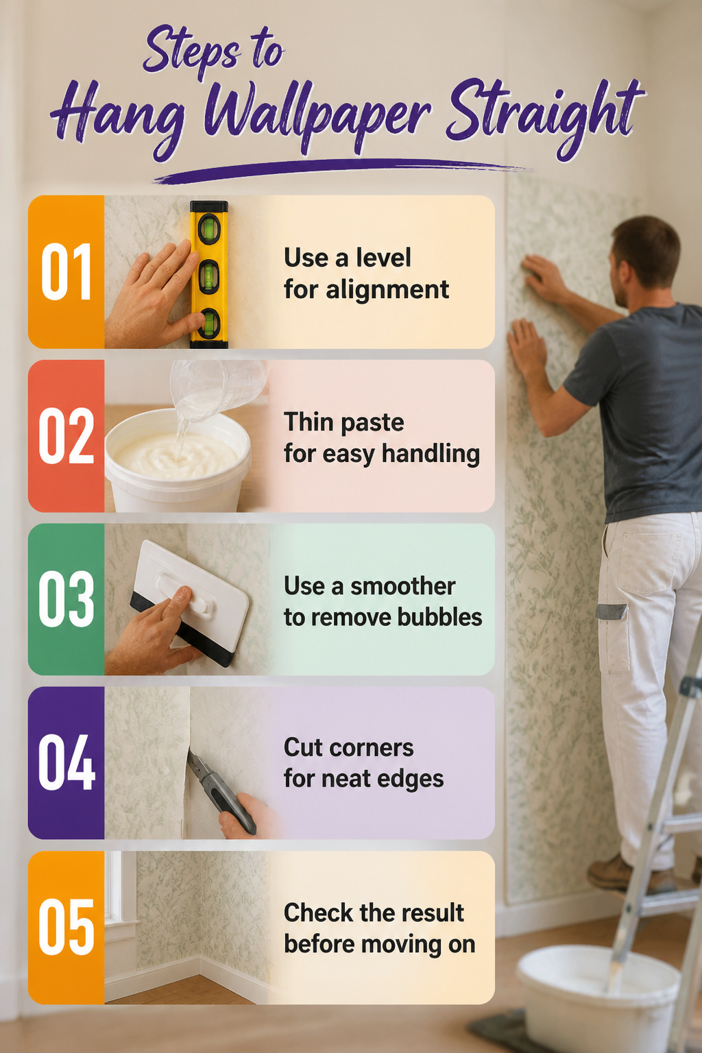
A level is the only tool that earns its keep on wallpaper day. The laser gadgets and app-based plumb lines look sharp in the box, but a six-dollar torpedo level and a yardstick handle the corners better than anything I have tried. The first strip sets the whole job. If that one leans, every panel after it leans a little more, and by the fourth strip you are trimming an inch off one side and stretching bare wall on the other.
Paste matters more than the label suggests. I once bought a tub marked "professional grade" and spent an afternoon fighting slip that let the paper slide downhill before the glue set. Thin the paste ten percent past what the directions say for standard paper; it tacks faster without the bubbles that come from repositioning too long. A plastic smoother, the kind with the felt edge, pushes air out without tearing the face. Skip the metal tools for that step; they crease the paper and leave a shine you cannot fix.
Corners are where pride goes to die. I used to wrap full strips around them and watch the seam pop by morning. Now I cut at the corner, overlap a fresh strip by a quarter inch, and match the pattern in the new plane. The overlap is technically wrong by textbook standards. On the wall it disappears, and the seam stays flat for years.
Keeping It Clean
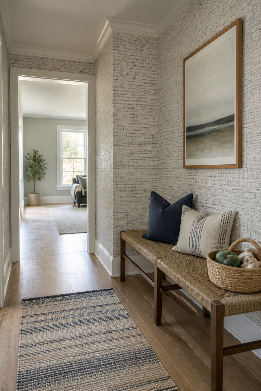
Vinyl wallpaper in a hallway with two dogs and a toddler taught me what "scrubbable" actually means. The paper claimed it, but the backing softened any time I used more than a damp cloth, and the seam along the baseboard started lifting within a year. Peel-and-stick vinyl with a woven fabric backing held up better in the same conditions, mostly because water sat on top instead of soaking through.
Paper wallpaper without a coating is a different category entirely. A soft brush and dry sponge remove dust; anything wet leaves a watermark that does not fade. I learned that after trying to wipe a smudge near a light switch and watching the pigment bloom outward like a bruise.
For rental turnover, the real test is whether a patch job blends. Small tears in vinyl can be sealed with clear adhesive and barely show. Paper tears spread if you touch them, and matching a discontinued pattern means replacing a whole wall. The extra twenty or thirty cents per square foot for a thicker vinyl layer pays back the first time a chair back scrapes the corner or a cat decides the dining room wall is a scratching post.
Eco-Friendly Options Worth the Search
Sustainable wallpaper starts with the ink. Eco-friendly options use water-based or latex inks instead of solvent-based ones, which means no volatile organic compounds off-gassing while you hang the paper or after. The substrate matters just as much. Some brands print on paper from managed forests, others on cellulose from fast-growing grasses, and a few now offer wallpapers you can recycle through standard paper streams once you strip them down.
Certifications help cut through the marketing. FSC on the label means the paper pulp came from forests audited for replanting and watershed protection. Greenguard or OEKO-TEX indicate the finished roll passed emissions testing for indoor air quality. A single certification rarely covers both the material and the ink, so two labels beat one if you can find them.
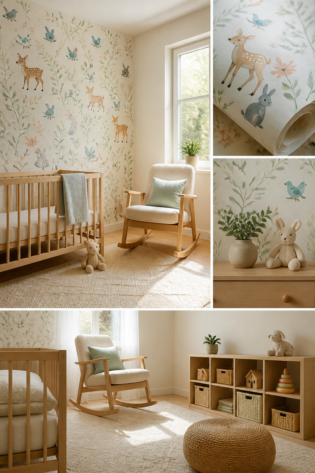
The premium runs real. Expect to pay roughly 30–50 percent more per roll for a fully certified eco option compared to standard vinyl. For a small powder room or one accent wall, that might add $40–80 to the job. For whole-room coverage, the gap widens. My own take: if you are renting or plan to move inside three years, the air-quality benefit is still worth it in bedrooms or nurseries where you spend hours breathing the same air. For a high-traffic hallway you will redo soon anyway, standard vinyl is the practical call.
Frequently Asked Questions
What are the best wallpaper designs for small spaces?
Bold patterns on a single wall work best, letting the other three walls stay quiet. A small powder room swallowed a dainty vintage print in one example; large-scale modern florals or simplified botanicals read better because they do not disappear into corners. The key is scale over color, and limiting busy prints to one surface so the room does not close in like a jewelry box.
How do I choose the right wallpaper for my room?
Pull one color from something you already own and let that shade lead the paper choice. Match the room’s purpose and actual use, not its Pinterest potential, and consider whether the wall faces the door when you enter, since that is where a statement belongs. For renters, peel-and-stick botanicals in a bedroom you see for ten minutes each morning are a different bet than the dining wall you stare at through every meal.
Can wallpaper be used in kitchens and bathrooms?
Yes, but only moisture-resistant and wipeable options. Vinyl-coated or coated non-woven paper survives steam and grease splatter; paper-backed rolls lift at seams within weeks in bathrooms, and textured grasscloth traps cooking oil permanently. Apply vinyl only after walls have dried a full day post-painting, since one damp spot underneath weakens adhesive slowly until edges lift on humid mornings.