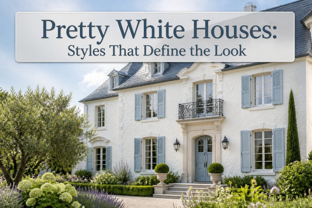
Pretty white houses are a deliberate architectural strategy, not a default. The catch is that each style demands a specific white tone and surface finish; get that pairing wrong and the facade collapses into blankness or institutional glare. Benjamin Moore White Dove OC-17, warm enough for Georgian Colonial glazing bars without tipping into cream, is the wrong choice entirely on French-style stucco, where Sherwin-Williams Eider White’s gray warmth keeps slate roofs from reading as prison architecture.
Georgian Colonial
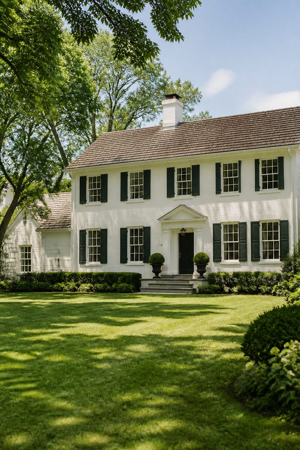
A Georgian Colonial in white paint reads as geometry first, ornament second. The style demands a centered door, matching windows spaced evenly across the facade, and a roofline that sits level with the chimney stacks. White does the actual work here: it erases the seams between brick courses or clapboards and lets the eye travel straight to proportion and line. Color would break that rhythm and turn the eye toward trim or shutters instead.
The multi-pane windows, usually twelve-over-twelve or nine-over-nine sashes, need a warm white rather than a stark one. Benjamin Moore White Dove OC-17 carries enough cream to keep the glazing bars from looking like bare plastic against old glass, but it stays light enough to read as white from the street. I have seen it hold up on both wood and fiber-cement siding without going chalky.
Formality in this style is not about expense; it is about restraint. A centered door with a simple pediment, black or dark green shutters hung true to the window center, and a brass fixture that actually matches the period. The white ground lets you get away with hardware that would look cheap on a busier facade. Skip the wreath, skip the seasonal banner. The symmetry is the decoration.
Farmhouse with Veranda
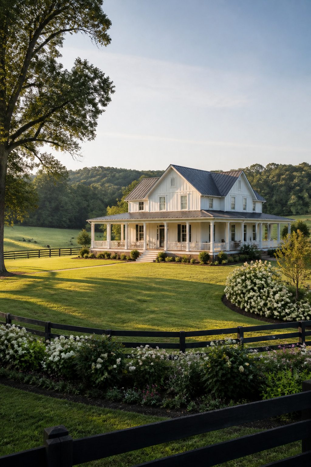
Board-and-batten siding reads differently on a farmhouse than clapboard does. The vertical strips break the wall into narrow bands that catch shadow all day, so a white facade stays dimensional instead of flattening into a blank plane. I noticed this driving past a restored place outside Fredericksburg last spring; the same paint color on the neighbor’s horizontal siding looked almost gray in comparison, while the battened house held its warmth.
The wraparound porch, or veranda, turns that vertical rhythm into a gesture toward the yard. Columns repeat the siding’s spacing, and the roofline steps back so the house mass reads as smaller from the street than it actually is. White paint began as a practical choice for heat reflection in agricultural buildings, long before it became an aesthetic signature. On a porch-heavy facade, that cooling advantage matters more, since the overhang creates semi-enclosed outdoor rooms where air movement helps.
A full veranda demands more maintenance than a stoop or a small entry portico. The railings, the corner posts, the underside of the eaves all collect pollen and mildew in humid months. The houses that keep their crisp look year after year tend to use semi-gloss on the porch floor and matte on the walls, a combination that hides scuffs where people walk while keeping the upper surfaces clean-looking from a distance.
French Style
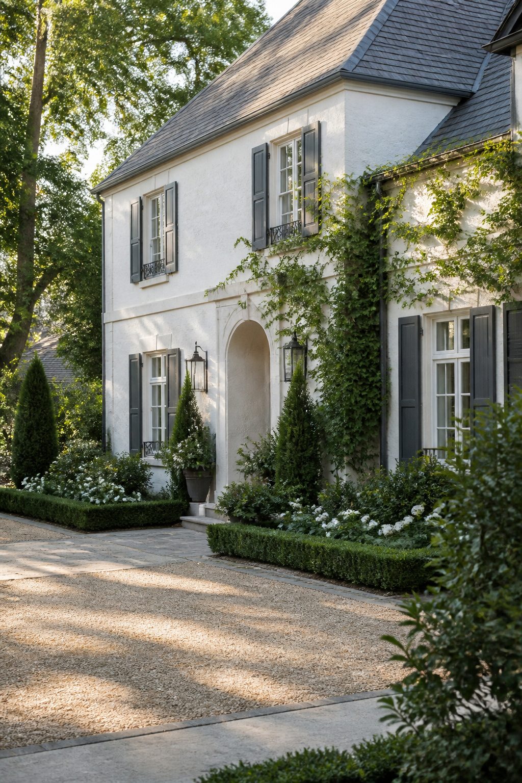
French exteriors in white tend toward creamier, chalkier tones than the bright whites Americans often default to. Stucco or a limestone-look finish carries that warmth naturally, and the roof matters as much as the walls: slate in soft gray or even weathered black keeps the whole thing from reading as a blank box. Shutters in deep blue-gray or faded green give the eye somewhere to rest.
Paint color is where renters and first-home owners usually miss. A stark white against slate looks institutional; what you want is a white that carries a drop of warmth without tipping into yellow. Sherwin-Williams Eider White sits right in that pocket, a warm gray-white that reads as lived-in rather than freshly bleached. I spent an afternoon once holding swatches against a stucco sample in shifting light, and the ones with subtle undertones held up across morning to afternoon. The pure whites fell flat by noon.
Limestone-look siding or a good stucco finish with Eider White and slate roof tiles gets you most of the way there. Shutters you can add later, or paint existing ones in a weekend. The creamier base color is the part worth deciding upfront; everything else layers on top.
Contemporary Minimalist
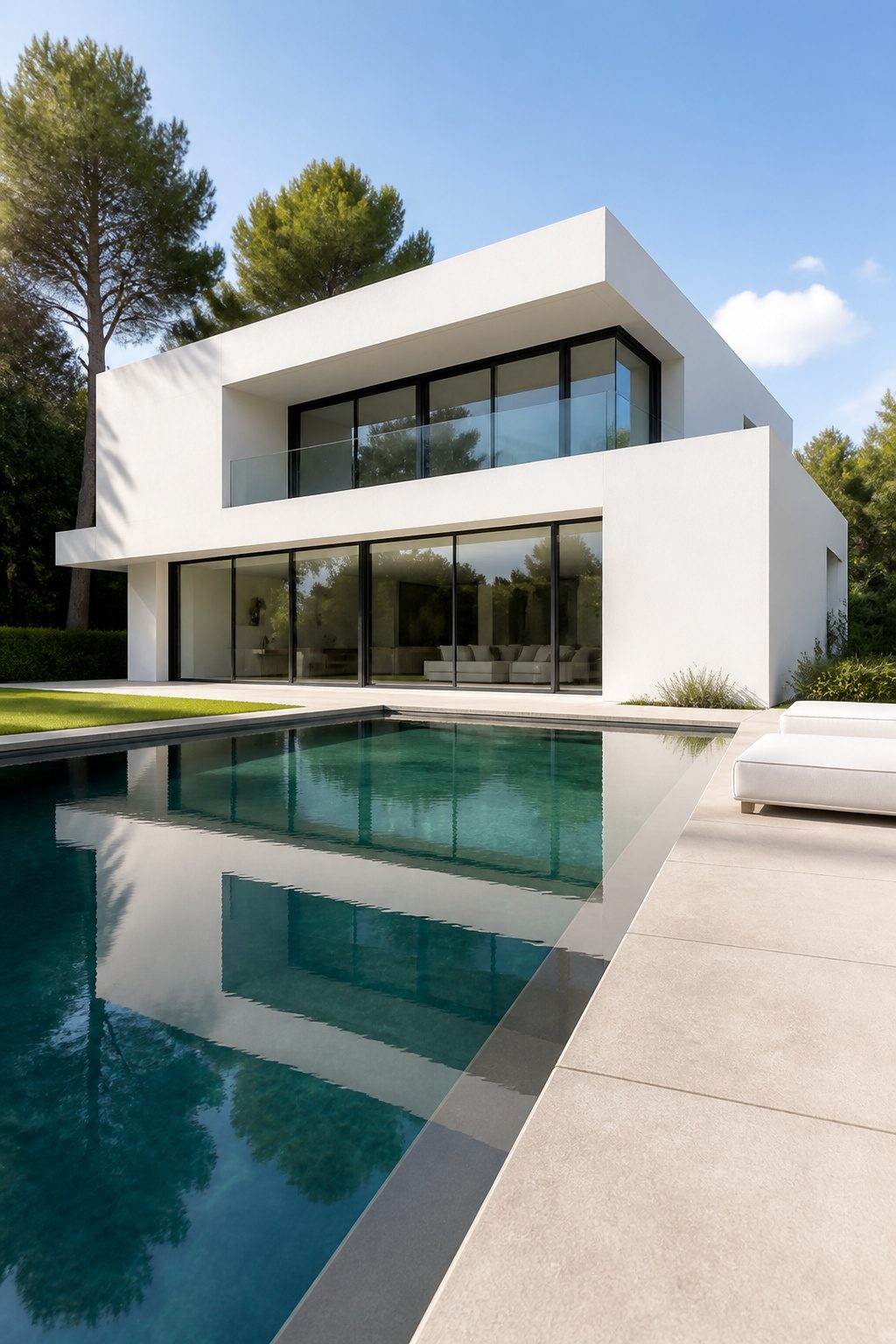
Flat roofs and wall-size glass panels read as white architecture stripped to its bones, not painted tradition. The render or metal panels bounce light upward and catch shadow from every overhang, which is the whole visual point. Dirt shows within weeks, not seasons, on those flat planes, so the material choice matters more than the color. A textured white render holds dust differently than a smooth metal panel; the render turns dingy at the edges first, while metal streaks from any water runoff path. I learned that the hard way watching a neighbor’s place go from crisp to tired before the first summer ended. If you are renting and dreaming of this look on a budget, stick to smaller metal panel accents you can wipe down, not a full flat-roofed render box that traps grime in every pore.
Mediterranean
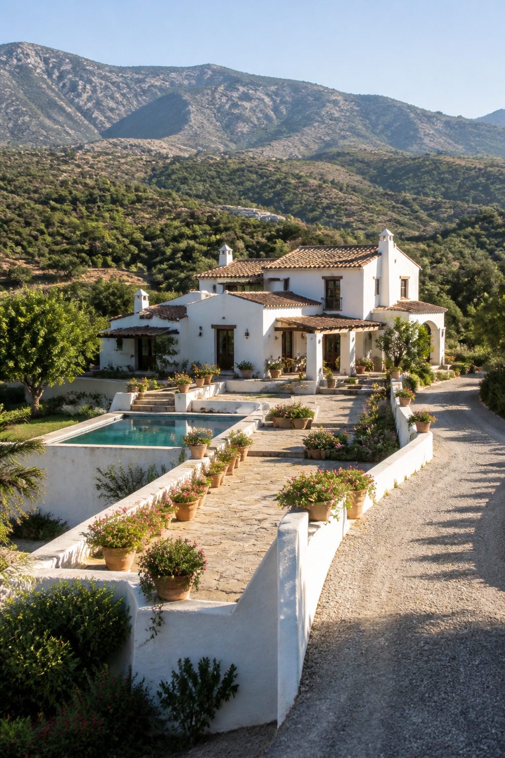
White stucco and terracotta tile read as Mediterranean because the pairing solves a real climate problem. The white reflects intense sun rather than absorbing it, and hand-troweled stucco carries shadow and texture that keeps a whole wall from going flat in that glare. I notice the effect most where the finish is slightly imperfect, the trowel marks catching morning light at different angles.
The scale can be surprising. Villa Paula, a 15th-century Valencian villa, sits on 43,055 square feet of garden, and the white mass of its stucco still holds up against that much open space because the texture breaks it into human-sized planes. The terracotta roof grounds it, the warm color pulling from the soil rather than competing with the sky.
For a weekend project on a real budget, the move is paint, not stucco. A flat white exterior paint on textured siding gets you halfway there if you choose the right undertone, something with enough cream to read as plaster rather than primer. The roof is harder to fake; unless you are replacing it anyway, skip the tile and add terracotta in pots, in window boxes, or as a single painted accent door. The color relationship matters more than the material.
Modern Beach House
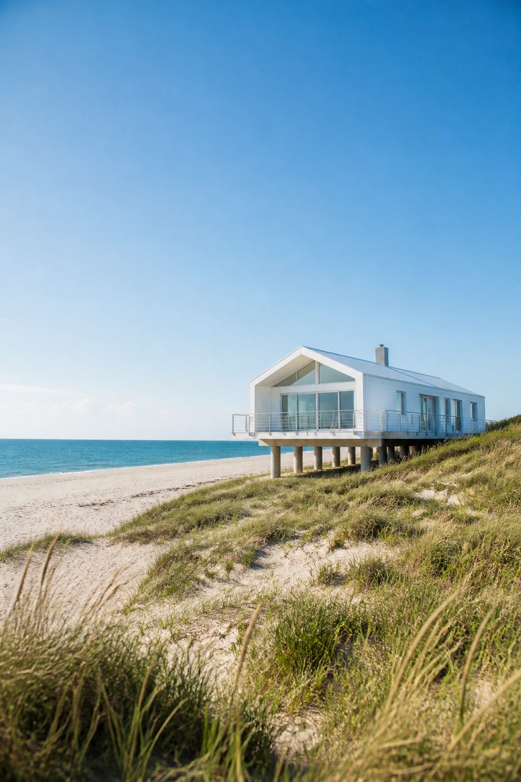
Elevated floors and open pilings keep the living space above storm surge and give the house that light, almost floating silhouette you see along the Carolina and Florida coasts. White siding or smooth concrete reads differently here than inland: against open water and a pale sky, the color softens instead of glaring, and the edges of the structure seem to dissolve a little, which is the whole point of the style.
Salt air destroys ordinary hardware in about three seasons, so corrosion-resistant fasteners are not an upgrade, they are the build. Stainless steel or hot-dip galvanized brackets cost more upfront but skip the rust streaks that ruin white walls by year two. I learned that the hard way on a rental repaint where the previous owner had used standard nails; the streaks bled through new paint like watercolors.
Concrete cladding skips the fastener problem entirely and handles sand abrasion better than wood, though it cracks where the pilings flex in a hard wind. White stucco over block is the middle path, common in newer builds, but it needs resealing every few years or the salt gets behind it.
Tiny Home
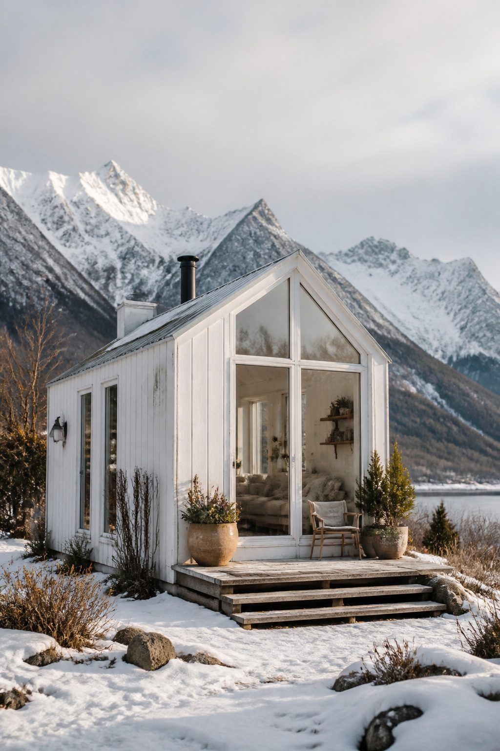
White paint on a sub-400-square-foot structure does more than look clean; it pushes the walls outward visually in a way darker colors simply cannot manage. I noticed this first in a tiny home perched on a Lac-Beauport mountainside, its pale exterior blending into the snowscape so completely that the building seemed to dissolve into open sky rather than announce its 400-square-foot footprint. That same home sleeps four people across two floors, with bunk beds tucked below and a master suite above surrounded on three sides by glass, proving the color does not demand a sacrifice of function.
The practical challenge arrives with the surface itself. A tiny home gets bumped, brushed, and handled constantly: ladders against the wall, gear dragged past the corner, hands steadying yourself in a space where every square inch works for its keep. White shows every scuff immediately, and on a structure this small there is nowhere for the damage to hide. My recommendation is to budget for a scrubbable exterior-grade satin or eggshell rather than the dead-flat finishes that look pristine for exactly one afternoon. Touch-ups become part of the rhythm, not an emergency, if you keep the original paint on hand and accept that a weekend of living will write itself on the walls.
Traditional Hacienda
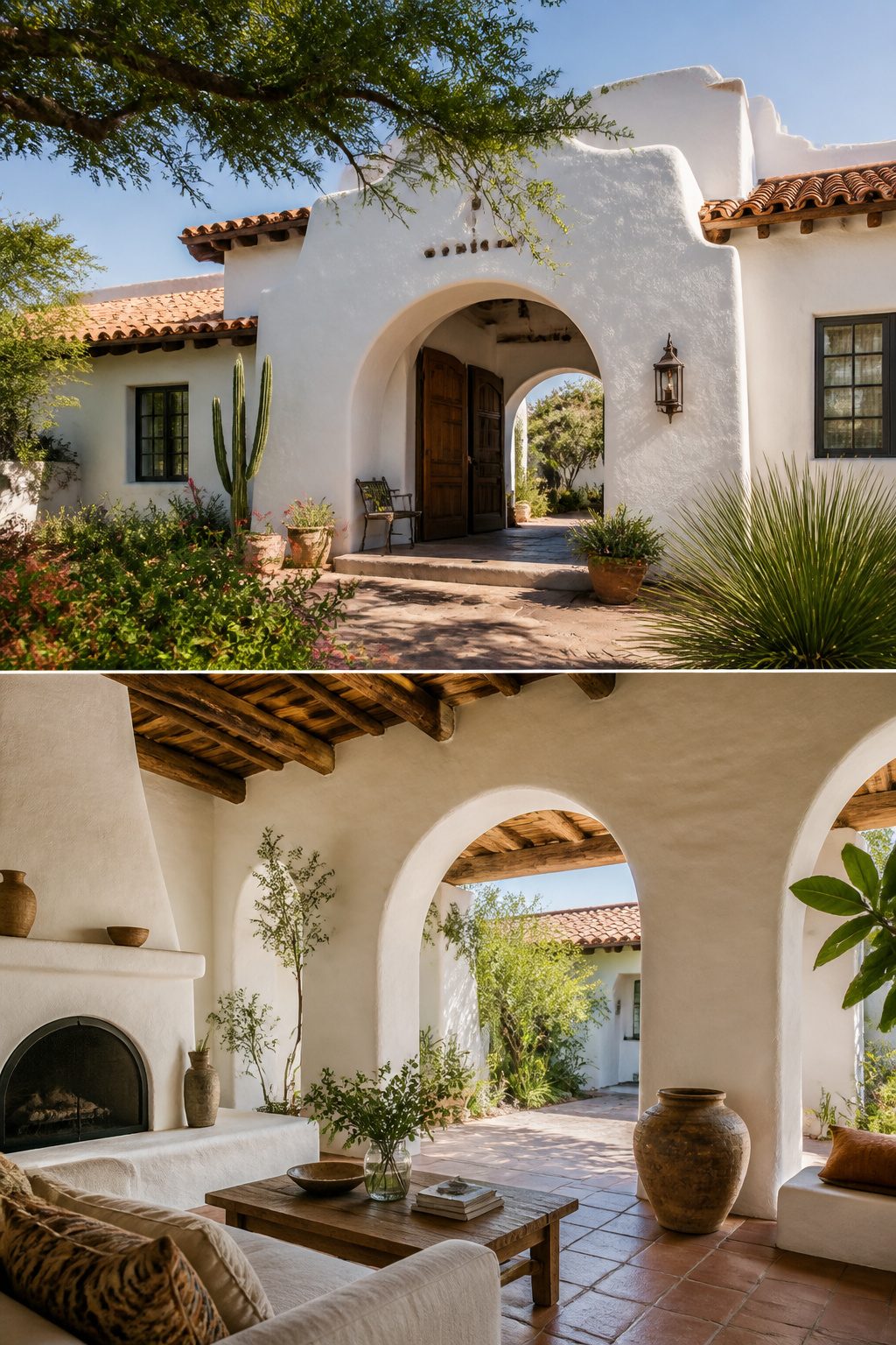
White plaster walls in a hacienda start with function. The thick walls absorb daytime heat and release it after sunset, keeping interiors livable when desert temperatures swing forty degrees. That thermal mass is the reason the style spread across the Southwest, not ornament.
The red tile roof against white plaster became the signature look, but the pairing solved a practical problem first. Clay tiles vent heat upward; light walls reflect what radiation still reaches the walls. Together they drop cooling loads in ways modern insulation still struggles to match.
Building codes now complicate the equation. True adobe or thick plaster rarely meets current R-value requirements without backup insulation, and seismic zones demand rebar cores that the original builders never used. A few manufacturers produce insulated concrete forms finished with traditional lime plaster, which gets closer to the old performance while passing inspection.
Courtyards matter as much as the walls. They create convection that pulls cool air through the house after dark, but that only works with cross-ventilation and shading. I’ve seen modern builds skip the courtyard depth or face it the wrong direction, then wonder why the mechanical bills run high. The white paint alone does nothing if the air sits still.
Mid-Century Modern
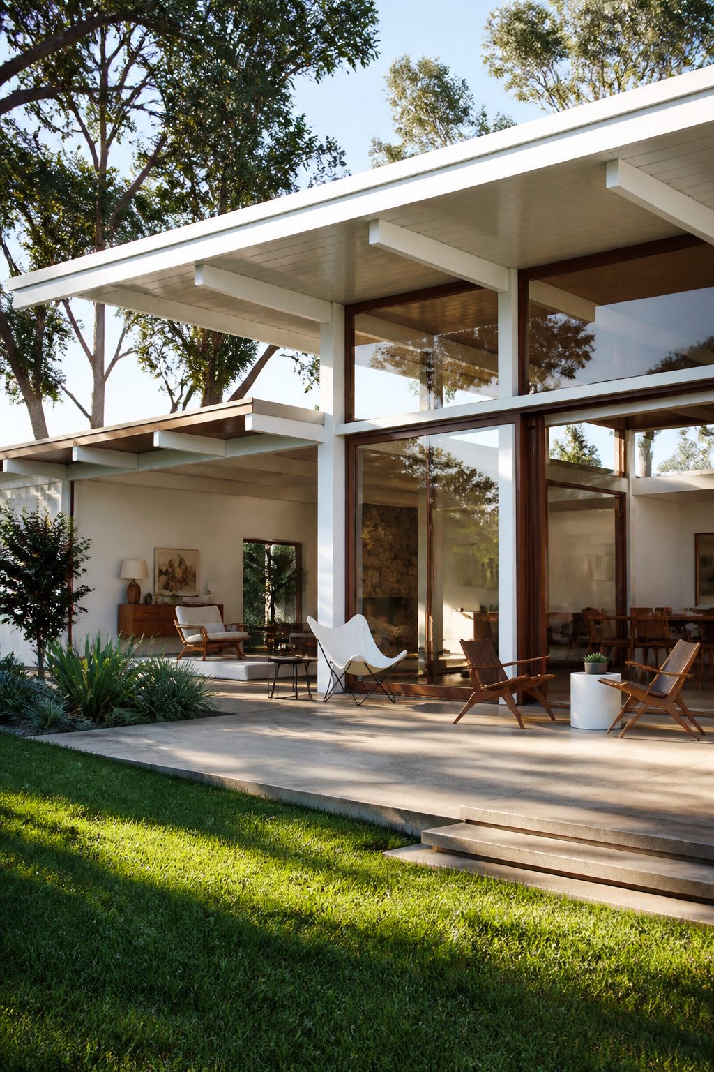
Post-and-beam construction reads as honest structure, and white paint on those vertical boards or brick faces lets the geometry do the talking. I keep running into the question of whether the white was there in 1957 or applied decades later by someone chasing the pretty white houses aesthetic. The originals were often cedar stained or left to gray, so a bright white mid-century facade is usually a later decision, not a restoration.
The wood beams and soffits, left natural or oiled, keep the look from going sterile. I saw one rental in Palm Springs that handled this well: painted brick, raw teak entry canopy, and a carport that framed the front door like a picture. It slept sixteen guests across five bedrooms and a converted den, which tells you how open those plans run.
If you are repainting an actual mid-century house, the trick is checking what was under your current color. Sand a test patch. If you find original white, you are restoring. If you find raw wood or a 1960s mustard tone, you are editing, and you should keep the edit light enough that the bones still read as period. Heavy trim moldings will fight the whole point.
Architectural Villa
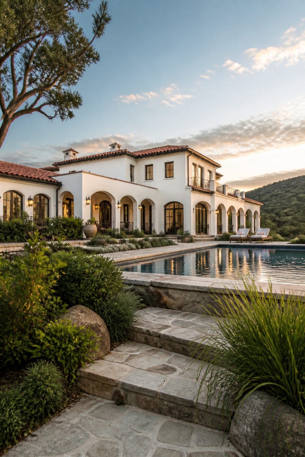
A Mediterranean-style house in Fort Worth sits on five acres of Texas countryside, its white stucco walls and red tile roof built to catch the late sun. The architect used white as a frame for the land itself, not as a regional nod. Five hours east, a Palladian mansion in Essex spreads across 52 acres and reads like a wedding cake tiered against rolling green. Both are new builds or restorations commissioned around the architecture rather than inherited style rules. White here does what white paint does in a gallery: it steps back so the proportions, the symmetry, the way the roofline meets sky, can read first. The Fort Worth place adds a pool and outdoor kitchen, but the house still anchors the view. The Georgian mansion does the same at ten times the scale, its columns and pediment busy enough that color would only compete. For a renter or owner working with a fixed facade, the lesson is about restraint on the surface so the structure underneath gets the attention. White serves the lines; it does not replace them.
Contemporary Coastal
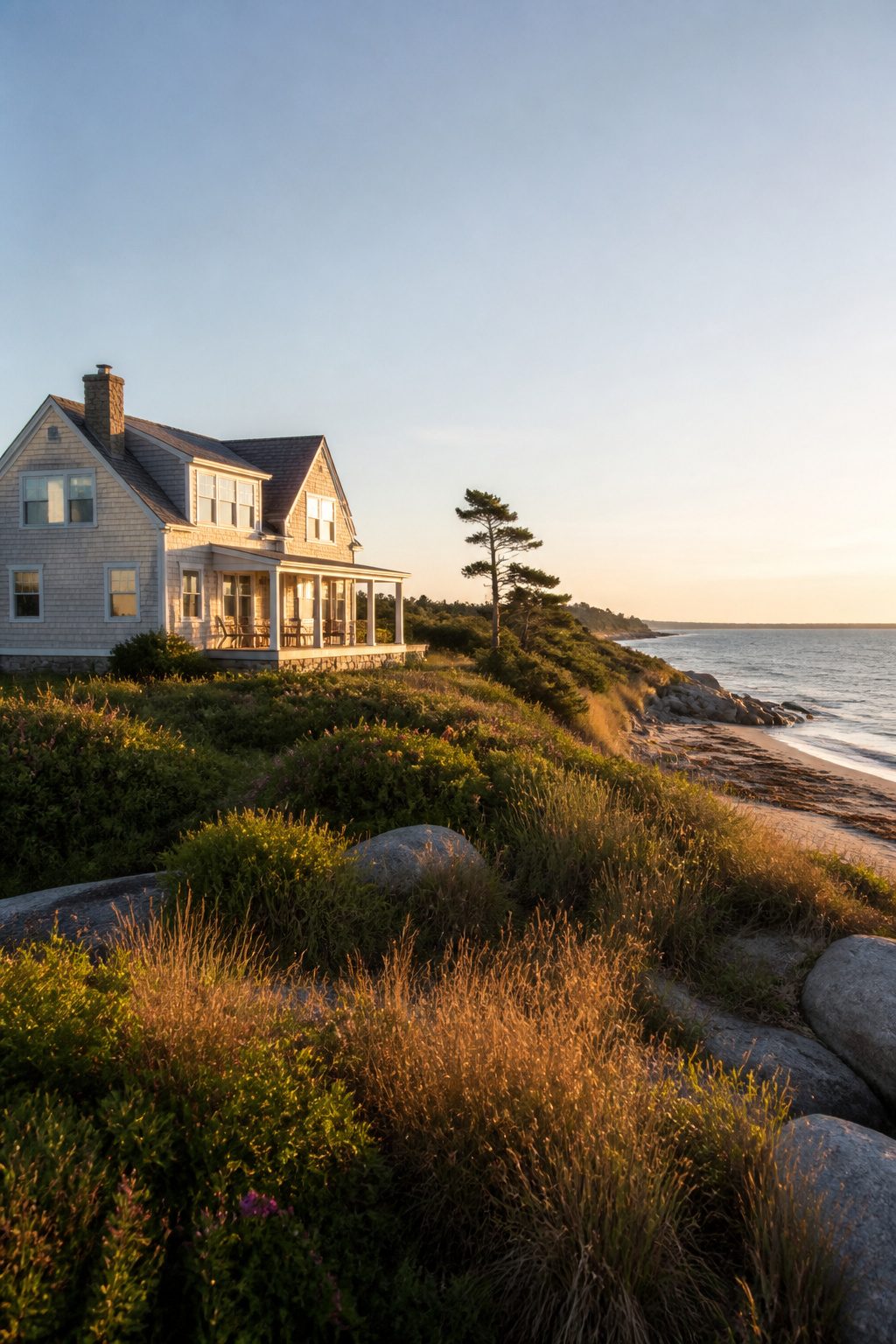
Shingled white along a New England or Pacific Northwest coast carries a softness that stucco modern beach houses rarely attempt. The siding here is usually cedar clapboard or shakes, and the white reads as warm because the wood underneath keeps it from going clinical. I noticed this difference walking a Maine shoreline where houses twenty years old looked settled into the dunes, not freshly installed.
Weathering is part of the aesthetic, not a failure. Salt air and steady moisture turn the finish matte within a couple of seasons, and owners who fight this with high-gloss repaint jobs end up looking like they missed the point. The refresh cycle runs roughly every five to seven years, not because the paint fails structurally but because the chalky fade signals that the house belongs to the coast. A pressure wash buys another season if the budget is tight.
The Pacific Northwest version leans greener in undertone from the heavier tree cover; New England reads slightly grayer under open sky. Either way, trim stays the same white as the body, or very close to it. Contrasting shutters read as inland affectation here. I would skip them unless the house faces a harbor where boats, not dunes, set the scene.
Tiled Villa
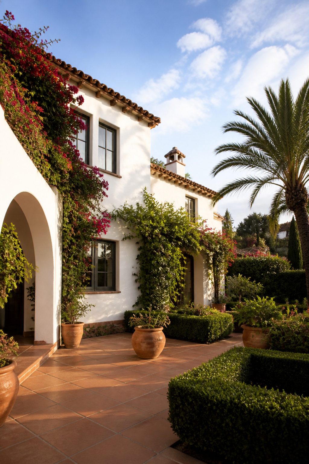
The terracotta roof on a white stucco villa is what most people picture first, but the tile itself does the harder work. Patterned clay tiles in blue, green, or warm earth tones turn a plain white box into something that reads intentional from the street. I spent an afternoon once driving a neighborhood near Santa Barbara where every third house had this combination, and the ones that held up best had grout lines kept narrow and the tile color repeated somewhere at eye level, usually on a window surround or a fountain basin.
White stucco shows dirt in a completely different cycle than tile shows wear. The walls chalk and fade evenly over five or six years; the tile loses its glaze patchily, and the patterns that looked crisp start to read as busy in the wrong way. Pressure washing the stucco buys you time, but the same pressure lifts the mineral haze that protects older clay tile. I would rather wash the walls by hand every spring and leave the roof alone for a decade than reverse that schedule and end up with porous tile that stains every time a branch drops sap.
For renters, peel-and-stick tile decals exist now that mimic the look well enough for a balcony rail or a small entry overhang. They will not survive a roof, but they let you test whether the pattern competes with your particular shade of white before you commit a landlord’s wall to something permanent.
Victorian Mansion
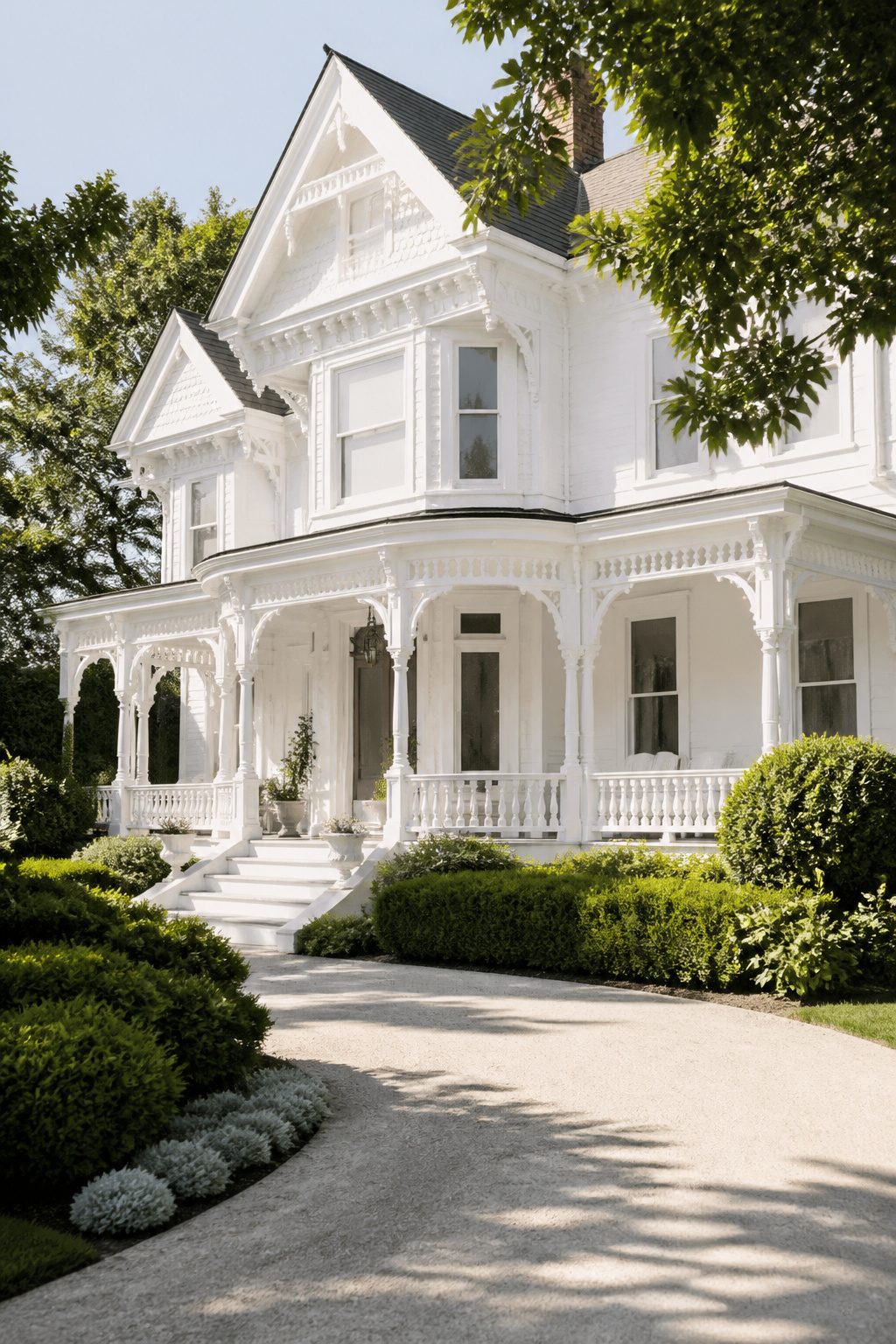
White paint on a Victorian mansion does something the original builders never intended. The style arrived in America with polychrome trim, jewel-toned siding, and enough color variation to make a paint salesman weep with joy. Stripping all that away for a single white shell reads as modern minimalism imposed on exuberant ornament, and the brackets, spindles, and fish-scale shingles lose their sculptural logic when they disappear into one flat tone.
I spent an afternoon once studying a restored 1880s Queen Anne where the owner had fought the local preservation board for a white-on-white scheme. The house looked elegant from the street, almost serene, but up close the carved details flattened out. Without shadow-casting contrast, the porch brackets read as lace doilies pressed under glass.
Historical accuracy sits at the center of the argument, and most preservation guidelines still push for documented period colors. A white body with a darker trim, or the reverse, keeps the architectural grammar intact while giving you the bright base you wanted. If you are set on all white, a barely-there shift, warm trim against cool siding, can recover some of the depth without abandoning the look. The cost difference between one white and three related tones is maybe a gallon or two of paint, but the visual return is the entire personality of the house.
Rancher
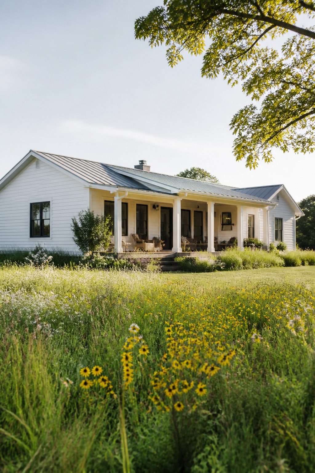
A ranch house in white reads long and low, the whole roofline stretching toward the horizon instead of climbing into it. The same horizontal line that made the style feel grounded in olive or tan turns almost weightless when the walls go white, and that is where trim color becomes the decision that holds the house together or pulls it apart.
I learned this walking my old neighborhood in Phoenix, where block after block of 1962 ranches sat in unchanged palettes. The ones that worked had trim two shades deeper than the walls, a warm off-white that caught shadow under the eaves and gave the eye something to follow. Keep the fascia and window frames within the same family as the wall color, just darker, and the line moves; go high-contrast with black or dark brown and the house breaks into stripes you did not plan.
Brick ranches complicate this. Painted brick in white needs the mortar joint as its texture, so trim should stay quiet, barely stepping away from the wall tone. Siding ranches have more freedom; the shadow lines between clapboards do some of the work for you, and a slightly brighter trim can push the walls back instead of forward.
My own mistake was painting the garage door to match the walls exactly on a white ranch I helped a friend with. Without that slight shift in value, the door disappeared and the facade went flat. We repainted it one step lighter, which sounds wrong but worked: the garage became a panel, not a hole, and the house finally had depth.
Craftsman
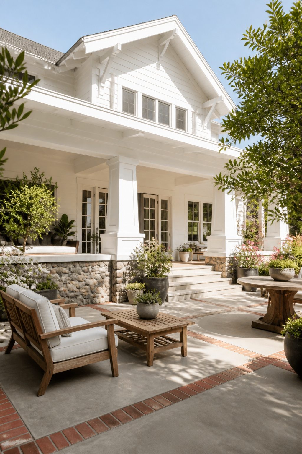
White-painted Craftsman homes stand out because the style usually leans into natural stains that show off cedar, fir, and redwood grain. Painting everything white is a deliberate break from tradition, and that choice changes what you can build with.
Tapered columns and exposed rafter tails still read as Craftsman, but paint-grade lumber costs roughly half what stain-grade does because knots, color variation, and grain irregularities get hidden under opaque coating. I learned this the hard way on a porch rebuild where I bought clear cedar for columns I planned to paint, then watched my contractor install standard Doug fir on a neighbor’s same-week job for about forty percent less. The painted finish looked identical from the street.
Mixed materials complicate the math. Stone or brick wainscoting with painted clapboard above works beautifully on white Craftsman houses, but trim boards, brackets, and corbels multiply fast. Paint-grade poplar or finger-jointed pine trim runs cheap and takes latex well, though it swells if water sits in joints. Stain-grade alternatives like mahogany or clear cedar demand oil-based primer and more sanding, and the material premium stacks with every decorative bracket.
If you are stripping an existing Craftsman to repaint, check whether previous owners used stain-grade wood everywhere. Replacing rotted knee braces or barge rafters with paint-grade stock saves money but changes the texture close up, where the old grain still shows at bracket ends and new paint-grade reads flat. That mismatch matters on a style built to reward walking up the front path and looking closely.
Southern Colonial
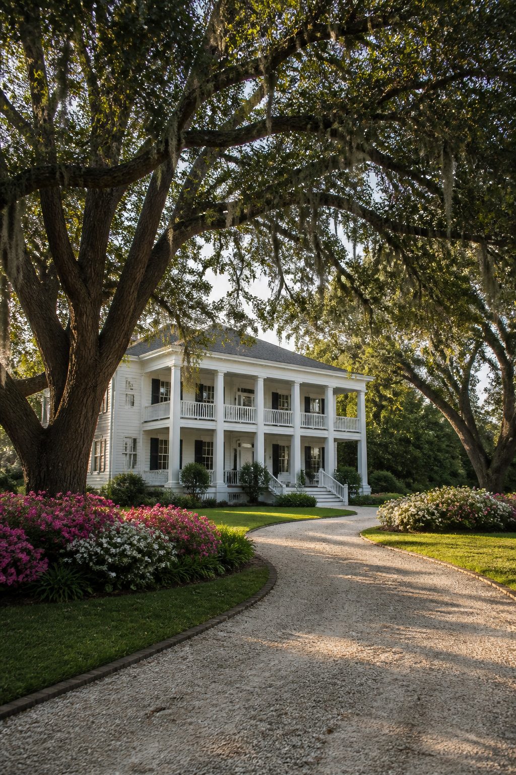
White columns and clapboard on a Southern Colonial read as inevitable, not chosen. The porch runs deep enough that midday sun never reaches the rockers, and live oaks drop enough shade to keep the walls from glaring. That same oak canopy traps humidity against the boards for hours after sunrise, which is why the white here is never just a color decision. It is a maintenance contract.
Mildew starts at the baseboards and the column plinths, wherever morning dew pools and air sits still. A flat white in a high-gloss or semi-gloss finish buys you time; matte chalks over in a season and holds moisture like a sponge. I would budget for washing down the north-facing porch posts every spring whether the dirt shows or not, because by the time the gray bloom is visible, the roots are in the primer. Paint marketed as "mildew-resistant" usually means fungicide additive, which helps but does not forgive bad drainage or gutters that drip. If the porch floor boards cup even slightly, water follows the grain uphill and the white riser behind it stains brown from the inside out.
The prettiest examples I have seen let the trim do the work: wide corner boards and window casings in the same white as the field, but stepped out an inch or two so shadow defines the shape. Without that depth, a Southern Colonial in flat light reads as a blank box, pretty only from the street and featureless up close.
Cape Cod
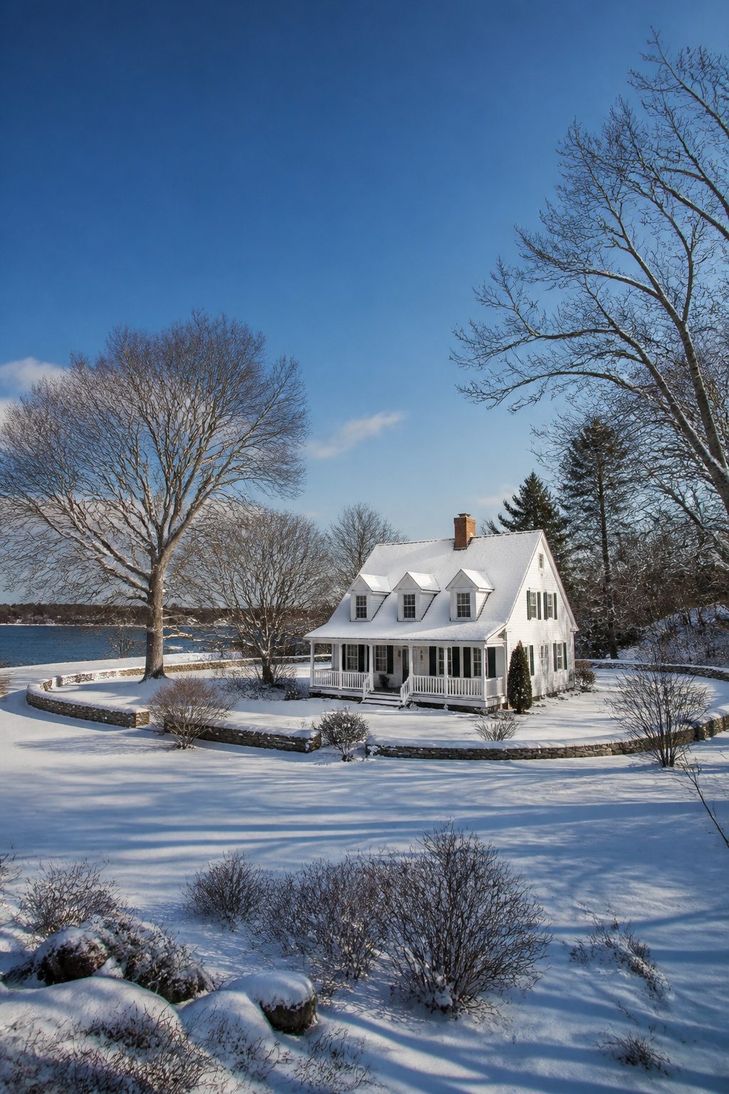
Steep roofs and dormers are what most people picture first with Cape Cod houses, and that silhouette exists because the style was built for punishment. The sharp pitch sheds heavy snow before it can load up and split a seam, while the compact footprint and central chimney let a single wood stove heat the whole house when a nor’easter cuts the power. White clapboard on these houses reads almost continuous from sky to ridge to wall on a February afternoon, which is why the color stuck even after insulation made thick walls less necessary.
The paint system matters more than the shade. Standard latex on a Cape Cod facing salt spray and freeze-thaw will start checking within two or three seasons, so oil-based primer with a high-build acrylic topcoat is the minimum I’d spec for anyone within a mile of tidal water. The primer seals end grain where clapboards meet at the rake, and the acrylic’s flexibility keeps it from cracking when the boards move through winter. I’ve watched too many homeowners roll on thick all-in-one paint and wonder why it peels in sheets by spring; the money you save skipping primer leaves you scraping the whole thing twice as often.
For dormers, the joint where the wall meets the roof plane is the failure point. Caulk there eventually hardens and splits, so I cut the siding to leave a shadow line that sheds water instead of trapping it. The white stays cleaner longer when you stop water from getting behind it in the first place.
Why White Survives
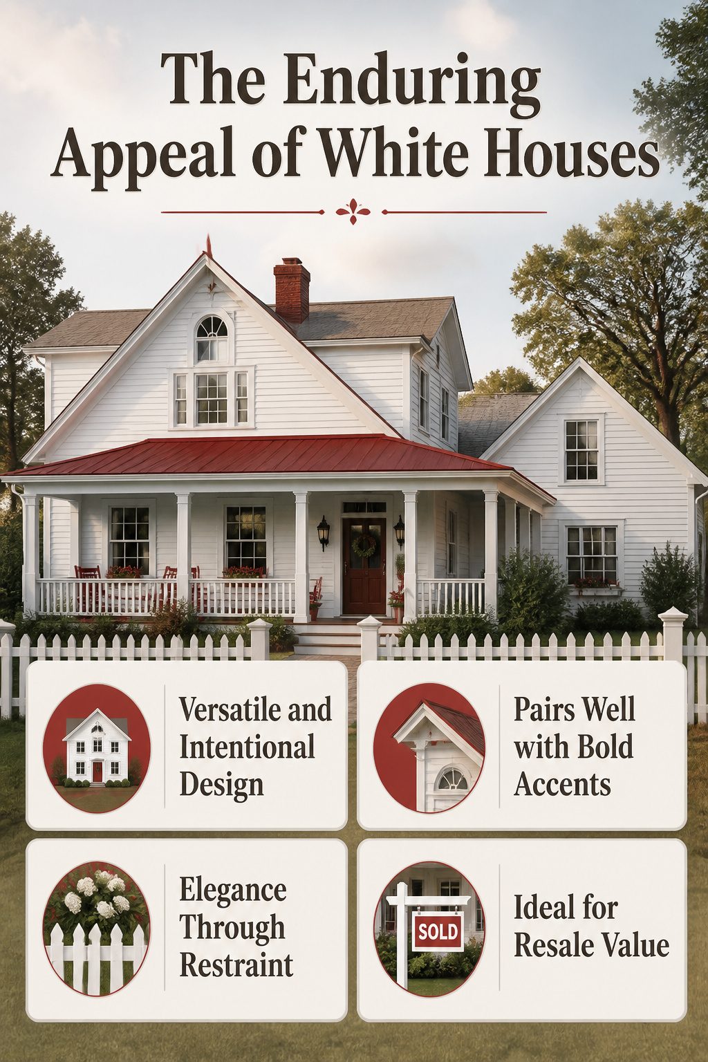
White paint on a house is less a trend than a reset button. Sources that track curb appeal keep returning to the same observation: a white exterior reads as intentional without reading as risky. That matters when you are painting once and hoping to sell in five years, or when your landlord finally agrees to let you touch the siding.
The versatility is what sold me, looking through dozens of examples. A white farmhouse with a red porch roof and a sleek suburban two-story with black trim both read as complete ideas, not compromises. White lets the architecture do the talking while you spend your budget on one good accent, like that red trim on the older home with the arched window, rather than distributing it across three competing colors.
Elegance enters through restraint. The white houses that stop scrolling tend to carry one bold move: a stone foundation, a picket fence, a pair of wooden front doors. Nothing shouts, which is why the look survives when louder palettes date themselves. I have watched enough neighborhood paint cycles to notice that the white house with red rocking chairs still looks settled, while the sage green and the navy blue come and go with the decade.
Resale is where the argument tightens. Buyers project their own accents onto white; they subtract from charcoal or terracotta. Whether that makes white permanent or just patient is the real question. My read: it is the color you choose when you want the house to outlast your taste in shutters.
The Dirt Problem
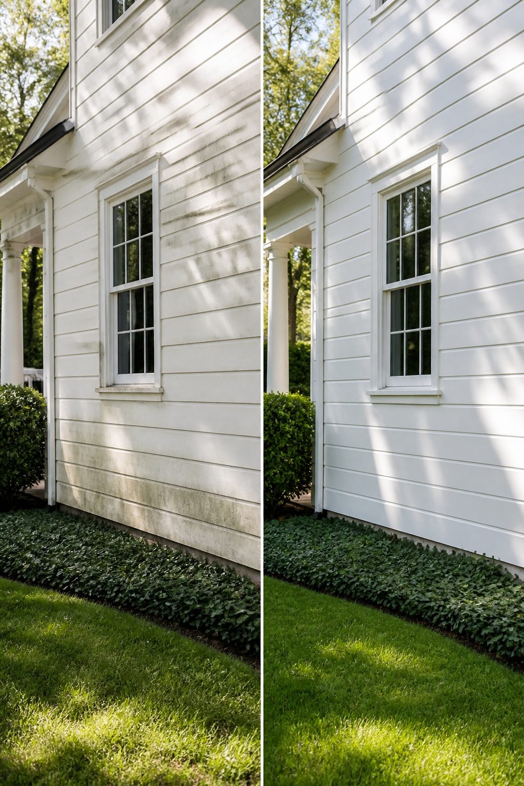
White paint turns every speck of dirt into a headline. After two rainy seasons on a pale exterior, the grime line along the bottom clapboard becomes impossible to unsee. Coastal salt, Midwest clay, city soot; each region writes its own signature stain, and white reads every one like a page.
The cleaning cycle is the tradeoff nobody puts on the mood board. A darker house forgives a year between washes. A white one asks for attention every spring at minimum, sometimes twice in pollen-heavy months. Power washing helps, but the siding wears a little softer each time, and the risk of water forced behind trim boards is real.
I spent one afternoon scrubbing what I thought was mildew off a garage door, only to realize the streaks were iron tannins from an old gutter above. The fix was a rust-blocking primer, not bleach, and the lesson cost me a Saturday I had planned to spend on something prettier. Grime on white is not always what it looks like, and the time spent diagnosing it is part of the maintenance bill.
Some owners make peace with a lived-in patina. Others treat the house like a pair of white sneakers, touching up scuffs monthly. Neither choice is wrong, but the second one is expensive in hours, and the first one slowly stops reading as "pretty" to anyone driving by.
Accent Colors That Work
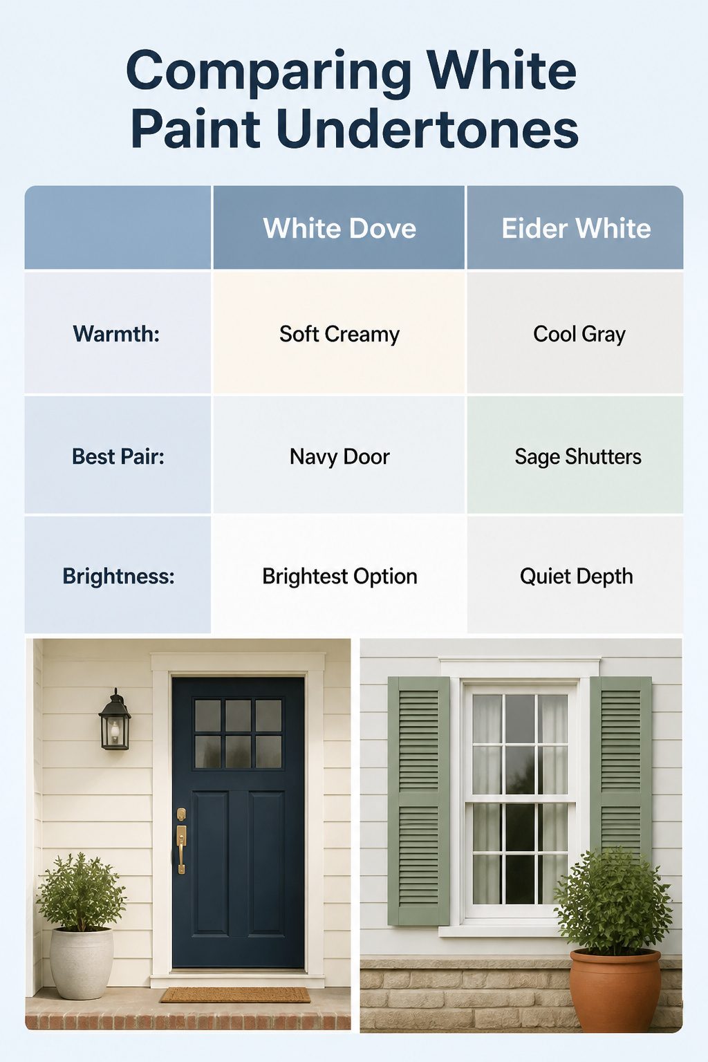
White paint is never just white, and the undertone decides what you can pair it with. Benjamin Moore White Dove carries a soft warmth that reads almost creamy in afternoon light; against it, a navy door feels crisp without going cold. Sherwin-Williams Eider White leans cooler and grayer, so sage shutters or a terracotta planter read as intentional rather than muddy. If you want the brightest option, Chantilly Lace is the one to sample side by side with White Dove; the difference shows up fast, and it lets black trim or a saturated accent color do the heavy lifting. China White sits quieter, with enough depth that it does not wash out against stone or brick details you might keep.
The real flexibility is in how the white shifts the pairing, not the pairing itself. A warm white forgives earthy accents. A cooler white demands cleaner contrast. Sample two on your actual siding before you buy the door paint; the same forest green reads rich against one and flat against the other. That test costs a sample pot and an hour, and it saves a full redo.
White as Controversy
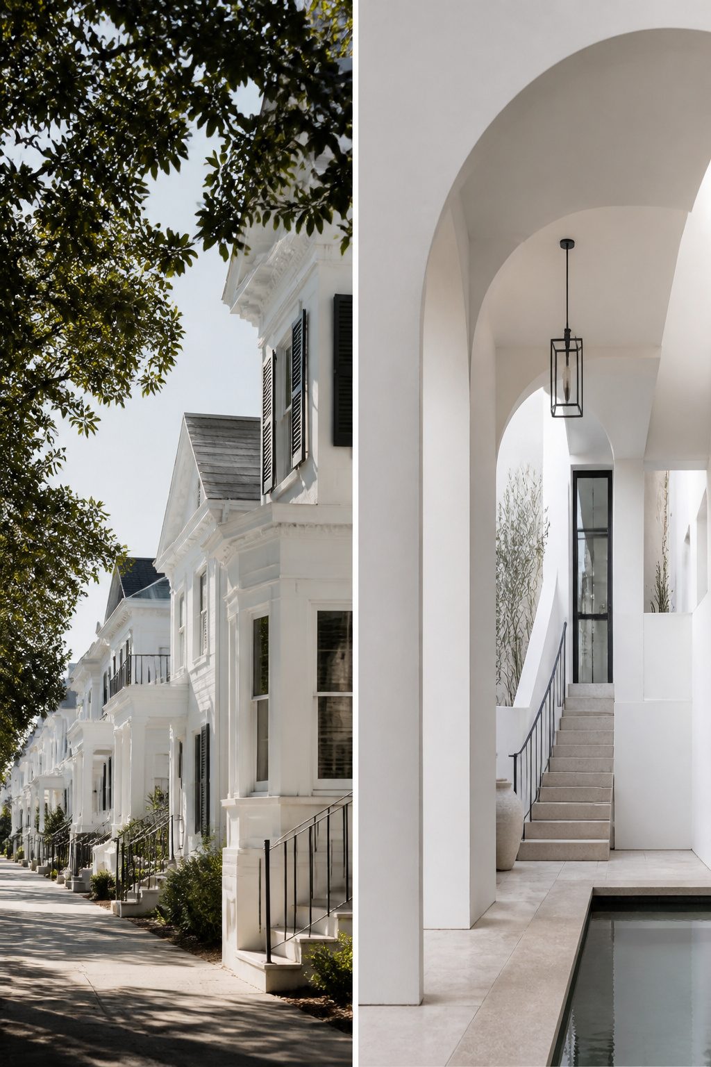
Some people look at a white house and see a blank slate waiting for personality. Others see the opposite: a decision so safe it borders on invisible. The tension between those two reads is older than the current trend cycle, and it flares up every time a neighborhood fills in with another coat of cloud-white siding.
The criticism that white lacks imagination usually comes from a real place. A builder-grade box with no trim variation, no texture shift, no shadow line to catch the light can read as unfinished rather than restrained. The color itself becomes a stand-in for a lack of decision-making, and that is fair to call out. But the defense of white holds just as firmly. A stately home with proportioned windows and layered trim can carry white as a deliberate choice, not a default. The same paint reads completely different when the architecture underneath earns it.
What shifted recently is that bold, earthy, and vibrant exteriors are genuinely on the rise, so the middle ground is shrinking. A white house used to be one option among many neutral contenders. Now it sits at one pole against saturated greens and terracottas at the other, which makes the choice feel more charged than it once did. White survives when the details do the work, because color alone no longer carries the whole design.
For someone mid-project with a few hundred dollars and a weekend, the practical question is whether your house has those details to support the choice, or whether a different direction would do more of the lifting.
White and Sustainability
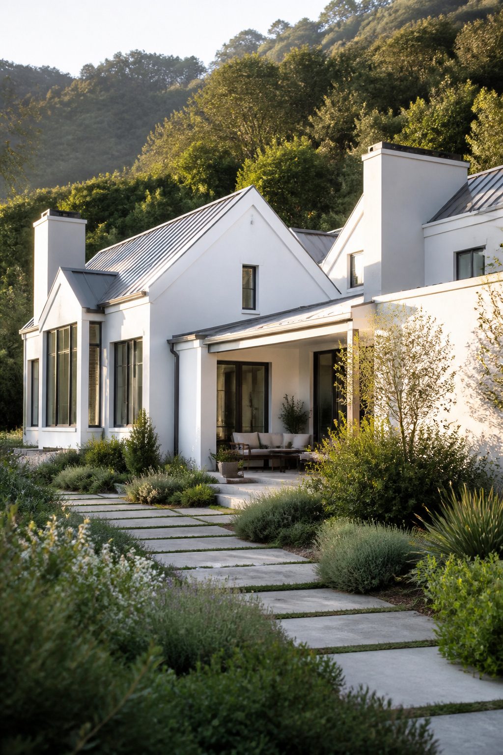
The shift toward earthy tones, deep terracotta, sage green, and muted yellows, is partly a response to sustainability concerns. Homeowners want exteriors that feel connected to the environment rather than set apart from it. White, by nature, can read as stark against a natural landscape where warmer colors blend in.
That said, white houses are not fading out. The same interest in sustainability that drives some toward earth tones leaves others choosing white for practical reasons. A light exterior reflects heat, which matters for cooling costs in warmer climates, and white paint formulations have improved enough that maintenance is less of a burden than it used to be. Dirt still shows faster on white than on deep blue or dark green, but the gap has narrowed.
The real choice is not white versus earth tones so much as which problem you are solving. If the goal is a house that looks grounded in its setting, terracotta or sage will do that work immediately. If the goal is longevity and flexibility, white still wins, and you can add warmth through wood accents, stone, or plantings instead of paint color. I have watched this play out in my own neighborhood: the white houses that look dated are the ones with nothing else going on, not the ones that are white by default.
Frequently Asked Questions
Are white houses a timeless classic or a passing trend?
White houses have long been a symbol of elegance, simplicity, and versatility in architecture and design. The article covers styles from Georgian Colonial to Contemporary Minimalist that all rely on white as a foundational choice, suggesting the look endures across centuries and regions. Bold colors and earthy tones may rise and fall in popularity, but white remains a constant because it serves structure rather than style alone.
What are the maintenance concerns for white houses?
Dirt, grime, and environmental stains show up quickly on white surfaces, which can require more frequent cleaning and touch-ups. The article notes that flat roofs and smooth panels on minimalist homes show dirt within weeks, while porch-heavy farmhouses collect pollen and mildew in humid months. Semi-gloss finishes on high-traffic areas and mildew-resistant formulas on shaded Southern Colonial porches help extend the clean look.
How do white houses pair with accent colors?
White acts as a neutral canvas that lets almost any accent color work, though the article stresses restraint as the guiding principle. Georgian Colonials get by with black or dark green shutters and brass fixtures; French styles use deep blue-gray or faded green shutters against creamier whites. The key is keeping accents period-appropriate and minimal so the white ground highlights proportion and line rather than competing with it.