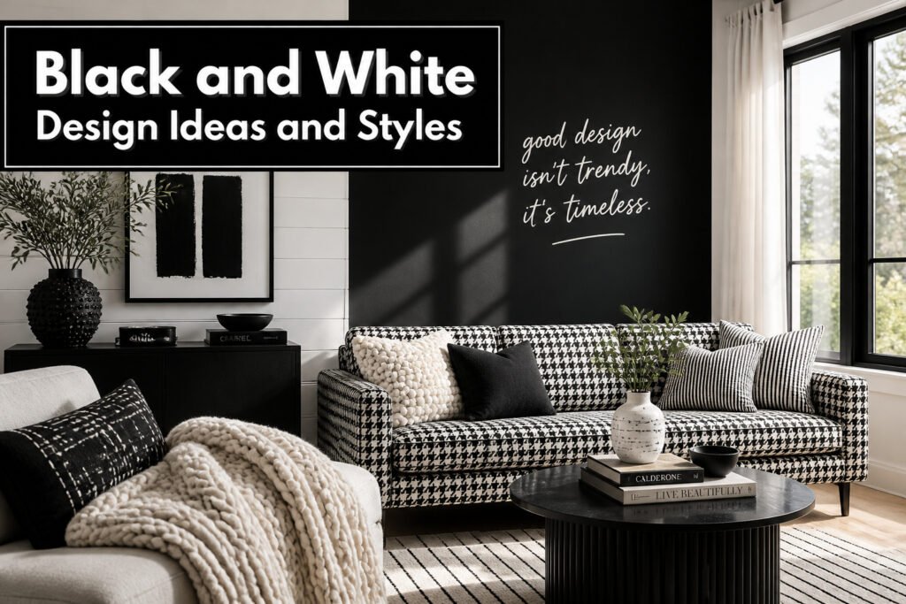
Black and white design inspiration spans from hand-lettered wall statements to optical illusions that vibrate if you stare too long, with the deciding factor being how much time you will spend in the room. The same stripe that energizes a hallway can make a bedroom feel unstable by day two, a lesson learned by painting an accent wall and repainting within the week. What saves the palette from flatness is texture: a 15-inch-wide stripe reads as architecture, but a nubby linen sofa against smooth shiplap is what makes the space feel inhabited rather than printed.
1. Striking Custom Typography

Black and white typography gains its power from the achromatic palette’s stark clarity, with no competing color to dilute the message. Hand-lettered or custom type treatments read as both modern and traditional depending on execution, and the difference sits almost entirely in weight and scale.
A thin, elegant script at small scale leans traditional, like a Parisian hotel sign. The same letterforms blown up to wall scale with heavy weight flip to modern, almost architectural. The scale threshold for room impact starts around 18 inches in letter height, where the form becomes structural rather than merely readable.
White on black reads bolder than black on white at identical weights, an inversion that lets you pull back on thickness and still hold presence. I have seen this used to split functions in a single wall: black background for navigation or labeling, white for the main statement, or reversed depending on which element needs to dominate. Gray shades between the extremes add layering without breaking the system, useful when you need hierarchy without introducing a third color.
The risk is overstatement. At room scale, one bold word or short phrase outperforms a paragraph. The palette is flexible enough to look mod or classic, but the execution commits to one or the other.
2. Bold Lines and Movement

Stripes, chevrons, and directional graphics give black and white spaces their energy when there is no color to pull the eye along. Line weight matters more than pattern choice: a 15-inch-wide stripe carries the wall like architecture, while a pinstripe reads as texture from across the room. The first time I tried this, I painted the baseboard and chair rail white, the ceiling black, and ran wide stripes wall to wall. The chair rail to ceiling connection gave the room a single visual frame instead of three competing bands.
Direction controls where attention lands. Horizontal stripes widen; verticals lift the ceiling; chevrons or diagonals add movement that feels almost kinetic in a hallway or stairwell. In actual rooms, this works best where the geometry already supports it. A long corridor with a chevron runner pulls you forward. A square bedroom with bold horizontal stripes can feel like the walls are pushing outward, which is not always the goal. Solid fabrics on the largest pieces, the sofa or the bed, keep the graphic from becoming noise. I have seen striped walls paired with striped upholstery, and the eye has nowhere to rest; the room feels like it is vibrating.
Graphic-only contexts, a poster, a tile layout, a digital header, can handle denser pattern because the viewing distance is fixed and the surrounding space is white space. In a room you walk through, the same density turns oppressive. The rule I follow now: if the pattern repeats more than three times in my field of view at the entry point, it is too much for a living space.
3. Elegant Illustration-Based Patterns

Hand-drawn or engraved-style motifs in black and white carry a weight that geometric patterns rarely match. Where grids and stripes feel clean and modern, illustration-based patterns read as noir, vintage, or storybook, depending on the line weight and subject. A toile with sketched botanicals or a block-printed animal motif turns a wall into something closer to a woodcut or a film still than to wallpaper.
The emotional difference matters when you are renting. Geometric patterns tend to dominate a room and fight with your furniture for attention. Illustration-based patterns, especially in black and white, recede in a way that lets your actual pieces breathe. Peel-and-stick panels with engraved-style florals or crosshatched landscapes give you that mood without the landlord conversation. I have seen renters cover the backs of bookcases, line drawer fronts, or paper the ceiling of a narrow hallway with these patterns, getting the effect for the price of a few rolls and an afternoon.
The risk is choosing something too detailed for the scale. A dense engraving in a small bathroom can feel like a fever dream. In larger areas or above eye level, the same pattern reads as atmosphere. My own preference runs toward single-color linework rather than the shaded or stippled varieties; the flat black holds its graphic punch even under warm LED bulbs that would muddy a half-tone pattern.
4. High Contrast Imagery
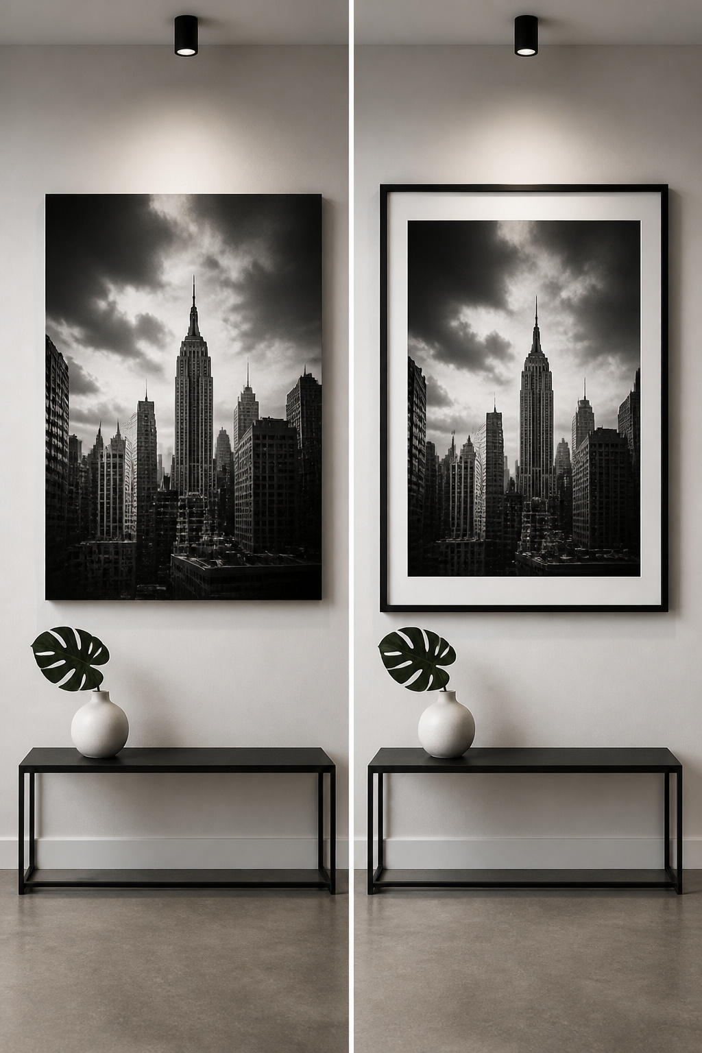
High-contrast photography lives or dies by how it handles the extremes. In a black and white room, a print with true blacks and clean whites pulls the eye immediately; the same image with flattened grays just disappears into the wall. I learned this the hard way with a skyline photograph I ordered at 24 by 36 inches. On screen it looked dramatic, but blown up, the mid-tones turned to mush and the building edges lost their bite. The piece went back.
Poster size demands harder contrast than small frames. At 8 by 10 inches, your eye forgives a softer tonal range because you are close enough to read the detail. At poster scale, you are reading from across the room, so the image has to communicate through silhouette and stark light shapes alone. Look for work where at least forty percent of the surface reads as near-black or near-white, with minimal gray in between. That is the threshold where the piece starts to work architecturally in the space, not just decoratively.
The common mistake is choosing for subject matter instead of tonal structure. A dramatic mountain scene can still be useless if the photographer let the shadows lift and the highlights compress. When I am shopping prints now, I desaturate the thumbnail mentally: does it still hold its shape as a pattern of dark and light? If the answer is no, the frame size will not save it.
5. Combining Imagery and Type

A gallery wall lives or dies by how much room each piece has to breathe. When you are mixing black and white photography with framed typography or a painted sign, the instinct is to fill every inch, but negative space is what keeps both image and type readable. The eye needs a place to rest before it can absorb the next element.
I learned this the hard way on a hallway project last year. I had a 24-by-36 botanical print, a hand-lettered "Wash your paws" sign for the mudroom, and three smaller frames, and I hung them too close together. The text on the sign competed with the dense leaves in the print, and the whole wall looked muddy even though every piece was technically black and white. Spreading them out so the wall showed through between pieces fixed it instantly.
The rule I follow now: treat the empty wall as an active shape, not leftover space. In black and white design, you do not have color to separate one element from another, so the gaps do that work. If your image has heavy dark areas, give the type more margin than feels natural. If the type is bold and graphic, let it sit in open space while the image handles the detail. One dominates, the other supports, and the wall between them is the switch.
6. Minimalist Website Layouts

Scrolling through a portfolio site last year, I noticed how the black sections pulled my eye straight to the headline while the white ones let me breathe before the next block of text hit. That rhythm, alternating black and white section backgrounds, works the same way on a living room wall or a mood board pinned above your desk. The contrast does the organizing so you do not have to.
The negative space matters just as much as the marks you make. A graphic by Mieczysław Wasilewski uses the empty shape around the image to tell the story, not the ink itself. When I lay out a project board, I leave wider gaps than feels safe; the eye needs somewhere to rest or the bold pieces fight each other and nothing wins.
Motion and scale finish the job. Subtle animations, scroll effects, and transparent or looping videos keep a monochrome site from flattening out, and the physical equivalent is mixing typography scales and weights or letting one object carry the weight while others stay quiet. Larry V’s site design does this with a single sharp central image striking into white space; I have copied that move with a black metal floor lamp against a pale wall and let the line do all the work. For your own planning, limit the interface to black, white, and gray, pair it with a minimal well-aligned layout, and the cohesion shows up without extra spending.
7. Mixing Patterns

Scale variation is the only thing that keeps mixed black and white patterns from turning into visual noise. I learned this the hard way in my own living room, where I once paired a medium-scale buffalo check with a similarly sized houndstooth. The two patterns fought for attention until the whole wall looked like it was vibrating. The fix was dropping one pattern down: a large-scale geometric on the curtains against a tight herringbone on the throw pillows. The eye reads them as layers instead of competition.
The same rule held when I added a third pattern. A small-scale ticking stripe on the lamp shade sat quietly against the larger geometries because the scale gap was at least double. What failed was trying to bridge the gap with a mid-size floral. It sat in the awkward middle ground and broke the hierarchy.
In a powder room, bold black-and-white wallpaper already carries the weight of a large pattern. The towels or a small framed print should stay small and simple, or go solid entirely. The sources that pull this off treat pattern mixing as a volume game: one loud, one whisper, and nothing in between.
8. Optical Illusions

Stripes in strict black and white do something flat paint cannot: they seem to vibrate. The effect is not subtle. Wide, glossy black-and-white stripes on a wall bring in a playful element, but the same pattern in a narrow hallway or a home office where you stare at it for hours turns from engaging into exhausting.
I learned this the hard way with a single accent wall in a rental bedroom. The vertical stripes were about six inches wide, matte finish, and by the second evening the wall appeared to shift when I moved my eyes across it. The room felt unstable, not dramatic. I painted over it within the week.
The rule that emerged: optical patterns work best where people pass through, not where they settle. An entryway, a powder room, the backing of a bookshelf. Geometric patterns and polka dots behave the same way. Overlapping them, as some designers do, creates new forms that hold attention for a moment, which is exactly the right duration. Use them as conversation pieces, not as wallpaper for daily life.
9. Black and White Photography

Black and white photography lives or dies in the printing. A matte finish on cotton rag paper gives the tonal range room to breathe; glossy stock crushes the shadows and turns every mid-tone muddy. I learned that the hard way with a print of my grandmother’s farmhouse porch, the one with the swing. On glossy paper the shadows behind the railings disappeared into a single black slab. The same file on matte paper let me see the individual balusters, the grain in the floorboards, the depth that makes a photograph feel inhabited.
Frame color matters more than the frame itself. A thin black frame against a white wall can make the photograph feel like a window punched through the surface. White frames, especially in a grid, turn the images into objects on the wall rather than views into something. I keep the mat width generous, three inches minimum, so the eye has space to settle before it reaches the image.
Not every color photograph survives conversion. Images that already read well in thumbnail form, the ones with strong shapes and clear separation between elements, gain weight in black and white. Photographs that depend on color temperature to create mood, a sunset, a rusted door against green paint, often flatten into gray noise. The ones that work are the ones where you could describe the composition to someone over the phone and they would see it. If you need the color to explain why you took the picture, leave the color in.
Ebonized or black lacquered floors against stark white walls create a classic space you can live with for a long time.
That same permanence applies to photographs. A black and white print chosen for its structure, not its novelty, hangs comfortably through years of changing everything else in the room.
10. Adding Color Accents

Gold fixtures and hardware in a black kitchen, or a thin vein of gold running through marble countertops, add warmth without breaking the monochrome spell. The same restraint works in any room. A single cobalt vase on a white shelf, or a line of scarlet in an otherwise grayscale print, gives the eye a place to land.
The rule I settled on after too many busy rooms: one accent color, two sources maximum. Maybe the lamp base and the throw pillow share the same rust tone, or the artwork and the desk tray repeat a single teal. Spread that same tone to a third object and it stops reading as an accent; it starts reading as a second theme.
Gold earns its place because it functions almost as a neutral against black and white. It reads as metallic warmth rather than competing color, which is why it works on hardware, frames, or a single sculptural piece without demanding the two-source limit. For brighter hues, keep the ratio closer to ninety-five percent monochrome, five percent accent. The black and white design inspiration holds only when the color stays the guest, not the host.
11. Black and White Interiors
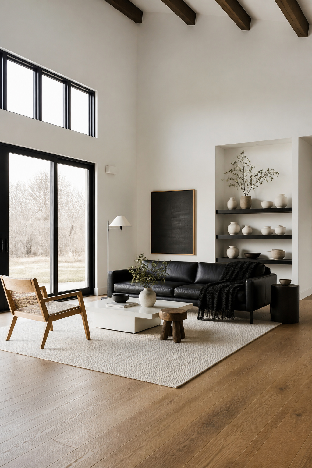
Black and white interiors only stay classy when the balance is deliberate. Three sources of each color, minimum, or the room tips into a showroom sterility that feels lived-in by nobody. I learned this the hard way after painting a rental floor solid black. The finish looked sharp for about six hours, then swallowed every photon that entered the room. Lamps that worked everywhere else barely dented the gloom. I ended up repainting half of it a warm medium-tone brown within the month, which finally let the space breathe.
The fix for contrast this sharp is natural material. A wood floor in that warm brown range, live branches in a ceramic vase, linen with its slubbed irregularity. These elements keep the palette from reading as a photograph rather than a room. For furniture, one noir piece anchors the space without competing. The rest should sit in the white or natural range, never another black competing for dominance. Three sources, three tones, and something alive in the corner. That is the ratio that survives a real weekend and a real budget.
12. Black and White Patterns in Decor

A black and white checkered floor still reads as one of the clearest statements you can make in an entry hall, living room, or kitchen. The size of the squares changes the effect entirely: an 18-inch tile set on the diagonal lifts the eye and stretches the room outward, while smaller squares pull the gaze down and can feel busier than most weekend projects want.
Pattern alone will flatten a space if you let it. I learned this the hard way with a bathroom redo where the graphic tiles looked sharp in the sample but relentless once every wall was covered. What saved it was breaking the pattern with solid fabric, a plain shower curtain in a warm white that let the eye rest. The sources that convinced me all pointed to the same move: pair your bold tile or textile with something unprinted, or the monochrome starts to hum.
Texture does what pattern cannot. Quartz and marble carry their own quiet veining, a natural repetition that softens the contrast without adding a second color. Ceramic tiles with strong graphics work best when you limit them to a single plane, floor or wall, not both. I would skip the faux plant that some designers suggest as a finishing touch; it rarely solves the problem and often looks like an apology for the bold choice you just made.
Scale is the judgment call. Large repeats suit open floors and long sightlines. Small repeats belong on throw pillows, bath mats, the places where a foot or a hand passes close. Get that wrong and the room feels either stingy or shouting.
Why This Palette Lasts
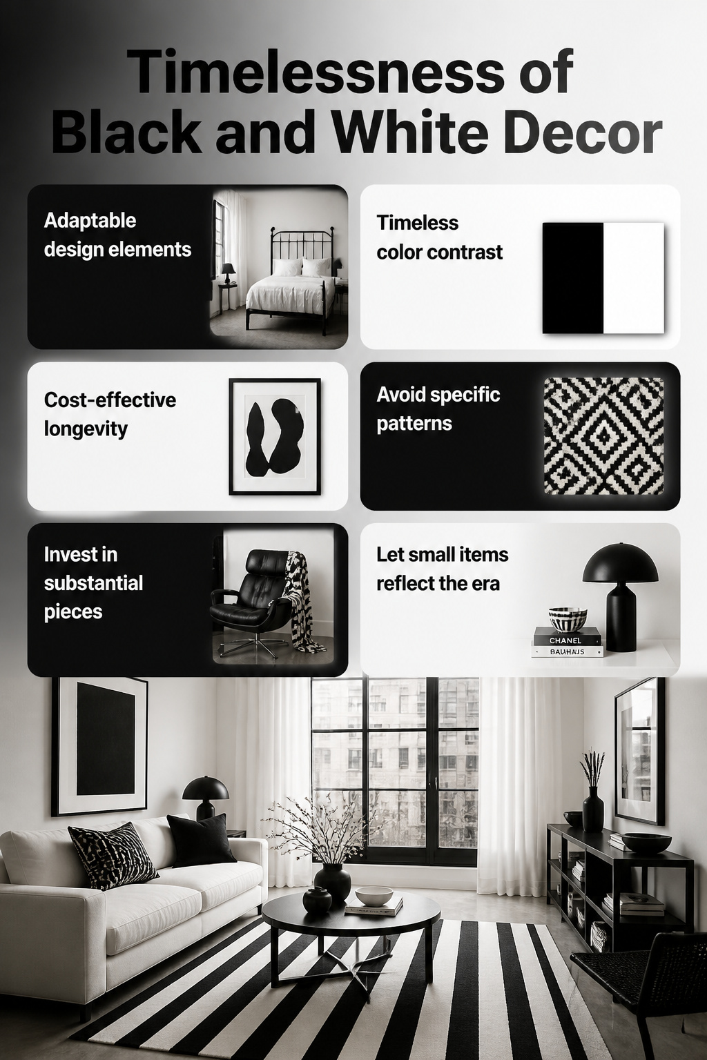
Black and white design inspiration works because the palette shifts without changing its parts. A graphic black-and-white grid reads modern; the same two tones in a soft ticking stripe reads farmhouse. I have carried a black iron bed frame and a set of white linen curtains through three apartments, one barely updated since the seventies and one with poured concrete floors. Neither piece looked out of place because the contrast does the work, not the style attached to it.
That adaptability changes what you can spend on. A bold black-and-white rug or a substantial framed print justifies its price when it survives two or three room overhauls. Color trends turn over every few seasons; a palette built on pure contrast does not date the same way. The risk is not boredom, it is choosing pieces so specific in pattern that they lock you to one look. I keep the large items simple and let the smaller ones carry the era.
Contrast That Actually Works

A black and white scheme lives or dies on whether the contrast is strong enough to read as intentional. The eye wants to see a clear jump between the two tones, not a muddy negotiation. I learned to check this with the camera already in my pocket.
Pull up your phone and photograph the wall or corner straight on, with daylight hitting it. Open the edit mode and look at the histogram, that mountain-shaped graph of light values. A working black and white room shows two distinct bumps: one huddled toward the left edge for the darks, another pushed toward the right for the lights. If the mountain sits as one soft hill in the middle, your contrast is too weak and the room will read as gray and tired, not graphic. That middle-heavy histogram told me my first attempt at a black and white bedroom failed before the paint even dried; the charcoal I chose was pulling 40% lighter than true black in that light.
The histogram also guards against too much punch. When the left or right spike gets slammed against the edge, you have gone to pure black or pure white with no detail, and the room turns harsh like a photo negative. I aim for the tallest spikes to sit about a thumb’s width inside each edge, leaving breathing room. It takes thirty seconds, and it beats standing in the aisle at Home Depot holding two swatches up to fluorescent light.
Texture as the Secret

Pattern alone will flatten a black and white room faster than almost any other mistake. Two years ago I painted a spare bedroom in crisp white with a bold black-and-white geometric stencil across the accent wall. The graphic read perfectly on camera, but standing in the room felt like staring at a screen. Nothing invited touch. The eye had nowhere to rest because every surface asked for the same kind of attention.
Texture is what separates a designed room from a printed page. In my living room now, I pair a nubby black linen sofa cover against smooth white painted shiplap, then add a chunky hand-knotted cotton throw in off-white. The linen catches light unevenly, the cotton reads almost architectural, and the painted wall behind them stays quietly flat so the fabrics do the work.
I learned that lesson the hard way in that bedroom. Without the contrast of physical surface, even expensive materials disappear into the pattern. Now I always include at least one element that breaks the visual rhythm by feel: raw ceramic, unglazed terracotta, live-edge wood left matte, or wool with the lanolin still slightly apparent. The black and white palette strips away color distraction, which means texture has to carry the entire sensory load. Skip it, and the room reads as a rendering rather than a place.
Small Branding Touches at Home

Black and white carries the same weight in a home office or entryway that it does on a business card. The palette reads as intentional, not inherited. A few years back I swapped the warm wood desk I’d lugged through two apartments for a black metal frame with a white laminate top, and the corner of my living room suddenly looked like someone had planned it rather than accumulated it. The overhead light, painted black against a white ceiling, drew the eye up the way a bold ceiling treatment should, adding depth without eating square footage I didn’t have.
The ceiling is where renters can be brave, since a landlord rarely looks up during a walk-through and a weekend of masking beats losing a deposit on wall color. In an entryway, a black console against white trim gives that first impression of deliberateness. It says you chose this, not that you were handed it. The same sharp lines and bold graphic elements that make monochrome branding memorable work at apartment scale: a ribbed lamp base in solid white, a mirror with a thin black frame, nothing fussy. The restraint is what reads as sophistication. Carleton Varney’s observation holds here too: black and white acts as a neutral backdrop, so the one colorful thing you do add, a single plant or a stack of mail, actually registers instead of disappearing into visual noise.
Frequently Asked Questions
What are the benefits of using a black and white color scheme in design?
The palette adapts across styles without changing its parts, so pieces survive multiple room overhauls. Contrast does the visual work instead of attached trends, which means a bold rug or framed print justifies its price over years. Black and white also simplifies choices for viewers and lets photography or typography carry the full impact.
How can I incorporate black and white into my interior design?
Balance three sources of each color minimum, or the room tips into showroom sterility. Add natural material like wood, linen, or live branches to keep the palette from reading as a photograph rather than a lived-in space. One noir furniture piece anchors the room; the rest should sit in white or natural tones, never a second black competing for dominance.
What are some tips for creating a black and white website?
Alternate black and white section backgrounds to create rhythm and let contrast do the organizing. Mix typography scales and weights, and add subtle animations or scroll effects so the monochrome does not flatten out. Leave wider gaps than feels safe; negative space separates elements when no color is available to do that work.