
Gallery wall ideas range from a single shelf you lean prints against to grids drilled directly into plaster, and what makes one right for you is almost never the art itself. The deciding factor is the surface you are stuck with: a landlord’s beige paint, textured drywall that refuses adhesive, or a barn door that will slam your frames into the jamb. Start from the constraint, not the Pinterest board. Two inches of kraft paper taped to the wall before a single nail goes in saves the Sunday you would have spent spackling, and the 57-inch eye-level rule keeps the center of your arrangement from floating above the sofa like an afterthought.
1. Monochromatic Color Scheme
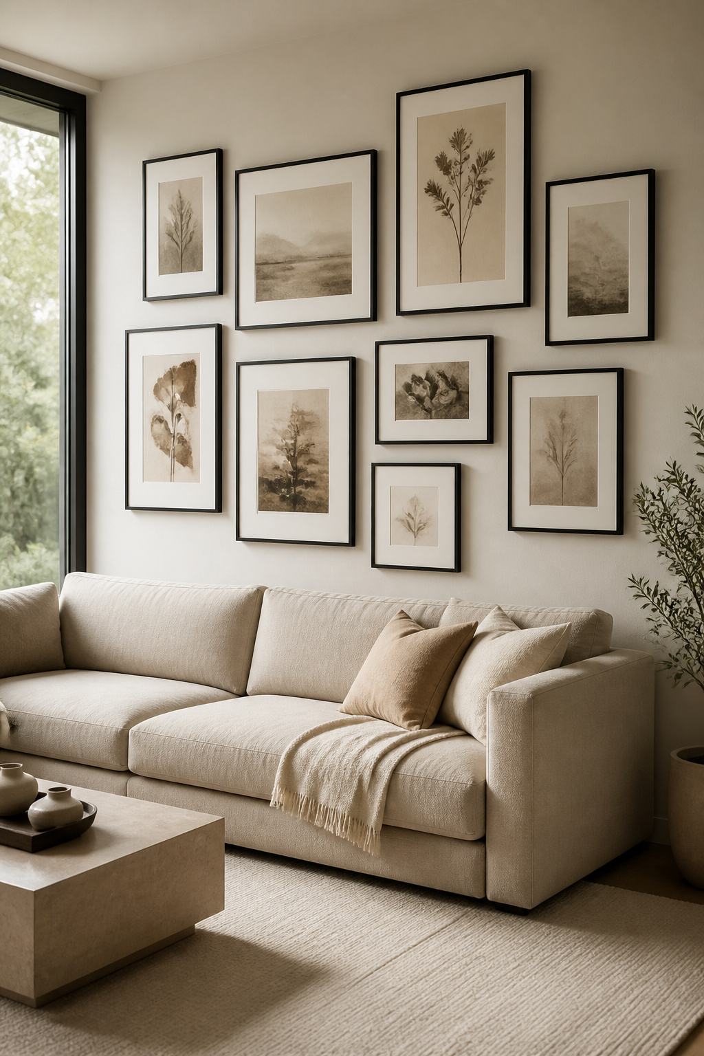
A single color family does more to quiet a busy wall than any layout trick. All-black frames with white mats, for instance, let you mix portrait and landscape orientations without the eye scattering every which way. The frames read as one rhythm, not twelve separate decisions.
Sepia-toned prints work the same way. The narrow palette keeps a collection of oil paintings, photographs, and even three-dimensional shadow boxes from feeling like a yard sale. Your eye starts noticing texture instead: the grain of a wooden frame, the curve of a sculptural piece, the way a canvas catches light.
For renters, this is the safest bet for impact. A monochrome wall in soft creams and warm beiges, or deep navy layered into smoky blues, never fights the paint color you are stuck with. You get the gallery effect without asking the landlord a thing.
2. Cohesive Genre
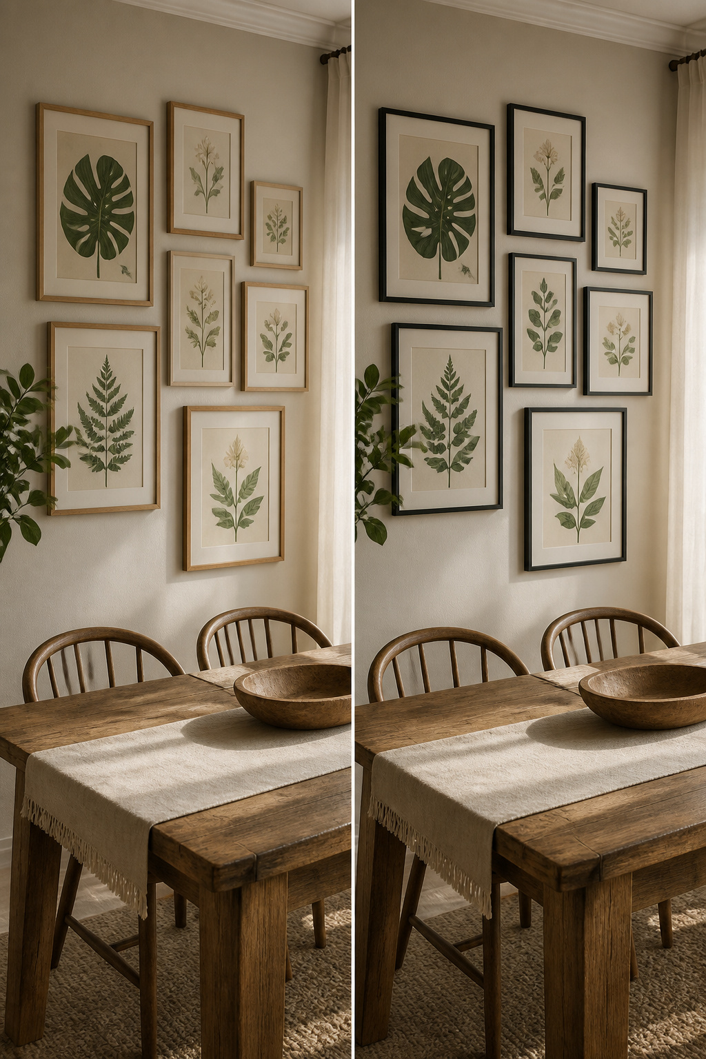
A gallery wall falls apart fast when every piece is shouting in a different style. Oil portraits, neon abstracts, and vintage travel posters all have their place, but that place is rarely the same four feet of drywall. The eye keeps searching for something to settle on, and when nothing connects, the whole thing reads as clutter you hung instead of a collection you built.
Keeping to one genre, whether that is all botanical prints, all family photos, or all line drawings, lets the arrangement breathe. The frames can vary in size, the spacing can shift, and the wall still holds together because the content speaks the same language.
I learned this the hard way when I tried to unify a wall by frame alone. Matching black frames were supposed to tie together a watercolor landscape, a concert poster, and a macro photograph of rust. The frames did their job; the art inside still fought. Anne Grandinetti at Ashby Collective puts it well: a cohesive genre is what makes a gallery feel curated rather than crowded. The frame is the envelope, not the letter.
3. Interesting Objects
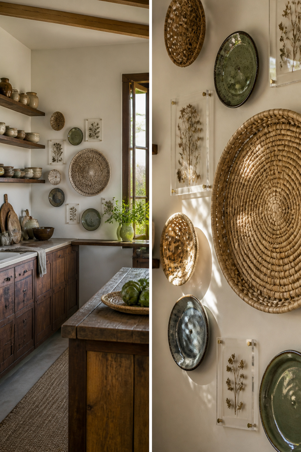
Flat prints have their place, but the walls that stick with me are the ones that borrow from the kitchen and the garden. Woven baskets, ceramic plates, pressed botanicals sealed in acrylic, vintage mirrors that catch the afternoon light: these are the pieces that turn a grid of rectangles into something you walk up to.
The catch is weight, and this is where I have watched friends learn the hard way. Command strips fail on anything with real heft. A rattan basket or a glazed plate pulls adhesive straight off drywall, especially in humidity. Basic nails hammered into a stud, or a proper hook rated for the poundage, are the only safe bet. Corinna Henderson, whose thrifted basket clusters I have admired for years, starts with the largest piece and arranges smaller ones around it, balancing size and color on each side. The same rule holds for a grouping of vintage mirrors: one dominant shape, then satellites.
Pressed botanicals in acrylic frames are lighter and easier, though the acrylic itself scratches if you rush the hanging. I would still use a nail. The mix of textures, the way a mirror throws light back across a plate’s glaze, is what makes the wall feel collected rather than decorated.
4. Symmetrical Layout

A symmetrical grid lives or dies by its anchor. I learned this the hard way after hanging four matching frames around a poster that was too small; the wall looked like a window with a random sticker in it. The fix is a 20-by-24 inch canvas print as the center weight, then building out with smaller frames in even rows. Keep the gaps tight: 2 to 3 inches between frames both ways, never wider, or the grid breaks apart into floating pieces.
The 57-inch rule fixes the height question that trips up most first-timers. Measure from the floor to the center of your anchor piece and mark that spot. That puts the middle of the arrangement at eye level, which keeps a symmetrical wall from feeling either disconnected or cramped against the furniture below. I check this mark with a level taped to a yardstick before any nail goes in; it takes two minutes and saves the patching later.
5. Unexpected Surfaces
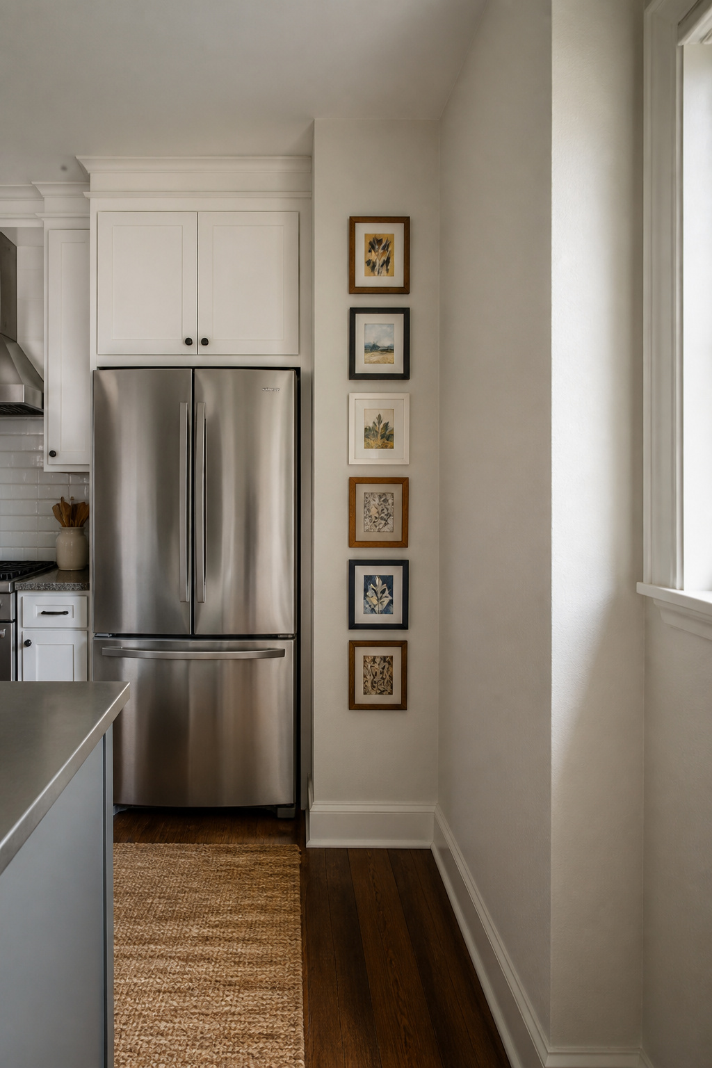
The narrow strip of wall beside a refrigerator is dead space in most kitchens, but it is exactly the right depth for a vertical stack of small frames. I ran a column of 5-by-7 prints there in my last rental, and the landlord never flagged it during move-out because the nail holes sat in a zone nobody expects to stay pristine. The same logic applies to the ceiling above a bed. A horizontal row of frames mounted flush to the ceiling draws the eye upward without eating the wall space you might need later for a headboard or shelving.
Sliding barn doors are trickier but worth the effort. The door becomes a moving panel, so the frames have to sit in the fixed half of the opening or ride with the door itself. If they ride, keep the arrangement tight and the frames light; anything bulky bangs the jamb when you slide it shut. The continuous look, open or closed, is what makes the extra work pay off. Staircase walls follow the same principle of claiming overlooked vertical real estate, though the angle means templates help more there than on flat surfaces. Kraft paper traced to your frame backs, taped up, and adjusted before a single hole goes in, saves the patching that eats your Sunday afternoon.
6. Mixed Art Mediums
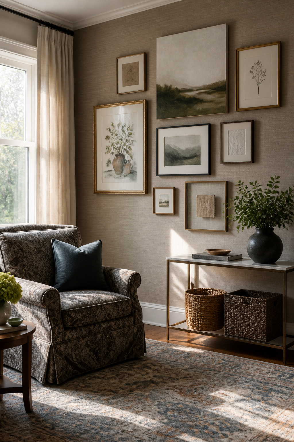
A framed watercolor, a canvas print, and a floating glass frame hung side by side do not just look different; they cast different shadow lines at different depths, and that physical variation is what keeps a mixed-medium wall from reading as flat. The watercolor sits back against the mat, the canvas juts forward, and the glass hovers a quarter inch off the print behind it. Step past the sofa and the shadows shift with you.
The catch is glare. Glass catches every window and lamp in the room, and if you stagger glass and non-glass pieces without planning the light path, one frame will always be a mirror at the wrong hour. I lay the whole arrangement on the floor first, then walk the room at the times I actually use it, noting where afternoon sun hits and where the reading lamp throws its cone. If a glass piece has to live in a bright zone, I tilt it or swap it for canvas.
"Combine different genres, time periods, scales, and mediums to create depth and intrigue"
What that means in practice: the floor rehearsal is not optional. A textile piece with a half-inch weave throws a softer shadow than a thin photograph, and until you see them together under your actual light, you are guessing at the depth you came for.
7. Personal Touches
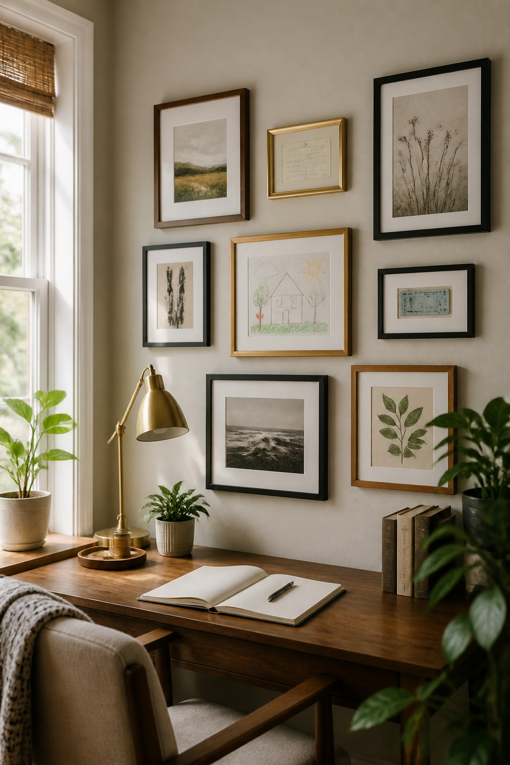
A gallery wall that feels lived-in, not bought-in, needs something that came from your actual life. The ticket stub from the concert where you met your partner, your grandmother’s handwritten recipe card for the pie she always brought, a child’s drawing slipped into a cheap IKEA frame, the map you carried on your honeymoon. These objects carry weight that no print shop can replicate, but they also carry practical problems.
Paper ephemera usually needs help before it meets a wall. Ticket stubs fade to illegibility under direct light; recipe cards often sit on cardstock too small for standard frames. Scanning at 300 dpi lets you reprint at archival size without risking the original. For anything with real dimension, a shadow box or custom matting bridges the gap between memory object and display piece. The cost runs higher than off-the-shelf frames, but not dramatically, and it protects the thing you actually care about.
The same spacing discipline applies here as everywhere else on the wall. Keep 2–3 inches between frames, whether the contents are a museum poster or your kid’s crayon sun. That gap is what lets a child’s drawing hold its own against a neighboring photograph; without it, the personal piece reads as clutter instead of anchor. Start with the largest item off-center and build around it. The irregularity of real life objects actually helps here; they give your eye natural places to rest between more uniform frames.
8. Layering Textures
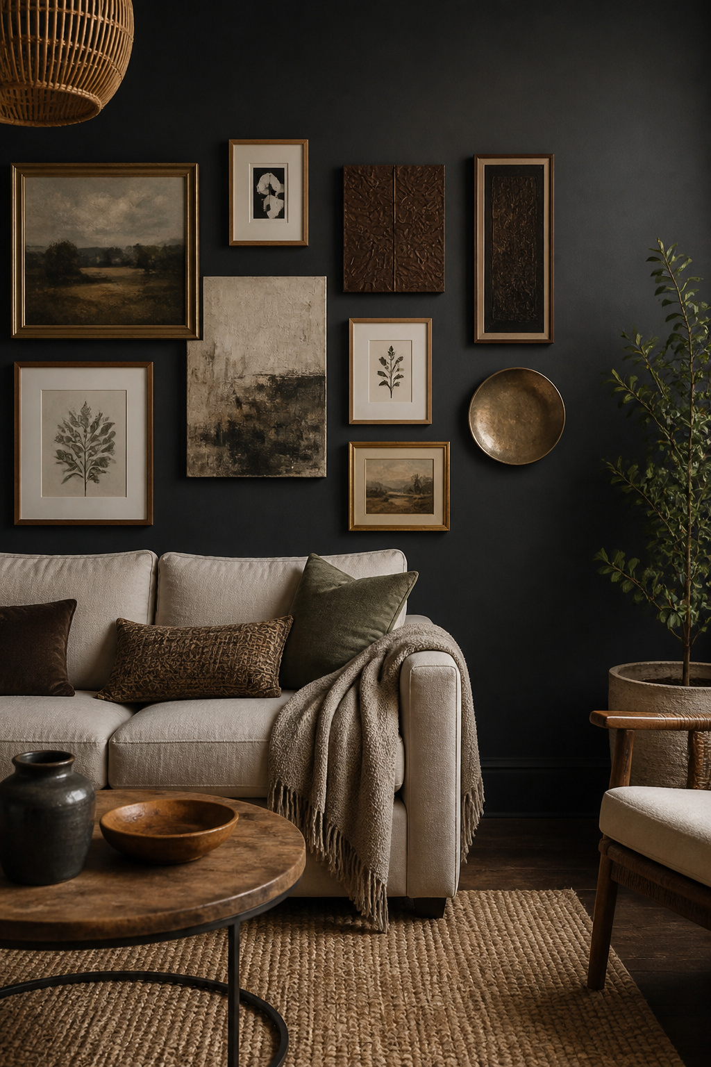
Flat walls read like a catalog page until the frames themselves start doing the work. Mixing materials, not colors, builds the depth that makes a gallery wall feel collected over time rather than bought in an afternoon. Wood warms a corner, metal catches lamp light, and an unframed canvas breaks the rhythm so the eye keeps moving.
The combination that finally worked in my living room was almost too cheap to trust: a thrifted gold metal frame from a church rummage sale, a raw maple piece I’d stripped myself, and two black-painted IKEA Ribba frames I’d already owned for years. Keeping them 2–3 inches apart let each material read as its own layer without the gaps turning into dead space. The gold and maple are warm, the black grounds them, and the canvas I left bare on the end keeps the whole row from feeling like a frame shop exploded.
Color matching across finishes is a trap. I spent an hour once holding paint chips against walnut and brass, trying to force harmony, and the wall looked like I was decorating by committee. The fix was simpler than I expected: stay in one temperature family, ignore the rest. Warm wood, warm metal, cool black as the neutral. The black reads as intentional contrast, not a clash, because it repeats enough to feel planned.
Ribba frames at $10–15 are the easiest entry point for renters who want that black border without committing to custom work. The thrifted metal frame cost me $4 and already had the patina I would have paid extra to fake.
9. Asymmetrical Layouts
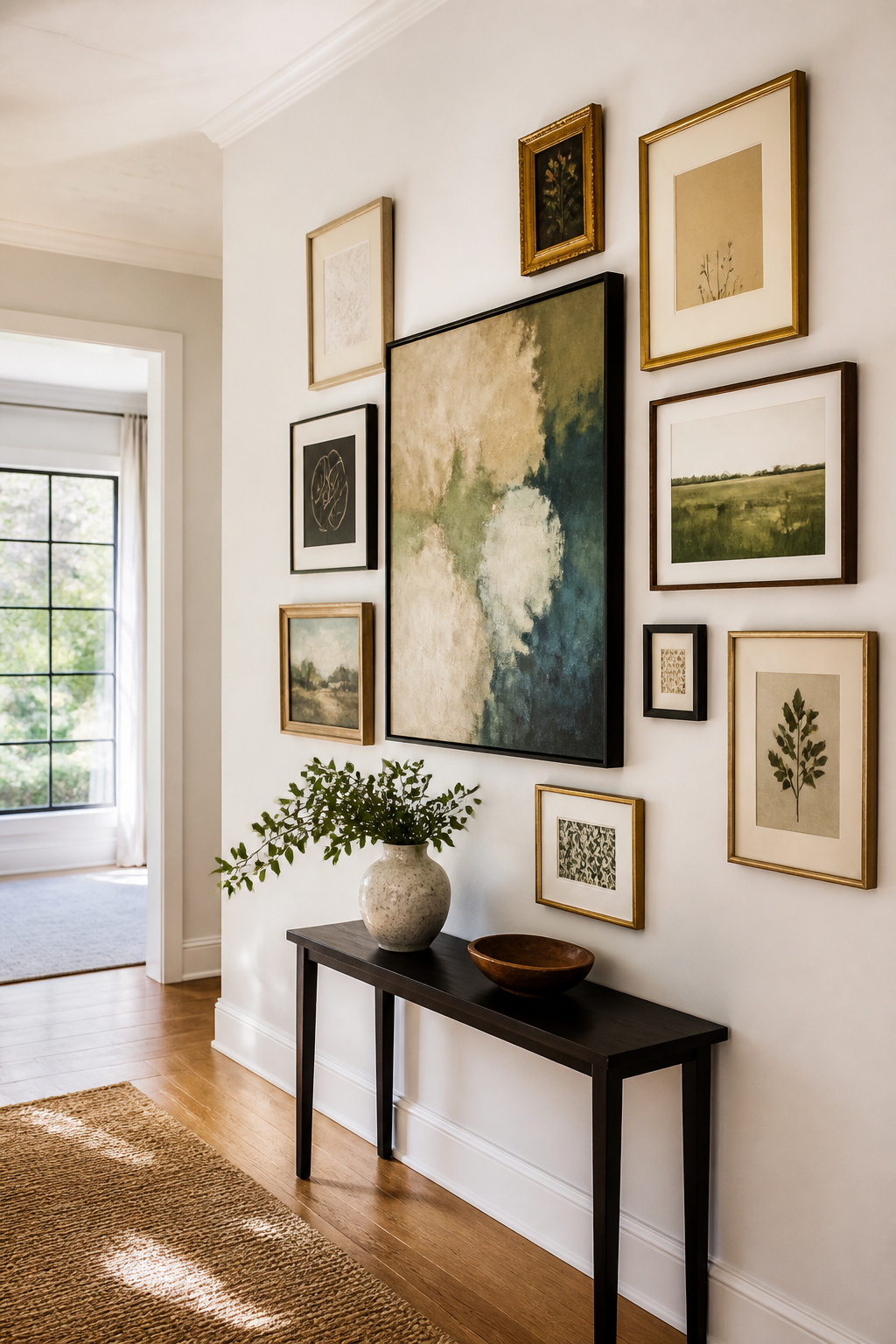
An asymmetrical layout, sometimes called a salon wall, starts with one piece deliberately off-center, then builds outward in a shape that roughly fills a rectangle without ever mirroring itself. The eye travels around the collection instead of slamming straight to the middle.
For a layout that forgives uneven ceilings or crooked walls common in rentals, trace each frame onto kraft or butcher paper and tape the templates to the wall first. This is where you tweak, not where you measure. Once the paper arrangement feels right, mark the hanging points, hammer through the paper, then peel it away and hang the actual frames. Putty on the bottom corners keeps pieces from getting knocked askew, which matters more in a busy household than most guides admit.
The method works because the casual arrangement draws attention away from the wall’s own flaws. A grid would broadcast every slanted line; a salon wall lets the irregularity look intentional. Start with your largest or boldest piece, place it toward one outer corner or just off-center, and let the rest flow naturally. Visual balance matters more than equal spacing, and trusting your eye beats a ruler here.
10. Picture Rails
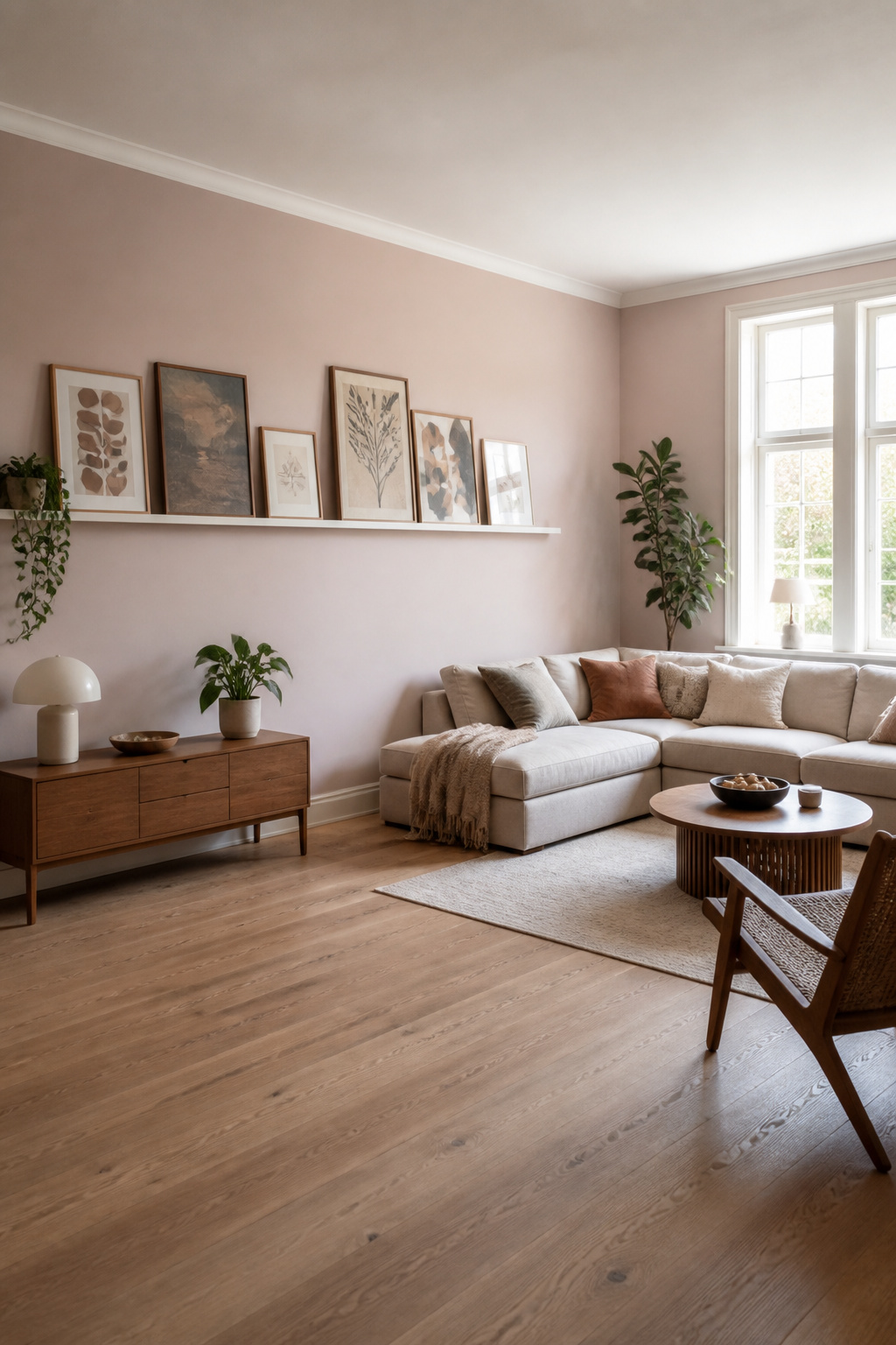
Picture rails solve the renter’s dilemma without looking like a compromise. A standard four-foot ledge from Target or West Elm sits two to three inches out from the wall, which means frames lean rather than hang. That gap is what makes the whole system work: you swap prints on Sunday afternoon without spackling anything on Monday.
Installation still needs two studs or heavy anchors, since a loaded rail pulls forward, not down. The 57-inch rule applies to the ledge top, not to individual frames. Line that top edge to eye level and the leaning stack sorts itself out. I learned this after measuring each frame on my first attempt and ending up with a staggered mess that looked accidental.
The real payoff is the freedom to rotate. A postcard from a weekend trip replaces the print you tired of, no holes, no patching, no landlord notification. For someone who moves yearly or just changes their mind often, that matters more than the clean look of a traditional gallery wall.
Planning and Layout
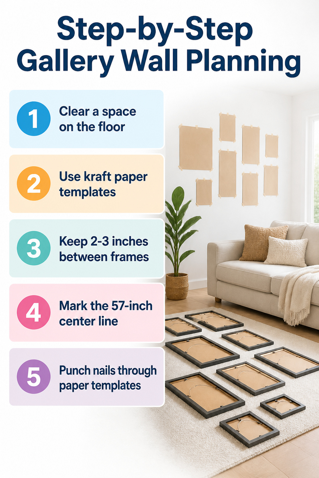
The floor is the only place where you can see the whole layout at once, so I clear a section of living room and lay every frame face down. Moving pieces around takes ten minutes, but the real value comes from stepping back to look. A frame that looked central on the table often wants to drift left once you see it from a distance.
Kraft paper templates traced to each frame size let you test the wall without committing. Tape them up, live with the arrangement for an afternoon, and you will catch the one piece that throws everything off balance. Keep 2–3 inches between frames; anything wider and the grouping starts to read as scattered, anything tighter and it turns into clutter.
The 57-inch center line from the floor is the height where most eyes land in a standard room, so I mark that on the paper templates with a pencil. Flip each frame, measure from its wire or bracket to the top edge, transfer that distance down from the center mark, and punch the nail straight through the paper. The whole planning stage runs 30–45 minutes, which feels slow until you have skipped it once and spent an evening spackling holes you could have avoided.
Spacing and Measurements
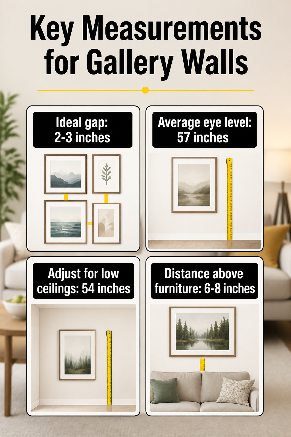
The gap between frames matters more than most people expect. 2 to 3 inches is the measurement that keeps a gallery wall from reading as either one heavy blob or a scattering of unrelated pieces. Too tight, and the frames merge into a single mass that the eye skips over as clutter. Too loose, and the arrangement loses its rhythm entirely, each piece floating in isolation.
The 57-inch rule anchors the center of the art at average eye level, which is where most people settle naturally when they enter a room. Low ceilings pull everything down, so the midpoint drops closer to 54 inches to keep the top from crowding the ceiling plane. Tall furniture behind the arrangement changes the math completely; over a sofa, the bottom of the lowest frame should sit 6 to 8 inches above the back, not at eye level at all. The wall becomes an extension of the furniture, not its own zone.
I have hung grids where I trusted the 57-inch mark above a low credenza and ended up with a band of empty wall that made the whole room feel top-heavy. The correction was simple once I measured from the furniture instead of the floor, but the mistake was visible for two weeks while I talked myself into redoing it.
Mixing Frame Styles
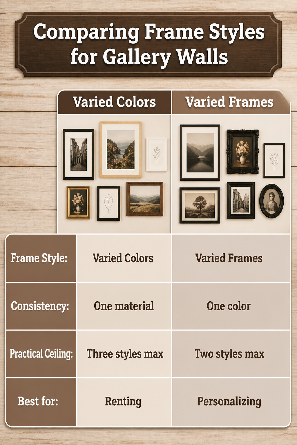
A wall full of identical frames reads like a hotel corridor, not a home. I learned this the expensive way after buying twelve matching IKEA Ribba frames for my living room and watching them flatten every bit of personality out of the art inside them. The larger the space and the more pieces you hang, the more frame styles you can mix without losing control.
Two approaches keep the mix from turning into chaos. Varied frames with one consistent color works well: white, black, and wood tones all in the same finish, or all-black frames in three different profiles. The second route is varied colors held together by consistent material: all wood frames in different stains, or all metal in mixed finishes. I lean toward the first for renters because it forgives thrift-store finds and Amazon Basics frames sitting side by side.
Three frame styles is the practical ceiling for most walls. Two clean modern frames, like a simple black and a light wood, plus one more ornate piece, maybe with a thin gold line, gives enough variety without demanding a design degree to pull off. Start with your largest pieces near the center or just off it, then build outward with medium and smaller frames, keeping an eye on how the outer edges line up. Clean perimeter lines do more for cohesion than matching frames ever did.
Choosing the Right Wall
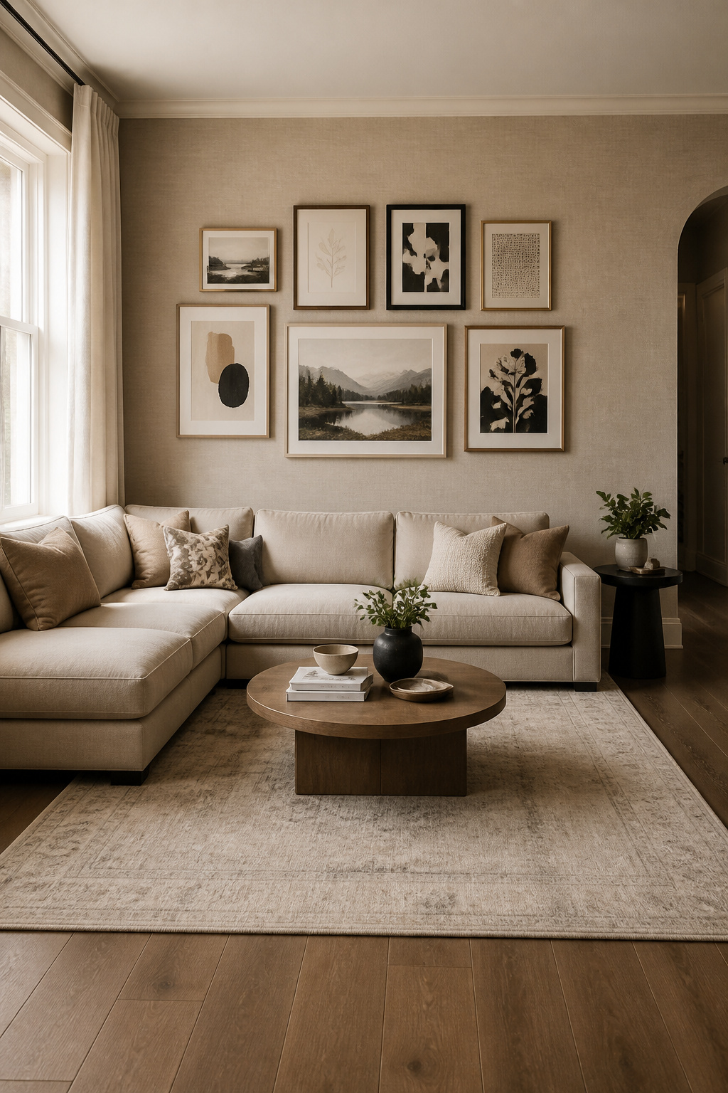
Some walls announce themselves the minute you walk in, and others fight back. The space above a sofa is the classic for a reason: your eye goes there naturally, and the furniture gives the frames a ground line to sit above. Leave 6–8 inches of clearance between the top of the sofa back and the bottom of your lowest frame. Any tighter and the arrangement looks like it’s sliding down the cushions; any higher and it floats.
Beds work the same way, though the scale needs to read from pillow height, not headboard height, or the whole thing tilts wrong. Hallways and staircases are where gallery walls earn their keep in a house with thin square footage. A staircase lets you build upward in waves on either side of the railing, adding frames over months without the pressure of a finished grid on day one.
The mistakes are specific. A wall that faces a television splits your attention every time; the eye cannot settle on both. A window with an actual view, even a modest one, will always win against framed prints. And the wall behind a door that stays open is space you will never see straight on. I have measured for frames there before realizing the door would hide half the work year-round.
Renter-Friendly Hanging
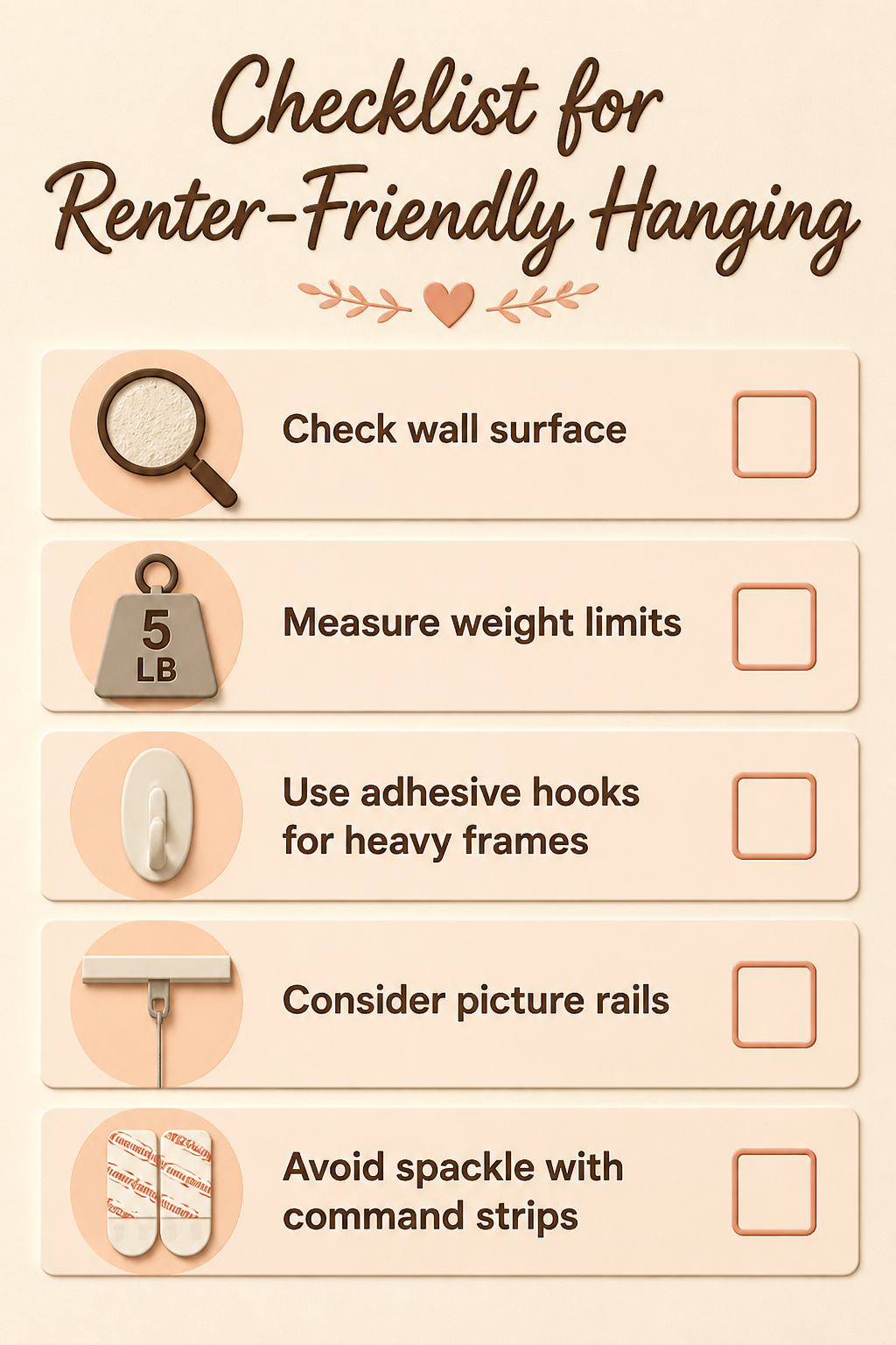
Command strips work until they do not. On textured walls, the adhesive grip loosens slowly, and a frame under five pounds can still drop in the middle of the night. The strips are rated by weight for a reason, and the margin between the rating and the actual load matters more than the package suggests. I have learned to check the wall surface first, then check it again.
For anything heavier, removable adhesive hooks carry a weight rating on the hook itself. Read it, do not round up, and remember that glass and matting add more than you think. Picture rails skip the adhesive question entirely; they let you switch pieces without touching the wall, and stacking ledges works if you leave room for tall frames to stand upright. Leaning frames on a mantel or shelf removes the risk completely, though dust settles behind them faster.
The real cost of getting this wrong is not the hook. It is the security deposit, or the hour spent with a three-dollar tube of spackle filling nail holes you could have avoided. That three-dollar tube is cheaper than the deposit, but zero holes is cheaper than both.
Frequently Asked Questions
How do you create a gallery wall?
Start by arranging pieces on the floor first to test layouts without commitment. Combine different genres, time periods, scales, and mediums for depth, but keep the content cohesive so the wall reads as curated rather than crowded. Trace frames onto kraft paper and tape templates to the wall before hammering any nails.
What are 2025’s biggest gallery wall trends?
More color and texture, grid style arrangements, and minimalist gallery walls are trending. Gallery walls are also moving into nontraditional spaces like staircases and corner nooks, not just living and dining rooms.
What’s the best room for a gallery wall?
Living rooms and dining rooms remain classic choices, but staircases, hallways, and even the narrow strip beside a refrigerator work well. The key is choosing a wall your eye naturally travels to, not one hidden behind an open door or competing with a television.