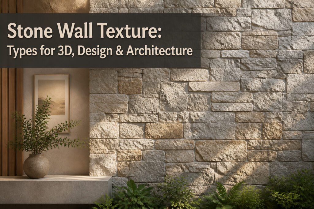
A stone wall texture is a digital or physical surface treatment that reproduces the color, grain, and relief of quarried or cut stone for use in 3D rendering, interior design, and building construction. The catch is that the same file can sink a project if its resolution, tiling, or map format clashes with your software or the scale of the wall. The 3" Split Limestone texture, for example, comes in six color options and stays invisible across large surfaces because its edges align with the stone joints rather than cutting through them.
1. Seamless Stone Textures
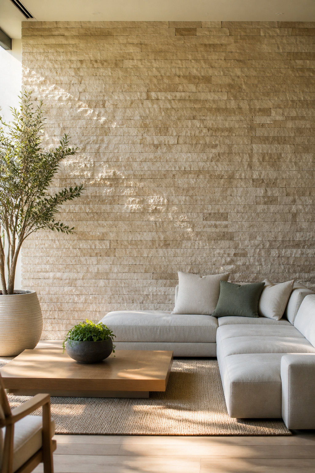
A tileable stone texture saves hours on any wall that runs more than a few feet. The 3" Split Limestone and 6" Split Limestone varieties both come in six color options each, and the repeat pattern stays invisible across large surfaces because the edges align with the stone joints rather than cutting through them. For physical installs, that means you can order a single texture file and scale it to a full accent wall without the telltale grid that cheaper patterns show after the third repeat. In 3D renders the same file keeps file size down; one high-resolution tile loads faster than a unique 4K texture for every square foot of facade. The 3" scale reads as tighter, more refined stonework, while the 6" opens up the pattern for bigger rooms or exterior views where you need the grout lines to carry from ten feet back. Both downloads work in standard architectural modeling programs, so the jump from render to real material order stays clean.
2. Stylized Stone Wall Textures
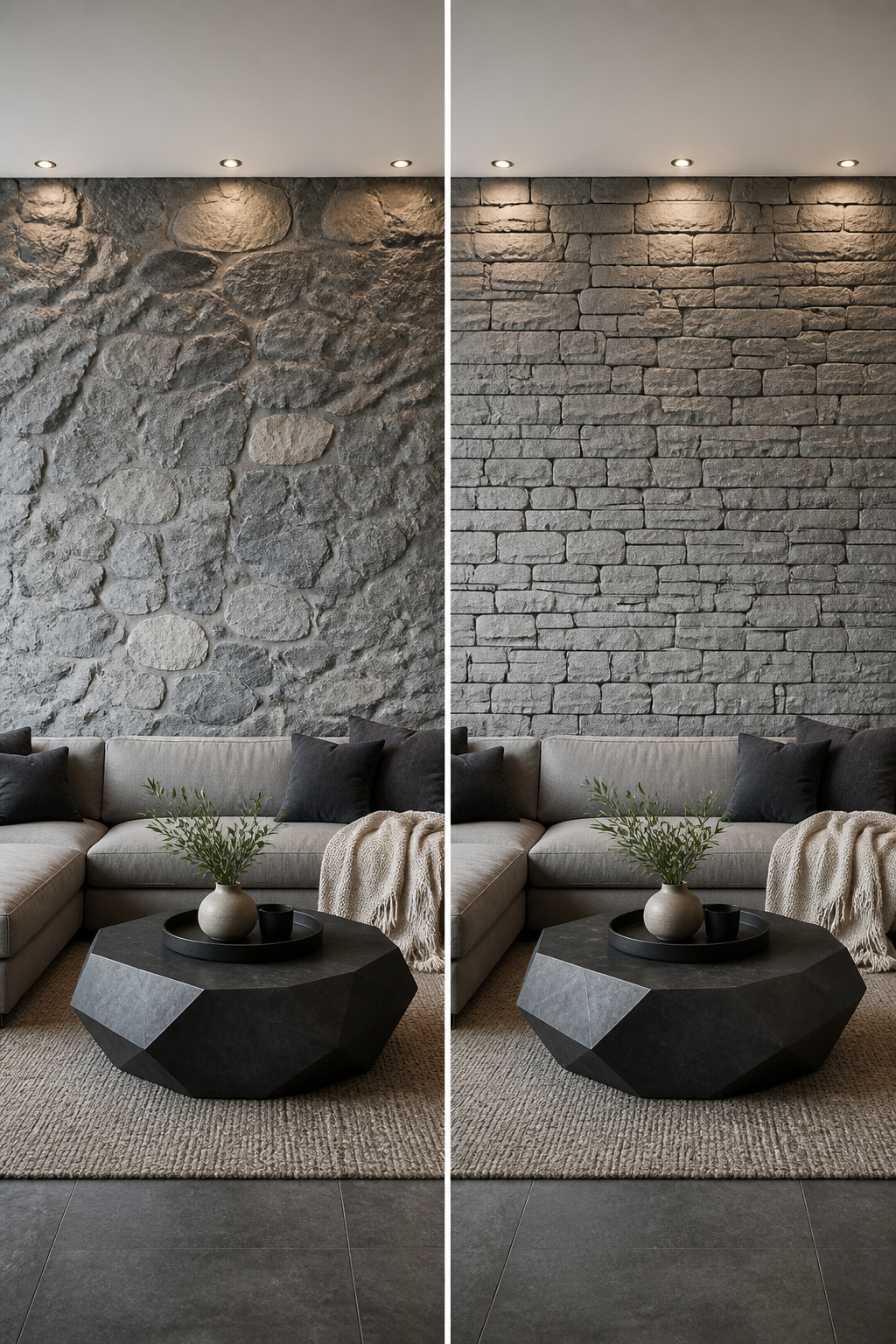
Stylized stone wall textures strip away the noise that photorealism piles on. Every seam, stain, and micro-crack in a scanned cliff face fights for attention; in a game environment, that visual shouting distracts from the gameplay itself. Hand-crafted stylized textures solve this by bolding the silhouette and softening the detail so the wall reads as stone from thirty feet away without stealing the frame.
The practical side matters just as much. These textures ship as PBR materials, built with the same base color, normal, roughness, and metallic maps you’d use for realism, just with cleaner edges and exaggerated plane breaks. Procedural tools like Substance Designer let artists bake the stylized look from adjustable parameters, then export game-ready files for Unity, Unreal, or Blender. The SBS and SBSAR source files mean you can push the look further, painter or hand-tooled, without rebuilding from scratch.
Photorealism wins for architectural visualization where a client needs to sign off on actual limestone. Stylized wins when the stone is scenery, not subject, and when your weekend project budget runs a few hundred dollars, not a few thousand for scan data and the hardware to render it. The readable look also ages better; a stylized wall from five years back still holds up, while early photoreal work shows its polygon count and texture resolution in every screenshot.
3. PBR Stone Wall Textures
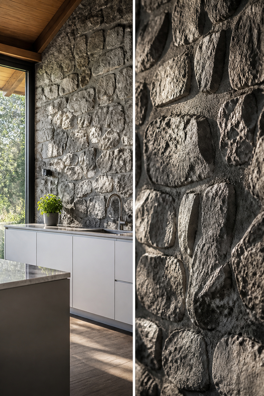
PBR stone wall textures are built from four maps that work together so the surface reacts to light the way actual stone would. The albedo map sets the raw color without any baked-in shadows or highlights, the normal map fakes surface bumps at the pixel level, roughness controls how scattered or tight the reflections are, and displacement actually pushes the geometry outward for the deep crevices between blocks. Get the balance wrong and the wall looks plastic; get it right and a render reads as weathered masonry even in a tight close-up.
These texture sets are made to drop straight into V-Ray, Corona, Unreal Engine, Lumion, Blender, SketchUp, Enscape, 3ds Max, and Cinema 4D. The formats are standardized enough that porting between them is usually just a matter of relinking the same four maps into the corresponding slots. I have spent more time than I care to admit re-wiring node trees because I grabbed a displacement map meant for 3ds Max and tried to feed it into Blender’s shader without checking the bit depth. The 8K scans from the medieval and natural stone collections give you enough resolution to push the camera within a few feet of the wall and still hold detail, though on a weekend project you can often get away with 4K if the stone sits mid-ground in the frame.
The real payoff comes from how the maps interact under changing light. A limestone albedo with a roughness map that keeps the face matte but polishes the exposed edges where hands have worn them, plus displacement that catches raking light across the mortar beds, will sell the effect without any modeled geometry beyond a flat plane. That is the combination I look for first when I am digging through a new stone wall texture pack.
4. Natural Stone Wall Textures
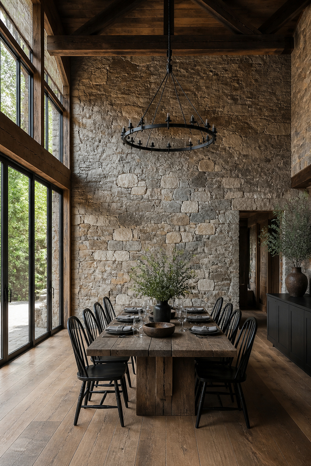
Quarried stone carries the irregular color shifts and fossil marks that come from sitting in the ground for millennia. The surface shifts from warm tan to cool gray within a single face, and you will find shells or fern impressions that no manufactured pattern replicates. For a feature wall or fireplace surround, that authenticity is the whole point; the eye reads it as real because it is real.
The same variation limits flexibility. A stone that looks perfect under morning skylight can turn muddy under warm LED bulbs at night. Matching additional stone later is nearly impossible; quarries run out, and the next batch from even the same pit will read differently. For renters or anyone who rearranges often, the commitment is closer to a tattoo than a paint color. Weathering helps somewhat, since all natural stone calms as it ages, but the first six months can look jarringly fresh against older work.
I have learned to source about twenty percent more than the project requires and to keep the extras, because patching or extending without them means a visible seam. The cost of that overage is usually worth the insurance, unless your budget is already tight to the last piece.
5. Medieval Stone Wall Textures
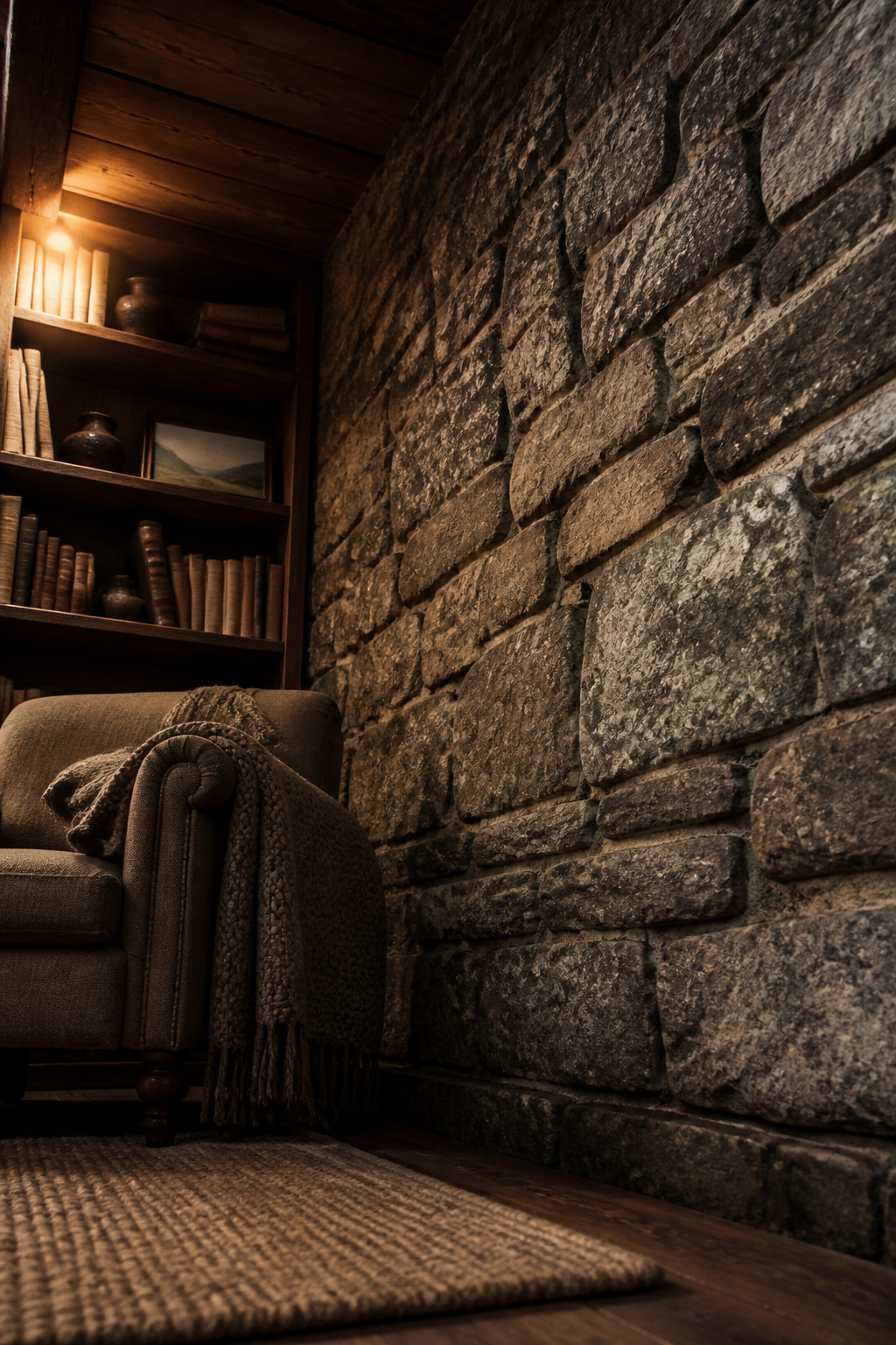
Medieval stone wall textures carry the weight of irregular, hand-hewn blocks with mortar joints deep enough to cast their own shadows. The blocks vary in size and never sit flush, which breaks up flat surfaces in a way that reads as fortress rather than facade. Weathering patterns matter here: water staining, lichen patches, and the soft rounding of edges where centuries of freeze cycles have done their work. In a modern room, that heaviness can anchor an otherwise airy space, or it can overwhelm it if the ceiling is low and the light is dim. I have seen this texture work best as a single accent wall behind a bed or sofa, where the eye can take it in without the room closing in. For renters, peel-and-stick murals that imitate this look have improved enough to pass at a glance, though the mortar lines will still read flatter than the real thing. The mood leans unmistakably toward shelter and permanence, which is either exactly what a space needs or precisely what fights against it.
6. Gabion Stone Wall Textures
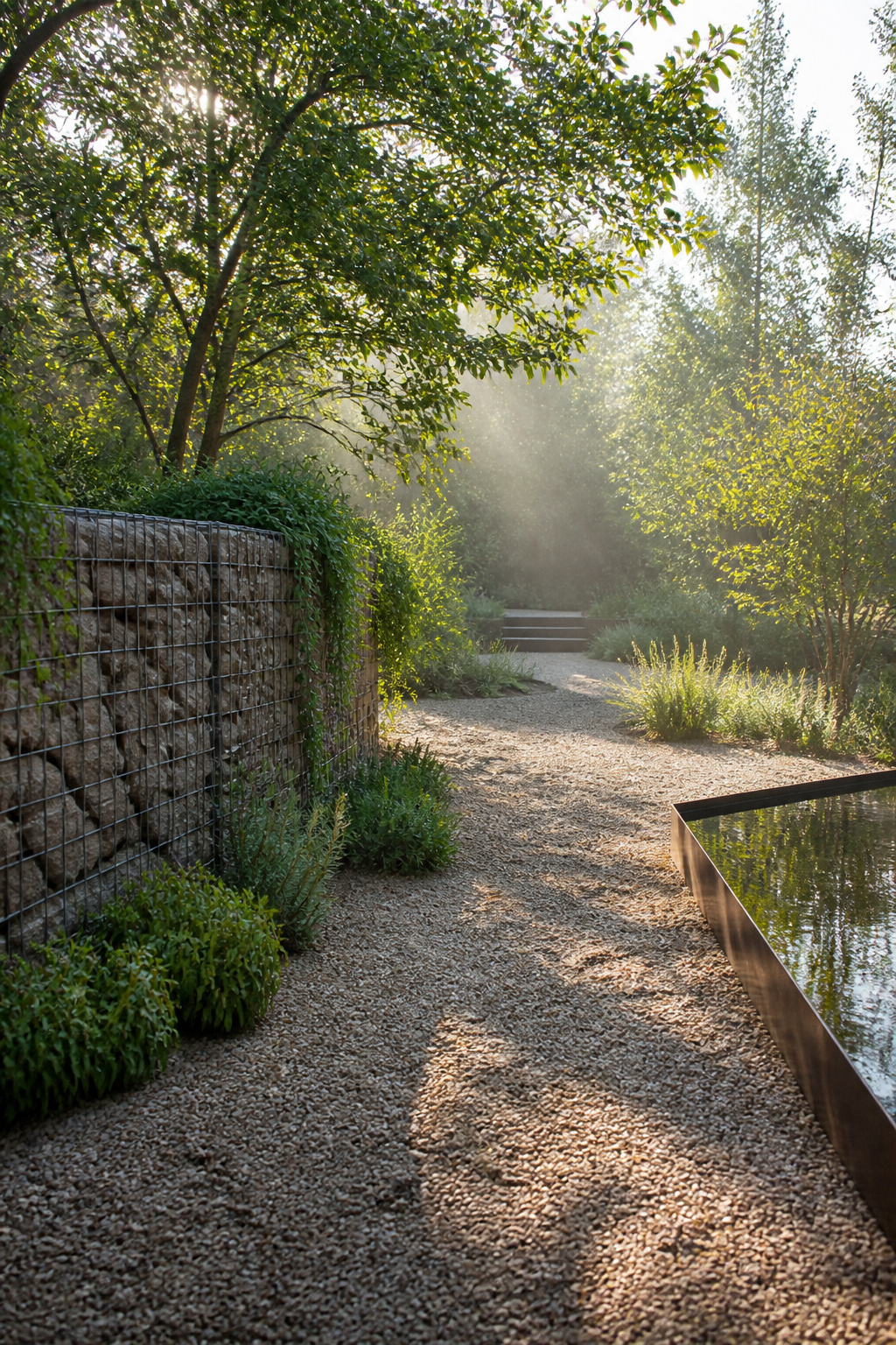
A gabion wall starts with a steel wire cage, usually rectangular, that you fill by hand with loose stone. The mesh leaves a strict grid pattern across the face, but the rock inside breaks that regularity with rough, irregular faces pushing through the openings. For anyone working in 3D, the texture is two systems at once: the predictable wire rhythm and the chaotic stone surface behind it.
I first noticed this tension while walking past a retaining wall at a park renovation. The contractor had used local limestone, so the color stayed muted gray-brown, but the stones were clearly dumped in, not fitted. That looseness is the whole point. In landscape architecture, gabions read as industrial because the cage is visible and the fill is unworked. The wall does not pretend to be dry stone masonry; it admits its construction.
For digital work, the wire mesh needs its own UV layout if you want the rust and tension bends to sit right. The stone fill can share a tiling texture since the eye expects repetition inside the cage, but the mesh should show slight deformation where the rock presses outward. Skip that detail and the wall looks like a render from 2008.
The real limitation is scale. A gabion reads correctly only at substantial thickness; a thin veneer cage looks like a fence with rocks stuffed behind it, which is exactly what it is.
7. Rubble Stone Wall Textures
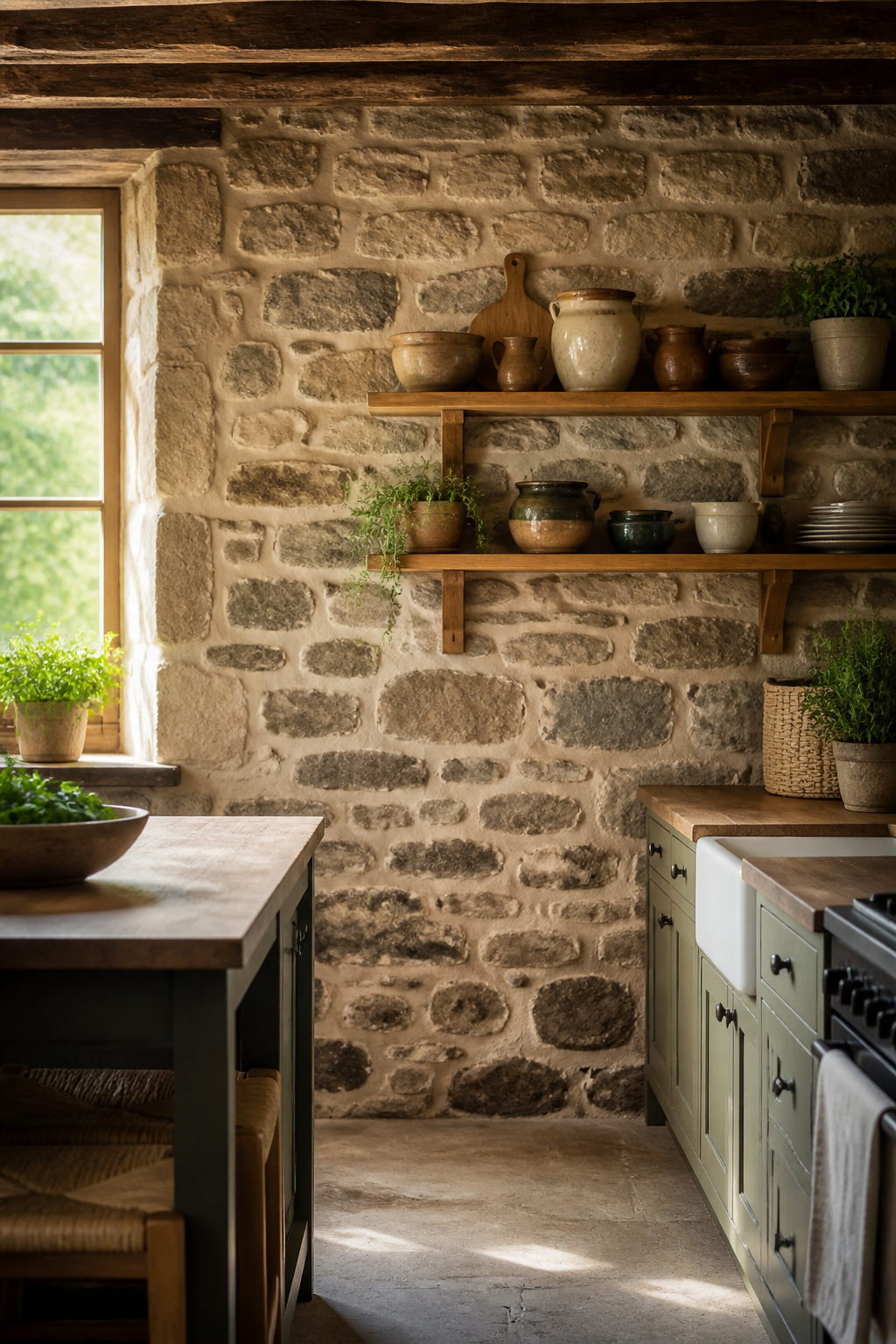
Rubble stone wall textures borrow their character from the oldest walls in the countryside, the ones built from whatever the field turned up. Stones of wildly different sizes get fitted together with thick, sloppy mortar joints that show the builder’s hand rather than hiding it. That looseness is exactly what gives the texture its warmth, though it walks a fine line. In a cottage setting with soft light and trailing plants, the same irregular surface reads as storybook charm. Drop it into a sleek modern loft and it suddenly looks like construction stopped halfway through.
The mortar matters as much as the stone. Wide, recessed joints catch shadow and make the wall feel centuries deep even in a flat digital render. For a weekend project, a veneer panel that reproduces this effect saves the structural weight of real fieldstone. Paint the mortar line a half-shade darker than the stone itself and the depth pops without looking cartoonish. I have seen renders where the mortar matches too closely and the whole surface flattens into wallpaper; the fix costs nothing but attention during color selection.
8. Cladding Stone Wall Textures
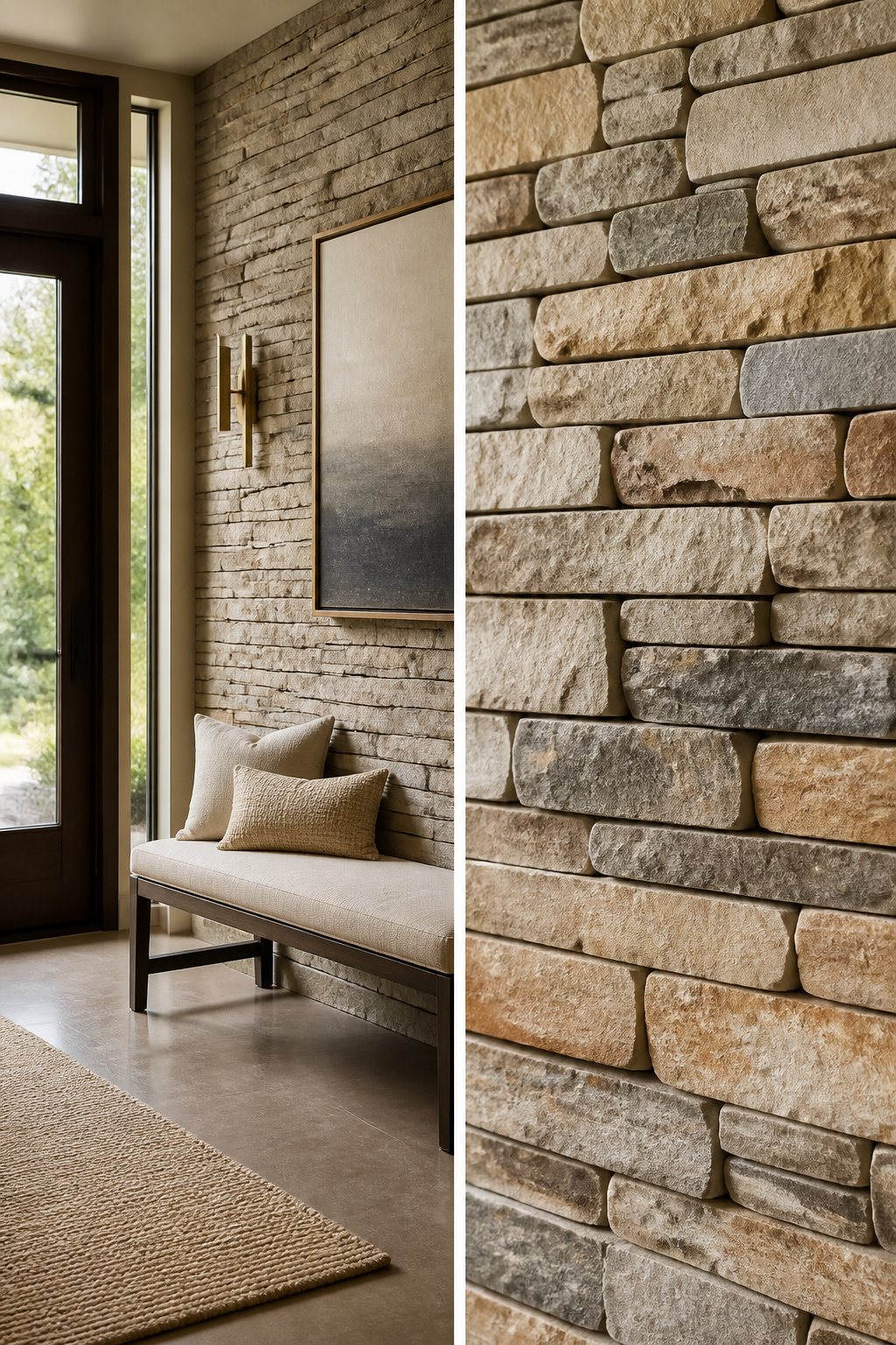
Thin stone veneer gives you the look of solid masonry without the structural load or the price tag that comes with it. The material arrives in uniform thickness, usually between three-quarters of an inch and an inch and a quarter, and that consistency is the visual tell you need to manage. Install it in a dry-stack pattern with tight joints and the eye reads each piece as individual stone; use a wider mortar joint in a traditional ashlar layout and the grout lines draw attention away from the identical depth. I spent an afternoon once studying a restaurant interior where the designer had tried to split the difference with half-inch joints, and the result looked like exactly what it was, tile pretending to be something heavier. The fix is simple: commit to one approach or the other. Dry-stack demands more precision in cutting, especially at corners and around outlets, but the payoff is a wall that reads as built, not applied. For a weekend project on a real budget, the material itself is forgiving; the installation pattern is where the work earns its credibility.
9. Damaged Stone Wall Textures
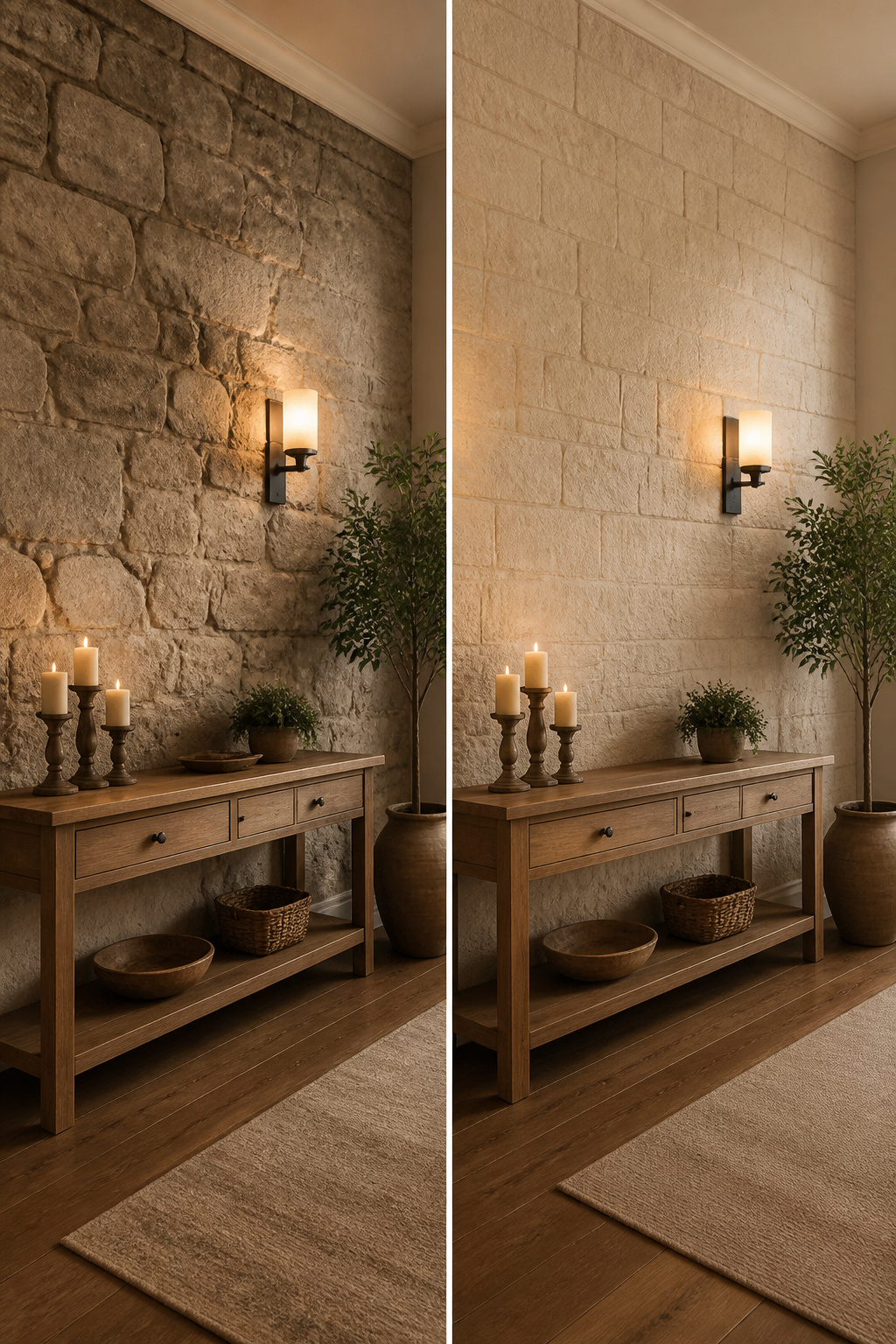
A cracked stone wall texture reads as history only when the damage follows a pattern. Random, scattered chips look like neglect; erosion concentrated along mortar lines or at the base where water runs looks like time doing its work. In a 3D scene or a living room accent wall, that distinction matters more than the texture resolution.
I learned this the hard way on a rental kitchen backsplash where I used a heavily damaged stone-look vinyl. The pattern repeated every 18 inches, and the "erosion" landed in identical spots, so the wall looked like it had been attacked with a hammer rather than aged. Damage needs a story to read as character: top edges weathered from sun, bottom corners softened from ground contact, mortar recessed where it would have washed out first. Without that logic, the eye catches the repetition and the effect collapses into sloppiness.
For renters, peel-and-stick options with deliberate, directional wear patterns cost about the same as random-damage versions, maybe ten to fifteen percent more per square foot. The difference is whether guests ask about the charming old wall or whether they notice something off and never mention it.
10. Country Style Stone Wall Textures
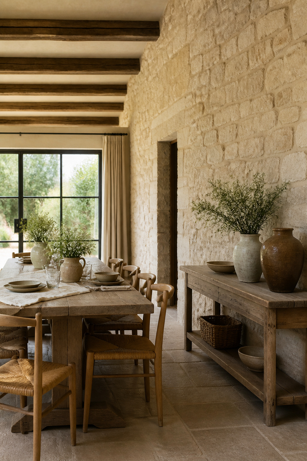
Country stone wall textures run warmer and softer than anything you’d find on a city facade. Limestone carries that buttery, almost chalky surface that catches afternoon light without throwing it back hard. Sandstone layers even more color variation into the same quiet range, tans and faint roses that read as age rather than effort. River rock rounds every edge; the stones look tumbled in by water and set where they landed, not chiseled to fit a line.
The palette stays lighter than formal masonry, and that lightness is what signals the style. Cream, warm gray, and the faded ochre of old clay mortar read as farmhouse before you notice the architecture. Darker stone can work, but it shifts the mood toward something more deliberate, more estate than barn.
For a weekend project, the texture you choose matters less than the color you pair it with. A limestone-look panel in warm white carries the country impression even in PVC; the same panel in cool gray reads as contemporary siding. Mortar color seals it. Matching mortar disappears the joints and softens the whole wall. Dark raked joints turn the same stone graphic and modern.
Texture Quality and Resolution
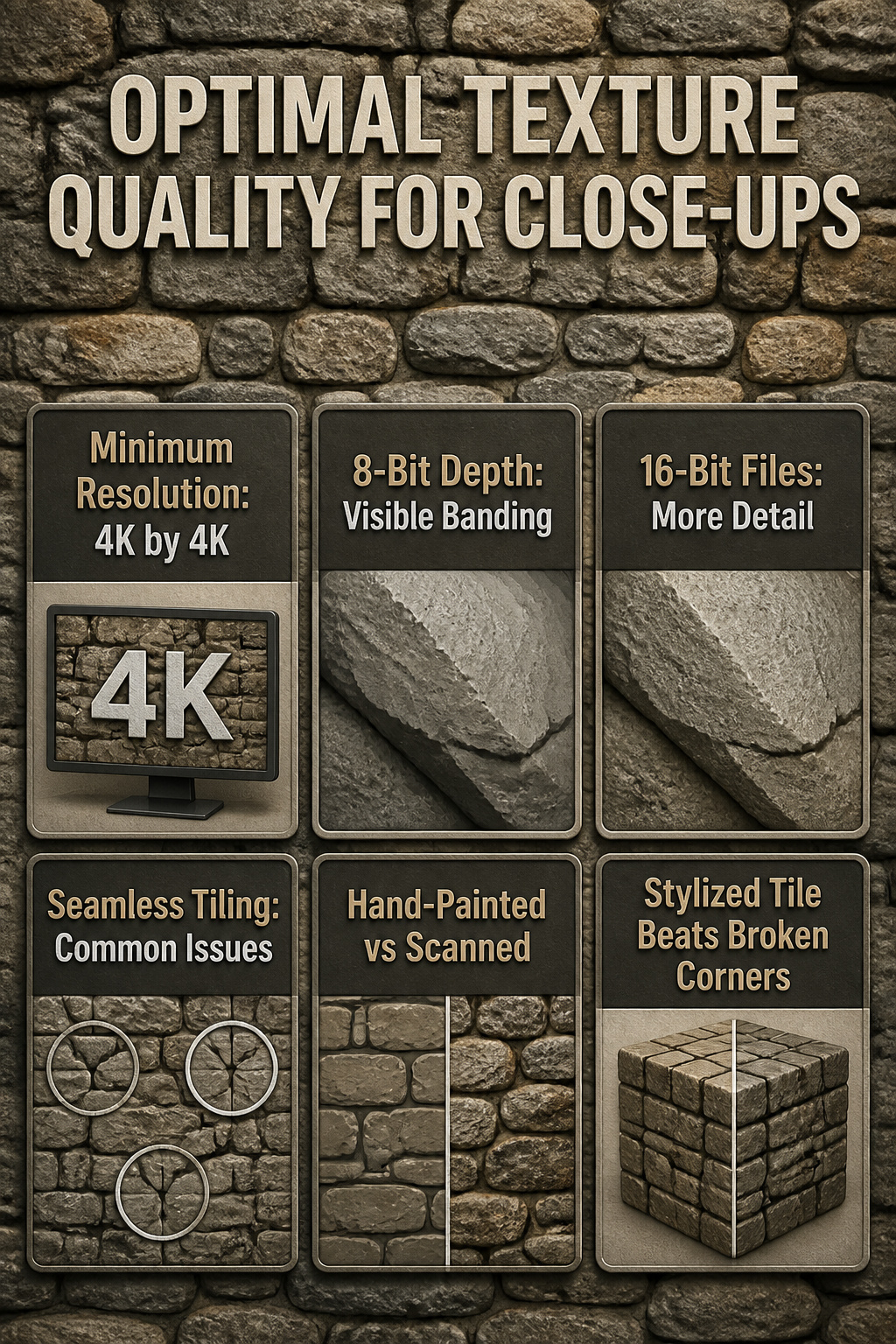
A stone wall texture only works if the pixels hold up when you get close. Most of the 65 textures I sorted through looked fine at thumbnail size and fell apart at full scale. 4K by 4K is the floor for anything you plan to render in a close-up shot; 2K textures save disk space but the repetition becomes obvious once the camera moves within a few feet of the wall.
Bit depth matters more than I expected. An 8-bit texture bands in the shadows between stones, especially on limestone or granite where the tonal range is wide. Sixteen-bit files fix that, though they double the size and some older 3D packages choke on them. I have learned to keep both versions and swap based on the project.
Seamless tiling is where most free collections fail. The edge matching looks perfect in the preview, then the same cracked stone shows up three times in a row once you tile it across a large surface. Hand-painted textures hide this better than photogrammetry scans, which carry too much unique detail to repeat cleanly. For a weekend project with a tight render budget, a slightly stylized seamless tile beats a hyper-realistic one that breaks the illusion at the corners.
File Formats and Software Compatibility
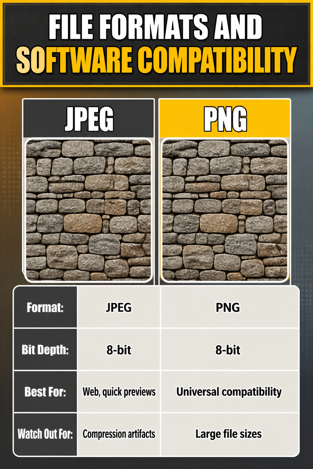
A stone wall texture set only matters if your software can read it. JPEG and PNG handle the basics: diffuse color, normal maps, roughness. They load anywhere and keep file sizes manageable for a quick Blender scene or a small Unreal environment. The catch is 8-bit color depth, which shows its seams when you push lighting hard or grade aggressively in post.
TIFF and EXR carry 16-bit or 32-bit depth, and that headroom matters for displacement-heavy work where banding ruins the illusion. I learned this the hard way on a Corona render where the stone looked terraced instead of weathered; the 8-bit displacement map simply ran out of values to describe subtle slope changes.
Engine compatibility is the real gatekeeper. Unreal wants specific channel packing for its material editor, usually roughness in green and ambient occlusion in red. Blender’s Cycles and Eevea are more forgiving with node setups but still expect normal maps in OpenGL format, not DirectX. V-Ray and Corona stick closer to standard PBR conventions, yet Corona’s displacement likes its maps in a specific bit range or the geometry explodes at render time.
| Format | Bit Depth | Best For | Watch Out For |
|---|---|---|---|
| JPEG | 8-bit | Web, quick previews, small builds | Compression artifacts on normals |
| PNG | 8-bit | Universal compatibility, alpha channels | Large file sizes for 4K sets |
| TIFF | 16–32-bit | Print, heavy grading, displacement | Not every engine reads all variants |
| EXR | 16–32-bit | VFX, HDR pipelines, serious displacement | Overkill for most weekend projects |
Before you download a texture set, check whether it ships with the maps your engine expects. A beautiful 4K stone wall texture saves no time if you spend Sunday afternoon repacking channels in Photoshop instead of placing assets.
Color Variations and Matching
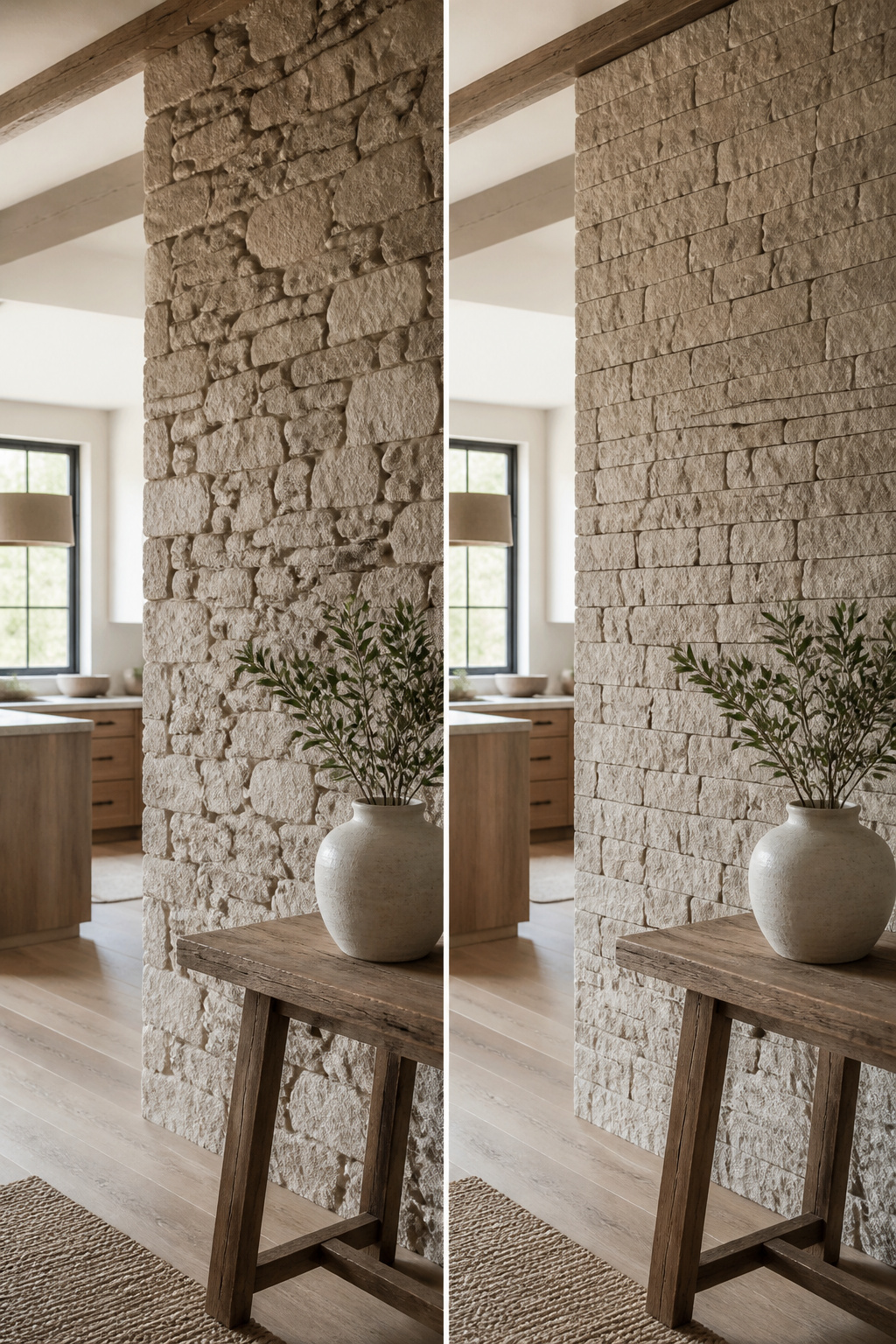
The 3" Split Limestone alone comes in six colors, and that spread is typical across most of the texture families. Coronado’s catalog runs heavy on six-color sets: 6" Split Limestone, Sawtooth Ledge, Element Ledgestone, Granite Peak, and the full Villa line each carry the same breadth. That range matters when you are trying to match existing brick, siding, or flooring without ripping it all out.
Warm undertones, the ones that read tan or buff, pull light inward and make a north-facing room feel later in the day than it is. Cool gray undertones do the opposite, bouncing light around and flattening shadows. I learned that the hard way with a creamy white lamp base that carried just enough yellow to fight my wall color. Stone works the same. The "6 Colors" label on a texture card is not six versions of the same thing; it is six distinct directions, and two of them will probably clash with your grout or your roof.
If your existing materials lean warm, stay in the buff, wheat, or honey ranges. Cooler pairings need the grays and taupes. The texture family stays the same, so the 3D model or the installed wall reads as one continuous material, but the colorway bridges what is already in the room. Eastern Mountain Ledge pushes this furthest with eleven colors, which sounds generous until you realize nine of them could still read wrong against your particular floor tile.
Frequently Asked Questions
What types of stone wall textures are available?
Stone wall textures fall into ten main categories: seamless, stylized, PBR, natural, medieval, gabion, rubble, cladding, damaged, and country style. Seamless versions tile without visible repeats; stylized ones use cleaner edges and exaggerated planes for games or animation; PBR sets include albedo, normal, roughness, and displacement maps for realistic light reaction. The remaining types each carry a specific mood and install method, from hand-hewn medieval blocks to wire-cage gabion fills.